Art World
Google Sets Out to Disrupt Curating With ‘Machine Learning’
What would Aby Warburg say about Google's new Experiments?

What would Aby Warburg say about Google's new Experiments?
In artnet’s predictions for 2017, I wrote that it would be the year Artificial Intelligence would finally crack the problem of curating. That was meant as a joke—but it turns out that I was already behind the times. The whiz kids at Google’s non-profit cultural arm, Google Cultural Institute, have spent the year trying to imagine just that.
Head to the “Experiments” section of the Cultural Institute website and you will find a catalogue of how they have been attempting to apply “machine learning” to the question of organizing artworks. Perhaps the experiment that best showcases their particular brand of cultural gimcrackery is called “X Degrees of Separation.”
Google Cultural Institute has secured millions of high-quality images of artworks and artifacts from hundreds of partner museums around the world. “X Degrees” lets you pick any two images from this library. Its algorithm then conjures up a series of steps that connect the two images visually, using other artworks from the trove.
The result looks like a logical evolution, if you squint. The connections are conjured out of a machine’s understanding of artistic similarities. Half the pleasure is the unexpected leaps this produces.
Thus, when I select Raphael’s Madonna in the Meadow (from the Kunsthistorisches Museum in Vienna) and a photo of a 2013 Nick Cave sound suit (from the Baltimore Museum of Art), “X Degrees” creates a visual pathway that passes through a Giulio Romano Madonna and Child, to a Cranach Pieta, to an Eliot Porter picture of crab legs, and a Wangechi Mutu painting of a bust composed of amoeboid, collage-like forms.
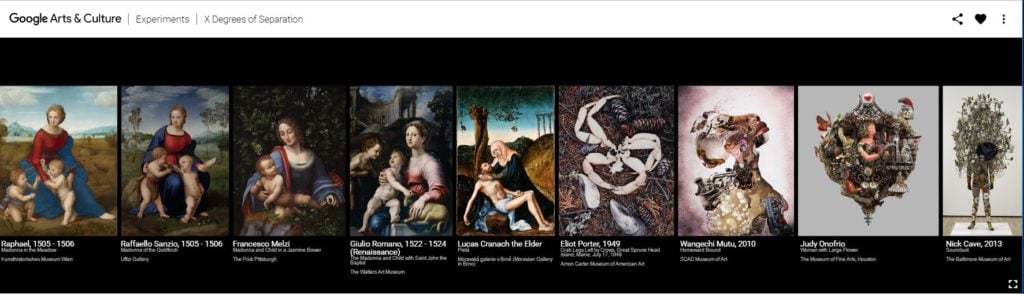
Screenshot from “X Degrees of Separation.”
Another recent Experiment, called “Tags,” scans the trove, then generates a wave of keywords “without the intervention of humans” that “reflect how a computer ‘sees’ Artworks.”
Apparently, a computer “sees” artworks according to categories like “vertebrate” and “hairstyle,” as well as genres like “monochrome photography” and “classical sculpture.” The Tags include the eccentrically specific, like “boats and boating—equipment and supplies,” and the unexpectedly abstract, like “material property,” as well as curveballs like “massively multiplayer online role-playing games.”
That last category, incidentally, does not yield up the expected images of World of Warcraft and EVE Online. Instead, it gives you a diorama of Cagayan Valley Life circa 750,000 BC from the Ayala Museum in the Philippines and a wallpaper depicting “Views of the American War of Independence” by the firm Zuber & Cie, from the Cooper Hewitt collection.
Such quirks, I guess, are part of the fun of learning how a computer “sees” art.
A detail of the landscape in “t-SNE Map.”
A few other Experiments involve organizing the Google trove of art images into 3-D landscapes. “t-SNE Map,” for instance, gives you a view of a landscape of rolling hills, composed of points. Zoom in on the terrain, and you discover that the points are actually images of artworks. The topography is formed by how the computer has decided to sort and cluster artworks in relation to one another, based on its understanding of aesthetic similarities.
“The algorithms only ‘looked’ at the artworks,” the description explains. “No meta data was used, the visual similarity was calculated with a computer image algorithm used in Google Search purely based on the images.”
Still another Experiment, called the “Curator Table,” claims inspiration from “the principle of laying out prints on a table when planning an exhibition.” It conjures a 3-D image landscape that you can sort by artist, time, or color, promising the ability to forge new connections quickly out of vast amounts of art. In a TED talk, Google Cultural Institute boss Amit Sood explained its origin:
Beyond the pretty picture, beyond the nice visualization, what is the purpose, how is this useful? This next idea comes from discussions with curators that we’ve been having at museums, who, by the way, I’ve fallen in love with, because they dedicate their whole life to try to tell these stories. One of the curators told me, “Amit, what would it be like if you could create a virtual curator’s table where all these six million objects are displayed in a way for us to look at the connections between them?” You can spend a lot of time, trust me, looking at different objects and understanding where they come from. It’s a crazy Matrix experience.
Last year, I was at multiple conferences with representatives of Google Cultural Institute—in Melbourne and Berlin, respectively. I’d say that the above is a pretty representative piece of rhetoric: you start out asking “what is the purpose,” and you end up with a product pitch for a “crazy Matrix experience.”
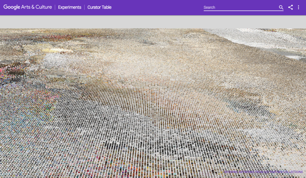
Screenshot of Google Cultural Institute’s “Curator Table.”
C.P. Snow’s classic essay “The Two Cultures” describes how Western education has fatally divided between cultural intellectuals and scientists, separated by mutual incomprehension. Snow saw it as of the utmost importance to bring these two sides together. The promise of something like Google Cultural Institute should be to do just that for art and technology.
Yet, in reviewing its output so far, I can’t help but think of the anecdote in Snow’s essay, when a scientist is asked what kind of literature he reads, and replies “Books? I prefer to use my books as tools.” Characteristically, the cultural objects that the Google Cultural Institute works with are referred to simply as “assets,” an unflattering bit of jargon. “We have this database of millions of great assets, and we try to find ways to create new experiences,” the Institute’s Laurent Gaveau told Wired last year.
To its credit, the Institute has tapped some very capable artists to work on these initiatives: Cyril Diagne (credited as having worked on a variety of the image-mapping works) and Mario Klingemann (credited on “X Degrees”). The Experiments, in effect, straddle the line between being interfaces organizing existing cultural objects and brand new artworks in and of themselves.
Any art historian could tell you 10 important artistic precedents that similarly blur the line between artwork and experimental art history, from Asger Jorn’s Scandinavian Institute of Comparative Vandalism, to Marcel Broodthaers’s Museum of Modern Art: Section of Eagles (shown at MoMA last year). Each of these is already attached to its own intense critical debate that could enrich the discussion here.
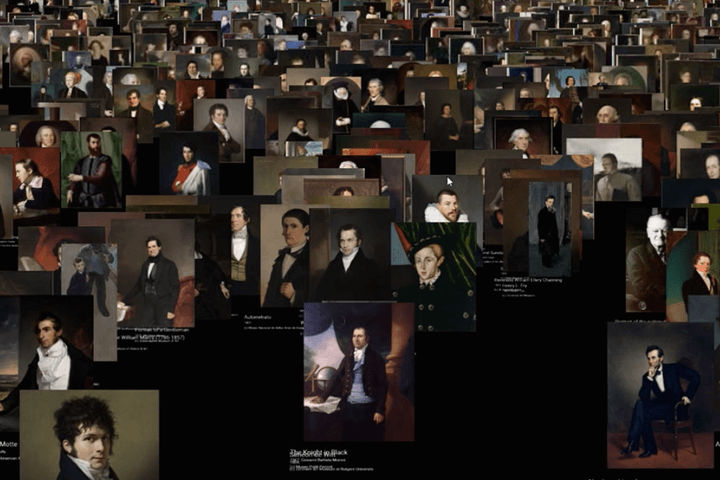
One that springs to my own mind is actually a project by an art historian: Aby Warburg’s famous Mnemosyne Atlas, his attempt at an “art history without a text.” (Cornell has digitized some of the project, and you can examine it online.)
Panel 8 from Aby Warburg’s Mnemosyne Atlas. Image copyright: The Warburg Institute.
Left unfinished at the time of Warburg’s death in 1929, the Atlas consisted of 63 panels, on which he laboriously organized sequences of close to 1,000 black-and-white reproductions depicting works of art and works of popular culture alike. His goal was to capture the growth and death of what he called “pathosformel,” the visual motifs embodying the deep structures of human experience, which he saw as existing within and beyond traditional narratives of art history.
Warburg’s evolutionary chains of images are as suggestive as those conjured up by “X Degrees.” The scheme by which he clusters them are no less quirky, though slightly more poetic, than those of the “Tags”: “Ascent to the Sun,” “Nymph as Guardian Angel and as Headhunter,” etc.
Warburg’s visual Atlas has lately been very fashionable—and it has also come under criticism. The connections it proposes are pseudomorphic; the notion of an underground language of images both too subjective and too universalizing.
David Freedburg writes that in Warburg’s Atlas, “the images have little of their original force, and in their servitude to a curious kind of genealogical encylopedism, all are strangely and improbably drained.” This kind of art history, he writes, embodies “the etiolation of contemplation that is implicit in the modern multiplicity of images.”
Freedburg’s verdict represents a challenge for all attempts of this kind—one that I remembered when perusing Google’s Experiments, where the pleasure of a snappy interface seems somehow to become the real point, with artworks just a pleasant excuse.
Still, this can’t be the whole story, because, as I said, Warburg’s passion project has had a tremendously long afterlife. It has inspired fields well beyond art history and generated an endless stream of interpretive hubbub. What is its secret?
The Mnemosyne Atlas has a fascination akin to those bulletin boards that the detective hero is always maniacally working over in movies, charting the web of connections between incidents and players in a far-flung plot. Its esoteric allure is that it seems to propose some revelation waiting to be uncovered by breaking down and reassembling art history in new ways.
Aby Warburg’s particular mythopoetic quest to trace the migration of deep meanings across cultures may be fraught—but you have to admit that it gives a little more to chew on than the mission Sood offers for the Google Cultural Institute in Wired:
People have too myopic a view of what art and culture is. For some people, a very long curatorial narrative on impressionist art will not work. But if I say: hey, you want to see what bling used to be like in 1800? I think there’s a lot of opportunity for disruption, for changing people’s minds.
Instead of proposing hidden depths, it seems to reduce all of art history to surface.
In diagnosing the split between the “two cultures,” C.P. Snow once said, “The non-scientists have a rooted impression that the scientists are shallowly optimistic, unaware of man’s condition.” This could easily sum up the public view of Silicon Valley today. I know enough sensitive computer scientists to realize that this is a stereotype—but it does seem that, as of yet, the technical sophistication of these Experiments is in direct proportion to the primitiveness of the attempt to make meaning with them.
In a lot of ways, these are truly dazzling achievements. The pitch is to make art engaging to web-savvy people, which is all to the good. Yet there seems to be little sense of why artworks, in particular, might be more significant than any other images you can play around with online. When you try and figure out what it all means, you are left with the impression of having listened to a product pitch meeting through a keyhole, where all you can hear is “art… digital… accessibility… disruption… change the world!”
I hate to be the art critic who says that the missing piece here is art criticism, but that is exactly what I think.