Art World
Why Is the Metropolitan Museum of Art’s Brand New Logo Already So Unpopular?
Its grand debut is slated for March 1.
Its grand debut is slated for March 1.
Changes are afoot at New York’s Metropolitan Museum of Art as the storied institution prepares to unveil Met Breuer in the former home of the Whitney Museum of American Art, and seems that those changes just might involve a dramatic redesign of the museum’s logo.
According to Justin Davidson’s merciless takedown in New York magazine’s Vulture, the Met will be unveiling a new, contemporary logo designed by Wolff Olins, a global branding firm with offices in New York and London, on March 1, timed to the Met Breuer launch. (A press preview on March 1 precedes the March 18 public opening.) Davidson cites a museum statement that claims the new look hopes to make the Met “feel more available and accessible to first-time as well as frequent visitors.”
In his article, he shares a photo of the new logo, a blocky, two-tiered design that reads “THE MET” in red lettering featuring prominent serifs. The Met’s soon-to-be-announced rebranding attempt is a dramatic change from its current logo, which was adapted in 1971, and is quite beautiful in its simplicity.
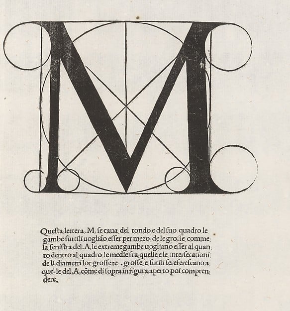
Fra Luca Pacioli (after Leonardo da Vinci), Divina proportione (1509).
Photo: courtesy the Metropolitan Museum of Art.
The iconic Met “M” was actually drawn from the museum’s collection, from the Divina proportione woodcut in Renaissance-era book by Fra Luca Pacioli, designed after Leonardo da Vinci. The design, which overlays the letter M on top of a circle and a square, with smaller circles resting on each serif, recalls Leonardo’s famous Vitruvian Man drawing with its proportional geometry.
Davidson reports that the Met’s new logo will be accompanied by a branded floor map and new signage throughout the museum. He slams the redesign, saying “the whole ensemble looks like a red double-decker bus that has stopped short, shoving the passengers into each other’s backs.”
Other museums have survived initially unpopular changes, such as the Whitney’s 2013 adoption of the “responsive W” design below. But will the Met?
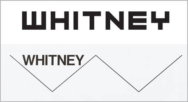
The Whitney’s old logo, and the new logo courtesy of Experimental Jetset.
Photo: courtesy the Whitney Museum of American Art.
As of press time, neither the Met nor Wolff Olins had responded to artnet News’s request for comment, although the firm confirmed that the museum is one of its clients. Wolff Olins’s website claims “to help organizations shake off their corporate camouflage.”
In June of 2015, Judith Dobrzynski wrote on Real Clear Arts that the Met’s new logo “was chosen some time ago” but that the museum seemed reluctant to unveil the makeover. The museum’s 2013–14 president’s report mentions the firm in conjunction with a new “audience engagement study,” explaining that “the results of this initiative, which is being undertaken with assistance from the Wolff Olins agency, will help us expand our reach and relevance.”
In an e-mail to artnet News, Davidson explained that he saw the new logo on a mailing sent to Met members. Initial response to the news on Twitter has so far been less than positive.
@vulture Charmless. I love logos & do brands for a living. Adore @metmuseum A red, artless shift where there was potential for genius. Sigh.
— Dana Moorehead (@DanaMoorehead) February 18, 2016
@JDavidsonNYC @vulture Abominable
— Deborah Frost (@HeadSurgeon) February 17, 2016