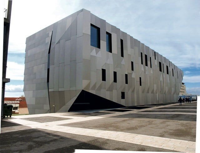
THE DAILY PIC (#1317): This photograph seems to brilliantly capture the totality – the gestalt – of a music conservatory built by the Japanese architect Kenga Kuma in Aix-en-Provence in 2014. It’s from Portraits of the New Architecture, 2, a second volume of architectural shots by the veteran photographer Richard Schulman that just came out from Assouline.
The book, full of similar images, got me thinking about the best of today’s buildings – and how much the new Whitney Museum of American Art, by Renzo Piano, departs from them. When I first saw the building I was as unimpressed as many other critics. It worked well inside, for showing art, but its outside seemed a dog’s breakfast, without any order or total impression that a viewer could grab hold of. The only way to describe it would be to make a list of all its very different facades and details; there was no one metaphor or image that could give a sense of the whole, as there has been for almost all the great buildings in the Western tradition.
Since my first visit, however, I’ve completely revised my view: The building’s variety is its greatest virtue, and the feature that makes it a new piece of architectural thought. As some critics have said, the building relates to its setting more than a lot of others have done. (No one could praise the Whitney’s gloriously Brutalist former home, by Marcel Breuer, for its sensitivity to what’s around it.) In its variety, the new Whitney speaks differently to the different views that it faces, north, south, east and west. But I think its embrace of site is more meta than that, and more metaphorical: This one building echoes the larger, gestalt-free variety that makes the totality of New York City one of humanity’s greatest-ever creations.
I wonder how Schulman will do when he tries to include the Whitney in his next book of buildings. If he can’t capture its essence, he’ll have proven how good it really is.
For a full survey of past Daily Pics visit blakegopnik.com/archive.