Art World
Why Does Red Represent Power? A New Book Reveals How Natural History Drives the Cultural Evolution of Color
Read an excerpt from American Museum of Natural History curator Rob DeSalle's new book on color.
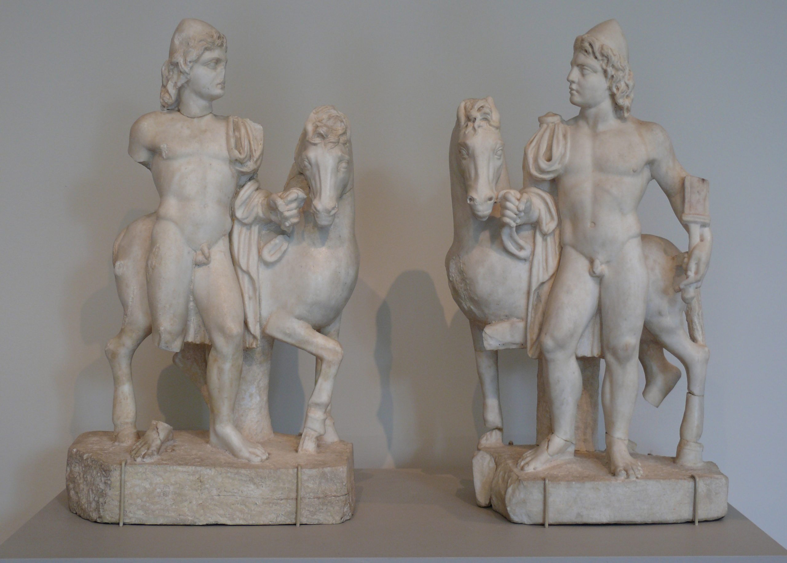
. Courtesy of Kunsthistorisches Museum.")
Read an excerpt from American Museum of Natural History curator Rob DeSalle's new book on color.
American Museum of Natural History curator Rob DeSalle’s new book A Natural History of Color explores how cultural meanings get attached to colors, and how they evolve over time. In this excerpt, he examines the lifecycles of red, pink, and blue.
The use of red in clothing often means power, or “look at me—I stand out.” Look no further than the 2016 presidential race in the United States, where one candidate is famous for wearing an overly long red tie and the other a red power suit. The stylist Bill Blass once said, “When in doubt wear red,” probably because if you aren’t interested in making a specific statement with color, the best thing to do is make a power statement. Since red can also mean “look at me,” it is one of those colors that has a dual meaning in Western cultures. Often it is considered garish or less than honorable. Just think red-light district, or Sting’s lyrics from “Roxanne”: “You don’t have to put on your red light.” And while there were some pretty tacky tuxedos in the 1960s and 1970s, the color red was so tacky that very few males wore red ones to the prom. Today the staid color black is the norm for tuxedos. Tacky or dishonorable uses of red directly contrast with its use as a symbol of power. Red conveys emotions too, like passion and romance, anger,
dangerous feelings and volatility.
Colors are often used to establish group membership and form bonds. While there are many examples in American sports, the color red is used throughout the globe for sports teams as a way to make group (be it team or fan) divisions easily recognizable. But it’s not just sports where the color red and other colors are used to engender group identity. In the United States, political parties are identified by red and blue—so much so that a state is designated as a red state or a blue state depending on whether the state leans toward conservativism (red) or liberalism (blue). In Australia, it is reversed, as the Liberal Party (which leans more to the conservative right) is represented by blue; the Labor Party (which is liberal leaning) is represented by red; and of course, the Green Party is represented by green. In most European countries the left-leaning parties are represented by red. While these color preferences for political parties are rather new, using color to identify political philosophies is older. The red flags of the People’s Republic of China and the now dissolved USSR are good examples of red representing political movements in these countries. The red in the flag for the USSR goes back to the French Revolution, where a red flag, or Red
Banner, was oppositional to the upper class and represented protest. Later the Paris Commune of 1871 adopted a red flag. The use of red in both earlier movements were adopted by the USSR as it was being formed as the color of the national flag. The red in the Chinese flag has a much deeper history though. Confucianism used red as a symbol of luck, happiness, and joy, and this meshed nicely with the Marxist leanings of the Cultural Revolution in China. It is almost as if the red in the Chinese flag was preadapted to represent Maoist thinking. Red pops up in Mao Tse-tung’s Little Red Book, in the de facto anthem of the Chinese republic (“The East Is Red”) and the famous chime of the Chinese people that Mao is “the red sun in our hearts.” Other non-Communist cultures developed an aversion to red. Not wanting to be associated with Marxist, Maoist, or Communist thinking, they chose yellow as the go-to color for protest.
Red is also used ceremonially, including in weddings and religious rites. In India brides wear red saris, which represent fertility and prosperity for the Hindu women who are marrying. Red also has the traditional meaning of love in Hindu cultures, hence the use of red in a wedding rite. Many Asian cultures have adopted red as a sign of auspiciousness, and red in the Hindu wedding rite appears not only in the bride’s dress but also in other objects used in the rite representing good luck and providence. Contrast this with the now popular use of white dresses for the bride in Western wedding rites. In 1840 Queen Victoria wed Prince Albert in a white dress, and this started a trend in the West of white as a wedding dress color. White in this context also meant wealth because of the tradition of wearing the dress only once. Prior to the tradition, brides wore their favorite dress at weddings, but if they could marry in white and then store the dress, this was a sign of wealth. Red also was developed as a very important color in the Catholic religion, as it represented the blood of Christ. Red was also the color of the cardinal’s robe and signified the willingness of these religious leaders to shed their blood for Christ.
Red was a difficult color to create before modern times because there was no readily available red dye for clothing. While red ochre could easily be created from specific kinds of earth, it was a dull red and not a very good dye for clothes. As the New World was colonized, dyes that fit the bill for various colors were discovered and brought back to Europe. In 1523 the Spanish explorers returned with a brilliant red dye called cochineal, which quickly became valuable and rare in Europe. It comes from insects (Dactylopius coccus) that live on cacti in Central and South America and was discovered by the Native Americans from these regions over two thousand years ago. People from these regions cultivate the insects, dry them, and crush them to produce the brilliant red dye. They kept the process a secret as well as they could, so the dye became rare and coveted by Europeans. The rarity of these red dyes allowed only those of high status to use them. It is not surprising that Europeans developed a penchant for the color red via cochineal. Among the Inca, red conveyed a high status, as only the king was allowed to wear red clothing dyed using cochineal. The Aztec rulers also recognized the sign of high status from the color red in general, and cochineal specifically, and they would demand tribute in the form of cochineal.
Even if we go a little off red to pink, the cultural ramifications are still significant. In the 1700s, three portraits—The Blue Boy, Pinkie, and The Pink Boy—foreshadowed the use of pink and blue to indicate masculinity or femininity. Blue Boy, painted in1770 by Thomas Gainsborough, depicts a young man decked out in blue pants, jacket, socks, and shoes. He maintains a very masculine stance, with one hand on his hip holding a blue cape. In his dangling hand he holds a dark blue hat. His hair is a bit tussled, and his gaze is very boyish, as anyone with a tweenish son can attest. Pinkie was painted in 1794 by Thomas Lawrence. It shows a young girl in an ankle-length pink dress, with a dark pink sash across her waist. The dress is flowing in the wind. She wears a pink bonnet with the ribbons also flowing in the wind. Pinkie has one hand behind her back and the other crossing her body just below her neck in a quite graceful pose. Her face is blushed pink throughout, and while Blue Boy has some pink in his cheeks, the contrast between the two faces is striking. Twelve years after Blue Boy, Gainsborough painted Pink Boy. This boy strikes a masculine pose similar to that struck by Blue Boy. Pink Boy holds his hat in his left hand, his right hand free, his face blushed as pink as the suit he is wearing. Fast-forward to the early 1900s, and it would not be unusual to dress a male baby in pink or blue in the USA and Europe. But as the 20th century progressed, pink became the color for girls and blue the color for boys as a result of targeted marketing of wholesalers. This artistic pink and blue dichotomy is what we would call a weak or neutral CSV [cultural survival vehicle, or what gets learned and passed on]. Preference for blue as masculine and pink as feminine wavers back and forth even across generations. As we implied earlier, parents were confused in the early 1900s as to whether pink was a good color for their male offspring. In the 1960s and 1970s, pink was entrenched as a feminine color.
Words get created all the time, and in 1989 Susan G. Cole created a perfect term—“pinkification”—in her book Pornography and the Sex Crisis. This term literally means “the act or process of being made pink or being saturated with pink.” Cole’s book is about sexual suppression and the subordination of women by men. Cole used “pinkification” as a reminder that the color pink and its implication of femininity and its spread in cultures was problematic and contributed to subordination. Cole was probably very familiar with Barbie dolls and their pinkification. Pink is a dominant color in Barbie’s wardrobe, while her male counterpart, Ken, rarely has pink in his. Even astronaut Barbie (released in 1985) gets in on the act, with a white space uniform and pink helmet, pink moon boots, and pink bands marking the uniform around her waist, thighs, and ankles. Her oxygen tank is even pink. In a more recent example, JeongMee Yoon, a Korean artist and photographer, created the 21st-century Pinkie and Blue Boy with her art installation The Pink and Blue Project. She placed young children in their bedrooms with typical kid items, but for the male children the items were mostly blue and for females the items were mostly pink. The photographs are stunning and demonstrate Yoon’s initial observation and stimulus for the project, which was that the phenomenon is tied to marketing, which specifically targets girls with pink and boys with blue. Currently the Pussyhat Project is popular. This movement recently found prominence in several Women’s Marches across the globe. It was started as a symbol of unification; women at these marches wear pink wool caps topped with little pussycat ears. It is quite impressive to see these marches, where a significant proportion of women in the march don these hats to produce a sea of pink. As we write this book, the Pussyhat Project is under fire for using the color pink for a wide variety of reasons, including, but not limited to, the assertion that while pink represents femininity, it does not represent all women. Oh, and in 2019, pink is now the “new black,” as it is used widely in suits, shirts, and ties for men. This fallout demonstrates further the fragility of color involved in CSVs.
Remember that we are discussing mostly Western cultures here. There are many parallel stories around the globe. For example, as marketing gets more and more global, the preference for pink as feminine and blue as masculine tugs back and forth at each other. We focus mostly on red (and its diluted cousin, pink) in this chapter to demonstrate the lability of color preferences in the history of some cultures. How do people use any of the other primary colors that humans perceive? A cultural history of color, instead of a natural history of one, would certainly make for a tremendous follow-up to this book.
Excerpted from A Natural History of Color by Rob DeSalle. Pegasus Books Ltd. Copyright © 2020 Rob DeSalle and Hans Bachor. First Pegasus Books edition July 2020.