Art & Exhibitions
Stupid Cooper Hewitt Design Museum Ad Insults Chelsea and Contemporary Artists
Playing to resentment is never a good look.

Playing to resentment is never a good look.
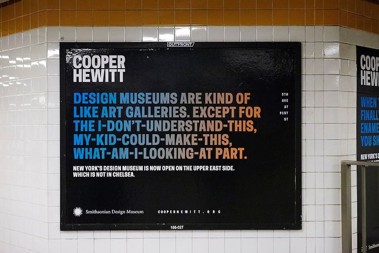
An ad from the Cooper Hewitt, Smithsonian Design Museum’s new campaign, designed with Wieden+Kennedy.
A new ad campaign by New York’s Cooper Hewitt, Smithsonian Design Museum falls seriously flat, and flips the bird to Chelsea galleries and contemporary art along the way.
“Design museums are kind of like art galleries,” says a poster now in the New York subway system. “Except for the I-don’t-understand-this, my-kid-could-make-this, what-am-I-looking-at part.”
The ad’s appeal to audiences alienated by contemporary art is dispiriting at best and offensive at worst. Sure, it’s all in fun, but it plays on uninformed, retrograde resentment by the kind of people who think artists are trying to put one over on them.
It’s true, art really has changed a lot over the last, I don’t know, hundred years or so. It’s a fact that ever since Duchamp, much of the most influential art has de-emphasized skill in favor of concept. It’s not the Renaissance anymore, or even the 19th century.
But hey, maybe the ad is right. Maybe art schools should be all about life drawing class.
The campaign, launched a week ago, is the work of global firm Wieden+Kennedy, which boasts offices from New York to Portland and Shanghai, and counts Chrysler, Nike, Honda, Heineken, and the government of India among its clients. With such a powerful firm and a sophisticated design museum behind the campaign, it’s also surprising that the ads aren’t more attractive.
The “contemporary art sucks” ad also jabs at Chelsea, home to hundreds of galleries, by adding, helpfully, “New York’s design museum is now open on the Upper East Side. Which is not in Chelsea.”
Right, who knew that there were good museums on the Upper East Side? The Metropolitan what? The Guggen-who?
Another poster needlessly doubles down on the sarcasm against the West Side: “The most cutting-edge art gallery in Chelsea,” boasts another poster, “is not an art gallery and is not in Chelsea.” But wait, I thought cutting-edge was bad?
The museum reopened in December 2014 after a successful three-year, $91-million renovation and expansion (see Revamped Cooper Hewitt Museum Debuts). It even managed to increase its gallery space by 60 percent without changing its footprint, by converting a library and offices into exhibition space, a great accomplishment by any standard.
It’s not as though the institution is afraid of the new; it aims to make use of technology, offering a pen-like object you can carry around in the galleries that stores information about your favorite objects and uploads it to a page on the museum’s website that you can access later (see Cooper Hewitt Museum Bets on Interactivity).
The ads are part of a push to increase anemic attendance. Thanks to a popular show of jewelry, the Cooper Hewitt hit a record 225,000 visitors over the 12 months before it closed for renovations, considerably more than its previous peak of 170,000. That’s not strong compared to, say, the 470,000 who visited the James Turrell show at the Guggenheim, a block away, in 2013.
The Cooper Hewitt aims to draw a half a million a year now, but when I asked director Caroline Baumann about that figure last year, she didn’t offer any metrics that would make that seem like more than a devout hope.
If playing up resentment against conceptual art brings more tourists in, well, god bless. But perhaps the gigantic numbers of people visiting institutions like the Museum of Modern Art and the Guggenheim are visiting partly because of rather than despite those institutions’ exhibitions of avant garde art?
It’s ironic, too, that the museum calls on contemporary art in the galleries, aiming to borrow some of its luster when de-skilled art serves its purposes. The inaugural show features, for example, Damián Ortega’s Controller of the Universe (2007), which consists of dozens of found antique tools hanging by wires from the ceiling, arranged such that they radiate out from the piece’s center as if in an explosion; viewers can walk into the middle of the work via two narrow walkways. It’s not a piece that demands great skill, which seems to be the ad’s knock on contemporary art. So what the heck? Is contemporary art good or bad? (The show, by the way, is good, and is on view through May 25.)
Maybe it was the geniuses at Wieden+Kennedy who suggested the snarky tone, which, honestly, the ad campaign doesn’t even really get right.
“The Williamsburg design scene is as played out as your fixie,” reads another poster. “We’re kidding, of course. Nothing’s as played out as your fixie.”
Williamsburg humor and quips about fixed-gear bikes were “played out” a while ago, guys. And I don’t think anyone actually says “fixie.”
Oh, well. It’s only one ad campaign. Maybe the next one will be better.