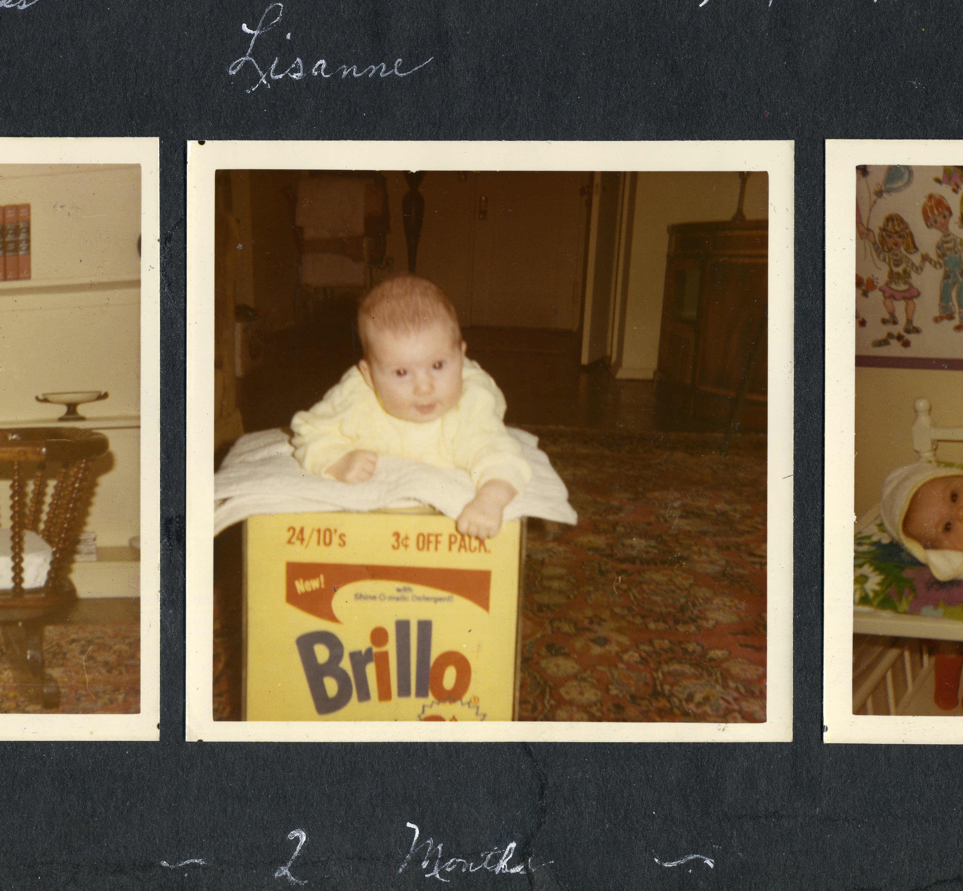
THE DAILY PIC (#1647): A new Andy Warhol documentary called Brillo Box (3¢ OFF) has its New York premiere tonight at the New York Film Festival at Lincoln Center. (It will get wider release on HBO in 2017.) The director is Lisanne Skyler, the young lady shown in today’s Daily Pic, although she’s now more than four decades older than she was when that shot was snapped.
The documentary tells the story of the Warhol Brillo Box that her parents bought in 1969 for $1,000, and of its sale and resale until it fetched more than $3-million. (Did that last buyer get the three cents off that the box promises?)
The film doesn’t pretend to be a great work of documentary art. (It actually looks pretty home-made.) And it doesn’t deliver any vast surprises or stunning insights.
But it does provide some nice little windows into Warholian history.
When Skyler’s mother thinks back on the 1969 purchase, for instance, she describes Warhol as “an up-and-coming artist working on the fringe.” Although art insiders – and Warhol himself – were already thinking of his seven-year Pop career as old hat, casual gallerygoers like the Skylers could still see him as cutting edge.
Another instance of the gap between expert and average views of Warhol: Where most art critics saw, and still see, Warhol’s Pop work as taking jabs at his era’s art and consumption, Skyler’s father read it as a discovery, and then celebration, of the products of a consumer culture “that the public instinctively appreciated.” That common view of Warhol’s art let it play Trojan Horse inside the same culture it was questioning.
And here’s something that the film doesn’t nod to, because even most experts don’t notice it: The Brillo Box, from 1964, may have become a bestselling icon of Warhol’s Pop Art, but it is also quite atypical of it. Most of Warhol’s Pop imagery came with a dose of camp nostalgia: The Campbell’s soup can was an Edwardian design, as was the Coke bottle, and Marilyn Monroe, James Dean and Elvis Presley were 1950s figures that were already looking dated by the ’60s. The Brillo packaging, on the other hand, was absolutely up-to-date and ready for the Space Age. (If astronauts had had bathrooms to clean, the Apollo payload would no doubt have included Brillo as well as Tang.)
You could even argue that, as an icon of 1960s visual culture, the real Brillo box was in direct competition with the art that Warhol was making. The packaging itself has the brashness of Pop Art, almost as though it were intentionally satirizing America’s culture of consumable cleanliness by distilling and overstating it.
But there’s another sense in which the brand-new design of the original Brillo box was backward looking. It harked back to an earlier, Bauhaus moment when artists were supposed to bridge the gap between fine and commercial work; when brand-spanking new art was supposed to be at the service of a shiny new modern culture. Whereas postwar movements such as Abstract Expressionism – to which the designer of the Brillo packaging happened to belong, when he had on his fine-artist’s hat – were all about refusing to bridge the art-commerce divide. The great AbEx teacher Hans Hoffmann once said it was a tragedy that the Bauhaus had “confused the concepts of the fine and applied arts.”
I have a feeling that Warhol’s own Brillo Box refuses both an easy Bauhaus rapprochement and an equally easy AbEx rejection of it. He wants to underline the hopeless entanglement of modern art and life, and to see it as both tragic and comic. He needed Brillo’s brash new packaging to pull that off. (Image courtesy HBO)
For a full survey of past Daily Pics visit blakegopnik.com/archive.