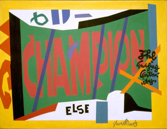
MY DAILY PIC (#1598): I came away from the wonderful Stuart Davis retrospective at the Whitney Museum in New York convinced that he was one of the most important, most influential artists in 20th-century America. The reason we can’t quite recognize his excellence is that history is always written by the winners, and Davis lost out to a rival tradition.
Looking back from today’s vantage point, we cherish everything in American art that has been difficult, conceptual, anti-esthetic, tough and unsparing. Those were the neo-Dada values that began to win out in the early 1960s and have remained in ascendance ever since – and that I have to admit I often buy into.
Davis represented different tendencies that we’ve mostly lost track of but that mattered hugely in his own time. His art was all about inventing and perfecting a seamlessly coherent modern style, about embracing illustration and delight, about celebration rather than critique.
In looking at Davis’s work, we need to remember that modernism once felt like it was starting from an absolute tabula rasa. This meant that turning it into a comprehensible, useable language felt like a greater achievement than celebrating its innate disjunctions and aporias (sorry for the term of art), which is what we tend to do now. Davis created just such a language, however facile and light it may seem to us. Stylishness, so derided today, was a real achievement when modern art had left you at style degree zero, as it seemed for Stuart and his contemporaries.
And then there was the utopian side to modernist image-making, especially for a dedicated lefty like Davis. It meant that creating a style that spoke easily to a wide audience also registered as an achievement – especially when that style was strikingly modern, rather than steeped in reaction a la Norman Rockwell. The overlaps between Davis’s fine art and the work of popular “illustrators” such as Saul Steinberg would have registered as a definite plus, not a minus, as he worked to bring modern experiments down to earth. Ditto for his use of motifs borrowed from pop culture – in today’s Daily Pic, it’s the Champion spark-plug. When he first launched into such borrowings, they would have felt like a truly populist gesture that was also avant-garde. That combination was an ideal that few other artists really managed.
The links between Davis and 1960s Pop art have often been asserted, and I’ve found pretty good evidence that Andy Warhol, for one, would have had close encounters with Davis’s art from early-on. But Pop, coming so late in American capitalism, always had an ironic, critical edge that Davis never quite mastered. Maybe it’s time we forgave him for that. (Collection of the Museum of Modern Art, New York, Gift of Gertrud A. Mellon; ©Estate of Stuart Davis / Licensed by VAGA, New York, NY)
For a full survey of past Daily Pics visit blakegopnik.com/archive.