What’s the deal with Leonardo’s harpsichord-viola? Why were Impressionists obsessed with the color purple? Art Bites brings you a surprising fact, lesser-known anecdote, or curious event from art history. These delightful nuggets shed light on the lives of famed artists and decode their practices, while adding new layers of intrigue to celebrated masterpieces.
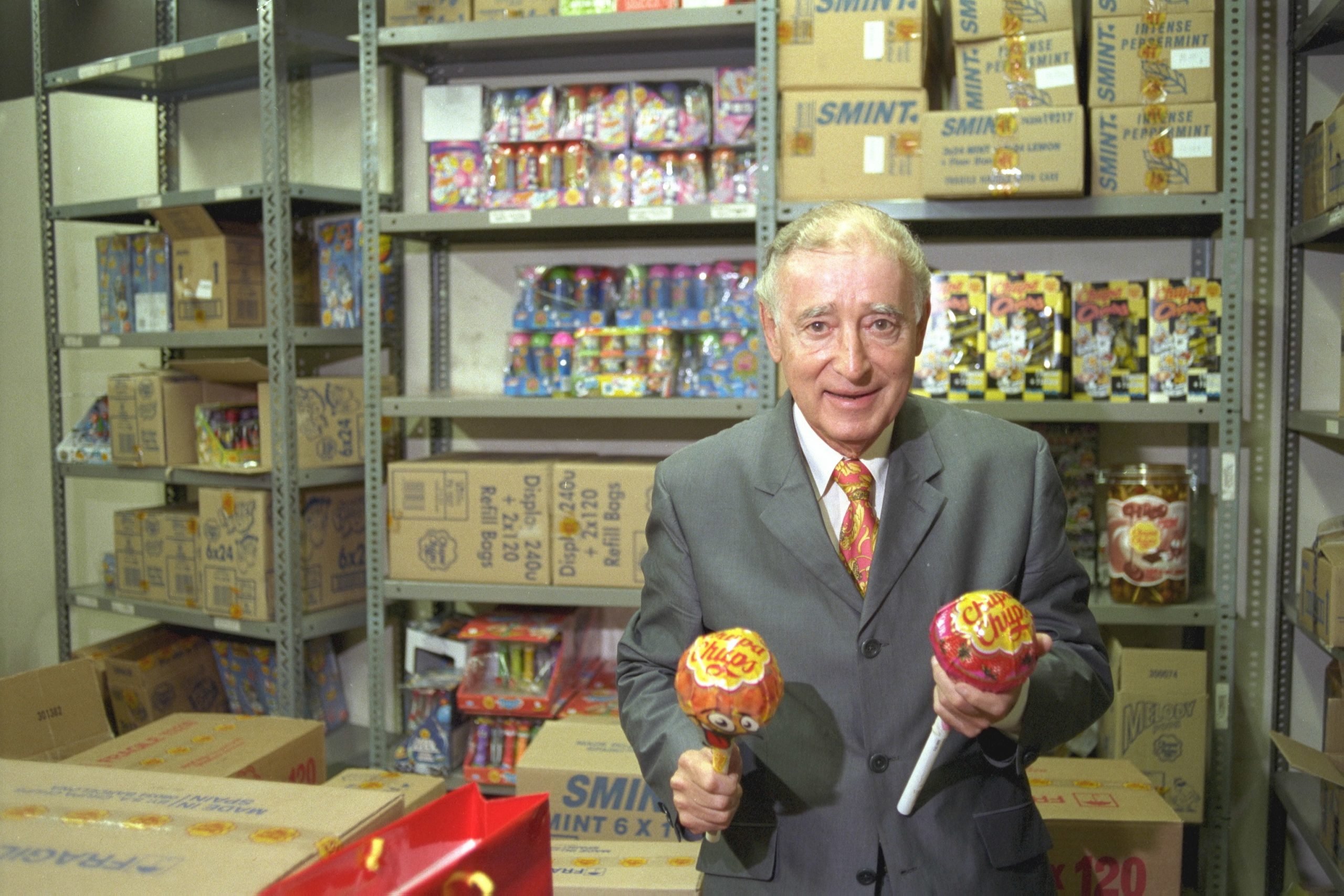
A Salvador Dalí original costs millions at auction, but the artist’s sweetest, most prolific prints are available for peanuts at most corner stores. In 1969, Dalí met with Chupa Chups founder Enric Bernat and designed the lollipop’s iconic logo, which remains in use today.
While the first stick-based candies date back to Medieval times, New Haven, Connecticut-based confectioner George Smith endowed the sweets with their colloquial name in 1908—inspired by the then-famous racehorse Lolly Pop. Bernat, a Spanish scientist and businessman, grew up working in his family’s cake shop. In the early 1950s, he relocated to help save an ailing apple jam factory in Asturias, Spain. Bernat bought that plant out in 1958 and used it to introduce GOL, a candy kids could eat without dirtying their hands. The sweet’s shape resembled a soccer ball perched atop a stick. The marketing materials likened customers’ mouths to nets. Savoring the lollipop was like scoring a goal.
Alas, GOL failed to catch on. In 1960, Bernat tried the name Chups instead, inspired by the Spanish verb chupar, to suck. By 1963, the Chupa Chups website recounts, their saccharine jingle went, “Get something sweet to lick, lick, lick, like a Chups (Chupa un dulce rameoe, chupa chupa chupa un CHUPS).” That caught on, and Chupa Chups as the world knows them were born.
Still, Bernat struggled to help Chupa Chups achieve international acclaim. In 1969, he traveled to have coffee with fellow Catalan and friend Salvador Dalí. By then, Dalí had been exiled from the Surrealists, who believed his ostentatious persona and commercial efforts overshadowed his art. In 1939, André Breton gave Dalí the pejorative title Avida Dollars, an anagram referencing Dalí’s opulent lifestyle. To fund his extravagance, Dalí designed ads for Schiaparelli and appeared in commercials for Lanvin chocolates, Alka Seltzer, and more.
Stills of the “Chocolat Lanvin” French television advertising campaign (1971), one of many advertising works from Spanish artist Salvador Dalí. Photo by Cesar Rangel/AFP via Getty Images.
Upon confirming compensation fit for a superstar, Dalí got to work immediately. The artist spent an hour at that meeting reimagining the Chupa Chups logo on the back of a spare newspaper. Dalí retained the company’s recognizable script, but made the font all red and encircled it with the now-ubiquitous daisy silhouette—which proved eye-catching and identifiable amongst the candy’s youthful target demographic. Dalí, ever the diligent salesperson, also advised Benrat to move the Chupa Chups logo from the side of the wrappers to the top, where shoppers could spot it from any angle. Then, Chupa Chups made the bold choice to move their wares from behind the safety of the candy counter onto its accessible surface.
Dalí’s vision for Chupa Chups has stood the test of time. The logo’s red text is now entirely cursive, and its flower is ringed with a matching hue where there was no border before. The core concept, however, has stayed the same—through pop culture collaborations over the decades. Russian astronauts brought Chupa suckers to space in 1995, and Italian swimwear brand Tezenis launched a Chupa Chups collection in 2017. Nonetheless, one of Dalí’s most prominent contributions to contemporary culture remains hidden right under people’s noses—literally.