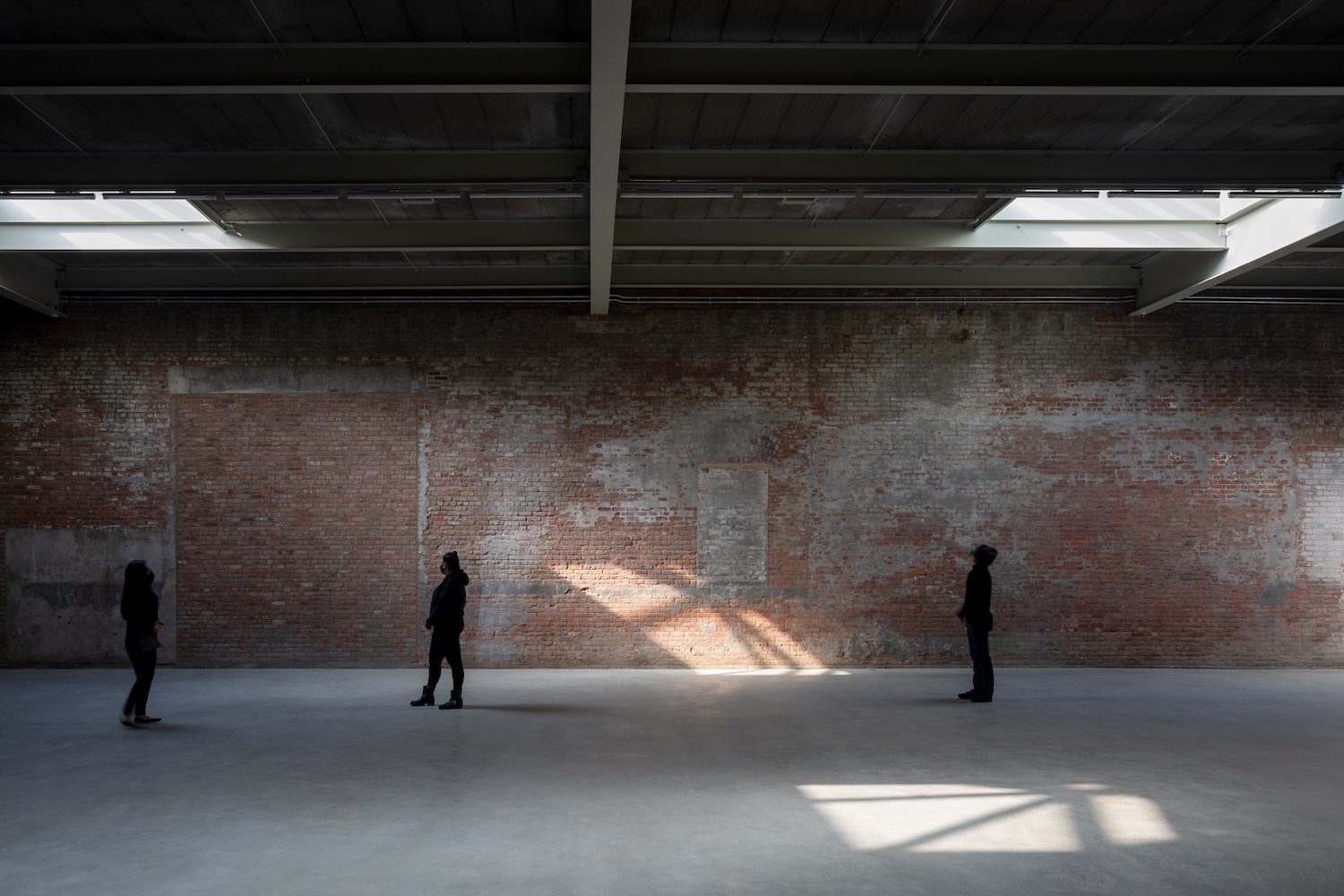
For major museums and galleries, a renovation is a statement. The announcements usually look the same: X starchitect will lead Y’s redesign that cost Z millions of dollars. Z is always a big number.
But the Dia Art Foundation has opted to tweak the traditional formula—instead of going big, it has opted to go subtle. The Minimalism-focused organization opens its renovated 20,000-square-foot home in West Chelsea, New York, on Friday after a two-year renovation.
In 2018, when Dia first announced a fundraising campaign to upgrade its campuses, including a redesign of its three contiguous industrial buildings in Chelsea, it said the goal was to raise $90 million. That’s a big number, to be sure. But only $20 million—an uncharacteristically small figure for such a prominent project—was put toward the renovation in Chelsea. The rest was put back into the organization’s endowment for future use. (Money from the fund will also be used for the construction of Dia’s new 2,500-square-foot exhibition space in Soho starting next year.)
The restraint and foresight to squirrel away money for safekeeping looks even more canny today, two years and one pandemic-induced financial crisis later. It also expresses the ethos of the redesign, which is about preserving what you have.
Dia Chelsea, New York. Photo: Elizabeth Felicella. Courtesy of Dia Art Foundation,
New York.
Led by Architecture Research Office, Dia’s industrial properties, which were in rough shape prior to construction, weren’t whitewashed in pursuit of the big, boxy aesthetics we’ve come to associate with flashy renovations. Instead, the buildings were left more or less intact. Broad wood beams span the ceilings, bisected by windows that fill the place with natural light. The walls are brick; the floors, concrete.
“The modesty of this was very intentional,” says Dia director Jessica Morgan, who, upon taking the director job in 2015, scrapped her predecessor’s flashier renovation plan. “These buildings are remarkable, particularly for showing art—even more so, I would argue, than some spaces that are deliberately designed that way, which often end up competing with the art that they are showing.”
The goal, Morgan adds, was to find a “way to do it that was practical, achievable, and that would allow us to put more money into the institution.”
Lucy Raven, Casters X-2 + X-3 (2021), installation view, Dia Chelsea, New York City. © Lucy Raven. Photo: Bill Jacobson Studio, New York. Courtesy of Dia Art
Foundation, New York.
A suite of newly commissioned works by American artist Lucy Raven, on view through January of next year, inaugurates the new galleries. Dia’s first room is illuminated by two wall-mounted spotlights, which the artist calls Casters. Attached to moving armatures—a technology that was invented for war before being appropriated by big-budget filmmakers—each one projects a beam of light that roves around the space as if simultaneously searching for an escaped convict and promoting a Hollywood premiere.
Sitting in the second gallery, meanwhile, is a massive movie screen, recalling those found in drive-in theaters. This one plays Raven’s slick new black-and-white film Ready Mix, which depicts the process by which minerals become concrete. It was shot with an anamorphic lens—another military invention adopted by the movies.
The artworks occupy all 20,000 square feet of street-level exhibition space, which may come as a surprise when you see just how minimal they are in their installation. But granting artworks like Raven’s the space to breathe is something Dia, which is best known for its sprawling converted Nabisco factory space in Beacon, upstate New York, has long prioritized.
Lucy Raven, Ready Mix (2021), installation view, Dia Chelsea, New York City. © Lucy Raven. Photo: Bill Jacobson Studio, New York. Courtesy of Dia Art Foundation,
New York.
Early on in the renovation process, Morgan turned to friends like Zoe Leonard and Roni Horn, both of whom have shown with the foundation before, for an artist’s perspective on what to do with the space. Both preferred a minimal approach that embraced the industrial vibe; anything else would be like putting lipstick on a pig—and in this case, the pig wasn’t a bad place to show art in the first place.
“They really encouraged me to dig into what would be possible by staying here and using what we had rather than thinking about building anew,” the director explains. “Ultimately, these are galleries and we want to make sure that artists are inspired by these spaces.”
“It’s not about what I think is necessarily a good space,” she continues, “it’s about what artists think is a good space.”