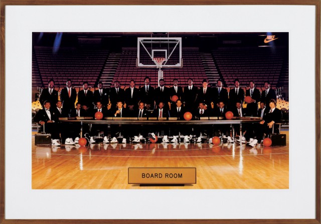
The previous item in my once-a-week Koons-O-Rama looked at a racially-tinged ad that Jeff Koons appropriated, almost unchanged, into the world of 1980s high art. This week, here’s another ad where he’s done the same–sort of. (Click on my image to enlarge it.) The difference is that my earlier example is all ad, all the time; the only thing about it that says “art” is the fact that it was printed on canvas, and that it is hanging in the Whitney Museum in New York. This week, my image is still 100-per-cent ad: It really was designed by a bunch of advertising creatives, with the single goal of selling Nike shoes. But it also happens to look very, very much like late-1980s and early-90s art. Its juxtaposition of image and printed title reminds me of conceptual photos by Lynne Cohen and Lorna Simpson. The way it pairs professional sports and corporate culture, and underlines the racial dynamic in that pairing, could come straight from any of the most political artists of its era. Hans Haacke, anyone? And yet the ad is supposed to be–really was–an object in the thick of pop culture.
Is the similarity just accidental, or did the ad’s original designers, probably trained in art school, know and admire the avant-garde and want to borrow from it? That would be as though Campbell’s, in 1962, had started to corrupt the type on their tomato-soup cans to make them look more like Warhols. Whatever the ad’s true genesis, Koons clearly spotted what looked like a feedback loop between high and low culture, complicating both. He then inserted himself into that loop. Warhol had always aspired to being a fine artist; he was surprised when his unsalable radical art launched him into mass culture. Koons, Andy’s most notable heir, gave finding a place in pop culture–or pretending to find such a place–a central role in his high art. (JPMorgan Chase Art Collection, ©Jeff Koons)
For a full survey of past Daily Pics visit blakegopnik.com/archive.