Tequila brand Maestro Dobel, along with artnet, announced its first artist collaboration with the London-based sculptor and designer Julian Mayor last week.
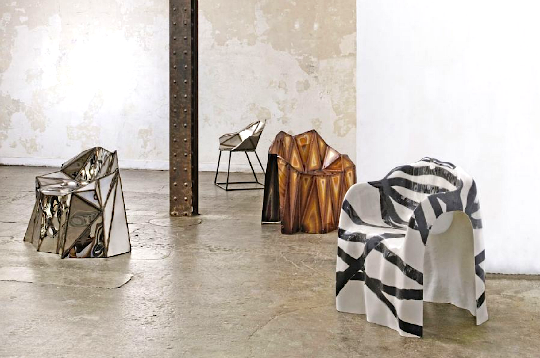
Mayor is perhaps best known for his “pixelated” computer-planned design objects, which often take the form of tables, chairs, and other household furniture and are constructed by hand from industrial materials like steel, mirrored glass, and heavy duty wood.
Mayor has long been interested in the relationships between nature, technology, and human-made design. His works—the most popular of which are a series of geometrical chairs—are explorations of that trio of influences, and occupy the space between art and design, reflecting Mayor’s many years of working in both the fine arts and product and interior design.
Last week, Maestro Dobel hosted a one-night only exhibition of the British artist’s best-known sculptural works, kicking off a yearlong partnership that will culminate in a full-scale new show to be unveiled at Art Basel Miami Beach this December.
Maestro Dobel aligns itself with Mayor’s creative aesthetic, and celebrates a similar sense of innovation in its cutting-edge tequila distillation techniques, bringing a modern approach to a time-honored tradition. The brand is proud to have produced the first cristalino tequila, and is currently the number one ultra-premium tequila brand in Mexico, and the fastest growing cristalino worldwide.
Below, we interviewed Mayor about the partnership, his art inspirations, and the significance behind his creations.
Julian Mayor’s Fernando Bench. Mirror finished stainless steel. Image courtesy Twenty First Gallery, 2012.
How did you react when you found out you had been selected for the artist collaboration with Maestro Dobel? What were some initial ideas that came to mind when thinking of what you would create for the project?
I was really excited to be selected, it’s a fantastic opportunity. In terms of the planning for the objects, I came up with some initial designs that were based on the shape of the agave plant, from which tequila comes. I was interested in the plant’s sculpture and lines, and thought about how I could work that into the pieces. I’m excited for everyone to see those later this year.
Tell me about your sculptural furniture pieces overall. What do you hope viewers are seeing when they’re observing these works?
I’m hoping the pieces work on different scales—that they work at a distance and when you move closer towards to them. I think from further away, you can get more of a geometric feel of the pixel-like, computer-planned planes of each one. (I always start my designs on a computer.) And then when you move in closer, you can see the paint, the brush-strokes, and the welding lines of all the parts that come together to create the whole, the parts that recall the actual craft that’s gone into the piece’s making. That combination and tension is something I really enjoy about my work, and what I try to achieve with each object: the space between the rational, computer-lead side, and the art-focused, freehand side.
Which artists and designers have inspired you and your work?
I’m an avid Instagrammer and I spend a lot of time on there looking at new talent, but in terms of artists I love, look up to, and take inspiration from, there are really so many. Today, I saw Frank Stella’s new show. An important teacher of mine at the Royal College of Arts, where I studied Design Products, was Ron Arad—he was an early influence and I loved, especially, his 1980s work. Even Tom Dixon’s earlier design objects have also inspired me—his pots and pans, the roughness of his welding. The sort of kinetic energy you get from the work of all of those guys is really great. I love Lynn Chadwick, who has, in my mind, an interesting post-apocalyptic feel that captured post-Cold War sentiments really well. I like Richard Deacon and his bent wood work, where you can see the glue oozing out, the energy of making something. Somebody like Tom Sachs as well has a similar kind of idea. He doesn’t try to make things look raggedy. He makes them to the best of this ability, but if they don’t turn out perfectly, that’s okay. That’s the feeling I try to go for in my work. You do the best that you can, and it’s sort of artfully ragged. The work is honest about its creation.
The use of mirrored materials and the theme of reflection runs consistently through your sculptural works, especially your most popular objects, like the steel and mirrored glass chairs. What is it about the element of reflection in art and design that most appeals to you?
I like to have a feeling of lightness in my work, even though the pieces themselves are substantial and heavy. I always want to create that kind of contrast. If you see the reflective pieces outdoors, especially—the way they change throughout the seasons, and play with the quality of sunlight throughout the day—the lines of the welding aren’t as visible, making it look like the pieces are interacting directly with their surroundings, hopefully. There’s something really cool about that, to me.