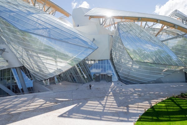
Photo: ©Iwan Baan
There is nothing like the birth of a new museum—look at all the hooplah the new Whitney Museum caused.
Something positive has been added to our world, a world where, if you read the news, not too much that’s positive seems to be happening.
The Fondation Louis Vuitton in Paris is beautiful. It’s beautiful as a building, beautifully built and lovely to look at. It’s a jewel, even, and indeed a “handbag palace on steroids” as one critic put it. But the museum is first and foremost a place to show art and aside from the grandeur of the structure it needs to be looked at and understood in this way.
I’m in my 20s, I like art, work as an arts writer and have an attachment to fashion. So for me, and people of my generation, the idea of a Louis Vuitton museum seems like a seductive and alluring one. It’s a brand, a strong and innovative brand that’s so ingrained in our culture. It has a rich history, it’s desirable, and really, who doesn’t want one of those new Nicolas Ghesquière-designed handbags? Louis Vuitton should have a museum.
Richard Prince, The Blue Cowbows (1999).
Photo: courtesy Fondation Louis Vuitton/ Marc Domage © Richard Prince.
All of these things are good reasons to visit the museum—an essential stop for anyone now going through Paris. That’s pretty amazing because for years Paris has been bereft of new cultural energy, to me and several peers, an unattractive place to spend a lot of time in. The city is exquisite but the people have a static mentality and can be, yes, stereotypically rude.
The museum was the first cultural hot spot I wanted to hit when I arrived at the Gare de Lyon via Zurich. It’s quite surprising in a good way to see a new art institution become so quickly embedded into the popular art museum consciousness. That’s an achievement in itself. Or perhaps Louis Vuitton is exceptionally ace at marketing.
The look of it is extraordinary, a sleek-looking version of Morpheus’s Nebuchadnezzar that could possibly transcend into another galaxy. But the strange use of space or should I say the internal waste of space was a disappointment.
Walking through the museum I couldn’t work out why so much time and money was spent to create a building in which the art seems so unhappy, or oddly out of place. The art felt secondary, an after-thought, and that annoyed me. It all felt insincere, as if the building and the brand, had seduced me into being there, and then not delivered on the promise of a real art museum.
I know this is how brands tend to work. I’ve definitely been sucked into stores by more than a few shop windows. There’s a reason Chanel employs Peter Marino to design their flagship stores. But at the end of the day, the quality of product has to match the packaging, and in this case they don’t. There is a sense of dissonance between them.
Kazimir Malevich installation shot.
Photo: screenshot of fondationlouisvuitton.fr.
I didn’t see the opening show. What I did see was “Keys to Passion” an exhibition that presented master works by Kazimir Malevich, Francis Bacon, Henri Matisse, and Claude Monet. The show, which was ill-lit, was divided into rooms based on or around themes such as “Subjective Expressionism,” where Edvard Munch’s $120 million The Scream was on display; “Meditations on Nature”; and “Popist Art” where there were a few decent Francis Picabia paintings; and “Music,” where stunning works by Wassily Kandinsky, lent by New York’s MoMA, hung on long white walls.
Navigating upstairs, smaller disparate rooms were dedicated to anchoring the show in a contemporary context. “Popism” showed off works by Allora & Guillermo Calzadilla, Basquiat, Richard Prince, and Gilbert & George.
Marina Abramovic, Rejuvenator of The Astral Balance (2000).
courtesy Fondation Louis Vuitton/ Marc Domage © Adagp, Paris 2015.
Most exciting was the immersive installation Crossfire by American-Swiss artist Christian Marclay. The artist lined a blacked-out cube with floor to ceiling screens in which spliced movie clips depicted characters loading, cocking, or shooting guns. You, the viewer stand in the firing line.
The “Music” section, on the upper floors, brought together works by John Cage, Marina Abromović, Rineke Dijkstra, Cyrpien Gaillard, and Douglas Gordon. This felt more relevant if a little lackluster.
But what I really wanted to see was Olafur Eliasson’s light installation, downstairs, so I could take a #selfie. Missing the artist’s Weather Project at the Tate in 2003 is one of my regrets, so I was glad to catch his work here.
The trouble was, I couldn’t find it!
Auditorium of the Fondation Louis Vuitton.
Photo: Christie Chu.
It took me quite a bit of time to figure out how to get to the work. Curiously enough during my travels through the museum to find Eliasson’s light installation I actually came across an infrastructure that embodied my frustrations with the building: an installation of a double door hanging from the ceiling. This was a doorway to nowhere, and couldn’t even be accessed.
In the end, the Fondation, although magnificent, feels like a real missed opportunity for my generation to experience art in a new way. Maybe they just need a fresh millennial eye.