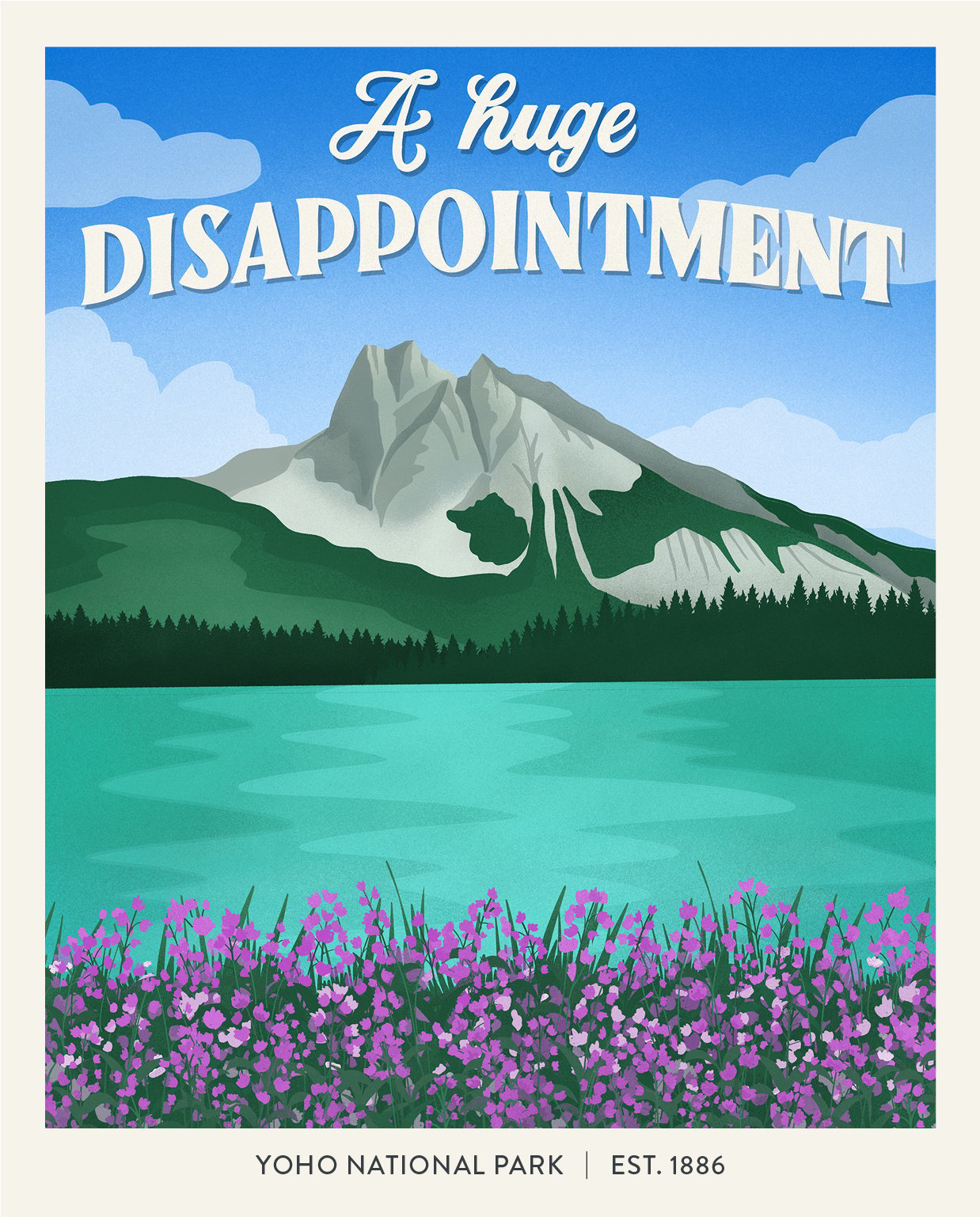
Not everyone appreciates the natural majesty of America’s national parks. Just ask illustrator Amber Share, who has created an entire series of fake travel posters inspired by ridiculously cranky one-star reviews of such scenic locals as Arizona’s Grand Canyon, Maine’s Acadia, and Yellowstone in Wyoming and Montana.
Titled “Subpar Parks,” the humorous artworks were inspired by a Reddit post sharing one-star Yelp reviews of National Parks. The complaints about these national treasures were so laughably unbelievable that Share decided to illustrate the best (worst?) of them.
“I love the outdoors, and I also love some good snark,” Share wrote on Instagram as she launched the project, noting that “apparently even mother nature is subject to the wrath of the internet.”
Share started drawing one park poster a week in December, promising to continue until she immortalized scathing reviews from all 62 national parks. She reached that milestone last month, after more than 500 hours of drawing. (Share works on an iPad in Procreate or Adobe Photoshop, and sometimes shares riveting time-lapse videos of the process.)
Amber Share, Arches National Park from the series “Subpar Parks.” Courtesy of the artist.
The very first image in the series depicts the 46-foot-tall opening of Utah’s Delicate Arch, the text complaining that the natural wonder “looks nothing like the license plate.” (The most famous of the 2,000 or so natural stone arches at Arches National Park, Delicate Arch has become something of a symbol of Utah, immortalized on the standard issue state license plate.)
At Joshua Tree in California, “the only thing to do here is walk around the desert.” Montana’s Glacier National Park is “too cold for me.” The “dunes are not that high” at Indiana Dunes National Park.
An immediate hit, “Subpar Parks” now has some 271,000 Instagram followers. The sales of posters, stickers, and other prints based on the series allowed Share to quit her full-time job in March, and transition to working solely for herself. She’s now continuing the project by tackling international parks, starting with Canada.
Amber Share, “Subpar Parks.” Courtesy of the artist.
The series is reminiscent of old-school travel posters, with graphic drawings of colorful park vistas paired with blocky lettering, a style pioneered by the Works Progress Administration with its series of 14 posters commissioned for 13 parks and monuments in the 1930s and ’40s.
But the series’ appeal goes beyond the visual, offering a fleeting moment of escapism at a time when opportunities to travel remain limited. “There is so much negativity out in the world right now, including in these reviews,” wrote Share on Instagram upon finishing the project. “I wanted to find a way to bring more wit and positivity into the world.”
See more posters from the series below.
Amber Share, Acadia National Park from the series “Subpar Parks.” Courtesy of the artist.
Amber Share, Petrified Forest National Park from the series “Subpar Parks.” Courtesy of the artist.
Amber Share, Katmai National Park and Reserve from the series “Subpar Parks.” Courtesy of the artist.
Amber Share, Mammoth Cave National Park from the series “Subpar Parks.” Courtesy of the artist.
Amber Share, Grand Canyon National Park from the series “Subpar Parks.” Courtesy of the artist.
Amber Share, North Cascades National Park from the series “Subpar Parks.” Courtesy of the artist.
Amber Share, Yellowstone National Park from the series “Subpar Parks.” Courtesy of the artist.
Amber Share, Voyageurs National Park from the series “Subpar Parks.” Courtesy of the artist.
Amber Share, Bryce Canyon National Park from the series “Subpar Parks.” Courtesy of the artist.
Amber Share, Wrangell-St. Elias National Park and Preserve from the series “Subpar Parks.” Courtesy of the artist.
Amber Share, Indiana Dunes National Park from the series “Subpar Parks.” Courtesy of the artist.
Amber Share, Pacific Rim National Park from the series “Subpar Parks.” Courtesy of the artist.
Amber Share, Biscayne National Park from the series “Subpar Parks.” Courtesy of the artist.
Amber Share, Cape Breton Highlands National Park from the series “Subpar Parks.” Courtesy of the artist.
Amber Share, Hawai’i Volcanoes National Park from the series “Subpar Parks.” Courtesy of the artist.