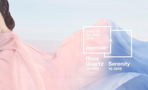
Photo: via @pantone Instagram.
There are many predictions and uncertainties about what awaits us in 2016. But one thing we do know for sure already, thanks to Pantone, is which two colors will reign supreme during the next 12 months.
For the first time ever, for 2016, Pantone has named not just one, but two Colors of the Year: the soft pink Rose Quartz and the baby blue Serenity. And the reasons couldn’t be more relevant.
According to a release from the brand, the choice of colors responds to “Societal movements toward gender equality and fluidity, the consumer’s increased comfort with using color as a form of expression, [and] a generation that has less concern about being typecast or judged and an open exchange of digital information that has opened our eyes to different approaches to color usage.”
Leatrice Eiseman, executive director of the Pantone Color Institute, added, “Joined together Rose Quartz and Serenity demonstrate an inherent balance between a warmer embracing rose tone and the cooler tranquil blue, reflecting connection and wellness as well as a soothing sense of order and peace.”
Artist James Turrell is a fan of the hues.
According to the Daily Mail, Pantone selects the yearly color trend by polling designers, manufacturers, and retailers about what tones they are planning to use in their products in the next year.
Rose Quartz and Serenity have been spotted in the Spring 2016 collections of Prada, Thom Browne, Chanel, Valentino, and Carolina Herrera.
The fashion industry loves these hues, as seen in the September 2015 cover of Harper’s Bazaar.
Photo: via Daily Mail.
Will we see an avalanche of Rose Quartz and Serenity-hued artworks in gallery shows and art fairs across the world in the next few months? Watch this space.
Here’s a video explaining why these colors matter: