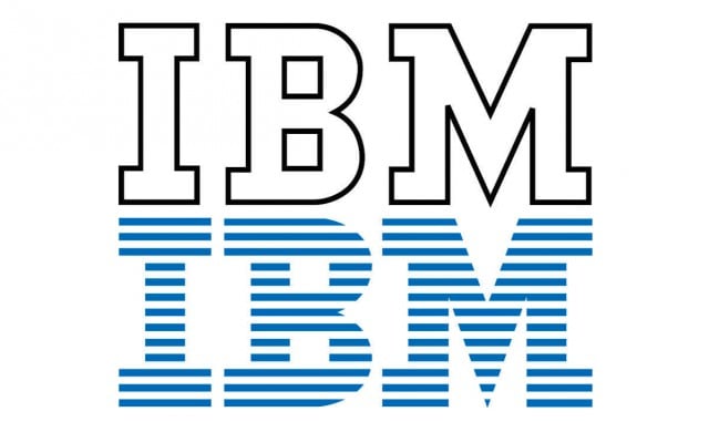
THE DAILY PIC (#1348): “Everything is Design: The Work of Paul Rand”, at the Museum of the City of New York, shows a true design genius at work.
Take his logo for IBM. The 1956, black-and-white version (on top in today’s image) is really very nice: Light and agile, because it’s done in outline, but also bold and simple and solid because of its letterforms. (The serifs on its “M” seem almost like a trusty worker’s feet, set four-square on the floor; its “I” is an i-beam.)
But then Rand’s 1967 revision of the symbol – he was always revising his own work – turns it into a masterpiece. Its sliced letters now make the logo merge with the background behind it, as though IBM is always, unavoidably, everywhere, as a new virtual presence in our lives. This is Internet-age everywhereism, before the Internet even existed.
Those slices also conjure up speed: Probably, in its day, the speed of punch-cards feeding into an IBM mainframe, but also the speed of anything that passes so quick it dissolves from view.
If the ’56 version is both lithe and solid, the ’67 version manages, oxymoronically, to combine presence and absence.(Images courtesy paul-rand.com)
For a full survey of past Daily Pics visit blakegopnik.com/archive.