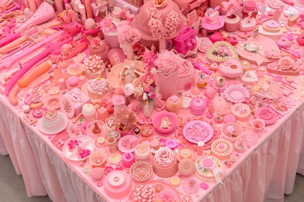
Among the showcases of the 160 galleries and over 1000 artists participating in the 14th edition of the prestigious Frieze art fair in London, all eyes are drawn to the explosion of pink emanating from the booth of New York gallery, P.P.O.W. Representing four generations of feminist artists in its Frieze offerings, the gallery promises an exploration of the complexity of the female identity.
The source of the pink is Portia Munson’s work Pink Project: Table (2016). As you approach the arresting installation you discover that it is really thousands of pink objects arranged on a table. The dizzying array is made up of discarded items: anything from combs and dolls to dildos and tampon applicators, all in varying hues of pink.
Portia Munson in front of her installation “Pink Project: Table” (2016). Photo: Naomi Rea.
The piece’s vivid tones made it an early Instagram hit and passers-by still can’t help but react to it. I manage to catch Portia amidst the many clamoring to talk about her striking work. Her voice is a little hoarse but she is smiling.
“Frieze has been really great so far,” she tells me. “What I particularly liked to see was that even before the fair opened, lots of the workers (many of them male) were stopping by and getting really into my work.”
She continues, “It’s exciting, because even though I first showed the piece in 1994, people are still responding to it and it’s still resonating with them. And I think it is doing what I hoped it would do, and I think part of that is: all of these things are cheap, throw-away ready-mades, but putting them all together makes a strong cultural statement.”
The project debuted in 1994 at the New Museum as part of the Marcia Tucker-curated exhibition, “Bad Girls.” Portia explains its inception, saying, “Since I was a young girl I was always attracted to the color pink. As I got older, into my late teens and twenties, I started to question that. Why pink? Why am I being identified with this color, as a woman? So I started collecting.”
“I first started collecting the objects and did these very simple focus paintings of certain pink objects. And then I realized that I was amassing so much of it that I decided to make this collection. I started arranging the objects to see the different kinds of quantity and meaning that would come out through putting the objects together.”
Portia Munson, Pink Project (2016). Courtesy of P.P.O.W.
We speak about the links between color and gender identities that are instilled in us from an early age: pink for girls, blue for boys. When Portia was building Pink Project she was, ironically, pregnant with a son, Zur, whom she beckons to join our conversation. She shows me a series of photographs in which a baby Zur is outfitted head to toe in each of the loaded colors, in pictures titled Boy Child in Pink and Boy Child in Blue and a similar second series, executed five years later, of her daughter. “I liked the idea of challenging those notions about what color has to go with what sex, or what gender,” she says.
One of the things I notice is the contrast between the homogeneous appearance of the objects and their many disparate functions. From pacifiers to sex toys, each item is lazily marketed towards women by its color, evincing corporate disinterest in female individuality. We talk about how the color pink is cultural code for femininity, which in turn is shorthand for weakness, and she explains how she hoped to disrupt that association by performing a sort of color intervention.
“What was interesting to me when I put it together, and when I first created and saw this piece myself, was that it actually felt very empowering,” says Portia. “Because before I did this piece there was this idea that pink is more passive, and that femininity is a passive thing, as opposed to a strong thing, and so I feel like what I did for myself and hopefully for others by putting it together, was to make it more full of energy, putting the power back in the pink.”
Portia Munson, Pink Project (2016). Courtesy of P.P.O.W.
Unpacking the many layers of meaning in the pink table is an ongoing process, and even Portia’s understanding of the work has evolved over time.
“When I first did this piece I really did it as a young, feminist artist from that point of view,” she explains. “And I still feel that I’m a feminist artist but I’m older now and my awareness has shifted a little. And so I now see this piece also as an environmental piece, talking about excess in terms of plastic and single use items and what kinds of things we’re making. I see it as a sort of time capsule and I’m hoping and imagining the end of this age and that in maybe two or three hundred years it will be this totally bizarre—I mean it’s already bizarre—but it’ll be a real novelty, like you wouldn’t be able to find these things out there anymore, they’d be kind of extinct.”
I ask her if she thinks much has changed since she created the piece in 1994, and she responds in terms of color, remarking, “It’s harder to find the really soft-colored pinks. The pinks you find nowadays are really much stronger. When I first started doing this, the pink that you would find for any kind of cosmetics or beauty things were all this soft, pale pink and now the shade of pink has actually shifted, which might imply that all its associations have become stronger too.”