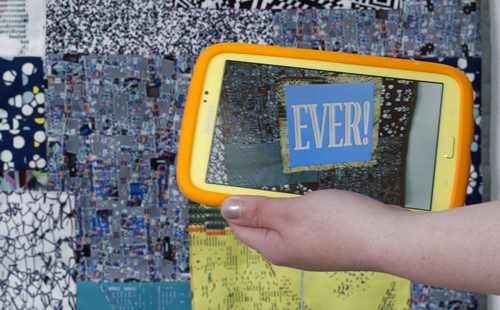
Left: Claudia Hart, Little Crazy (2014); center: Big Crazy (2014); right: Nue Morte (2013) and Double Narcissus (2012).
Courtesy bitforms gallery, nyc. Photo by John Berens.
Lewis Carroll’s Alice in Wonderland is a story that seems tailor-made for artists who are computer programmers. A small girl named Alice wonders what the world looks like behind the reflection of a mirror and is transported to a world that makes little sense. Once there, she’s cast as a pawn who will be made a queen if she can get to the eighth row on a chessboard, so she travels across a landscape filled with challenges and puzzles that follow an impenetrable logic.
The metaphor, if it’s not already obvious, goes something like this: Today’s mirrors are our smartphones and augmented reality apps; Alice’s eight levels of progressively more difficult trials follow classic video game structure; and logic, an essential developer skill, will not save you. Emotion and intuition will.
Claudia Hart, Big Crazy (2014).
Photo: John Berens; courtesy bitforms gallery, nyc.
Enter Claudia Hart’s “Welcome to Alice’s Gift Shop” at bitforms, a show built on an algorithm that reordered sentences from the Lewis Carroll book and randomly chose Alice’s friend Mabel to be this re-sequenced narrative’s protagonist. Employing all of those Alice in Wonderland metaphors along with a few tried and true art tropes, the show’s central thesis isn’t so much a cohesive statement as it is a collage of pre-existing ideas and gestures. The female body is a subject of desire: Check. Materials have embedded meaning: Check. The art is intuitive and does not require narrative flow: Check.
The show itself is arranged in seven tableaux with three distinct focuses: the female torso and plates; quilts that resemble chess boards; and a projection of the Mabel-centric Alice remix being performed as an opera that is titled The Alices Walking.
“Welcome to Alice’s Gift Shop” reads a bit of cheerful wall text near the show’s entrance. Beneath it a shelf supports a TV screening a video in which a man reclines in bed while looking at a tablet device on which we see the image of a woman’s naked torso on a decorated kitchen plate. On either side of the TV is one of those kitchen plates, each with the same squiggly black-and-white pattern. Hart has built an augmented reality app that maps images to specific GPS locations so that when you look at the seemingly innocuous plates through the tablets provided, a naked woman’s torso with ants crawling all over it appears.
Still from Claudia Hart, Double Narcissus (2012).
Photo courtesy bitforms gallery, nyc.
The technology is impressive, but the conceptual work is insubstantial at best. The video’s endless references to technology serve to depict the mediated world we live in—a meaning only a moron would miss. The virtual torso on the real plate, according to Hart, articulates a message that was always embedded in the plates.
What that message is could be any number of things, including a reference to surrealism, and a feminist statement about how women have historically been depicted as objects of desire in art. The next tableau features the words “Eat Me” with the same torso overlaid on a single warped plate, as if to underscore the feminist positioning of the piece. The issue with this isn’t so much calling out sexism in art—that needs to be done more often—but the lack of thought about the problem. Does merely referring to Judy Chicago’s Dinner Party constitute a significant statement? Does the juxtaposition of a handmade plate with an app tell us anything we don’t already experience every day? On both counts: No.
That’s a shame, because the augmented reality construction work is very impressive. Hart’s rendered images and text align perfectly with the real world, achieving a kind of seamlessness I’ve rarely seen by artists using those apps.
Claudia Hart, Nue Morte (2013).
Photo by John Berens Photo courtesy bitforms gallery, nyc.
This virtuosity of technology and craft is evident everywhere, particularly the show’s centerpiece, video documentation of the Mabel-themed opera The Alices Walking—where we see different versions of Alice walk around on stage. Their costumes look like chess figures covered in QR codes; there’s a horse wearing an orange skirt and hooves; a king in a blue speckled body suit with faux 2D axes attached to his arms and legs; and a woman dressed as a castle sporting 2D steps that run down the middle of her face and torso. There’s some real ingenuity to these costumes, which are distinct enough from each other aesthetically, that the idea of constructed and marginal identity is communicated without them having to do anything at all.
All that’s ruined, though, by seemingly endless and contradictory positioning. On the one hand we’re presented with stylized documentation of the performance that makes it impossible to follow its logic. On the other hand, Hart offers personalized tours to gallery-goers so she can tell us what we missed—that she assigned tablets loaded with her app to the “important” people in the front row (critics, collectors, curators, etc.). Her app adds text like “Who am I?” and “How queer everything is today!” to the costumes.
Claudia Hart, Big Crazy (2014).
Photo: John Berens; Photo courtesy bitforms gallery, nyc.
There’s no reason to do this. Messages about class and identity are already embedded within the materials and performance context, so miming them out is pointless. Piling on text from Alice in Wonderland—a book so often referenced by technologists that even the 1999 hacker blockbuster The Matrix looks to it as a source—just replaces what could be artistic thought and interrogation with yet another cliché.
Claudia Hart’s “Welcome to Alice’s Gift Shop” continues at bitforms through June 13.