Dean & Deluca’s cheese room.
Photo: Cait Munro.
The first thing you’ll probably notice upon entering Design Miami is that there’s no shortage of corporate logos: Fendi, J. Crew, Audi, Dean & Deluca and several other household brands have all stamped their names on the event, and the fair’s organizers clearly see no reason to try and hide it.
The second thing you’ll notice is that despite the fair’s clear focus on design, there’s a lot available for fine art lovers in the form of some impressive installations—many of which are sponsored by brands. For instance, while we got a kick out of Dean & Deluca’s mirrored room featuring a giant wheel of cheese that visitors are encouraged to orbit, we’re not exactly sure what purpose it served in the context of a design fair, other than to incite ample (and much appreciated) jokes about how “the cheese stands alone.”
But if you’re willing and able to look beyond all the branding (and we admit, it can at times be tough), there are a few highlights that should not be missed.
Katie Stout, Bedroom Curio, presented by Gallery Diet and Cultured magazine.
Photo: Cait Munro.
1. Katie Stout, Bedroom Curio, presented by Gallery Diet and Cultured magazine:
Brooklyn-based furniture designer Katie Stout has created an environment that’s equal measures psychedelic and inviting. Inspired by the “bedroom culture” of teenage girls—a subject that’s spawned sociological studies since the 1970s—Stout’s world does, in fact, feel like a place one could engage in activities like magazine reading, nail painting, and late night soul-bearing sessions with friends.
A bed with suggestive furry yellow posts, a glitter-covered mirror, and bright red carpet foreground walls feature whimsical figures that Stout painted, scanned, and then turned into wallpaper.
Fernando Romero Enterprise, El Sol, sponsored by Swarovski.
Photo: Cait Munro.
2. Fernando Romero Enterprise, El Sol, sponsored by Swarovski:
This is an example of obvious corporate sponsorship done well. Architect Fernando Romero has created a scale model of the sun using 2,880 custom-made Swarovski crystals that hug a core of LED lights. It’s mesmerizing, and after a glass of champagne or two, it’s likely you’ll struggle to remove your gaze from the kaleidoscopic ball.
VIPS were provided with a special lens that attaches to an iPhone and provides a prism-like filter that makes the sculpture (and anything else you photograph) look sparkling and wonderful.
Say what you will about catering to the Instagram-obsessed, but Romero and his associates clearly know their audience. “It’s about this idea of the selfie culture, and allowing people to see themselves through the piece,” explained Sergio Rebelo, the New York director of Fernando Romero Enterprise. “Originally the idea was to have one of the crystals from the piece for people to take home, but then we decided this was more interesting and interactive.”
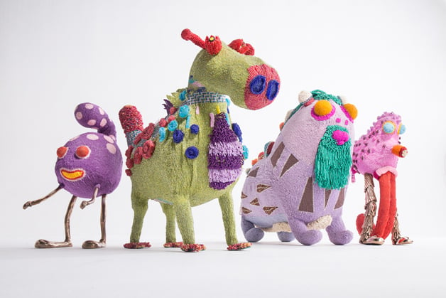
The Haas Brothers and Haas Sisters, Afreaks.
Photo: R & Company.
3. The Haas Brothers and Haas Sisters, “Afreaks” at R & Company:
If you’ve spent any time at all around the contemporary design world, you’ve likely heard of the Haas Brothers, the Los Angeles-based twins known for their claw-footed furry chairs.
But, who, you may wonder, are the Haas Sisters? “A group of women from Khayelitsha township in Cape Town that we collaborated with,” explained Nikolai Haas. “They actually began calling themselves ‘the Haas Sisters’ and we thought that was really amazing.”
The Brothers met the Sisters two years ago during a visit to South Africa, and collaborated with them on this series of hand-beaded chairs, benches, and sculptures. The resulting environment is one filled with humor and special touches, like a chair composed of orange, pink, and purple beads, along with two yellow eyes and a little protruding tongue. The whole thing feels very Haas Brothers, but the designers were quick to note the beading techniques and other key influences were provided by their collaborators.
“It was an equal partnership. We’re not really telling anyone exactly who did what, because the idea is really to give them as much credit as they deserve,” Haas said.
Kengo Kuma, Oribe (2015) at Galerie Philippe Gravier.
Photo: Cait Munro.
4. Kengo Kuma, Oribe (2015) at Galerie Philippe Gravier:
Japanese architect Kengo Kuma’s igloo-like “mobile tea room” is created using corrugated plastic boards arranged at 65 mm intervals and lit from below to create an environment that’s simultaneously cozy and futuristic.
The plastic boards are held together by a series of bands that, once unfastened, make the relatively cheap elements easy to move and difficult to harm. We imagine there are more than a few collectors out there who will appreciate such mobility in the wake of the art shipping nightmares that inevitably befall collectors.
Jean Prouvé, “4×4 Demountable military shelter” (1939) at Galerie Patrick Seguin.
Photo: Galerie Patrick Seguin.
5. Jean Prouvé, 4×4 demountable military shelter (1939) at Galerie Patrick Seguin:
We were beckoned into this diminutive pop-up cabin at the behest of a photographer taking fish eye lens photos of the interior, who felt the pictures would look far better with people in them. We’re not quite sure about that, but once we were inside the unit, we didn’t want to leave. Designed by architect Jean Prouvé during World War II, 300 of the units were ordered by French General Jacques Dumontier, and were assembled at a break-neck pace.
The 4×4 units are made using a bent steel frame that can easily be filled in with slats of wood to produce affordable, comfortable housing. While over 300 were produced, all but two were destroyed in the 1980s, and just one exists today. It is the historical hut’s first time on display at Design Miami.