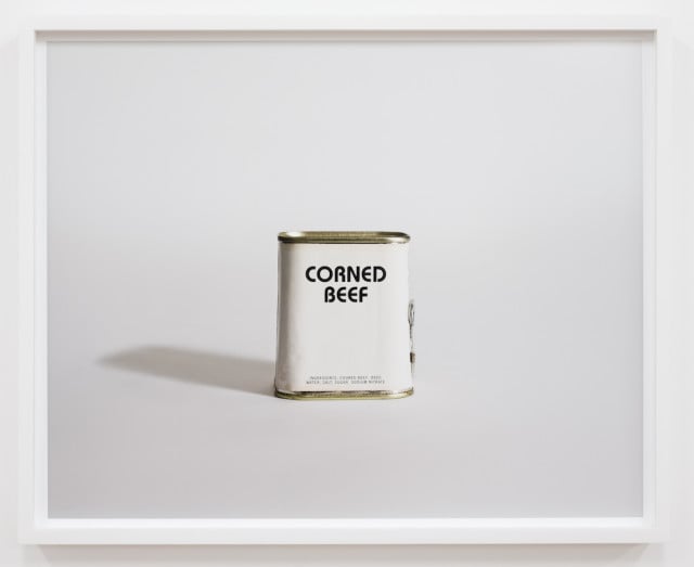
THE DAILY PIC (#1513): The décor of my bathrooms took a dive somewhere around 1990, when supermarkets stopped offering their “No Name” products (aka “generic goods”). I had relied on them for utterly plain white boxes of Kleenex, marked only with the single word “TISSUES” in black Helvetica. Those went with my modernist interiors.
I hadn’t thought of this until just the other day – I’d blocked out the pain of my loss – when I saw a lovely show of just such products, salvaged from the dustbin of history (and of dustbins) and put on display by the artist Maryam Jafri at the gallery called P! in New York.
On plinths and in photos, Jafri lets us contemplate such glories of design as a jar of peanut butter sold with a plain swath of Cooper Black letters on white, or a can of corned beef whose simple virtues are proclaimed in the pseudo-deco typeface called Bauhaus.
The gallery’s excellent essay suggests that the products disappeared when supermarkets developed in-house budget brands whose look was a closer match to established products. That’s no doubt right, but I’d like to add a footnote to that explanation: I have a sneaking suspicion that the pared-down design of No Name lines, for all its visual economy and no-nonsense approach, in fact reeked of elite tastes descended from the Bauhaus – and of the high prices associated with such tastes. To really communicate your intent to offer bargains, you had to go for low-end overdesign. I remember the day that my type-on-white “TISSUES” were replaced by a box bearing a sunset in pastels, floated onto a fake wicker background. I wept. (Photo by Sebastian Bach)
For a full survey of past Daily Pics visit blakegopnik.com/archive.