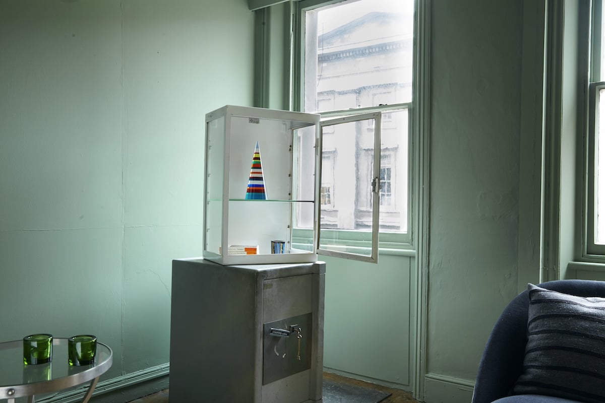
Installation view. Courtesy of Plinth.
Plinth gallery opens its doors this Friday, becoming the latest gallery to join the ranks of London’s art scene. But what sets this particular gallery apart is its focus on unique products and limited editions created by today’s leading artists, presented in a decidedly non-white cube space. Rather than exhibit their pieces in a traditional gallery setting, Plinth recreates a more domestic interior, with art objects jostling up against everyday home goods—just like they do in real life.
Here, co-founder Paul Franklyn explains Plinth’s mission in his own words, and what we can look forward to from their new central London space.
What type of art does your gallery focus on?
Plinth is especially interested in the medium of the limited edition. We are an organisation committed to making contemporary art affordable and accessible to a wider audience, and this philosophy is embodied in the nature of the limited edition. People can own a genuine work by a world-famous artist for a fraction of the price of an original. We’re interested in blurring the line between art and design, aesthetics and functionality—many of our products are designed to be displayed in a domestic setting, not a white cube.
Installation view. Courtesy of Plinth.
How did you settle on your specialty, and what makes your gallery unique?
Once we felt we’d aligned our products with our manifesto, the question remained where best to exhibit these pieces. They really aren’t made to hang on white gallery walls, but rather to be propped on a mantelpiece or rested on a coffee table. The problem was solved when we stumbled across a Georgian townhouse, dating back to 1710, in the middle of central London. Much of the building’s idiosyncratic details remain, and we’ve tried to embrace both its domesticity and grandeur. Our gallery will be set up much like an “artist’s salon.” We’ve sourced beautiful vintage furniture and shop fittings from London’s best suppliers and designers, and everything in the building is for sale, which makes for an interesting equaliser and a blurring of the distinction between two genres of object.
What is your next important show? Tell us why we should come.
Our next important show is our most important show—not only the launch of a new exhibition, but a whole new gallery! We’ve combined an exquisite setting in a central location with the best of London’s design scene, and work from the world’s most celebrated artists. We believe it’s a winning formula, and will have something to offer any visitor, of any age, on any budget.
Installation view. Courtesy of Plinth.
How did your partnership with Ikon Gallery arise?
In the summer of 2015, Ikon Gallery—like many publically funded art galleries in the current financial climate—needed to raise funds to support its ongoing artistic programme. Their strategy was so pragmatic. Ikon organised an auction at Sotheby’s where works donated by artists out of Ikon’s programme were sold, and the proceeds became Ikon’s 50th Anniversary Investment Fund. We were eager to get involved and suggested collaborating with the gallery to produce new limited editions, which could be sold to further support the fund. The result of this exciting partnership is a collection of five new editions, published by Plinth and Ikon, from some of the world’s leading contemporary artists.
How do you select the artists you represent? When does your personal taste play a role in your selection?Once we’d finalised the list of artists producing limited editions for Ikon we were left with a lot of freedom. Most of the time we stuck to the limited edition formula—we’ve sourced several other pieces from The Multiple Store to broaden our portfolio. The space itself has dictated many of our choices—as has its enormous interior transformation—since we first saw it in December. The formulation of the programme is quite a fluid experience. For example, Susan Collis, in the Ikon studio space, is creating site specific work—quite literally drawing on the surroundings.
What is the best show you’ve seen recently?
I loved Park Seo-Bo at White Cube’s Mason’s Yard. I’d say that “Ecriture” was one of my favourite shows of the year, but I worry that the calendar one hasn’t gone on long enough yet for that to mean enough. Nonetheless, Park Seo-Bo’s exhibition ticked all the boxes: aesthetically beautiful, conceptually elegant, and skillfully curated by Katharine Kostyal.
Paul Franklyn. Courtesy of Plinth.