Opinion
Hudson Yards Has Thrown Everything at Making Itself Into a Cultural Destination. Does It Succeed?
From the colossal 'Vessel' to custom works by a host of hot artists, it's got it all. Is it enough?
From the colossal 'Vessel' to custom works by a host of hot artists, it's got it all. Is it enough?

Ben Davis

The main thing that you must know about Hudson Yards to understand the unique type of cultural radiation that it is throwing off is the unspeakable gap between what it actually is and how it wants and needs people to think of it.
What it wants and needs is to project an image of being totally special, singular, unique in every way, and a beacon for the cognoscenti. Hudson Yards is the largest private development in the United States, a $25 billion, once-in-a-lifetime developer opportunity, as the businessmen and politicians repeated over and over at the opening like a self-help mantra. Unutterable amounts of cash have been poured into transforming Manhattan’s West Side Rail Yards. As a pure feat of real-estate engineering, it is impressive.
But what Hudson Yards in fact is, at its heart, is absolutely the most boring, uninteresting thing that you could realize with all that investment: It is an engorged complex of high-end office space and retail. It is no one’s idea of cool except to the kind of people who think that Eataly is an edgy destination.
And so there is a particular kind of overcompensation that Hudson Yards is liable to provoke from its partisans, well on display at Friday’s ribbon cutting, a curious mix of pomp and perplexity held in the shadow of Vessel, the towering, shiny spiral-staircase-cum-architectural-folly designed by Thomas Heatherwick as a centerpiece for Hudson Yards Plaza.
What, I wonder, was the most head-scratching moment of that day?
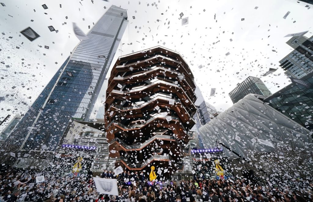
Confetti is showered during celebrations for the opening of New York’s newest neighborhood, Hudson Yards, March 15, 2019. Photo by Timothy A. Clary/AFP/Getty Images.
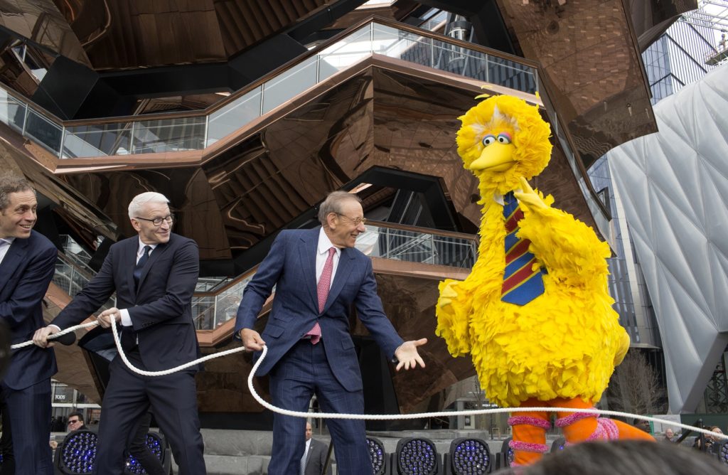
Was it when Big Bird came onstage to banter with CNN newscaster Anderson Cooper, who was MCing the event, before posing with all the assembled real-estate bigwigs and yanking a cord that detonated a confetti-spewing explosive device to open Hudson Yards? At one point, I am pretty sure that Cooper made a joke about how Big Bird had been drinking.

Senator Chuck Schumer Speaks onstage at Hudson Yards’s official opening Event on March 15, 2019 in New York City. Photo by Dia Dipasupil/Getty Images for Related.
Was it when New York senator Chuck Schumer took the stage, invoking Emma Lazarus’s “give me your tired, your poor” poem stamped on the Statue of Liberty and vaguely insinuating that the opening of this vast monument to New Gilded Age New York was a victory against intolerance?
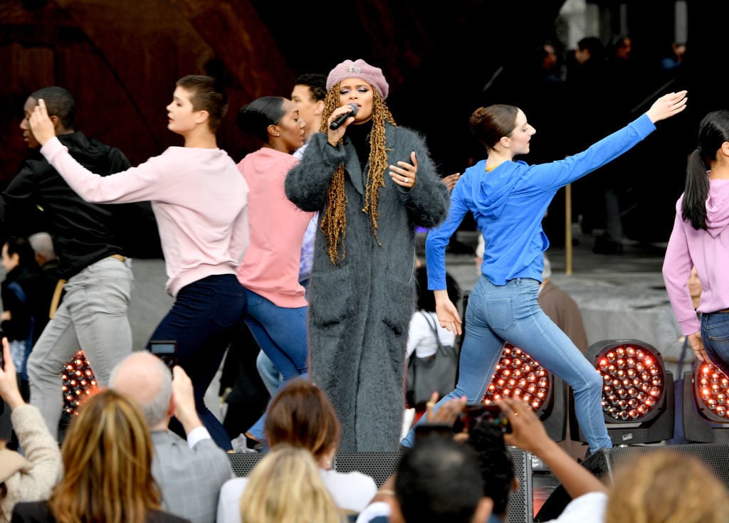
Andra Day performs onstage with Alvin Ailey Dancers at Hudson Yards on March 15, 2019, in New York City. Photo by Dia Dipasupil/Getty Images for Related.
Or was it when the whole thing wrapped up with a performance by Grammy-nominated singer Andra Day, belting her hit “Rise Up,” which has been claimed as an “unofficial anthem” of Black Lives Matter (so TIME magazine tells me)? As the Alvin Ailey Dancers swirled around Day onstage, a gospel choir appeared behind them, occupying the lowest level of Heatherwick’s Vessel.
The song built to a resounding crescendo: “I’ll RISE UP / Rise like the day! / I’ll RISE UP / In spite of the ache…”
A powerful ode to the triumph of… tax increment financing? To the “rise” of Heatherwick’s looming sculpture itself? Hard to say.
But we must push past such lingering questions, now, to consider just what the artistic amenities of Hudson Yards are doing and how they fit into this pattern, a little more closely.
No feature of Hudson Yards signifies its attempt to inspire that needed extra little bit of frisson more than Vessel, whose spidery abstracted profile serves as the symbol of the whole project.
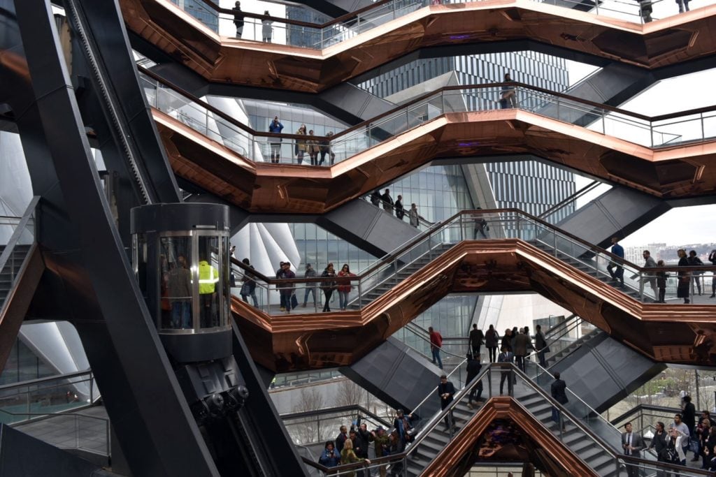
View of the elevator in ‘Vessel.’ Image courtesy of Ben Davis.
New York is a city whose culture is being slowly throttled by unaffordability. So in the long run-up to the opening of Hudson Yards, it is only natural that Heatherwick’s concoction, as both symbol of the development and an obvious example of the kind of mega-art preferred by tycoons looking to buy some ersatz cultural cachet, also became cathected with all those negative associations. Critic Andrew Russeth memorably begged for the project to be cancelled.
And from the outside, the heart sinks to look upon it. It is too big, too close to the front of the entrance of the Hudson Yards Shops, so that it actually does feel oppressive up close.
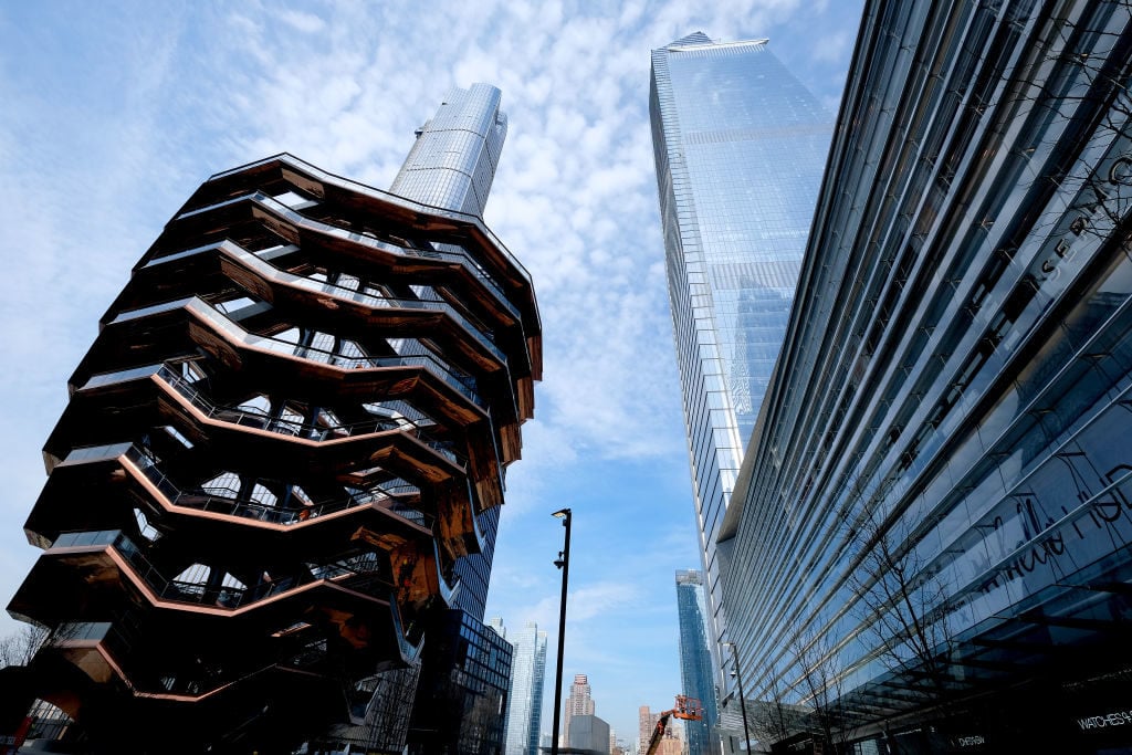
An outside view of the Vessel at The Shops & Restaurants at Hudson Yards on March 14, 2019, in New York City. Photo by Dimitrios Kambouris/Getty Images for Related.
Vessel’s stainless-steel cladding has the virtue of being literally flashy—shiny, mirrored surfaces being the lowest-common-denominator prop of the age of like-courting Instagram Art. But upon a moment’s consideration it honestly looks kind of chintzy, and, worse, very quickly registers the dirt and grime of the New York atmosphere. It was already streaked in parts at the debut (or maybe it hadn’t been fully cleaned yet?).
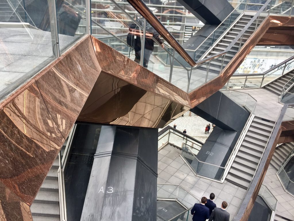
Image of the cladding on Vessel, at left. Image courtesy Ben Davis.
Oh well. I suppose that the maintenance needed to keep it photo-worthy will generate a few more jobs.
Once you get inside this sculptural structure, the impression is more positive. As you climb Vessel’s interlinked lattice of repeating platforms, the architecture gradually opens up, so that you get the feeling of ascending to a more rarified world. At the highest levels, the vistas across the plaza and the Hudson River are nice—though it is the view into the sculpture that is the real point here.
The coolest image is from the highest platform down into the heart of the sculpture, so that you see all the repeating geometry radiating out like a blossom. It has a vaguely hallucinatory quality, as if someone had mistakenly hit the same button over and over again in an architectural rendering program.
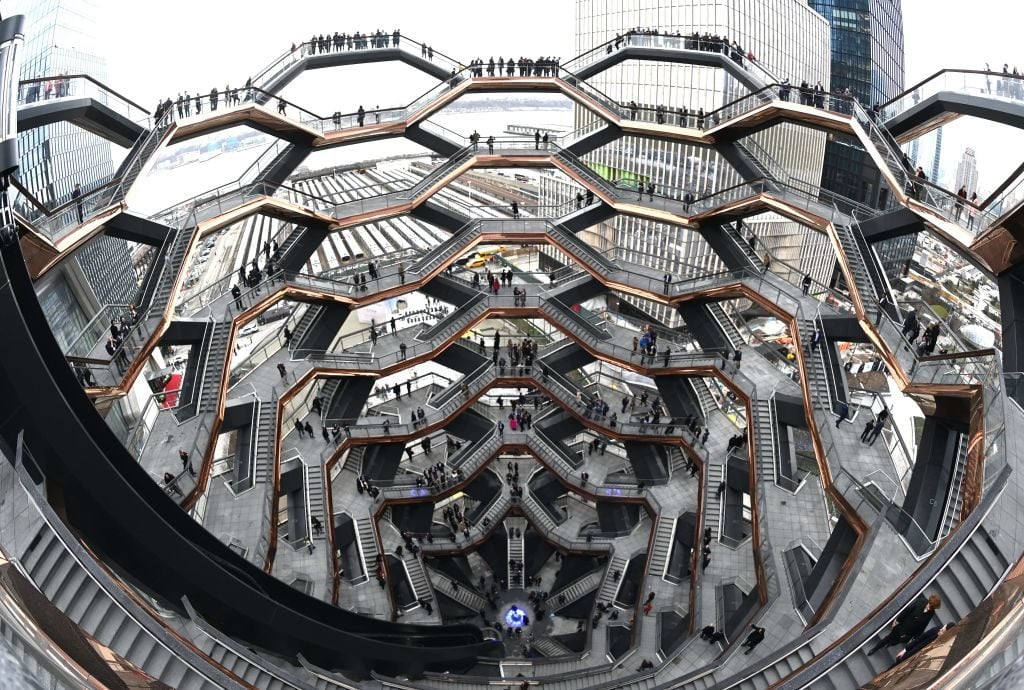
People take an inaugural walk up the urban landmark, temporarily known as Vessel during the the opening of New York’s Hudson Yards on March 15, 2019. Photo by Timothy A. Clary//AFP/Getty Images.
Seen from a height, with all the humans in it trudging up and down all those identical stairs rendered anonymous by distance, the go-to art reference that comes to mind is M.C. Escher. A more sinister one might be Giovanni Battista Piranesi (1720-1778), whose vertigo-inducing etchings of delirious fantasy prisons emphasized a sense of human technical capacity grown all out of scale with human reason and human value.
On some level, Heatherwick’s concoction is the fun-park version of that insight. The slightly uneasy thrill you get looking down into the belly of the beast bears the same relationship to Piranesi’s melancholic limbo-scapes as riding a roller coaster bears to the real fear of plunging off of a cliff.
A “city within a city” is what Schumer called Hudson Yards. You have to appreciate, conceptually, how perfectly Vessel’s polished, involuted experience, whose spectacle is of yourself watching others watch you from its many platforms, serves as a hood ornament for that ideal.
Vessel’s claim to be a big-hearted contribution to public space is only partly undermined by the developers’ decision to introduce it as a (free) ticketed experience. I can’t quite figure out why, except to give it a sense of exclusivity and be able to offer yet more perks to VIPs. Tickets are currently booked up for the next two weeks.
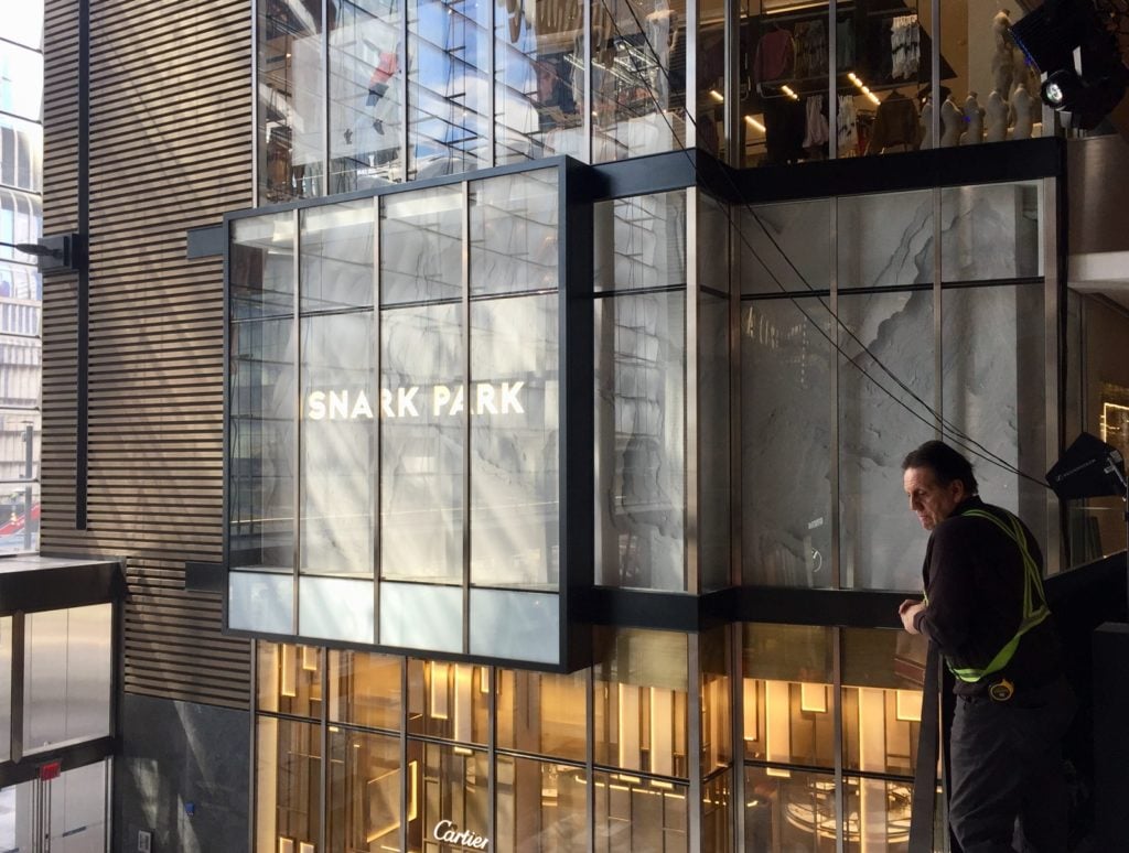
Exterior view of Snark Park at Hudson Yards, from a balcony. Image courtesy of Ben Davis.
Tickets are not free, however, for the site’s other big cultural attraction: Snark Park, designed by the ultra-hip design team Snarkitecture.
Nested within the second floor of the Shops & Restaurants at Hudson Yards (don’t call it the “Mall at Hudson Yards”!), a ticket for Snark Park will set you back a cool $28. With that, you get a 45-minute slot—though somehow I don’t think that many people will be using up their entire 45 minutes—inside the inaugural installation, “Lost and Found.” (The environment will change every few months.)
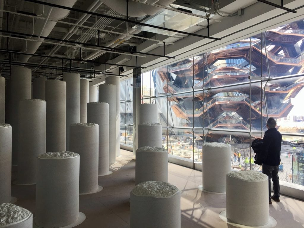
Inside Snark Park. Image courtesy of Ben Davis.
As my colleague Sarah Cascone noted on Friday, Snarkitecture very much predicted today’s Instagram Trap/Big Fun Art aesthetic with its 2015 installation “The Beach” at the National Building Museum in Washington, DC. “Please do touch the art,” the official Snark Park site cheekily entices. So it is just baffling how unengaging the results are.
Essentially, upon entry, what you get is a room filled with repeating gray columns—more or less the vibe of being in a slightly offbeat car park. It is, honestly, the same imagery of repeating and iterating architectural forms that Vessel goes for in another way, only without the immensity to animate it.
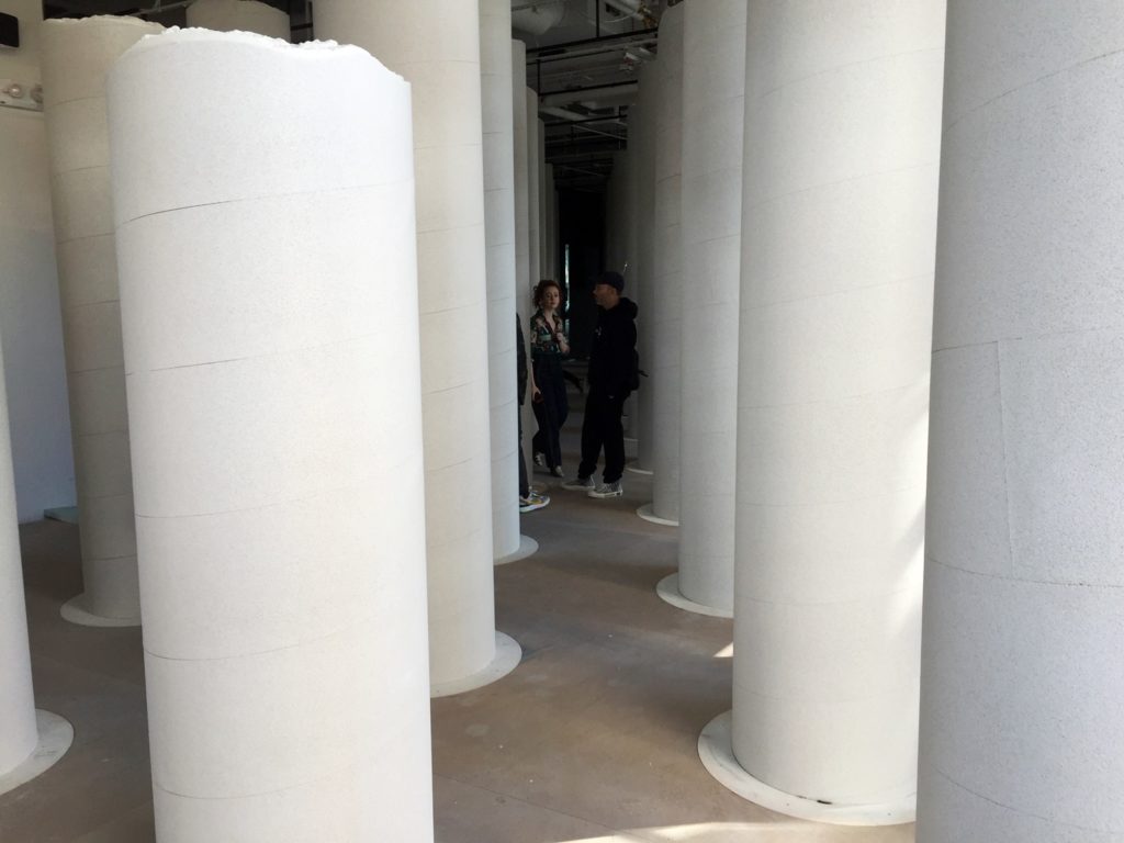
View inside Snark Park. Image courtesy of Ben Davis.
You can pose amid rows of columns taking pictures, or you can wander among them to find little secrets hidden in the environment: One pillar is broken open to reveal a mirror-tiled throne you can sit in; another has a large cavity in it lined with fake fur that you can touch, and so on.
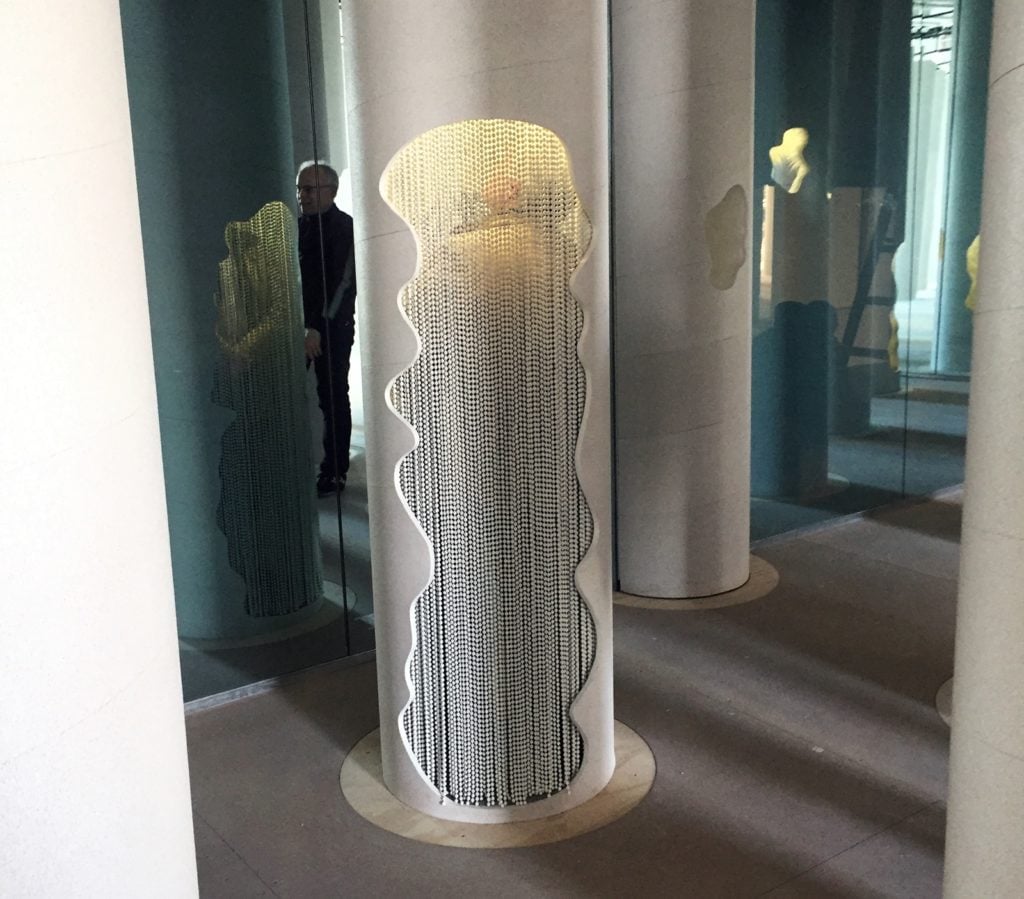
One of the attractions at Snark Park. Image courtesy of Ben Davis.
Maybe people will find this more enthralling than I do—but I don’t think so. To be honest, it feels like Snarkitecture lost its nerve here. Psyched out by the credibility-testing challenges of doing something cool in the most uncool of places, they flinched, and pulled back from the level of thirsty spectacle that the task demands.
Better luck next installation.
The other major cultural anchor of Hudson Yards, the showy, much-hyped, multi-functional art space known as the Shed, is yet to open. But what we do have for cultural consideration is the public art program at the Shops & Restaurants at Hudson Yards, curated by Doreen Remen & Yvonne Force’s Culture Corps.
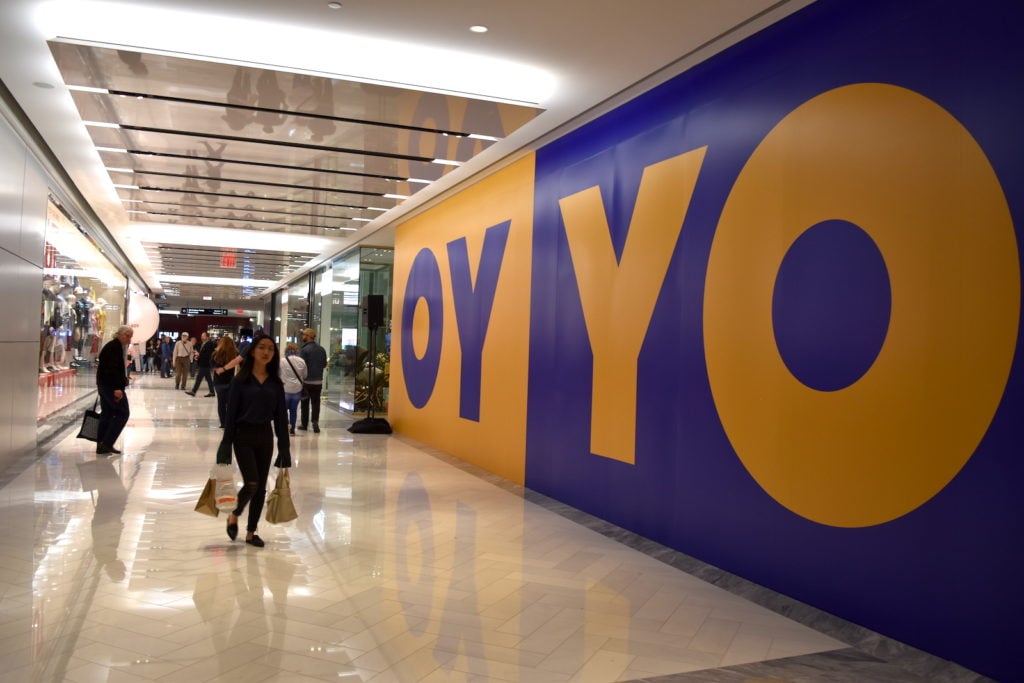
Deborah Kass mural at Hudson Yards. Image courtesy of Ben Davis.
With a variety of artists, ranging from the well known and well respected (Deborah Kass) to the up-and-coming and admirable (Rico Gatson), this probably represents a high water mark for the integration of visual art into a retail environment in the US. But that’s a high water mark in a shallow pool.
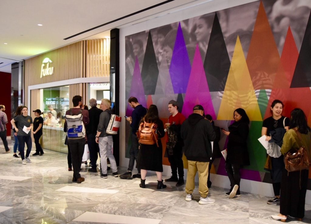
Shoppers wait in line for Fuku in front of Rico Gatson’s Hidden in Plain Sight. Image courtesy of Ben Davis.
The mall itself is lavish, full of luxe boutiques, fine dining, and, of course, Shake Shack, already swamped on opening day. It spreads across multiple levels (“People call it vertical retail,” one Related executive vice president told Retail Dive. “I call it vertical hospitality.” Bold!), and promises the best of contemporary shopping. Truth be told, though, wandering among its shiny, glassy-eyed surfaces and echoey, air-conditioned ambiance, you begin to suspect that you could as well be in Vegas or Dubai.
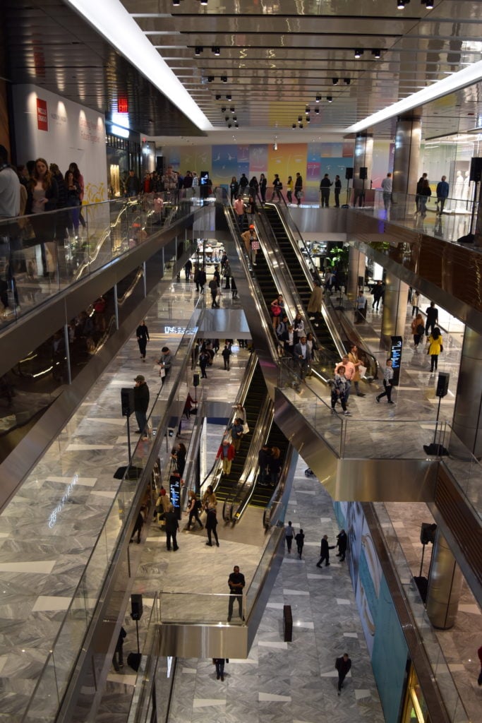
The Shops & Restaurants at Hudson Yards. Image courtesy of Ben Davis.
So it is very obvious what the emphasis on artistic amenities brings here: They are trying to inject, through art’s mythologized uniqueness, a sense of place and purpose to this gleaming shopping cathedral. (Not least because, according to Bloomberg, New York City’s other existing malls aren’t doing so hot.)
And that’s a difficult matter, because so many of these boutiques have already metabolized enough of contemporary art’s signature tricks into their displays so as to make standing out against the noise quite difficult. To the curators’ credit, the art doesn’t totally lose—but it doesn’t win either.
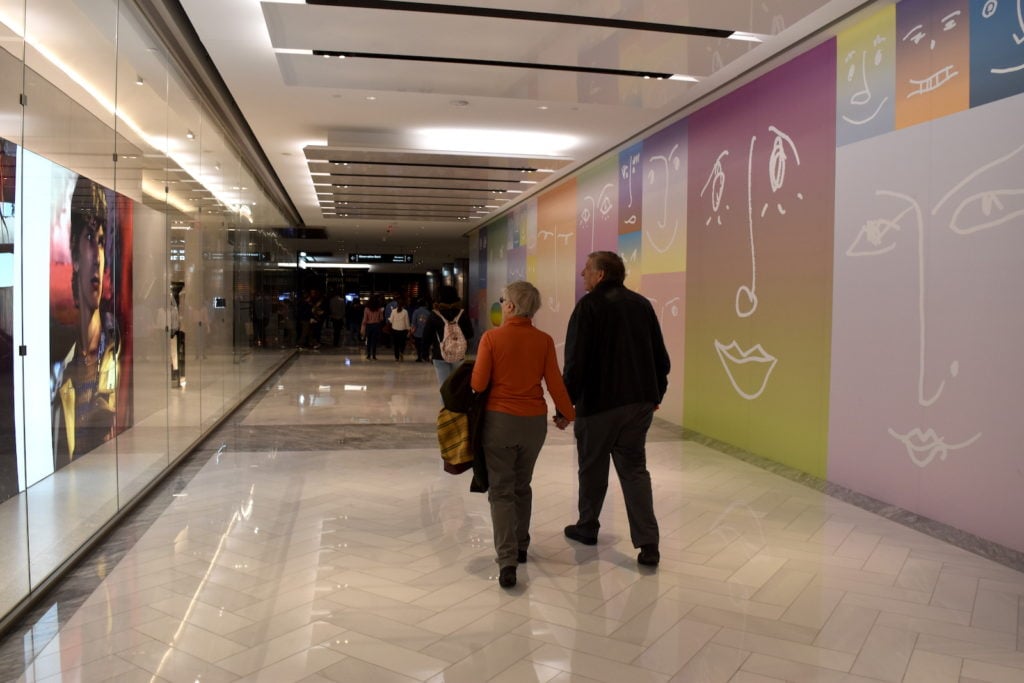
Rob Pruitt, (untitled), faces (2019). Image courtesy of Ben Davis.
There are some works that feel as if, whatever grit they might have had elsewhere, they fade into inoffensive background, like Rob Pruitt’s mural of blocky pastel faces, or Willie Cole’s wallpaper depicting totems composed of stacks of high-heeled shoes against a cloudy blue sky, combined with mandalas made of recycled plastic bottles. The latter is wrapped around a corner between a bathroom and a boutique.
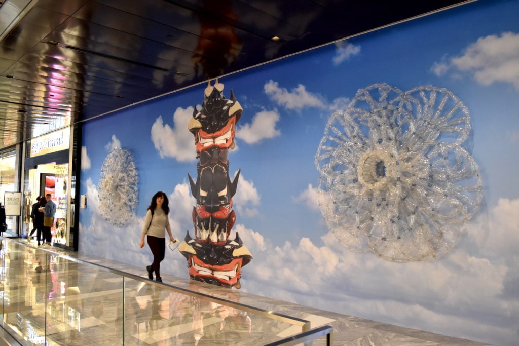
Willie Cole, Wheels, Totems, and Wishes (2019). Image courtesy of Ben Davis.
There are some artworks, like Will Cotton’s images of baby-faced models dressed in clothing made of candy and frosting, that so thoroughly chime with what you suspect the mall wants its users to believe about themselves, as self-actualizing through over-the-top consumption, that it makes you a little queasy. The Culture Corps-written wall label explains what makes the images so empowering: “the women directly engage the viewer’s gaze or reveal their active role in the construction of their self-image.” They could easily be mistaken for ads for Dylan’s Candy Bar, up on the fourth floor.
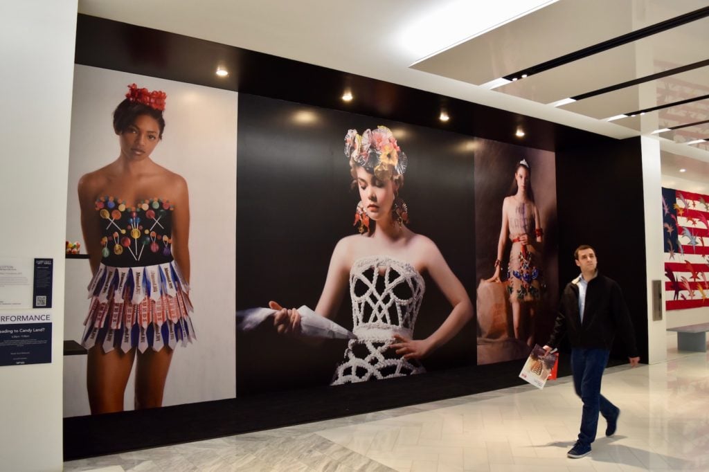
Will Cotton, What to Wear in Candyland (2019). Image courtesy of Ben Davis.
The accent in all the chosen art is on the interactive and the colorful. Jeanette Hayes’s mural adds her signature internet psychedelia to a mural featuring Vessel, all the cavorting cartoon characters making the new attraction look more outré than it feels. Hayes’s image is also studded with scannable QR codes that take you to websites offering information about Hayes herself, the Hudson River School, and how to sign up to support current Democratic novelty candidate Andrew Yang.
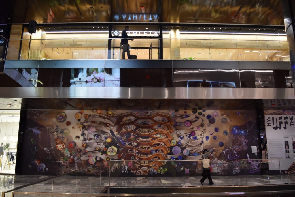
Installation view of Jeanette Hayes mural at Hudson Yards. Image courtesy of Ben Davis.
Probably most successful—certainly in terms of crowd interaction on the first day—is Dutch-born, LA-based Laura Schnitger’s I WAS HERE (2019), a touchable tapestry that dominates one long wall. The various panels are covered with sequins that flip, changing color from one side to the next as you run your hand across them. It hits that tactile part of the brain that the touchscreen-addicted need, while also being appealingly funky and low-fi.
Schnitger’s work too implies a kind of allegory in it about the bargain at play here: I WAS HERE is all about the artist laying out a composition, stitched in the fabric—”RIOTS NOT DIETS” a slogan reads across one of the the top panels—then letting the passersby be empowered to totally disregard these, their distracted engagement washing across her artwork like waves over a signature written in sand at the beach.
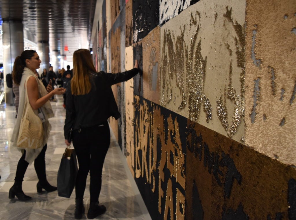
Laura Schnitger, I WAS HERE (2019). Image courtesy of Ben Davis.
All in all, however, the emblematic artwork for the Shops is not part of the Culture Corps programming.
It is found in the maw of the entrance to Neiman Marcus. There, an artist named Minnie Muse has installed Theme 1, a “visual love letter” to New York featuring a photographic backdrop of New York city at night, overlaid with a yellow neon skyline, including a braided yellow neon Vessel alongside the more familiar landmarks. The rear end of a yellow taxi cab juts out of the wall, its trunk swollen open with flowers, its custom license plate reading “NM x MM”—Neiman Marcus x Minnie Muse. It exists as a seemingly successful lure for iPhone pics.
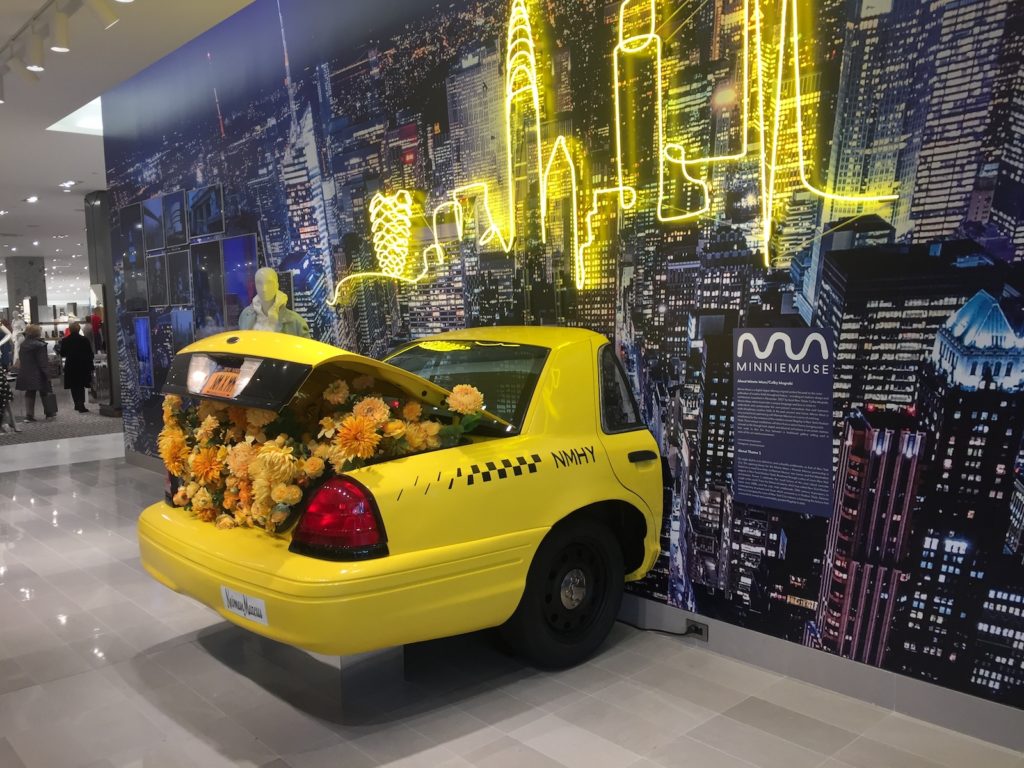
Minnie Muse/Colby Mugrabi, Theme 1 (2019). Image courtesy of Ben Davis.
Devotees will know Minnie Muse better by the name Colby Mugrabi, the fashion blogger, daughter of private equity king John W. Jordan, and wife of art super-collector Alberto “Tico” Mugrabi (they met at an Urs Fischer opening and their 2016 wedding at the Riviera’s Hôtel du Cap-Eden-Roc was, Fashion Week Daily said, the “talk of Instagram”).
The installation is almost so dumb it is smart; so shallow that it almost achieves a kind of honesty. It’s a prop that doesn’t even take itself seriously enough to pretend like its ideal intended audience cares otherwise. In the whole place, it may be the only thing that is completely comfortable with what it is.