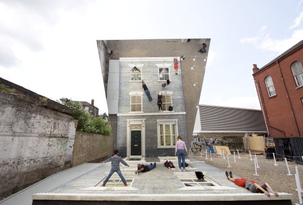
Have you noticed a lot of people posting photos of all the #art in your neighborhood? That might be a sign that your rent is going up.
So argues a new paper by Chanuki Illushka Seresinhe, Tobias Preis, and Helen Susannah Moat, published in the new-ish “open-access” science journal Royal Society Open Science. The title of the paper is “Quantifying the link between art and property prices in urban neighborhoods,” and it looks at art’s connection to gentrification, a topic that has been the subject of much debate.
The paper’s proposed methodology is what makes it novel. The authors combed the online photo-sharing site Flickr for photos geotagged to London’s various neighborhoods, sorting through 4.4 million images overall. They then looked specifically at which locations had accumulated the greatest concentration of images labelled with the word “art,” and compared these clusters to trends in property values. (It’s a little more complicated than that, but that’s the jist of it.)
In a nutshell: “[R]elative increases in mean residential property prices are significantly associated with higher proportions of ‘art’ images per neighbourhood.”
Figure from “Quantifying the link between art and property prices in urban neighbourhoods” showing proportion of ‘art’ photographs uploaded to Flickr from 2004 to 2013.
More specifically, the authors note that London neighborhoods “thought to be associated with arts-led redevelopment,” such as Shoreditch and Dalston, “exhibit particularly high proportions of ‘art’-related photographs, as well as high relative gains in house price.”
Science is able to confirm, in other words, that neighborhoods associated with arts-led development do indeed feature both more art and more development.
The paper is part of a wave of research using social media data to investigate sociological questions. Vague as it seems, mapping the location of “art”-themed photos does solve a problem when it comes to researching the relationship of art and gentrification. As the authors note, most studies of the subject are not very specific about what “art” they are talking about, lumping various unlike things together.
Flickr’s “art” tag may be broad enough to encompass, say, “Muswell hill gum art” (an example in the graphic above), but at least it avoids the “Creative Class” fallacy of lumping studio art together with “engineering, mathematics and computer science” into some sort of weird yuppie bloc.
However nifty their data-gathering is, though, the team is not able to provide a good answer to the major question presiding over art-and-gentrification debate: Does art cause gentrification, or do art amenities merely follow the affluent? Or both? As they state:
The nature, as well as the direction, of any causal link requires more investigation. Does the presence of art in an area remove a negative stigma attached to deprived neighbourhoods? Do artists improve the aesthetics of deprived neighbourhoods through the creation of public artworks such as iconic sculptures and street murals? Or, as people connected to the arts rely on socializing to advance their careers, are more ‘arty’ neighbourhoods attracting more cafes and restaurants, which in turn attract other groups of people to move into the neighbourhood? We highlight once more that it is also possible that ‘self-selection’ may be influencing our measure of art in a neighbourhood. As property prices increase, such neighbourhoods might attract more affluent people with interests in art, who might then be more likely to search for art in their neighbourhood which they can photograph and display on Flickr.
Indeed, the findings could reflect the biases of Flickr itself as a data source, since the venerable photo-sharing site skews both male and more-affluent-than-average.