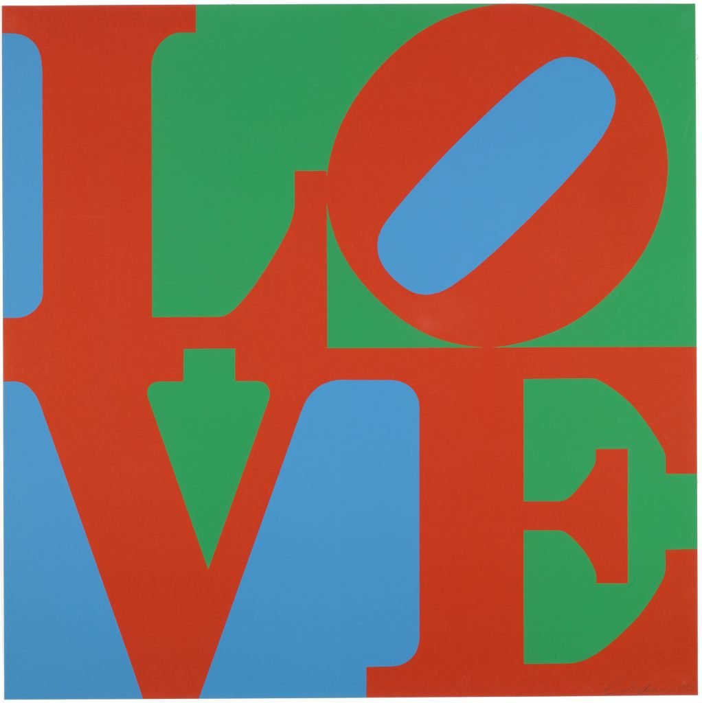
Though considered one of the most famous American artists of the 20th century, Robert Indiana (1928–2018) is perhaps best recognized by one singular motif: the word “LOVE,” represented in stacked serif capital letters within a perfectly square format, and featuring a slightly tilted “O.” For Indiana, love was an irreducible and universal theme, and his signature work has unsurprisingly won the world over.
Indiana, who was born Robert Clark, showed a proclivity for art starting in childhood, and he attended a technical high school with an art-focused curriculum. Following graduation, he spent three years in the U.S. Air Force before continuing his study of art at the Art Institute of Chicago, the Skowhegan School of Sculpture and Painting, and the Edinburgh College of Art respectively. He eventually relocated to New York, and in 1956, met Ellsworth Kelly, who suggested that he move to Coenties Slip on the south of Manhattan, which was home to pioneering artists such as Agnes Martin, James Rosenquist, and Cy Twombly. Living and working within this tight-knit community of artists significantly influenced Indiana’s work, and in the early 1960s he began experimenting with the word that would ultimately have a profound impact on his life and career.

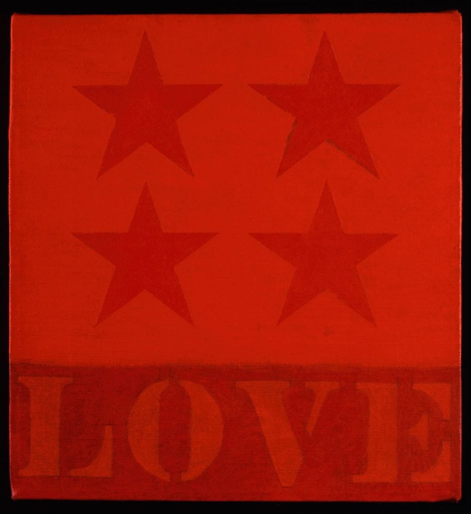
Robert Indiana, 4-Star Love (1961). Collection of the Portland Museum of Art, Maine. Gift of Todd Brassner in memory of Doug Rosen. © Star of Hope Foundation, Vinalhaven, Maine.
In 1961, Indiana completed 4-Star Love, his very first painting that featured the word “love.” In his 1964 painting Love is God, the spiritual element of the word was brought to the fore, inspired by a refrain frequently reproduced in the Christian Science churches of his childhood. Over the next few years, he would reimagine the word again and again in silkscreens, as greeting cards, and ultimately, as the sculptures that gained him a global audience.
In honor of the universal and transformative power of love this Valentine’s Day, we revisit Indiana’s seminal LOVE works to bring you three intriguing facts about the beloved motif.
Indiana’s LOVE motif first became famous as a MoMA holiday card

Robert Indiana, LOVE (1964). Gift from the Gene Swenson Collection. © 2023 Morgan Art Foundation Ltd. / Artists Rights Society (ARS), New York.
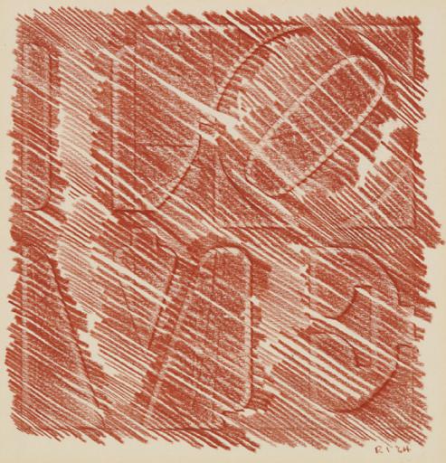
Although we tend not to equate fine art with stationary, that is exactly where LOVE got its big break. Initially, Indiana experimented with various stylistic approaches to the stacked letters by forming “love” through a series of rubbings; he included one of these rubbings done in red crayon in a Christmas card that he gave to art critic Gene Swenson in 1964. Meeting Kelly, however, proved pivotal for the design, as he introduced Indiana to Hard Edge abstraction, which ended up being the stylistic catalyst for the design of LOVE that we know today. In 1965, the Museum of Modern Art (MoMA) invited Indiana to submit a design for its Christmas card, and LOVE in red, blue, and green was chosen. “With the red, blue, and green paintings, the interaction in the eyes is of such a nature that with the slightest change of light, the fields automatically interchange, the positive becomes negative and vice versa, with almost a violent effect in the eye,” said Indiana. It became one of the museum’s most lucrative cards ever produced, and it allowed the work to be disseminated to a huge audience.
There are over 50 LOVE sculptures around the world

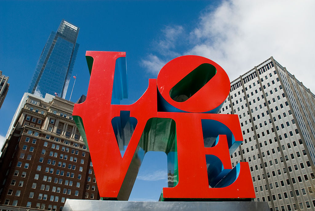
An edition of Robert Indiana’s LOVE sculptures in Love Park, JFK Plaza, Center City, Philadelphia. Photo: Richard Levine/Corbis via Getty Images.
Following the runaway success of the MoMA holiday card, LOVE took on a life of its own as a hallmark of the Pop art movement and as a symbol of the “Love Generation.” Indiana continued to experiment with the motif—including working with Marian Goodman to produce the first versions of the work in aluminum—and it was reproduced on an eight-cent postage stamp in 1973. The first iteration of the work in Cor-Ten steel was created in 1970, and acquired by the Indianapolis Museum of Art. Over the following decades, Indiana went on to produce over 50 editions of the sculpture that have been installed worldwide—with two being translated into Spanish and Hebrew. In 2008, he returned to the stacked letters and produced the design with the word “hope” (including the signature tilted “O”) to support the campaign of Barack Obama. It was reproduced on all manner of campaign trail merch from T-shirts to buttons, with proceeds going to the campaign efforts. The following year, he created a Cor-Ten steel sculpture based on HOPE.
Indiana didn’t exactly love LOVE

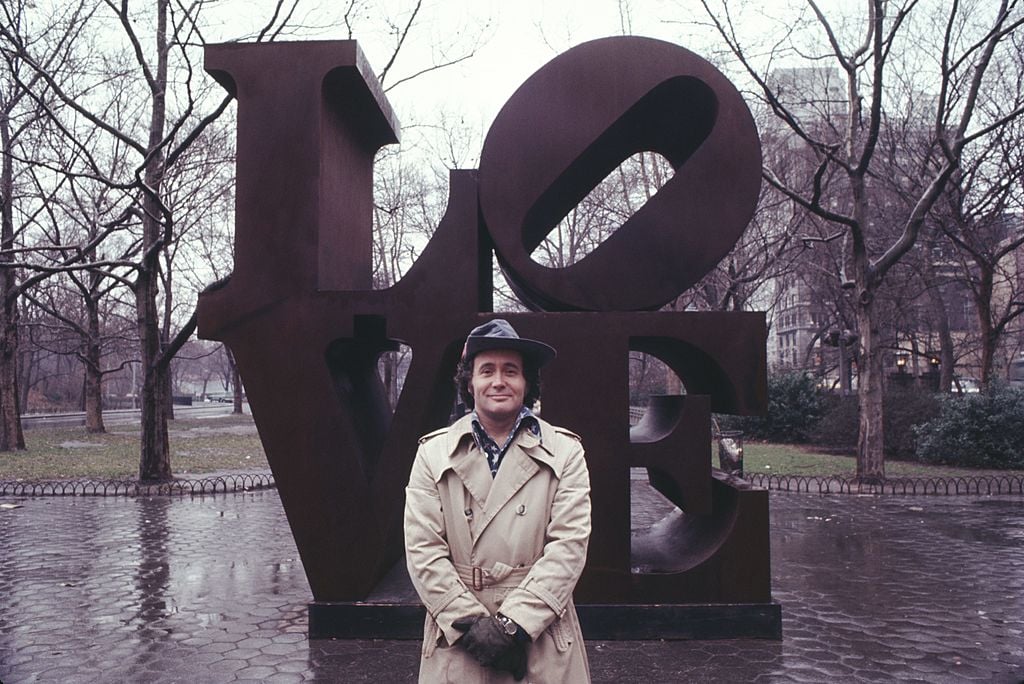
Robert Indiana with his LOVE sculpture in Central Park, New York City (1971). Photo: Jack Mitchell/Getty Images.
Indiana’s relationship with his most famous work was complicated. On the one hand, it catapulted him to global fame, earning him a spot in the art historical canon as a significant Pop artist. On the other, it largely overshadowed all his other work, with Indiana himself rejecting the Pop art label: “I was the least Pop of all the Pop artists.” The widespread popularity of LOVE also led many of his contemporaries to label him a sell-out, though Indiana did not enjoy a great deal of financial success from the work as the lettering was not trademarked, leading to massive numbers of unauthorized reproductions in the form of posters, souvenirs, and other merchandise. Overwhelmed by the work’s popularity and the fame it brought him, as well as the apparent inability to escape its shadow, Indiana left New York permanently and relocated to an island in Maine in 1978, where he lived reclusively for the rest of his life.
