Opinion
The Whitney Biennial: ‘Pleasant’ Should Count as a Rave in Our Troubled Age
THE DAILY PIC: The 2017 Whitney Biennial leaves visitors more sprightly than at earlier ones.

THE DAILY PIC: The 2017 Whitney Biennial leaves visitors more sprightly than at earlier ones.

Blake Gopnik

THE DAILY PIC (#1754): The 2017 Whitney Biennial is receiving almost universal praise, and I won’t be the one to break its run of luck. My Daily Pics for this entire week will be sampling the best works in the show.
Christopher Y. Lew and Mia Locks, the Biennial’s curators, are naturally getting a lot of the credit for the pleasures of their exhibition. Its 63 artists are also getting their share of kudos. (Although, reading between the lines, most of the reviews so far have found more works to like than to love; few if any pieces have been billed as earth-shaking. Critics have kvelled about the smaller size of this year’s affair. Think about that for a minute: Does it mean that less of today’s art is better than more?)
Whitney director Adam Weinberg has also come in for praise, at least implicitly, as the Big Boss in charge of the whole thing—and also, always, as the biggest mensch in the museum business.
But I think the honors need to be spread even wider. The sun, that star we all revolve around, deserves a lot of the credit for our satisfaction with this show: Light shines in from either end of the galleries and lightens everyone’s mood. The new Whitney’s lovely wood floors also deserve credit for cheering us up. Visitors will find themselves far less foot-sore than at earlier Biennials that were scoped-out on the great old Breuer building’s flagstones. (Critics’ aching arches may account for some of the slams they delivered to the surveys in the old space.) All of which is a way of saying that Renzo Piano, architect of the new Whitney, may be the unsung, unseen 64th artist of this Biennial.
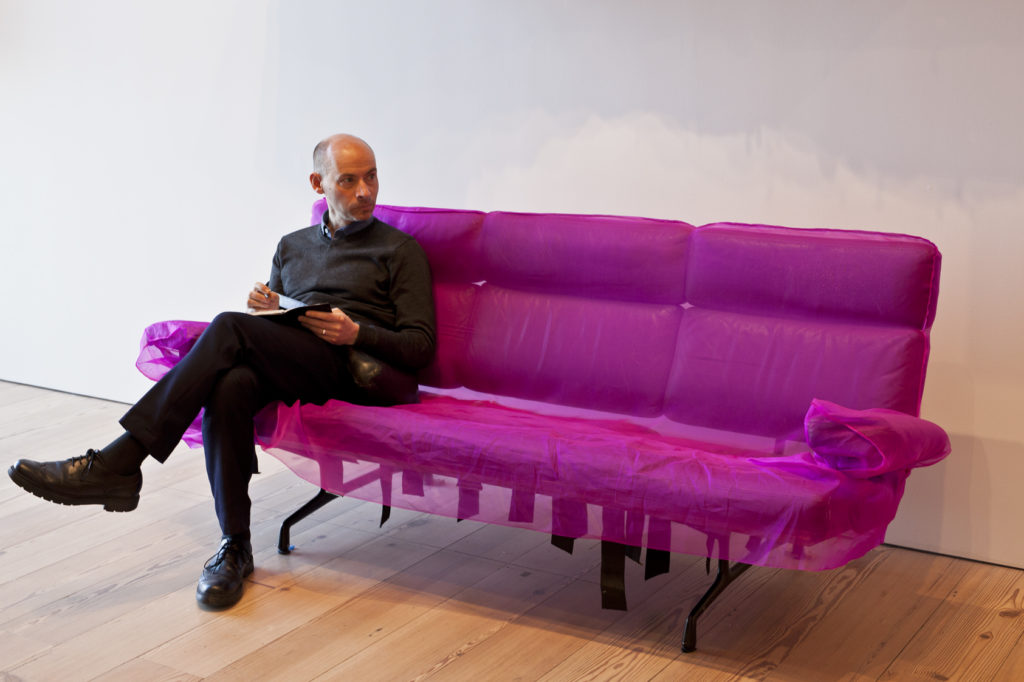
So I’m starting this week of Biennial Pics with an image of a critic – yes, me – at ease in the museum’s bright spaces, but made more so by one of the art-furniture crossovers installed here and there in the survey by Jessi Reeves. This particular piece has the witty title of Herman’s Dress. It consists of a slightly scruffy old Herman Miller Eames sofa that Reeves has slip-covered in organza dyed a deep fuchsia pink. The sofa invokes the importance, and profound aesthetic potential, of re-use, that vital second option in the three-Rs of recycling. And it also invokes the idea that fine art might at last embrace, and also vivify, the dull but worthy functionalism of design. Finally, its soft pinkness wakes us up to just how male almost all of modern furniture has been happy to be. If humans can go trans these days and use the bathrooms of their choice—at least at the Whitney and other such upstanding institutions—why can’t modernism’s bent metal also do some gender bending? (Photo by Lucy Hogg)
For a full survey of past Daily Pics visit blakegopnik.com/archive.