Art & Exhibitions
After 260 Years, British Museum Expands Mightily in Bloomsbury
World Conservation and Exhibitions Centre is one of its largest developments ever.

Photo: Paul Raftery, 2014.
World Conservation and Exhibitions Centre is one of its largest developments ever.

Denna Jones

On July 11 the British Museum unveiled its World Conservation and Exhibitions Centre (WCEC), one of the largest developments in its 260-year history. The center is a significant addition to the Museum’s estate of notable architecture.
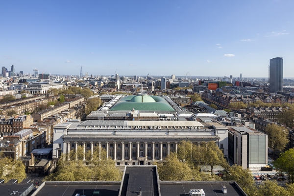
Designed by lead architect Graham Stirk of Rogers Stirk Harbour + Partners (RSHP), Stirk described its style as an “architectural vocabulary quite new to us . . . emotional modernity.” The Centre comprises five pavilions with a public temporary exhibitions gallery accessed through the main southeast entrance. The Centre as a whole, however, is a non-public “support” building. Three of the Centre’s five pavilions plug into a three-sided courtyard behind the Museum’s King Edward VII building; a fourth aligns with the King Edward street frontage; and the fifth is 68 percent below ground with a light-filled atrium. The pavilions will house world class conservation studios, science laboratories, storage, and a collections hub for loans. Stirk and RSHP architect John McElgunn led a tour for the press.
Stirk gives new meaning to Sheryl Sandberg’s phrase “lean in.” Soft-spoken, his voice becomes softer the closer that members of the press lean in—until he is almost whispering. Described by the museum’s director, Neil MacGregor, as the “most reticent architect anyone has ever encountered,” his shy mannerisms and modesty are bolstered by an impish humor. When asked if the brief to design an addition to one of the world’s finest museums was intimidating, Stirk shot back, “Too right it was!” Although the firm’s founder, Richard Rogers, made his name with two “inside out” buildings, Centre Pompidou, Paris (1977) and The Lloyd’s building (1986), the services for Stirk’s British Museum WIAC are expressed internally, not externally, and as such become one of the more interesting, if not entertaining, aspects of the building.
McElgunn describes the ground floor loading bay as “a little bit Tracy Island,” referring to the ever-popular 1960s British marionette television show Thunderbirds and its pint-size version of a James Bond–style spy island. Tracy Island includes an airplane hangar concealed beneath a retractable swimming pool, and Stirk’s loading bay has similar but “grown-up” features. The entrance drive has what McElgunn calls a “lid” and an “invisible” door in the fritted glass façade that pivots horizontally like an American garage door so trucks can enter the building and “disappear.” Designed to accommodate the maximum size truck that can legally operate on European roads, the “lid” is a hoist that allows truck access to three levels, including the “roof” bridge. But don’t get excited about seeing a monster truck rally five stories above ground; this pavilion is subterranean and the “roof” sits at ground level.

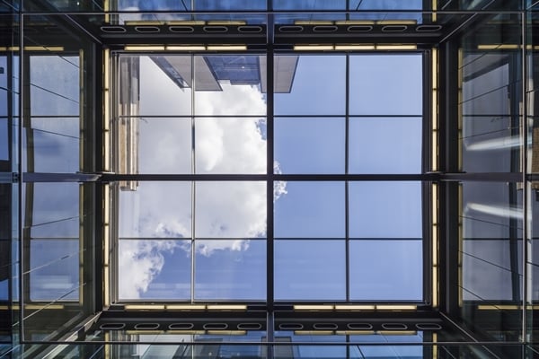
Balconies encircling the atrium at the World Conservation and Exhibitions Centre
Photo: Paul Raftery, 2014.
More Tracy Island wonderment is what will go on inside the buildings. The Organics Studio has ceiling-mounted accordion-pleated tube extraction arms that look like the arms of Robot B9 on the 1960s classic TV show Lost in Space, or they might be a legacy of the Archigram’s 1960s “plug-in” architecture that influenced Richard Rogers. Other studios have smaller versions as desk-mounted dust and fume extractors. The subterranean science facility (described as “Mission Impossible” by the chief executive of the Heritage Lottery Fund at the press briefing) includes a bunker-like level designed to be immune to vibrations, not easy to do with ground traffic and underground tube lines close by. McElgunn describes this level as “scientifically, the hardest working part of the building.” Services to this level take over the entire floor above. Scientists will never see those who service equipment. Segregating or exposing services without drop ceilings, is less to do with Archigram and more to do with pest control, an overriding concern for all museums. It will take seven years to consolidate all the museum’s off-site storage into the new building. The time frame reflects the number of objects, but also the need to examine for pests in a clean room before treatment and dispersal to storage.
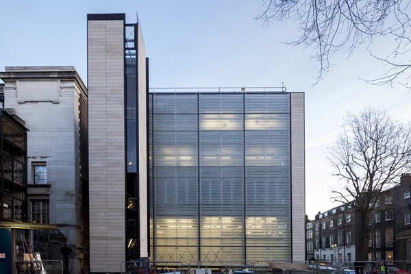
On the main exterior, rows of ranked, horizontal Portland stone “planks” are framed in steel alongside rows of similarly sized and ranked kiln glass planks fritted with a pattern of the contours of the Jurassic coastline opposite the stone’s Portland Island source. Selected to visually relate to the King Edward façade and the Portland stone basebed used elsewhere in the Museum estate, the surface of Portland Bowers Roach limestone is pitted with minor fossil cavities. These fossil “mould casts” include a bivalve historically called “horses’ heads” by quarrymen because they resemble horse heads in the famous Parthenon frieze housed in the British Museum. The Museum also has early 19th-century miniature Parthenon frieze casts (and cavity moulds) made by John Henning as souvenirs. It can’t be accidental that Stirk’s serene façade—with Louis Kahn as touchstone for the entire design—includes this type of largely invisible detail. In his trademark Nehru jacket suit, tiny hoop earring, and a peaceful 1960s vibe, Stirk seems a metaphysical architect. We can lean in close to ask about the horse heads, but I suspect the answer, in keeping with many of the spy-like details in Stirk’s latest success, is secret.

North facade of the World Conservation and Exhibitions Centre
Photo: Paul Raftery, 2014.