Art & Exhibitions
Andy Coolquitt Straddles Art and Design
THE DAILY PIC: It's great that he refuses to decide between fine and applied art.

THE DAILY PIC: It's great that he refuses to decide between fine and applied art.

Blake Gopnik


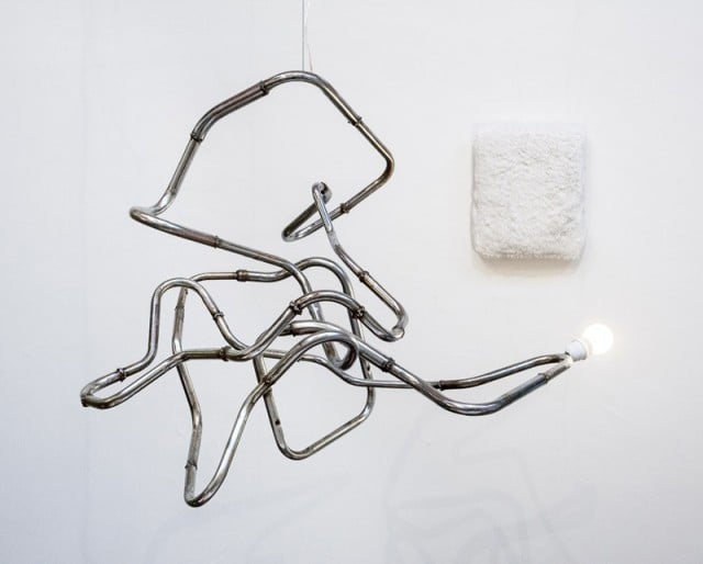
I saw this piece by Andy Coolquitt at Lisa Cooley’s art gallery in New York, and it reminded me that I’d meant to write about him when I saw his work at Art Basel’s design fair in Switzerland this summer. That gets at what I like about him: How, when he’s at his best, he perfectly straddles both design and art. His improvisatory, almost-expressionist, close-to-sculptural, lamp-like objects undo the sleek design-y-ness of so much that passes for “avant-garde” furnishing. (In the case of today’s Daily Pic, titled white/worm/bad/perm/lean/squeeze/wipe/learn/lip/germ/iight, the categories are further confused by the fact that the plush “painting” behind the “lamp” in my shot is actually part of the same, two-piece artwork. You are supposed to lean into its comfy stuffed painting as you contemplate its light.) On the other hand, the fact that many of Coolquitt’s objects could be mistaken for lamps–or rather, actually used as lighting–gives them a more-than-a-pretty face energy that a lot of similarly “unmonumental” sculpture never achieves. My enthusiasm for Coolquitt comes less from what his work is, as from what it is not: it is not-design and not-sculpture, at the same time. (Image courtesy Andy Coolquitt and Lisa Cooley, New York)
For a full survey of past Daily Pics visit blakegopnik.com/archive.