Art & Exhibitions
32 Short Thoughts About Andy Warhol’s Campbell’s Soup Can Paintings at MoMA
THE DAILY PIC: He cooks up 32 flavors of thought to match MoMA's 32 cans of 'Soup'
THE DAILY PIC: He cooks up 32 flavors of thought to match MoMA's 32 cans of 'Soup'
Blake Gopnik
 ShareShare This Article
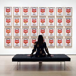
THE DAILY PIC (#1408): To show all 32 of Warhol’s Campbell’s Soups, as the Museum of Modern Art is now doing, is the equivalent of setting out all of Leonardo’s portraits, including the Mona Lisa, or all of Rembrandt’s paintings of himself, or Monet’s complete Haystacks. Art just doesn’t get any better, or more important, than the 32 paintings that MoMA has up. Weirdly, the New York art world hasn’t much cottoned on to the epochal exhibition in its midst; there’s far less buzz about it than there should be.
With only nine days left in the show, I decided to toot its horn in today’s expanded Daily Pic.
Herewith, in honor of the 32 flavors of Warhol’s cans, are 32 Short Thoughts About Campbell’s Soup (with apologies to scholars who may have had some of these thoughts before me):
1) These 32 canvases are pretty much old-school paintings, without much in common with actual ads. Like most Pop art, that is, they are distinctly high art that happens to riff on the low. They do not undo the difference; they need it in order to mean anything.
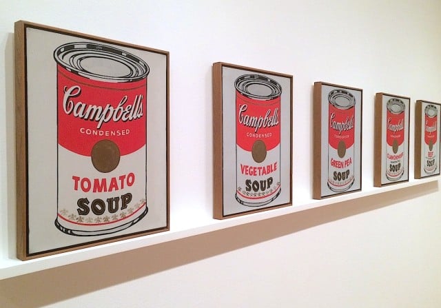
2) MoMA is presenting all 32 “flavors” in one room, in one long line, to mimic the way they were shown in their first exhibition, in July of 1962 at Ferus Gallery in Los Angeles. (Since then, they’ve usually been hung in a modernist grid.) As at Ferus, all 32 are standing at MoMA on a long shelf about three inches wide, which is almost always billed as evoking supermarket display. But when was the last time you saw a three-inch deep shelf at your local Gristedes? (That was Warhol’s grocer, right across Lexington Avenue from the home where he painted his Soups.) The shelf at Ferus and MoMA is much more like the ones used to display precious prints and paintings, when they’re brought out for consideration at a fine picture gallery – the kind of place Warhol frequented around this time as he built his own collection.
3) Another bromide I don’t buy: That Warhol’s decade in commercial art was what led him to make art about commercial products. As several of his early clients have explained – and as a bit of social history proves – his illustrations were seen as deploying elite styles to sell high-end goods. His commercial work was closer to traditional, conservative artmaking than his Pop art was; it didn’t lead him to Pop. Pop was actually his escape from his commercial past, into something more serious and radical.
4) Warhol may have been a commercial artist, but he almost never made an image that would have been seen with a crowd of its mates, the way you see a pile of identical products on a supermarket shelf. His illustrations would have been seen on a single magazine or newspaper page, one by one; after all, how many people buy more than one copy of such publications? In fact, I think the scruffy, very hand-made look of his illustrations was meant to give the magazine that commissioned them a one-off look, even when a reader knew it was printed in vast numbers. With his lineup of Soups Warhol is going somewhere he hasn’t been before.
5) If Warhol had wanted to truly ape the assembly line, he’d have made 32 paintings that were all of tomato soup. Instead, he gets us noticing the range of soups that are made and the variations among them. The paintings are less about repetition and uniformity than about uniqueness and difference. Is it worth noting that a gay man made them?
6) Spend any serious time looking at these 32 canvases, and you realize that they were laboriously painted by hand, no doubt over many weeks. They are an entirely, and explicitly, artisanal simulation of mass production, not some kind of bastard child of it. That tension between hand and mass production is part of their meaning and charm.
7) Warhol’s 32 paintings are working class, but in an older sense. They are the direct product of labor – not purchased, but made. In the language that was de rigeur in their era, Warhol’s paintings are not examples of alienated Labor filling the demands of Capital (that’s what actual assembly-line soups are about) but rather they stand for the honest labor of an artisan filling his own needs – in this case, for avant-garde art.
8) The actual Tomato Soup painting has several random little splashes of red paint on its background. Was Warhol trying to signal that it had started life in a classic artist’s studio, where all kinds of splashy accidents happen – not in a printing plant where product labels are born?
9) To make his Campbell’s Soups, Warhol projected his source images onto the canvas, drew the edges of what he saw, then brushed-in those outlines with paint. It’s a tremendously laborious, lo-tech, old-fashioned process that had almost nothing to do with mechanical reproduction – with the kind of reproduction that went into real soup-can labels, for instance. Warhol is staging himself as the anti-machine, even while he pretended to love automation. (Even a few years later, the silkscreening in Warhol’s so-called Factory never went beyond cottage labor.)
10) I spent five hours with the soup cans, and could easily and happily have spent more. That’s because their effects and details are so subtle that they demand, and repay, close looking and hard thought. Coming to grips with them is an all-or-nothing proposition: You either take a quick look to get their gestalt or you dig deep into their subtleties. As with Warhol’s great movie Empire (a single shot of the Empire State Building, which I once watched for its full eight hours), the lack of obvious and special effects in his Campbell’s Soups makes you more attuned to their smallest details. Warhol, supposedly the most newfangled of artists, in fact makes works that compel the most old-fashioned connoisseurial looking.
11) As you study the 32 kinds of soup, you notice all kinds of strange details: Who knew (or remembered) that tomato-rice soup is “old-fashioned” or that cheddar-cheese soup (which is what, thinned-out Cheez Whiz?) got billed by Campbell’s as being “great as sauce, too.” Notice Warhol’s carefully preserved comma in that last phrase; it points to how intensely observational these paintings really are. They are in the best, open-eyed tradition of the Dutch still life. Despite Warhol’s slacker persona as an artist, there’s nothing casual about the looking that went into his Campbell’s pictures.
12) Actual 1950s ads for Campbell’s products are cheery, Norman Rockwell-ish things, they aren’t deadpan presentations of packaging. That means that Warhol, despite his background illustrating ads, is using his paintings to riff on objects and products, not on the way they are sold to us by commercial artists of the kind he had been.
13) Warhol’s Soups, as painted for the Ferus show, weren’t based on photographs of a Campbell’s can. (There are other Soup paintings that are.) The Ferus pictures are based on a crude little print of a can that the Campbell’s company used on the front of its mailing envelopes. Because of that, while Warhol may be suggesting that he’s rendering a product rather than an ad for it, there’s a strange extra distance between his image and an actual thing. There’s a hall-of-mirrors effect in these Soups, and it begins at their beginning.
14) For Warhol at least, some of these soups may have acted as tiny in-jokes or mementos. “Scotch Broth (A Hearty Soup)” may have recalled his childhood in Carnegie-powered, plaid-mad Pittsburgh (his college was totally Scottish-themed). Memories of his move to New York may have been triggered by “Clam Chowder (Manhattan Style)”.
15) The Campbell’s Soup label was developed in the 1890s, and was showing its age by the time Warhol copied it in his 32 paintings. Those soup cans don’t represent an example of the latest in postwar consumption and marketing, as has been claimed; their label made them all about nostalgia for an earlier era that had a fond and faintly comic feel. That label was of a piece with the Victorian and Edwardian gewgaws that Warhol had been collecting for a decade by then, as part of his foray into camp – which often has a drop of nostalgia to it.
16) The vintage Campbell’s label is also perfectly in keeping with the Pop pictures Warhol had made just before, also riffing on nostalgic designs: A candlestick telephone from the 1920s (his very first apartment had come with one), a Royal typewriter from 1936, dollar bills with their iconic 19th-century look.
17) It’s hard to know if there’s any truth to the story that Warhol used to eat a daily meal of Campbell’s soup. He’s such a dedicated fibber that him saying it makes it less likely to be true, not more; when others tell the same story they may just be aping his anecdote. But if Warhol’s diet did in fact include a Campbell’s moment, there are hints that it might have begun not long after his father died, when his mother fell sick with cancer and was too ill to cook for her boys. That means that for Warhol, at least, those tin cans weren’t a cheery sign of good times but a reminder of hard ones.
18) Where, in modern culture, do you come across a bunch of oblong images in a row, with just slight variations among them? In a length of exposed movie film. The Campbell’s Soups, from early 1962, either foreshadow the films Warhol starts making about nine months later or they come out of his childhood infatuation with movies. (Although that’s been much overstated.) Think of the 32 frames in the MoMA show as some 1.3 seconds of footage. (Or two full seconds at the slow-mo speeds Warhol preferred.)
19) You can only get at the full effect and meaning of Warhol’s Campbell Soups by seeing them all together. (I’m not sure I could have voiced 32 different thoughts on a single one.) Luckily, Warhol’s L.A. dealer, Irving Blum, realized just this, and bought the whole lot for $1,000 dollars. (He bargained Warhol down). He sold them three decades later to MoMA for $15-million. If you found the right Qatari royal to buy them now, they might be worth 30 times that.
20) Out of the mouths of babes … comes a good art review. In a rare moment of blankness in front of the Soups, I heard a little boy, about eight years old, reading off the labels on all 32 cans. I suddenly realized that, on top of being visual objects, these works are also phonetic and poetic. They lie somewhere on the spectrum between text-based art, concrete verse and radical music. Warhol knew all three: An early boyfriend (of sorts) was in the poetry crowd at the avant-garde Black Mountain College; Warhol’s favorite LP of 1949, when he’d just arrived in New York, was a MoMA recording of Edith Sitwell reciting the near-nonsense verse of her “Façade”, to tough music by William Walton; the woman Warhol was rooming with at the time had founded the nation’s first all-percussion ensemble – both she and Warhol were great fans of John Cage.
21) As is very hard to see in reproduction, the 32 paintings’ backgrounds are a mid-gray, not white. That means that they have still less in common with the printed soup ads that they are said to riff on, where the white of the paper is most often used as background. In the paintings, it feels more like the gray metal of the soup cans has seeped out across the whole canvas.
22) Nope, that’s not right – as is almost impossible to see, even when you’re right in front of the canvases. If you get them at just the right angle, however, you can see that Warhol added a thin layer of actual metallic paint to his cans, so they stand out just a tiny touch from their backgrounds. Metallic paint was a trademark of Jackson Pollock’s spilled abstractions, so you wonder if there’s an echo of that in Warhol’s choice. (Like Picasso, Pollock represented a Freudian father whom Oedipus-Warhol always needed to kill. And here I should cite the claims of my colleague-in-criticism Christopher Knight, who argues that, in 1962, “soup” was a word used for the paint of the Abstract Expressionists.)
23) A question, really, not a resolved thought: Why does Warhol not include any detail on the surface of the “medal” in the middle of his Campbell’s Soup labels? (The detail seems to have been there in his source.) Is it simply because other paints don’t stick well on top of gold? Because getting the medals just right would take too much work and might never look good, anyway? Did Warhol want the medal to evoke plain gold coins, as a kind of marker for the capitalist system? Did he just like the gold circle’s graphic punch?
24) Took me a while to notice, but Warhol’s 32 Campbell’s Soups … match Bach’s 32 Goldberg Variations. I’m not saying that Bach’s number governed Warhol’s choice; I’m just mooting the possibility that he and his viewers might have noticed the rhyme. Warhol was not the low-culture guy he’s been painted, not by a long shot; that was a pose. At least early-on, he loved serious drama and literature as well as classical music. Opera was his favorite – once he could afford it, he subscribed to the Met – but we know that he went to instrumental concerts as well. And let’s not forget that Glenn Gould had made a giant splash, just seven years before Warhol’s Soups, with his landmark record of the Goldbergs. One source claims that Warhol used to blast Bach on his stereo, and Edie Sedgwick herself once planned a dance to Bach’s music played as rock.
25) The format and size of Warhol’s soup paintings doesn’t have much to do with product advertising, as far as I can see. It comes much closer to the scale and shape of certain traditional portraits. So think of the Campbell’s Soups in terms of some display of ancestral faces, or as echoing the hundreds of self-portraits in the Uffizi’s Vasari Corridor.
26) Let’s just note, for the record, that a childhood neighbor of Warhol’s said that their street was far too poor for canned goods; you made your own soup out of the cabbage and scraps you could get, or from the “pet” chicken that we know Warhol’s mother once slaughtered for soup. “Canning”, on that street, meant putting up your garden’s tomatoes. (And this neighbor was considered better off than the Warhola clan.) Her description bills Warhol, the Campbell’s Soup painter, once again as an outsider looking in on what other Americans might take for granted.
27) The hand-made vibe and sheer eccentricity of the Soup paintings actually make them close cousins to real outsider art – in their own day, especially, there was no other category they fit better in. Outsiders often make art out of and about the things around them; they often have the limited skills (in hand-lettering, for instance) that Warhol displays.
28) And let’s not forget that the Pittsburgh of Warhol’s childhood was where outsider art first made its big splash, with the inclusion of John Kane’s work into the 1927 Carnegie International. There were outsiders in the museum shows of Warhol’s college years, and when he got out of art school, there was a big dose of outsiderism in the style he chose for his commercial work. If not literally “cooking-up” his soup paintings at the kitchen table, Warhol, outsider-like, was making them nearby in his home – he didn’t have the studio of a professional artist until late in 1962.
29) Back to that hand lettering for a minute. Warhol’s labels are not, in fact, fluently hand-lettered, the way a skilled sign-painter would do it. There are no manual chops on display. Instead, the letters in Warhol’s paintings are very cleared traced – and not very well – from someone else’s work. His paintings read as being more like just-good-enough records of things in the world – almost like detailed inventories of features – than like actual works of pictorial craft.
30) Why do we always talk about Warhol’s tomato-soup paintings, when there are 31 other flavors to choose from? It’s true that Campbell’s began its soup-making with tomato, and somehow that’s a fact that we’ve all taken in. This proves that Warhol was right to imagine that Campbell’s Soup has a special place in our cultural knowledge-base.
31) There’s no visible order to Warhol’s Campbell’s Soups, and no particular order in how they should be hung. But they seem terribly systematic, as though governed by some unknown algorithm. They have the feel of conceptual works that came later by artists such as Mel Bochner or Hanne Darboven. Although the Campbell’s Soups are always presented as prime examples of a vintage, 1960s Pop-y style, I feel they sit equally well in later moments – including our own.
32) When they were first shown, the idea that these paintings might invite any kind of close or connoisseurial looking was mostly seen as absurd. They didn’t seem to have any noteworthy features, let alone esthetic or visual ones. They were seen as, at best, a deliberate, absurdist, Dada one-liner – a “put-on” was the term used at the time, or a joke. Just goes to show that, pace the basic premise of most art history, original, period readings can be less revealing and relevant than later ones. (Artworks ©2015 Andy Warhol Foundation / ARS, NY / TM Licensed by Campbell’s Soup Co. All rights reserved.)
For a full survey of past Daily Pics visit blakegopnik.com/archive.