Art & Exhibitions
At the Andy Warhol Museum, Witness the Artist’s Birth
THE DAILY PIC: An art-school magazine shows where Warhol got his modern chops.
THE DAILY PIC: An art-school magazine shows where Warhol got his modern chops.
Blake Gopnik
 ShareShare This Article
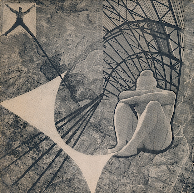
THE DAILY PIC (#1331): This is the amazing front cover of Form magazine, put out for all of one issue by the art students at the Carnegie Institute of Technology – now Carnegie Mellon University – in Pittsburgh in early 1948.
Last year, when I first came across it in the university archives, I may have been the first person to study it in 50 years, but now it’s out for everyone to see in an exhibition called “Pearlstein, Warhol, Cantor: From Pittsburgh to New York”, at the Andy Warhol Museum in Pittsburgh. The reason it gets into that show is that Philip Pearlstein, now one of our greatest figurative painters but then just a student G.I. with ambitions in art, has a long article in it about “Painting as an Educational Medium”. That piece has precisely the kind of methodical, systematic approach that he says made him fail to get a toehold as a commercial artist in New York, just when his sprightly friend and classmate Andy Warhol was starting to soar. (Pearlstein went on to get an M.A. in art history and then to teach art for decades, so the article can be seen as predicting his future in pedagogy.)
More interesting is an article on photograms by Perry Davis, one of a bunch of young, gay teachers at Tech who had a big effect on Warhol. (Wait for my upcoming biography to get all the juicy details.) Davis says that his students were so interested in Man Ray’s signature technique, where you place objects directly on photographic paper and then expose it to light, that he got together a team of them to look deeper into the process. It’s hard not to imagine that Warhol was one of those Perry-ites, since he had already used a photogram as a Christmas card (see the image below). On December 23, 1947, it was in the mail to his Tech classmate George Klauber, who at that point had already moved on to New York, eventually becoming a notable figure in graphic design and among the queer aesthetes of Brooklyn Heights.
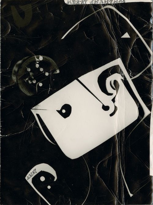
(The Andy Warhol Museum, Pittsburgh; Gift of George Klauber, © The Andy Warhol Foundation for the Visual Arts, Inc.)
And most interesting of all may be the overall look of Form, which is deeply dedicated to the latest ideas on design, circa 1948. Among other things, the entire magazine is typeset without a single capital letter or paragraph indent, making it hard to read but great to look at – and a clear influence on Warhol, who left out capital letters in all his typed notes of the 1950s and beyond. The marbling on the cover of Form also becomes a device that Warhol tries out for a while in the 1950s, when he’s trying to finding something that can signal his ambitions in pure fine art.
With his love of irony and play and social observation, Warhol the Pop and post-Pop artist can come across as the first of the postmoderns. (Even his Christmas card is a sly undoing of the abstract rigors of most photograms.) In fact, it makes more sense to see Warhol as the last of the diehard modernists; he was so dedicated to making it new that he had no choice but to move on from the old modernist novelties – novelties that he learned from, and along with, his wonderful teachers and classmates at Tech.
For a full survey of past Daily Pics visit blakegopnik.com/archive.\