Art & Exhibitions
Rising Star Caitlin Keogh on How Vintage Fashion and Contemporary Poetry Inspire Her Hypnotic Paintings
The painter's first solo museum show just opened in Boston.
The painter's first solo museum show just opened in Boston.

Henri Neuendorf

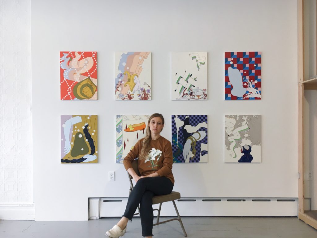
Situated in a nondescript converted storefront in Long Island City, Caitlin Keogh’s studio is unusually neat and pristine for a painter. Right now, it is nearly empty, the majority of her recent paintings having already been shipped to Boston, where her first solo museum exhibition opened recently at the Institute of Contemporary Art, Boston. Only eight small-scale studies and a few larger canvases lean against a wooden rack.
The Alaska-born artist’s unique approach to painting, both stylistically and thematically, has earned her plaudits. Rendered in flat pastel colors, Keogh’s paintings employ sign painting techniques to explore themes including gender, the female body, the natural world, patterns, and design. Her bold lines are shaped by her experience as a technical illustrator, but she gives them a surrealist twist.
On the eve of her ICA show, we sat down with the rising star to discuss her beginnings and her many influences as she prepares to emerge on a much bigger stage.
What was your first point of contact with art and when did you decide that you want to do this as a career?
I grew up around art. My dad is an artist, and so I spent a lot of time in his studio as a little kid. I did a lot of drawing and painting and always felt surrounded by art. I think I felt so surrounded by it that I took it for granted a little bit. I didn’t identify as someone who wanted to be an artist.
It wasn’t until I was done with high school that I realized that this was something that I would really miss if I didn’t pursue it and go to art school.
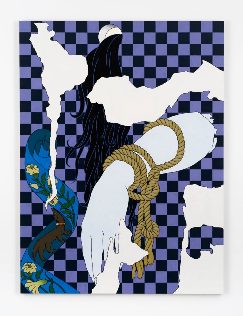
Caitlin Keogh Blank Melody, Old Wall (2018). Photo: Courtesy the artist and Bortolami, New York; Photo by John Berens; © Caitlin Keogh.
You grew up in Alaska, right?
I lived in Alaska only until I was six. Then my family moved to Eugene, Oregon. That’s mostly where I grew up.
How did that upbringing affect your work?
Eugene was a really great place to grow up. It’s a real counter-culture city, and I think that has had some influence on my work. It’s an incredibly beautiful place. I spent a lot of time outdoors, and I think that was also influential for me.
The thing that immediately catches my eye, looking at your work, is the strength of line and color palette. Can you talk about how each of those facets of your work developed?
Drawing is a really big part of my practice. I really love to draw, and I think that for a long time I felt as if I was a drawer who was learning how to paint.
I make drawings now, which are plans for my paintings, and then I blow them up when I paint them. So drawing is really central.
The continuous black outline, though, comes from my experience working as a technical illustrator. That’s the kind of work that I did for a couple of years at the end of collage and as I was starting grad school. It was a really helpful job to get me through that period of time. I was drawing handbags, shoes, jewelry—stuff like that—in an environment where there was an emphasis on complete clarity.
Those drawings were like a set of instructions, a really different way of thinking about picture-making than what I had been taught in art school. The formulaic way I work on a project today, starting from drawing, I think that comes from my time creating technical manuals, where you have to work within a certain set of parameters.
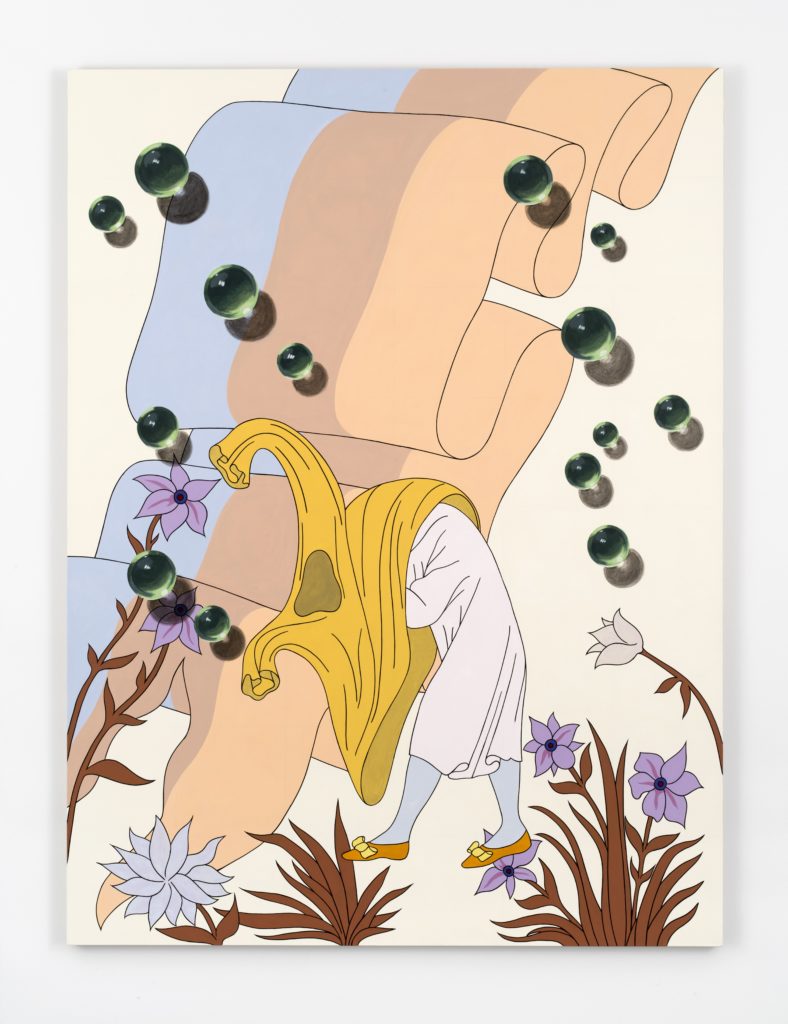
Caitlin Keogh Blank Melody, Cloaked Figure (2018). Photo: Courtesy the artist and Bortolami, New York; Photo by John Berens; © Caitlin Keogh.
Is that kind of work still resonant for you?
For sure. The emphatic decisiveness of that kind of image-making, coming from illustration, is something that I still really appreciate. There’s a kind of pressure to make things clear in the paintings.
During your time as a technical illustrator, you were working a lot with fashion items. I think that’s reflected in your paintings. Is there a connection between the two?
I’ve been interested in fashion since long before art school. I grew up reading a lot of fashion magazines, looking at fashion a lot, and I worked in vintage stores when I was younger. I just am really interested in textiles and fashion history and the kind of theatricality as well as tactility of fashion.
Right when I was starting grad school I found these Harper’s Bazaar magazines from 1937, ’38, ’39, just in the trash. It was kind of a lucky find. They were so incredible because they were this very commercial iteration of surrealism.
The covers were all illustrated by A.M. Cassandre, who’s this really great illustrator, and then they had illustrations throughout by Salvador Dalí, Man Ray, and Max Ernst, who were probably just doing this work as a day job.
I really liked that I saw artists who were in the contemporary art dialogue but working in a commercial space like a fashion magazine instead of in the rarefied art world. That was just a really great combination of things to think about.
Much of your work deals with issues such as gender and the body. What exactly are you trying to communicate?
The female body is definitely something that feels pretty charged for me. It’s something that I look at a lot in historical paintings, and then also in fashion. The image of the headless mannequin body or the headless antique form are both really compelling for me, partly because they speak to the aestheticization of a woman’s body, but also suggest a kind of erasure.
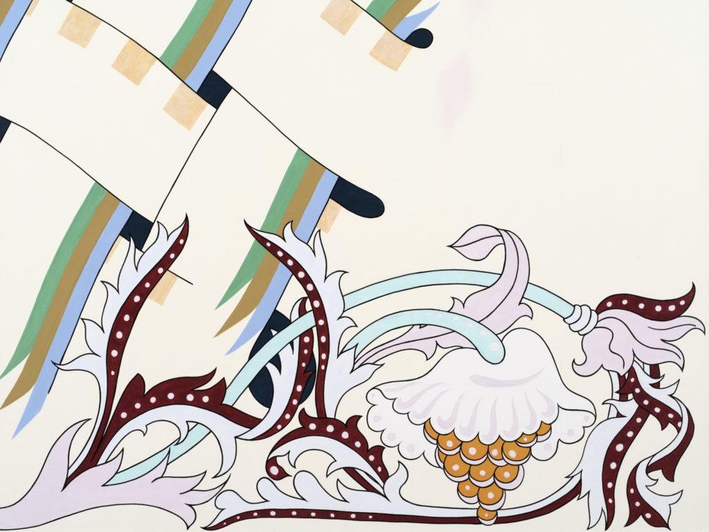
Caitlin Keogh Blank Melody, Margin (detail) (2018). Photo: Courtesy the artist and Bortolami, New York; Photo by John Berens; © Caitlin Keogh.
There is also a great deal of plant-life and nature in your work. How does that fit into your practice?
I enjoy that kind of feminine construction, but I also feel a little bit antagonized by it. I think about a figure like [fashion photographer] Cecil Beaton a lot, someone who’s art directing this artificial world, playing on all of these very feminine tropes.
You have a solo museum show at the ICA in Boston. How have you prepared for it?
I haven’t done a solo show in two years, so I really wanted to present a new body of work. I’m making a group of paintings in response to a poem [Blank Melody] by Charity Coleman.
Charity wrote that poem in response to my earlier works, so it’s kind of a feedback process. I guess her poem is the text that the new paintings illustrate.
There are also benches in the show made by Graham Anderson, who is a painter and furniture designer. He made these benches in response to the painting, playing off of this idea of a contemplative space of reading.
In terms of having a museum show of this magnitude, there’s a certain attention from the market that comes with that. To what extent do you think about this connection?
I am aware of the market in that it has enabled me to be in my studio all day, every day. That wasn’t the case before when I was working a lot of day jobs. In that sense, the market plays a role in relation to my practice.
But I think that the show is very unadulterated in relation to my interests. I guess I feel pretty unaware of what the market might care about with regard to this work.
What does a museum exhibition like the ICA show mean for an artist such as yourself, at this stage in your career?
I think it’s a truly incredible opportunity. The ICA definitely feels like a really special place to do a show.
As far as what the effect will be—I really don’t know. I’ve been thinking about it as a body of work made in dialogue with these other people, Jeff, Charity, and Graham, but also in response to the architecture of the space. Beyond that aspect, I just don’t know what the influence of the institution might be.
Caitlin Keogh: Blank Melody is on view at the Institute of Contemporary Art, Boston, until August 28.