Art World
Why We Can’t Remember the Difference Between Two Shades of the Same Color
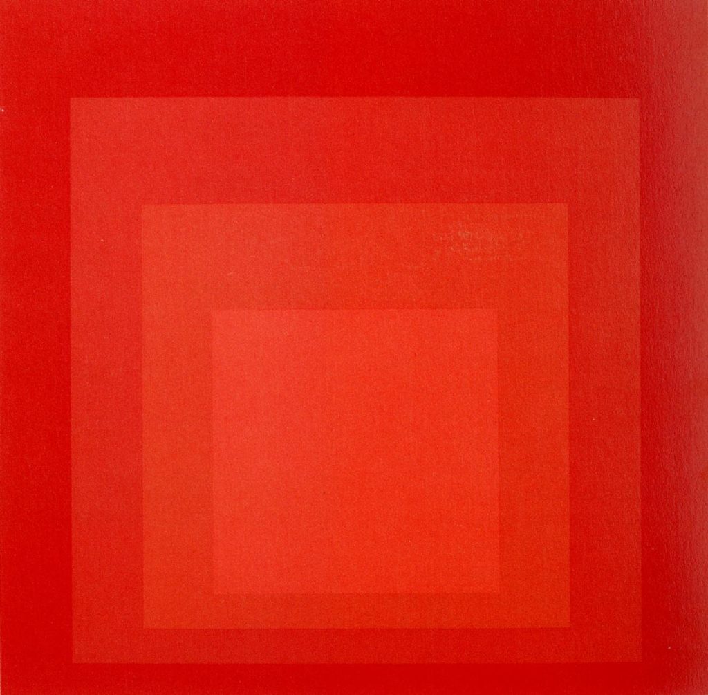
Photo: The Josef and Anni Albers collection.
Artnet News
 ShareShare This Article
Ever go to purchase a specific hue for curtains to match your carpet and find yourself at a loss? A new book about how we perceive certain shades, titled, Outside Color, by University of Pittsburgh assistant professor Mazviita Chirimuuta, explains why.
“Of all the properties that object appears to have,” Chirimuuta says, “color hovers uneasily between the subjective world of sensation and the objective world of fact.”
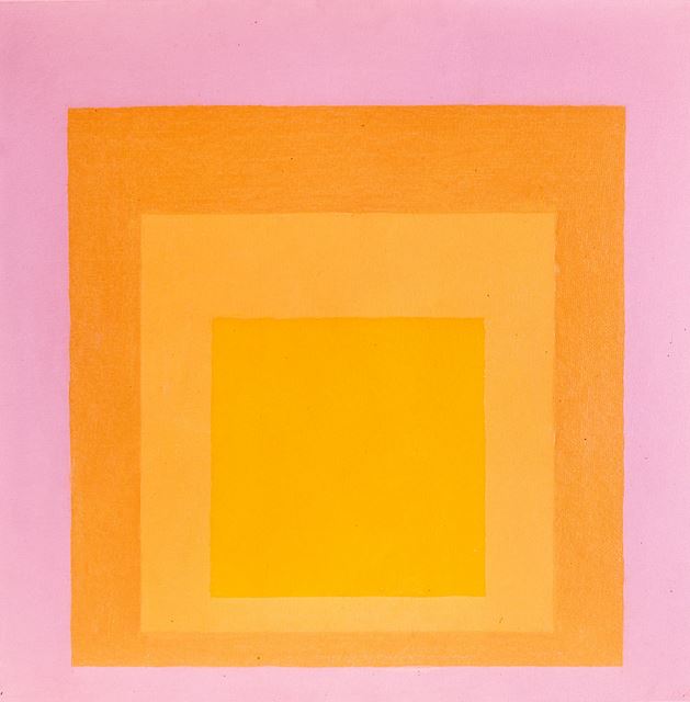
The artist Josef Albers knew this, and exploited it in his work, particularly in his series, “Homage to the Square.” In his 1963 book, Interaction of Color, he wrote, “In order to use color effectively it is necessary to recognize that color deceives continually.”
For those who witnessed the uproar over the blue and black dress (or white and gold) in February, the above statement makes perfect sense. Every celebrity seemed to weigh in, with Taylor Swift and Kanye on Team Blue and Kim Kardashian on Team Gold. As Chirimuuta writes, “to ask, ‘what is blue?’ has typically meant assuming that there is one kind of chromatic property belonging to blue things that our visual system detects.”
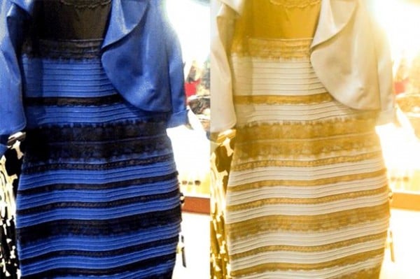
Blue and Black or White and Gold?
Photo: Irish Mirror.
In fact, some of the best-known artists might have been colorblind. In 2012, Japan-based color researcher Kazunori Asada studied Vincent van Gogh’s works in a “Color Vision Experience Room,” which modifies the light spectrum. He writes his observations on his Tumblr, proposing that “[Van Gogh] formulated rules how to choose and use paints which were optimal to his eyes.”
Not only do we perceived colors subjectively, but we also have extremely short term memory when it comes to recalling them. In a 2015 paper published in the Journal of Experimental Psychology, Jonathan Flombaum, an assistant professor in the Department of Psychological and Brain Sciences at John Hopkins University, discusses why people categorize memories for colors into biased “best” versions of basic colors. We can distinguish between ultramarine, azure, and cobalt but when faced with remembering the specific shades, we tend to categorize them as “blue” because our mind looks to “more limited, language-driven categories.”
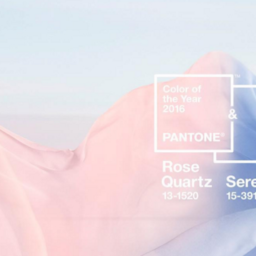
With these problems of differentiation, it’s no wonder Pantone has become a household name (see Why Is Pantone’s Vibrant New Yellow Shade Named After a Cute and Tiny Character? and Pantone’s 2015 Color of the Year Is Marsala).
Josef Albers, Untitled (1963).
Photo: courtesy of Galerie Melki.