Art & Exhibitions
At the Carnegie, Peter-Muller Munk Blends Function and Form
THE DAILY PIC: The designer's 1937 blender would do well in any wind-tunnel test.

THE DAILY PIC: The designer's 1937 blender would do well in any wind-tunnel test.

Blake Gopnik


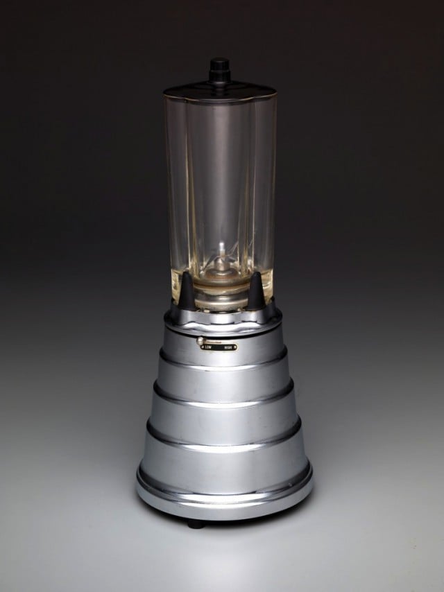
THE DAILY PIC (#1349): This lovely 1937 blender was conceived by designer Peter Muller-Munk shortly after he set up shop in Pittsburgh. It will appear in the Muller-Munk survey that launches Nov. 21 at the Carnegie Museum of Art in that town, and that I just covered (briefly) in the New York Times.
What interests me about this object, in particular, is the one tiny, spinning blade that we can just make out at its center. It made me realize how very basic the demands of function can be in design (a blender just needs a blade and a tube for it to spin in) and how little they really condition the look of a thing.
The idea that function and form are or need to be closely related is probably mostly myth; every designer, no matter how functionalist, has vast latitude in the look that he or she gives to an object.
Muller-Munk’s “Blendor, Model B” comes at a lovely moment when decoration and use are in particular tension: The appliance’s roots in Art Deco ornament are perfectly clear, but so are its leanings toward the machine-age esthetics of the new, streamlined “Moderne” style. Whether it matters or not to how we blend drinks, Muller-Munk’s piece looks like it would pass any wind-tunnel test. (Private collection; photo, Dallas Museum of Art)
For a full survey of past Daily Pics visit blakegopnik.com/archive.