Art World
Decorating Your Dorm Room? Here Are Some Art Poster Pro-Tips
Will it be a Basquiat or a Banksy?

How do you do, fellow kids? As summer ends and we head into fall, as you’re getting ready to head off to college, you’re probably thinking about what you can use to convey your personality to your classmates—from your clothes and hairstyles to what kind of music you listen to.
One key avenue for self-presentation is dorm-room decor—and a crucial part of that is poster art. What you definitely don’t want to do is hang those “iconic” (read: clichéd) posters of the Beatles’s Abbey Road cover, the “Keep Calm and Carry On” slogan, or Marilyn Monroe with her skirt blowing up in the wind.
Our advice: Scrap those in favor of some actual high-art choices.
But even that can be a bit of a minefield. Some artworks that seem sure to make you appear edgy may be the very same ones that the first-year next door is right now taping to their wall. Then again, that Bauhaus poster really does capture your unique personality…
To help you navigate this existential thicket, we’ve hand-picked a selection of art posters, weighing their pros and cons. Our guide also includes some necessary details about the artists and history behind these works, so even though if you’re not writing a term paper about your dorm room decor, you know exactly what’s going up on your wall.
Gustav Klimt, The Kiss
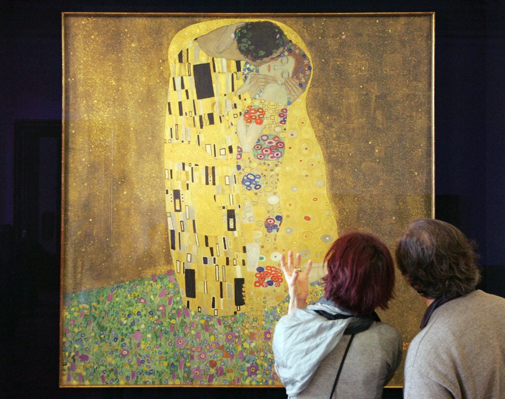
Visitors of the Belvedere Museum look at Gustav Klimt´s painting, The Kiss. Photo: Dieter Nagl/AFP/Getty Images.
The basics: This incredibly famous work of art is perhaps the most important by the Austrian artist. A couple, wrapped in fantastically elaborate robes, embraces in a painting covered with geometric patterns, embellished with gold leaf, silver and platinum.
The upside: The artwork has both contemporary and historical connections: the patterns are associated with Art Nouveau styles, and the spirit of excess takes part in the fin de siecle aesthetic. But the flat gold background harks back to medieval devotional paintings that used a gold ground so that the works would glow in candlelit settings. An immediate success, the painting was purchased by the Austrian government the day it went on view, for 25,000 crowns.
The downside: There simply could not be a more popular image for posters. Klimt is blockbuster material when his artwork goes on view in museums, and the art market loves him too—two of his paintings have cracked the $100 million mark at auction in just the last two years. So, you can expect some fellow-students to hang this one too—maybe even your roommate, and wouldn’t that be a drag?
Banksy, Flower Thrower
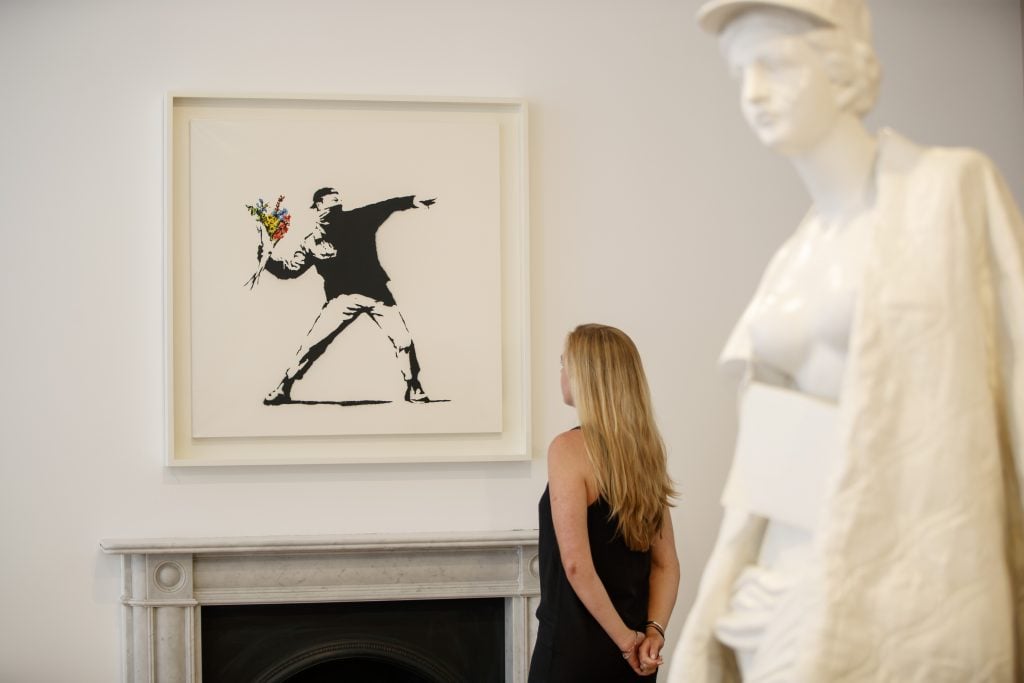
Banksy’s Flower Thrower (2006) on view at Lazinc Gallery in London, 2018. Photo: Tolga Akmen / AFP via Getty Images.
The basics: Anonymous British street artist Banksy created this work to convey a message that is both anti-authoritarian and pro-peace: a masked demonstrator prepares to throw what you might expect to be a Molotov cocktail, but in fact it’s a bouquet of flowers.
The upside: Banksy may have been inspired partly by photographer Bruno Barbey’s photo of student protestors on the Boulevard Saint Germain in Paris in May 1968; note the student at right. The image is timely, against the backdrop of campus protests. But those demonstrations are a touchy subject, and you may wade into sensitive territory with this artist: Banksy has often expressed support for the Palestinian cause.
The downside: Banksy is a bit overexposed. His every move is watched by millions worldwide, so no one will be surprised by yet another Banksy poster. And, believe us, not everyone is even convinced of his merits: a New York Times writer once acidly dismissed his “supposed wit.”
Salvador Dalí, The Persistence of Memory
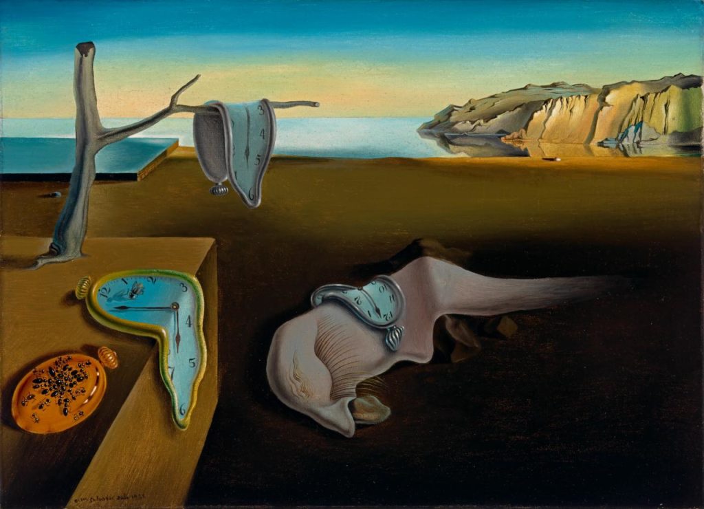
Salvador Dalí, The Persistence of Memory (1931). Photo: courtesy the Museum of Modern Art, New York. © Salvador Dalí, Fundació Gala-Salvador Dalí / Licensed by Viscopy, 2017.
The basics: An eternal classic, the Spanish Surrealist’s canvas, stocked with melting clocks, is an example par excellence of the movement with which his name is synonymous.
The upside: Dalí strove to come up with unconventional works, and to do so, he underwent an unconventional process, which he called his “paranoiac-critical” method. Might there be a better way to signal your own non-conformity?
While high-flying critical interpretations center on how the usually dependable clocks are here rendered unreliable, or posit that they may have been inspired by Einstein’s theory of relativity, the artist himself insisted that they are just meant to resemble melting Camembert cheese. The fantastical-seeming setting, similarly, has a simple origin: it shows the seashore at the Catalan Spanish region of Cape Creus, where Mount Pani stands in the distance.
The painting sold for a bargain $250, and the anonymous buyer donated it to the Museum of Modern Art shortly thereafter.
The downside: Though individual in style and subject, the painting is one of the most recognizable, even among the famous collection of New York’s Museum of Modern Art. So this doesn’t even tell those seeing it that you’ve been to a museum; it may just suggest that you’ve been to the online gift shop.
Katsushika Hokusai, The Great Wave off Kanagawa
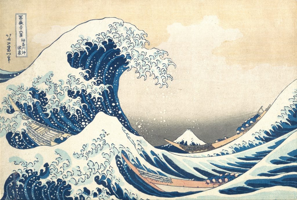
Katsushika Hokusai, Under the Wave off Kanagawa (Kanagawa oki nami ura) from the series “Thirty-Six Views of Mount Fuji (Fugaku sanjurokkei)” (ca. 1830–32). Collection of Metropolitan Museum of Art, New York.
The basics: Three boats do their best to survive storm-tossed waters, with Mount Fuji in the distance. This work is the opening image in Hokusai’s series “Thirty-Six Views of Mount Fuji.” Fascinatingly, Japanese woodblock prints such as this one were not even considered “fine art” by the artists or the consumers, and they weren’t treasured the way we treat these artworks today.
The upside: This artwork has so much going for it. Its unsentimental presentation of humankind struggling against nature, so dominant that you might not have even noticed the boats on first view? Compelling. The awesome power of the wave? Fantastic. And the artwork’s place in history as a canonical example of Japanese ukiyo-e printmaking, which Americans and Europeans, especially the Impressionists, fawned over after Japan was forced to open to international trade? Fascinating.
The downside: In strictly aesthetic terms, The Great Wave is a solid choice, though it, also, does not depart from a well-trodden path, one that is so well-trodden that you could probably find this poster outside the door of several departing first-years at the end of the year when they’re over it. If an artwork is so well-known that it appears on the emoji keyboard, you are far from making a statement by hanging it on your wall.
Vincent Van Gogh, The Starry Night

Vincent van Gogh, The Starry Night (1889). Collection of the Museum of Modern Art, New York.
The basics: This image is a classic. It’s ravishingly beautiful. Van Gogh has an undeniably fascinating and tragic story—the painting was based on the view out of his asylum window several months after he admitted himself—and his artistic interpretation of a star-studded night sky is endlessly enchanting.
The upside: First of all, let’s get one thing out of the way: Vincent van Gogh’s painting is called The Starry Night. Do not confuse it with “Starry, Starry Night,” which is the refrain of but not actually the title for Don McLean’s popular song “Vincent.” (Whether you should mansplain this to other students who get it wrong, well, that’s up to you, but it’s literally our job.)
Van Gogh painted the area outside his window many times. “Through the iron-barred window,” he wrote to his brother, Theo, “I can see an enclosed square of wheat… above which, in the morning, I watch the sun rise in all its glory.” This is the only nighttime scene; the brightest light, just to the right of the cypress tree, depicts Venus.
Van Gogh, in a letter to another painter, regarded it as “a failure.”
The downside: This is a pretty basic poster choice. It just lets people know you like art. There’s nothing really wrong with it. But let’s get real: countless tourists Instagram this painting every day from its home at New York’s Museum of Modern Art. A great painting it is; a distinctive choice for a poster it is not.
Vincent Van Gogh, Head of a Skeleton with a Burning Cigarette
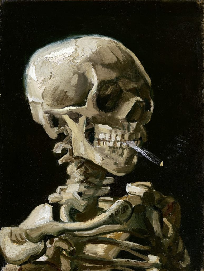
Vincent van Gogh, Head of a Skeleton with a Burning Cigarette (1886), Van Gogh Museum, Amsterdam. Photo: VCG Wilson/Corbis via Getty Images.
The basics: Against a velvety black background, a skeleton, depicted with rough, sweeping brushstrokes, smokes a cigarette that it holds between its teeth.
The upside: Here’s a Van Gogh choice that is a bit lesser known than The Starry Night. There’s no doubt that this painting is eye-catching and macabre, and it stays with you. It’s not the kind of image you expect from Van Gogh, so classmates may be surprised to learn that it’s by his hand.
This painting may harbor several messages. Images reminding us of death are part of a tradition called vanitas, Latin for vanity. The skeleton is a memento mori, or a reminder of death. It may also have lampooned conservative pedagogy, in which art students studied skeletons in order to familiarize themselves with human anatomy. In fact, Van Gogh was taking classes at the Royal Academy of Fine Arts at the time, and complained of being bored.
And nope, it’s probaby not an anti-smoking statement: the Dutchman smoked until the day he died.
The downside: Look, when a museum dedicated to an artist refers to a work of his, one that it actually owns, as “a juvenile joke,” you’ve got to take them seriously. And it’s not exactly a well-kept secret; if the painting looks familiar, know that appeared on the cover of David Sedaris’s 2008 book When You Are Engulfed in Flames.
Jean-Michel Basquiat, Riding With Death
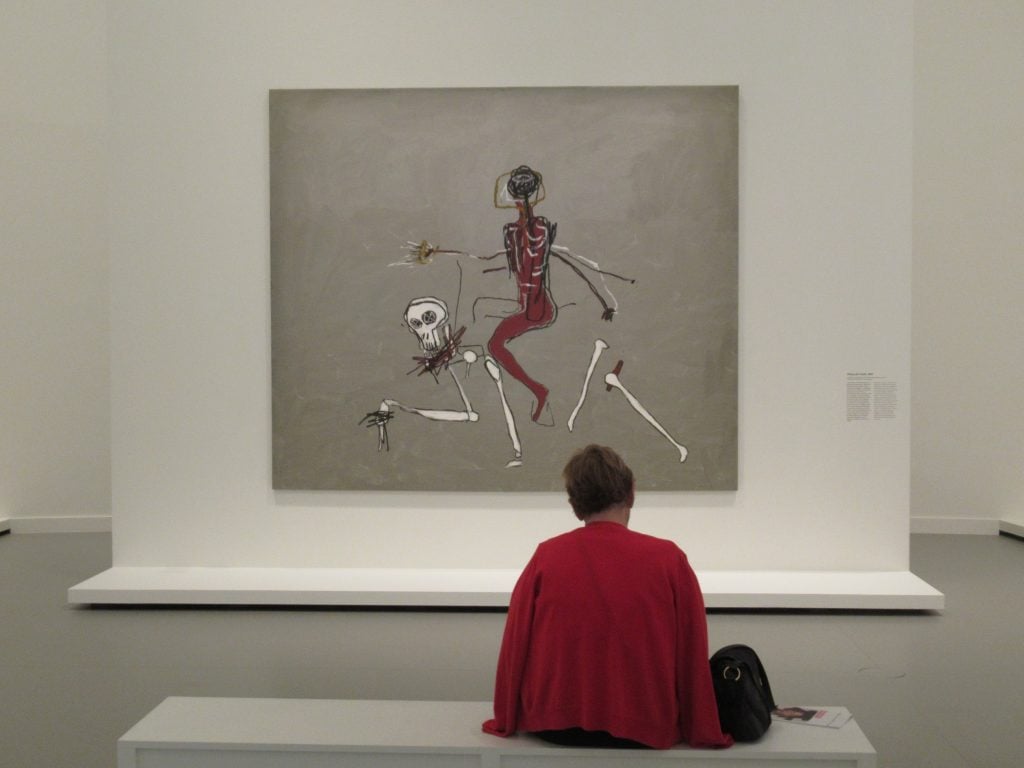
A visitor in front of the picture Riding with Death by Jean-Michel Basquiat. Photo: Sabine Glaubitz/picture alliance via Getty Images.
The basics: Whoa. In this remarkably spare and grim tableau, the artist depicts what seems to be a Black man with sticklike arms, his face turned away, riding death in the form of a disassembling skeleton. Perhaps surprisingly, this is a popular choice on AllPosters.com, so let’s get into it.
The upside: It’s an ambiguous and rich image with numerous art historical references. It calls back to a Leonardo da Vinci drawing; the gold background may recall Gothic devotional images; the circle around the Black figure’s head suggests a halo; and the pyramidal composition has been used throughout art history.
There are also personal dimensions. The Black figure at center may stand for the African-American artist himself, or, more broadly, to racial discrimination against Black people in America, a topic Basquiat often addressed.
The artist would die of a drug overdose the next year, making the work even more somber.
The downside: Basquiat is also, like Banksy, a bit overexposed. You might even have some Basquiat-themed Uniqlo clothing. And while death is a fascinating subject, just imagine bringing a potential hookup back to your room and showing them such a ghoulish image. It might just kill the vibe. And that’s the last thing we want for you.


