Reviews
Why It’s Worth Savoring Leonor Fini’s Enchanted Surrealism at Kasmin + Other Things to See and Read
Plus, the Mariah Carey "I don't know her" meme as art, and the "New Ugliness" theorized.
Plus, the Mariah Carey "I don't know her" meme as art, and the "New Ugliness" theorized.

Ben Davis

Well, one month of 2023 already gone. I started the year with a New Year’s Resolution to write a bit more about art outside of the automatically must-cover big shows or controversies. That’s hard—every pressure of media life pushes towards becoming a brain in a vat plugged directly into trending topics.
But I do want to try! Despite the general bad vibes of our moment, people go on doing and saying interesting things and trying to figure it all out. We’ll see how the year goes. In the meantime, here are a few things I saw and liked, or read and felt worth recommending, in the last weeks.
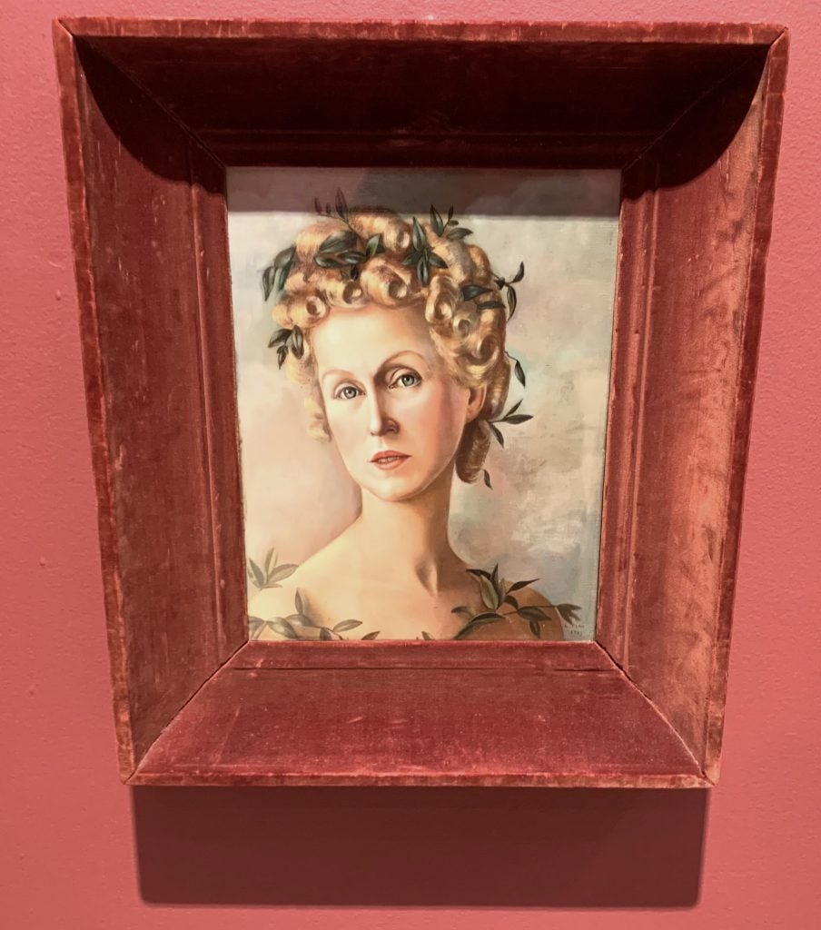
Work by Leonor Fini at Kasmin. Photo by Ben Davis.
Leonor Fini (1907-1996) is a Surrealist great, and also one of those figures who has been greatly under-appreciated. I mean, just a few years ago, it took New York’s Museum of Sex to give her a first big American retrospective. More recently, the Argentinian-Italian artist’s star has been ascendant, with her declaration that she wanted to be seen as a “witch rather than as a priestess” making her perfect for the feminist-Surrealist vibe of the recent Venice Biennale. Kasmin’s mini-survey has Fini’s numinous, libidinal paintings accompanied by her theatrical self-made outfits, freaky masquerade ball masks, and even a pair of clip-on gold devil horns. The show contains magic, maybe in metaphorical and non-metaphorical ways.
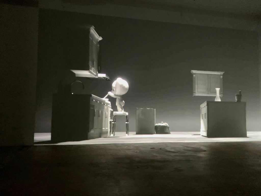
Installation view of Alfatih, “Day in the Life,” at Swiss Institute. Photo by Ben Davis.
The Switzerland-based new media artist’s slick, strangely engaging black-and-white digital animation in the basement of the S.I. centers on the doings of a seemingly super-intelligent cartoon baby, looping endlessly through different permeations of daily domestic rituals (cooking, taking a bath) within the confines of some kind of stylish domestic purgatory. If someone told me that I would be moved by something best described as—I dunno—“Yoshitomo Nara meets Spielberg’s A.I.” or “Limbo meets Boss Baby,” I wouldn’t believe them. But that’s why you don’t judge an art show based on pithy little riffs like that. A vignette where the enigmatic child plinks at the piano as rain pours and lightening strobes all around continues to circle in my brain long after I have left the cartoon creature to carry on with its own devices.
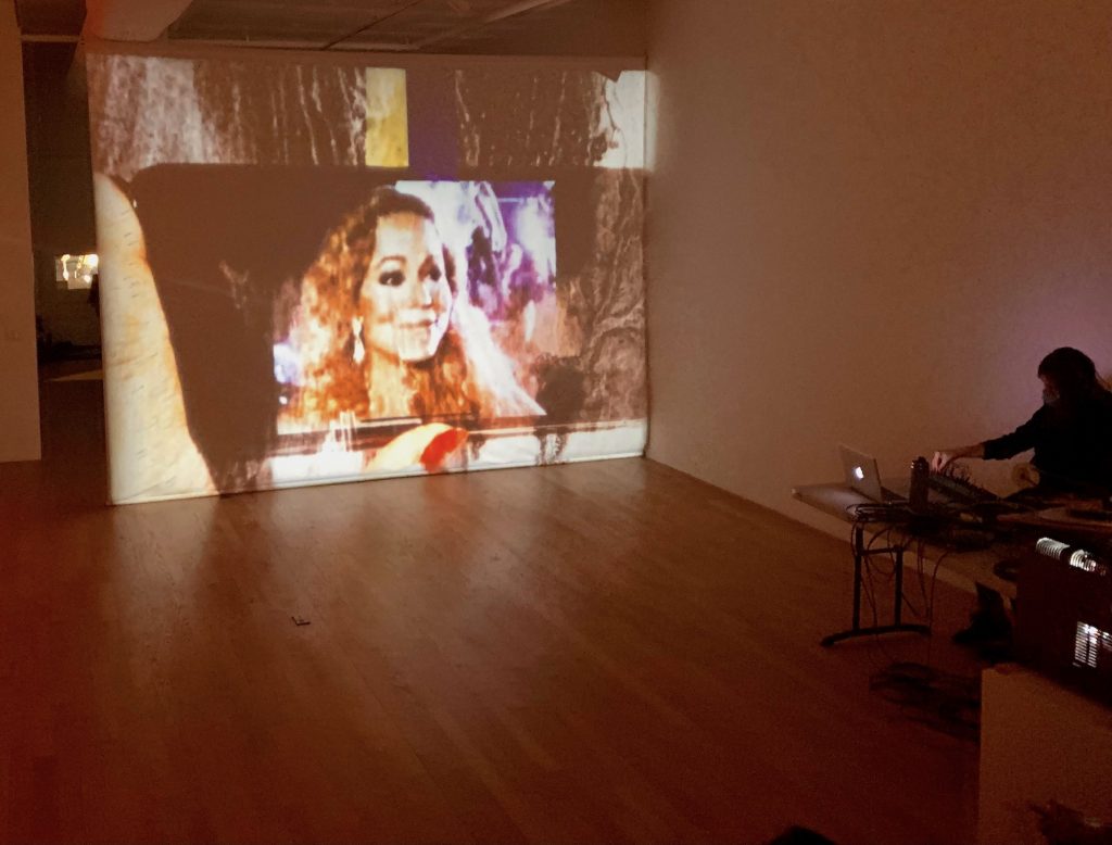
Installation view of Carrie Schneider, “I Don’t Know Her,” at Chart. Photo by Ben Davis.
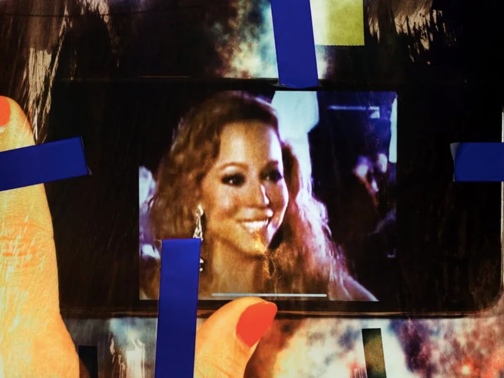
A 16-mm film installation concentrating on a looping image of the Mariah Carey “I don’t know her” meme (the singer pretending not to who Jennifer Lopez is, often used to cast shade), multiply abstracted and reprocessed. It’s an old-fashioned film film showing a phone showing a meme made from a TV show clip of a pop star talking about another pop star. Of course there’s a Pavlovian ’90s nostalgia element to just seeing Carey’s stone-cold quip reframed as art, but I Don’t Know Her (as the work is called) wrings an unexpected bit of beauty from freezing this circulation of media into a shimmering suspension, the image abstracted and pockmarked as it acquires personal associations like a worn-down lucky penny. Fun and brainy and weirdly hypnotic.
“Why Is Everything So Ugly?” by the Editors, in n+1
From the Winter issue of n+1, the scene-setting lead editorial on “the New Ugliness” made the rounds last month because it names something worth naming: the ambient, greige-colored sameness of the urban creative world now. Its various avatars are taxonomized here in an entertainingly and convincingly cranky ramble across the full landscape of consumption, from architecture to advertising. “One paradox of the new ugliness is that it flattens the distinction between the rich, the very rich, the superrich, and the merely fortunate by ripping them all off in turn.”
“TikTok’s Enshitification” by Cory Doctorow, in Pluralistic
A nice complement to the n+1 rant, and maybe the internet-specific corollary of the “New Ugliness.” The trigger for Doctorow’s screed is a consideration of the implications of recent revelations about how TikTok boosts key creators with the end of luring them into their platform with a fake sense of its potential. But really this is a famed web thinker’s master theory of why the internet feels so bad now, backed up by a pretty convincing, historically informed political economy of platform capitalism’s tendencies towards making its own services worse over time, i.e. “enshitification.” (While Doctorow is on your mind, Christopher Byrd’s conversation with him for the New Yorker last month is also well worth checking out.)
“Finding Awe Amid Everyday Splendor” by Henry Wismayer, in Noema
As an argument, this one is a bit scientistic for my tastes, but I like its summary of the history and present research on the aesthetic concept of “awe.” The key argument is that, in calling us to visceral awareness of our own smallness, awe is actually our brains signaling that we need each other. It is thus an emotion that “binds social groups in common purpose” (from which it follows that a society so jaded that it can’t make time for real moments of awe is also one that has lost one of its resources of holding itself together).

Outside Dunkunshalle for the book launch of Filip Kostic’s Personal Computers. Photo by Ben Davis.
Rachel Rossin’s Dunkunsthalle in FiDi
The scrappy art space in a repurposed Dunkin Donuts is worth keeping an eye on. It was a great site last week for the launch of L.A.-based Filip Kostic’s Personal Computers, a very amusing, long-in-the-making compendium of found photos showing the surreal lengths some hobbyists go to kit-out their PCs (gotta love the guy who built his CPU tower into a taxidermied beaver). Watching random passersby seeing Kostic fans packing the space, then peering slowly up at the “Dunkunsthalle” name in signature Dunkin lettering, and trying to figure out what was going on, was a bonus.
Josh On relaunches TheyRule.net
The project, debuted in 2001, is a net art classic and a very early and important example of what Albert-László Barabási recently termed “dataism.” Via crisp web animation, it compiles a catalogue of the names on the boards of the major companies in the U.S. and shows how they interlock. The new version of TheyRule has updated data for our even more corporate-dominated present, with an autoplay feature endlessly walking you from one end of the network to the next via branching graphics. The site is searchable by name or company, so it can serve as a research tool—but it’s also very much an artwork, something like an x-ray image of the economy so that you can see the unsettlingly alien bone structure underneath.
The artist modestly calls TheyRule a “one-liner,” but it’s a one-liner that hits, maybe even more than when it first launched.