Benjamin Sutton
 Share This Article
The new Louvre Abu Dhabi logo by Studio Philippe Apeloig.
Via designboom.
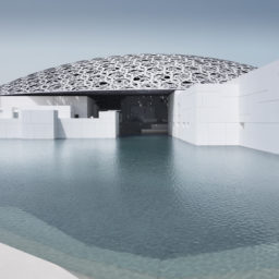
The forthcoming Louvre Abu Dhabi, apparently intent on setting itself apart from its Parisian sister museum—the world’s most visited—has unveiled a sleek, modern logo by Studio Philippe Apeloig to represent its Jean Nouvel-designed building on Saadiyat Island. The resulting graphic, a horizontal black bar traversed by straight and diagonal white lines—or, in its alternate version (below), a horizontal white bar traversed by straight and diagonal black lines—is… interesting? Or, rather, remarkably uninteresting.
“Jean Nouvel already had very precise ideas of what he wanted for the museum signage—that it should have a monumental scale to reflect the idea of luminosity,” Apeloig tells designboom. “So with these starting points, I set about understanding the architectural vision and finding graphic solutions that met all the expectations.”
We’ll chalk it up to Nouvel’s expectations that the logo turned out so bland, although the graphic above illustrating how the white lines are shaped by the letters in the museum’s name helps a little.
The new Louvre Abu Dhabi logo by Studio Philippe Apeloig.
Via designboom.
“For the logo I chose to symbolize the building’s spiritual dimension and to recreate its very particular micro-system and climate,” Apeloig explains. “The challenge was to evoke the mysterious whiteness and lightness of this exceptional space, and to take into account the area’s extreme heat. The flat outline of the design alludes abstractly to the horizontality of the architecture, echoed and reinforced by the waterline. A thick, straight line perforated with hatchwork creates a series of hyphens of different widths that scatter in different directions, embodying not only the dynamic link between world cultures but illustrating and giving form to the kinetic effects of light. This concept, in turn, provided the foundation for the pictographic system. The logo consists not only of the broken line but a line of Arabic script. The two are meant to be read non-hierarchically.”
The Louvre Abu Dhabi is scheduled to open next year.

Related Articles
-