Art & Exhibitions
The Other Side of Rothko: 5 Intimate, Must-See ‘Paintings on Paper’
"Mark Rothko: Paintings on Paper" at The National Gallery of Art in Washington, D.C spotlights the abstract expressionist's lesser known works on paper.
"Mark Rothko: Paintings on Paper" at The National Gallery of Art in Washington, D.C spotlights the abstract expressionist's lesser known works on paper.
Jo Lawson-Tancred
 ShareShare This Article
2023 has been the year of Mark Rothko. He is currently the subject of a landmark exhibition in Paris, which includes an impressive 115 paintings that redefines the celebrated Abstract Expressionist’s oeuvre. For anyone stateside who is experiencing FOMO, however, the smaller “Mark Rothko: Paintings on Paper” has opened at the National Gallery of Art in Washington, D.C. It’s also a revelatory show, albeit less grandiose than the Paris survey.
Though Rothko is most often associated with majestic canvases, these more intimate paintings, which the artist regarded as finished works in their own right rather than preliminary sketches, reveal a new side to his practice. Alongside his archetypal, hazy fields of color from the 1950s and 1960s, visitors can see figurative works from the 1930s and semi-surreal experimental constructions from the 1940s. In some of these early paintings, soft swathes and unfurling pools of watercolor pigment sit flat on the surface of the construction paper, foreshadowing Rothko’s later anti-illusionistic style.
The exhibition runs through March 31, 2024 and will travel to the National Museum of Art, Architecture and Design in Norway next year. Adam Greenhalgh, the associate curator at the National Gallery of Art in Washington, spoke with us about six paintings on paper that evince Rothko’s journey towards abstraction, never losing sight of painting’s richly expressive potential.
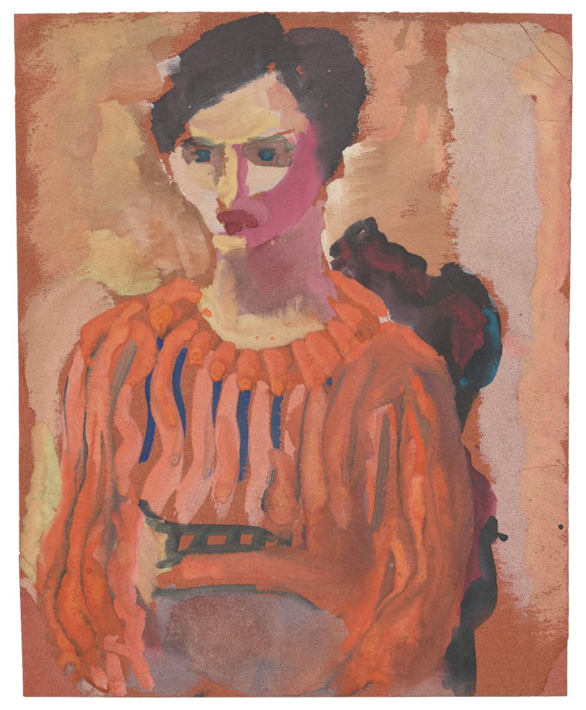
Mark Rothko, Untitled (seated woman in striped blouse) (1933-34). Photo: © 2023 Kate Rothko Prizel and Christopher Rothko.
Adam Greenhalgh: “To supplement his meager income during the 1930s, Rothko taught children’s art classes at the Center Academy of the Brooklyn Jewish Center. He took the job seriously, encouraging students to prioritize self-expression over technical skill. He also practiced what he preached, painting quickly and intuitively, delighting in the fluidity and translucence of water-based paints. In this portrait, pools of paint are offset by untouched construction paper, a material also used by Rothko’s young students. Watercolor billows in currents around the woman’s head, beneath her chin, and at the base of her neck, conveying a forceful personality.
This work illustrates how Rothko took advantage of the often-unpredictable results produced by such a liquid paint. And demonstrates his admiration for portraiture of the past, which he praised for its ‘eternal interest in the human figure, character, and emotions—in short, in the human drama.’ It also hints at the facile technique and expressive content of his mature works to come.”
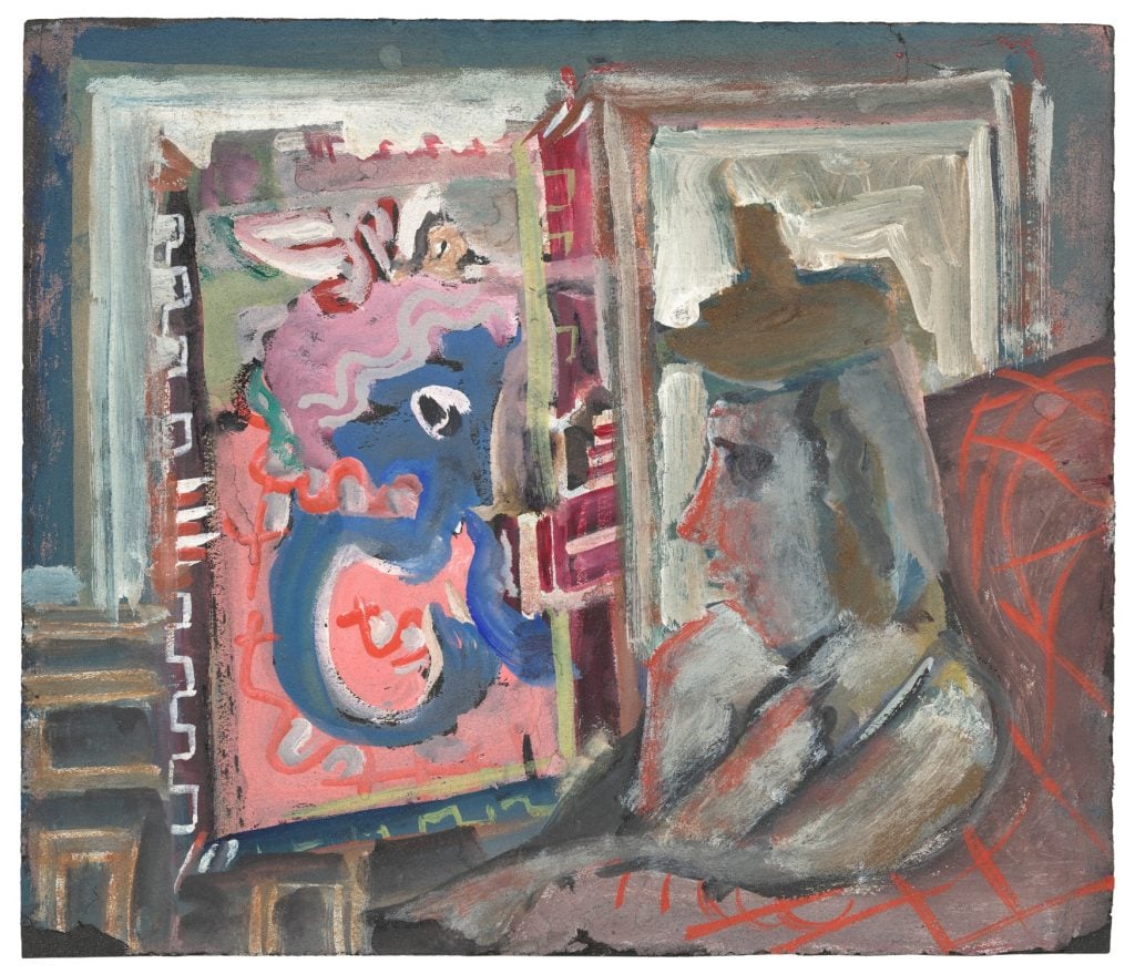
Mark Rothko, Untitled (seated figure in interior) (c. 1938). Photo: © 2023 Kate Rothko Prizel and Christopher Rothko.
Adam Greenhalgh: “Rothko was always concerned with the relationship between an artwork and its viewer. In this watercolor, a figure sits before an easel painting of a blue-skinned, pink-haired alter ego. The latter beckons invitingly with a curved blue hook of an arm. Bubblegum pink reflects onto the viewer’s face, tinting it. The pair stare at each other intensely, locked in silent communion.
Throughout his entire career, Rothko sought to foster engaging and potentially transformative encounters between viewers and paintings. This watercolor encapsulates the kind of viewing experience Rothko hoped to cultivate with an attentive and committed viewer.”
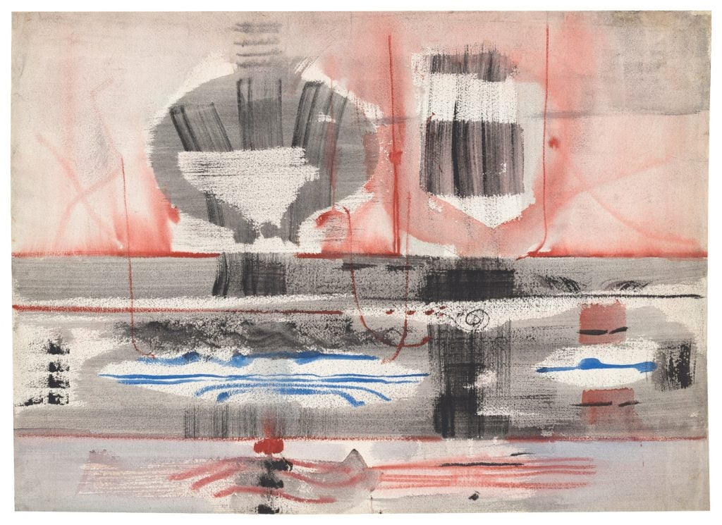
Mark Rothko, Omen (1946). Photo: © 2023 Kate Rothko Prizel and Christopher Rothko.
Adam Greenhalgh: “In the 1940s, Rothko looked to the past for a symbolic language that could address what he saw as the tragic nature of human experience. He found subjects in mythology, ancient art, archaeology, religion, and natural history, and stylistic inspiration in the work of European surrealists like Joan Miró and Yves Tanguy, who aimed to visualize the unconscious mind. Omen, with its cruciform composition, echoes 17th-century paintings that show Jesus Christ being taken down from the cross after his death. The suggestion of a figure at right, with upstretched arms and dangling legs, evokes a lifeless body.
Rothko felt that tragic biblical subjects of intense communal grief were emotionally relevant to his own time, as the world grappled with the brutality and terror of events like World War II and the Holocaust. Omen, with its pale, near monochrome palette, soft hazy appearance, and emotionally resonant subject, conveys in a powerfully moving manner, what Rothko saw as the essentially tragic nature of human experience.”
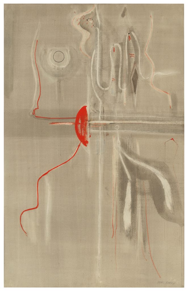
Mark Rothko, Untitled (c. 1948). Photo: © 2023 Kate Rothko Prizel and Christopher Rothko.
Adam Greenhalgh: “In 1947 Rothko declared that the “familiar identity of things has to be pulverized.” His mid-1940s symbolic motifs and linear compositions dissolved into hazy shapes and swirling backgrounds. This watercolor exemplifies a transitional period where Rothko is on the brink of developing his classic format. Squiggles and glyphs hint at a half-length figure—torso, shoulders, and head—emerging from a colorful soup, like a final echo of earlier figurative work.
Out of quasi-abstractions like this emerged the rectangular blocks and horizontal bands that came to characterize his art from 1949 onward. Rothko adapted the thin washes and dilute glazes of watercolor paintings like this one to the canvases that would dominate his output for the final years of the decade.”
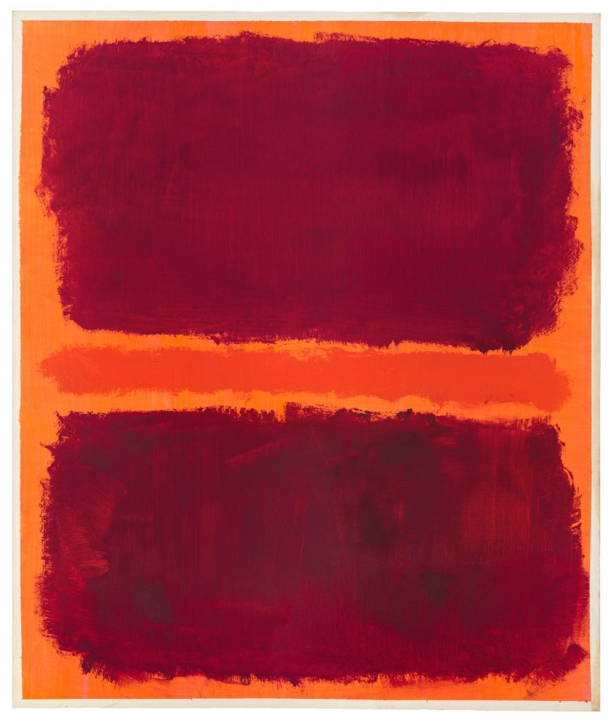
Mark Rothko, Untitled (1969). Photo: © 2023 Kate Rothko Prizel and Christopher Rothko.
Adam Greenhalgh: “Despite being, by all accounts, unwell and depressed following a near fatal aortic aneurysm in 1968, Rothko, somewhat surprisingly, made hundreds of paintings on paper in the final two years of his life. They vary greatly in composition, palette, and effect, from fiery and explosive to placid and caliginous. Many, like this one, display a startling vigor and vitality, erupting with volcanic energies and compositional tension.
Rothko once said: “You think my paintings are calm, like windows in some cathedral? You should look again. I’m the most violent of all the American painters. Behind those colors there hides the final cataclysm.”
In late paintings on paper, amplification is the name of the game—in scale, in the energy and force of paint handling, and in the immediacy, intensity, and potency of the colors. This large orange and crimson painting is exemplary. He worked energetically with a large brush, streaking and smearing the paint across the paper. His powerful gestures are recorded in the quick-drying acrylic paint. Rothko began this work with a thin base layer of pink ink, which makes the orange background almost blindingly phosphorescent.”
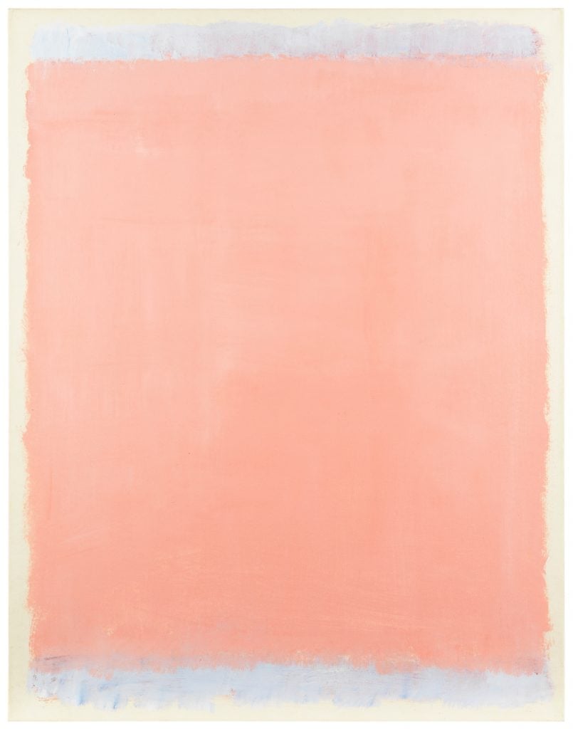
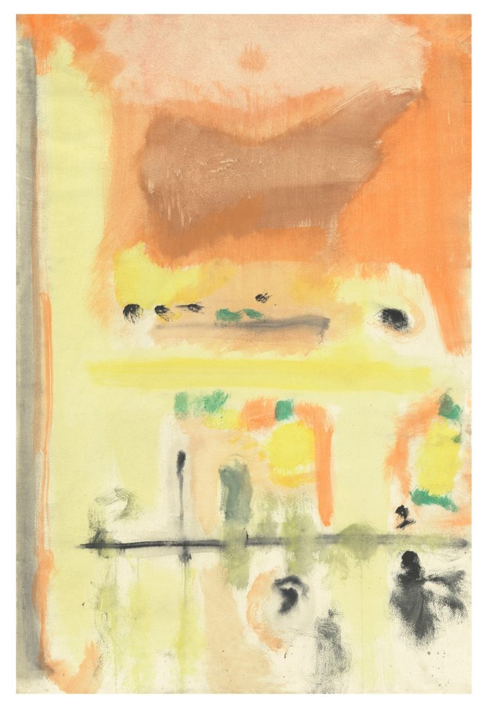
Mark Rothko, Untitled (1969). Photo: © 2023 Kate Rothko Prizel and Christopher Rothko.
Adam Greenhalgh: “Rothko’s late paintings on canvas trend dark—blacks, purples, maroons. After he died by suicide on February 25, 1970, the dark palette of these works became associated with his death—a link that persisted.
But, in the final months of his life, he produced a lesser-known suite of ethereal paintings on paper with soft, cloudlike edges surrounded by margins of pale paper. These late works, including this radiant pink painting, undermines any simple association between dark palette and mental or physical health. It is intriguing to speculate where Rothko might have taken his work after this startling painting.”