Art & Exhibitions
At the Met Breuer, Titian Skins Art Alive
THE DAILY PIC: The Met's 'Unfinished' is blurred, but Titian stays sharp.

THE DAILY PIC: The Met's 'Unfinished' is blurred, but Titian stays sharp.

Blake Gopnik


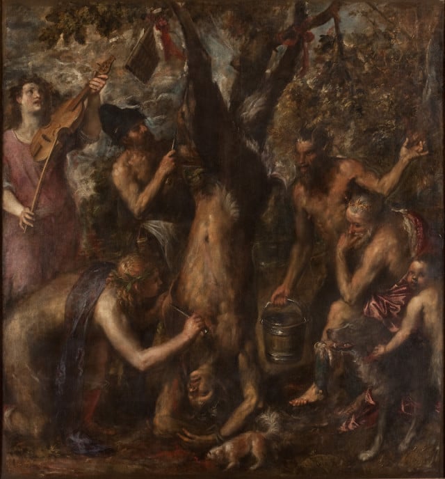
THE DAILY PIC (#1555): This is Titian’s canvas of the Flaying of Marsyas, a great treasure of Western art that’s normally hidden away in a museum in a far corner of the Czech Republic. Right now, however, it has made the risky trip to New York as the centerpiece – the mascot, almost – of “Unfinished: Thoughts Left Visible,” the first show at the new Breuer outpost of the Metropolitan Museum. Despite the glories of that piece, and of many others gems in the exhibition, every time I’ve spoken about the show with a serious art historian, I’ve gotten an earful. The premise of the show, they say, is incoherent and of no scholarly use: It confuses works that were unfinished by accident (and – surprise, surprise – have an unfinished look), with works that deliberately cultivated the style known as non-finito, and also with much later, modern works that might look crude but are all about issues that have nothing to do with “finished-ness”.
For a museum that in theory is even more dedicated than most to putting art in its historical context – its holdings from Egypt or Ancient Rome could as easily be in a history museum – the Met’s first Breuer show is notably anti-historical, almost totally disregarding what original viewers might have thought about what finish means. It is guilty of the great art-historical sin of pseudomorphism: Grouping things together according to their surface look rather than for what they were originally intended to talk about.
Is this what happens when the Met sets out to embrace modern art, which is what its Breuer outpost is meant to achieve? The show might as well have been mounted in 1950, when a new crop of formalist curators treated every work from the past as a found object, to be understood and appreciated for how it spoke to modern issues of style – for instance, to the modern taste for crude, “unfinished” surfaces.
These complaints are all cogent, but they may not be totally fair. (And they don’t apply to the show’s thoughtful catalog.) The thing to understand about the Breuer exhibition is that it really isn’t an exhibition at all: It is a display of the Met’s permanent collection, beefed up with a few fancy loans, which happens to have been arranged around a vague and desultory theme. That has become the norm these days as museums feel compelled to “exhibitionize” their holdings to please exhibition-addicted visitors. And the great thing about permanent collections is that they aren’t really structured to increase our knowledge of the works on view, the way scholarly shows are; collection displays are structured to let you do whatever looking and learning you feel you want to do, according to your own tastes and ideas and criteria. A great permanent collection is like a great library: It may be arranged with certain works next to others, for organization’s sake, but it never tells you what or how to read, and leaves you mostly alone to trawl its treasures.
For a truly fair take on “Unfinished,” you have to ignore its jumble of non-ideas about completion and instead take in single works on their own terms, and on your own terms, and see what they seem to be saying. That’s what the Daily Pic will be doing for this entire week as it “borrows” five works from the Met show, and tries to give them a read.
Today, for instance, I’m struck by how Titian’s Marsyas, from the 1570s, is indeed all about the issues of paint and its processes that are at the heart of the Met Breuer display. But I’d say that this isn’t only or even mainly visible in the painting’s brushy surfaces, which are the product of the non-finito style that Titian invented almost single-handed. It’s also there in the painting’s subject matter. Apollo, patron of all creativity, flays the living body of Marsyas, the arrogant satyr who challenged him to a musical duel, and in so doing he turns the bleeding flesh into a painting in Titian’s new style. Crop out everything except Marsyas’s flayed chest, deprived by Apollo of every feature right down to its nipples, and you get a pure sample of Titian’s brushwork. That chest has not become an abstraction – that would be the 1950s, pseudomorphous take on the passage – because abstraction was not yet a term in the language of art. But it is about the structural premises that underlie Titian’s new language of figuration.
It’s as though Apollo, in flaying his opponent, has also pulled back the skin of standard figurative paint that sits atop most pictures, to reveal a deeper truth that Titian has found underneath.
This skinning is important because the rival, Florentine art movement at the time was all about accurate human anatomy, as revealed in the fine detail of realistic drawing – called disegno, in opposition to the Venetian art of colorismo. So it’s no accident that Titian mounts his opposition to disegno by giving us a figure with its skin removed, as if on a Florentine anatomist’s table, only to show that colorismo – the bleeding, fleshy truth of humanity – is what you get when you go beneath the surface. Titian’s most complete statement of the art of non-finito, in a painting whose mythological subject is explicitly about art’s challenges, presents non-finito as the removal of finish, with the artist as a kind of refinisher, stripping off excess paint to get at a deeper, truer beauty.
The result of this for poor Marsyas is that he dies. Titian, well into his 80s when he made this picture, may be showing the price he is about to pay for a lifetime spent stripping things down.
For a full survey of past Daily Pics visit blakegopnik.com/archive.