Art World
Design Aficionados Make ‘Improvements’ to New Metropolitan Museum of Art Logo
The Internet comes to the Met's aid. Sort of.

The Internet comes to the Met's aid. Sort of.
Sarah Cascone
 ShareShare This Article
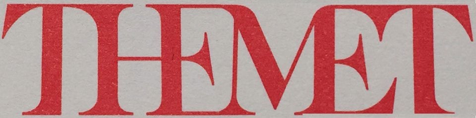
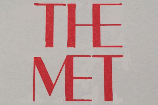
Could you do better than global branding firm Wolff Olins in designing a new logo for Metropolitan Museum of Art?
A number of social media users, critical of the institution’s new serif-heavy design and its prominent use of the definite article, seem to think so, and have begun sharing their “improvements” to the controversial new logo, which Justin Davidson introduced in a scathing New York magazine article on Wednesday.
Cortney Skinner’s take on the Met’s new logo.
Photo: Cortney Skinner, via Facebook.
Some played up the tight, squished up nature of the new design. For instance, Jacky Colliss Harvey said his friend Cortney Skinner thought the museum “wimped out with the job halfway done.”
“Onomatopoeically, it’s the sound made by common sense being gagged,” wrote Harvey on Facebook of the even more cramped design.
Others were even more blunt: “The Metropolitan Museum of Art’s new logo is basically the Human Centipede of branding,” wrote illustrator and designer Steve Cup on Twitter, while Mindy Diane Feldman described it as “an operational definition of ‘a camel is a horse designed by a committee,'” and Lisa Rubinelli tweeted: “There is a distinct difference between daring and sloppy.”
Giovanni Garcia-Fenech’s take on the Met’s new logo.
Photo: Giovanni Garcia-Fenech, via Facebook.
Some contributors were well-intentioned, however. “Maybe this is more simple,” Jeff Ibbo wrote of his effort, which eliminated the aggressive serifs that Davidson characterized as “stylized ax blades.”
(Losing serifs, of course, would probably not be a popular decision either. When Google did so to its own logo in September, the New Yorker‘s Sarah Larson blasted the new, childlike letter forms, saying “we have an insipid ‘G,’ an owl-eyed ‘oo,’ a schoolroom ‘g,’ a ho-hum ‘l,’ and a demented, showboating ‘e.'”)
Jeff Ibbor’s take on the Met’s new logo.
Photo: Jeff Ibbor, via Facebook.
Amid the uproar, perhaps inevitably, the question arose: how new was this new logo anyway? “Why is everyone talking about the new @metmuseum logo today, it’s been around since August?” tweeted a confused Erik C. Nelson.
Regardless of when the logo was unofficially unveiled (perhaps the museum is going for a soft opening, so to speak?), the Internet is officially having a field day.
Maybe @metmuseum wants to rebrand entire city with bad logo, starting w baseball @JDavidsonNYC @vulture pic.twitter.com/lRSEMquKV5
— David Herman (@DHermanStudio) February 18, 2016
The actual rollout of the new design is to take place March 1.
UPDATE: The New York Times reports that the Met has issued the following statement about their new logo, which will be used at all of the institution’s locations.
The new logo no longer relies on symbols and, instead, is based on the commonly used name “The Met,” which has an immediacy that speaks to all audiences. It is an original drawing, a hybrid that combines and connects serif and sans serif, classical and modern letterforms. In this respect, it reflects the scope of the Museum’s collection and the connections that exist within it. There may be debate about the logo because it involves change, but the museum chose it because it represents something simple, bold, and indisputable: The Met is here for everyone.
Wolff Olins strategy director Amy Lee told the Wall Street Journal that the company was not afraid of creating “work that people feel strongly about” and that “the project is about far more than just a logo—it is about expanding the reach and relevance of the Met.”