Pop Culture
How MF DOOM Redefined Hip-Hop Album Art Forever
Jason Jägel’s intricate painting for the iconic album is reimagined for its 20th anniversary.
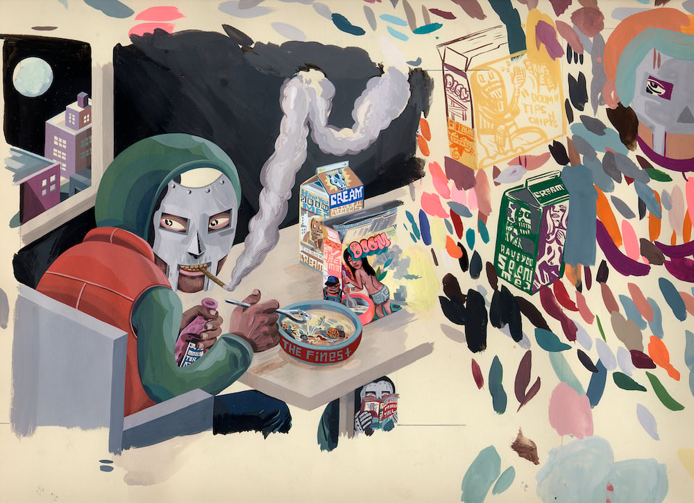
British-American rapper MF DOOM’s landmark album MM..FOOD was released 20 years ago, at what was not only a moment of change for the world of underground hip-hop and its relationship with the mainstream, but also a turning point for hip-hop album art. MM..FOOD notably features an intricate painting by San Francisco-based artist Jason Jägel. The artwork provided fans an enigmatic and colorful look into the world of DOOM, who was born Daniel Dumile in 1971 and died in 2020 from an adverse reaction to blood pressure medication.
Up until the early 2000s, rap album covers were mostly adorned with photography, or innovative photo collages. Though albums like Snoop Dogg’s Doggystyle (1993) and GZA’s Liquid Swords (1995) featured crafty illustrations, MM..FOOD marked a turning point with a commissioned painting, as indie rap became more of a part of the mainstream consciousness.
In his 2004 Pitchfork review, Nick Sylvester wrote that MM..FOOD was “an attempt to make good on Doom’s almost fascist conceit to restore rap’s golden age despite its loss of innocence.” The record’s music, like its artwork, sought clues in the past, while looking forward to see what might be next for hip-hop. For the 20th anniversary re-release, the label Rhymesayers enlisted San José–based illustrator Sam Rodriguez to create entirely new artwork to complement Jägel’s original piece.
Artnet spoke with both Jägel and Rodriguez about the artwork for the original release of MM..FOOD, its re-release and how both works fit into MF DOOM’s legacy.
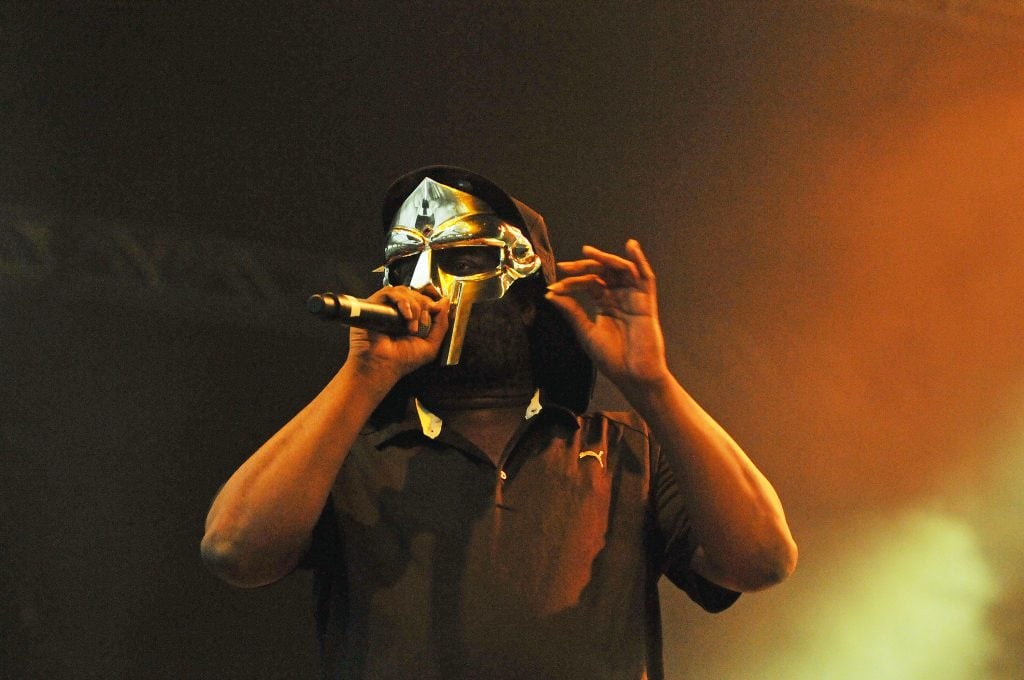
MF DOOM performs at Alexandra Palace in London, on July 23, 2011. Photo: Jim Dyson/Redferns/Getty Images.
Hearing you speak previously about color is intriguing and I think it’s something we take for granted. I think your approach to color is a special thing.
Jason Jägel: It’s a practice. I don’t know what my relationship was to color. My dad John Weir Jägel was red-green colorblind. He was a painter. He taught color theory, and studied with Josef Albers, the guy who wrote the book on color [Interaction of Color, 1963].
I grew up in my dad’s studio. I’d watch him pick up tubes of oil paint and read the labels to figure out what color he was using. He used color in a pretty experimental, interesting and dramatic way. He and his classmate Robert Slutzky designed the cover for John Colrane’s Olé Coltrane, which is a palette work masterpiece. It’s this minimal medley of oblique hues and tertiary hues, which is pretty incredible.
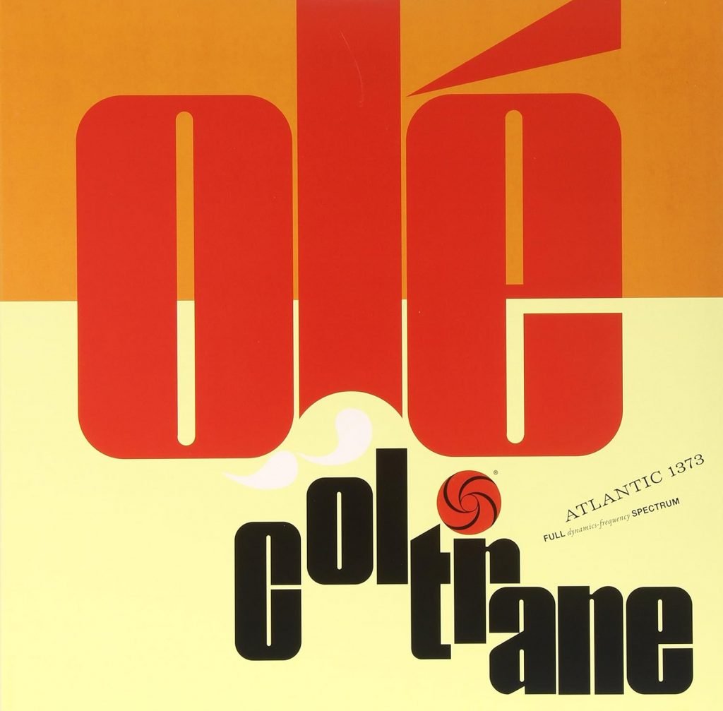
Jägel & Slutzky, artwork for John Coltrane’s Olé Coltrane, 1961. Photo: Atlantic Records.
I didn’t know that, so cool that’s in your family’s history.
JJ: Yeah, I mean, what a coincidence, two painters who happened to make what are regarded as iconic album covers.
How did you get in contact with MF DOOM to create the MM..FOOD album art?
JJ: DOOM got in touch with Jeff Jank, then art director of Stones Throw Records, for help with his album art. Jeff got in touch with me, and it’s great that Jeff thought of me for the project. Jeff and I had become friends because of my interest in Madlib as an artist and me reaching out to Stones Throw, the label he was working with at the time.
There was no guarantee, there was no contract. There was no payment stipulated, there was no guarantee that anything I made would be used. I just made a painting entirely on my own, based on my own art practice and my own vision of DOOM, being that I was a pretty obsessive DOOM fan for the three years prior to making this piece. I was in graduate school in Stanford at the time and when I started [grad school] in 2000, it was right around when I discovered Madlib and MF DOOM. Their works made a big impression on me.
DOOM especially, both of them used multiple aliases and obfuscated their authorship, which is something that the artist Chris Ware did with Acme Novelty Library in a way that was really profound to me back when I was an undergraduate art student in 1990 at CCA [California College of the Arts] in Oakland. This project of creating aliases and fictional worlds in order to express something very deep and personal, autobiographical really, is something that I’m apparently really drawn towards and I believe manifests in my own work.
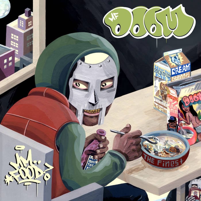
Jason Jägel’s final artwork for MF DOOM’s MM..FOOD album. Photo: Stones Throw
This was 2004. I imagine sharing drafts and going back and forth was a very different process at the time.
JJ: There was none of that. There were no drafts. Like I said, I made the painting on my own. Basically what I envisioned this album cover should be. Jeff had sent me a CD-R of the album in demo form, and I had it on continuously and I made one pencil sketch and then I made the painting.
DOOM and [DOOM’s wife] Jasmine liked the painting and they asked me to do a back cover at that point. I had one phone conversation with DOOM where he was interested in the back cover referencing the middle section of MM..FOOD. He wanted somebody depicted tied up and those were the only requests that he made. There was no review process, no editorial process for the work itself or the back cover either. I just made the painting and they accepted it. Then after that they asked me to do the single art for “Hoe Cakes.” Again, there was no editorial process.
After seeing my cover painting for MM..FOOD, I would guess DOOM is the type of person who would rather place their trust in an artist doing their best work, rather than trying to muck about in their process. I think most artists do understand that you’re better served letting an artist do their work, which is a solo job. It’s really corporations and committees that tend to want to muck about in people’s artistic process, and I would say it’s almost universally detrimental to the work itself.
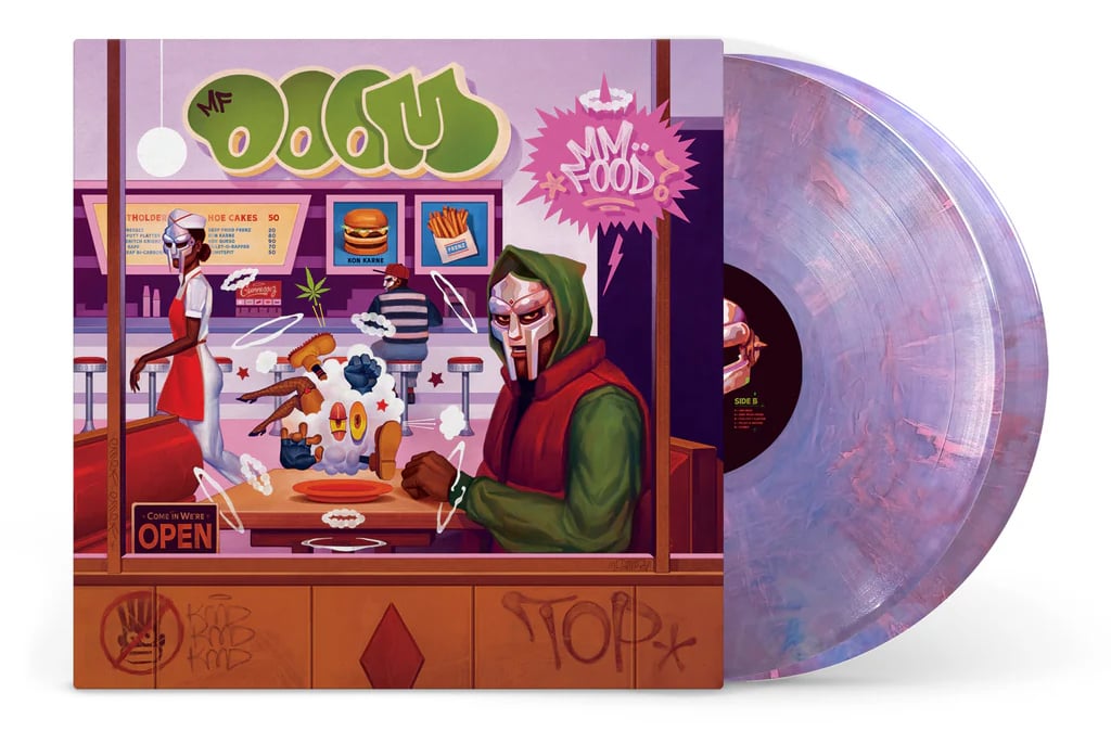
Sam Rodriguez’s front artwork for MF DOOM’s MM..FOOD (20th Anniversary Edition). Photo: Rhymesayers
Twenty years later, how did you want to pay tribute to Jason Jägel’s original artwork, yet make it your own?
Sam Rodriguez: I wasn’t in contact with Jägel [through the process], but love the work he made on the original. Rhymesayers explained that I did not have to riff off of his work. I wanted it to feel consistent with the OG cover, so I referenced Jägel’s color palette, the cook on “Hoe Cakes” and [kept] MF DOOM sitting at a table. The rest was mainly inspired by MM..FOOD’s lyrics and beats. I see my role in it all as being a conduit, helping to celebrate the artistry of MF DOOM.
MM..FOOD is an album that has taken on a life of its own with the Internet. On Reddit, etc. there are so many tributes to your painting and it’s been analyzed so many times. Can you speak to this?
JJ: I can’t really digest it to be honest with you in some ways. I really want my work as an artist to be experienced and for it to connect to people. I want it to be meaningful and at the same it’s hard to really digest it when I hear that it does.
When I made the painting, I was pretty excited about it, to be honest with you. He was still sort of an underground artist, without question. In 2004, there wasn’t a lot of commentary from the underground hip-hop world about the artwork itself. I remember feeling disappointed. Artists often want to feel recognized, so it’s easy to feel unseen. It’s kind of mindblowing to me that it connects with so many people.
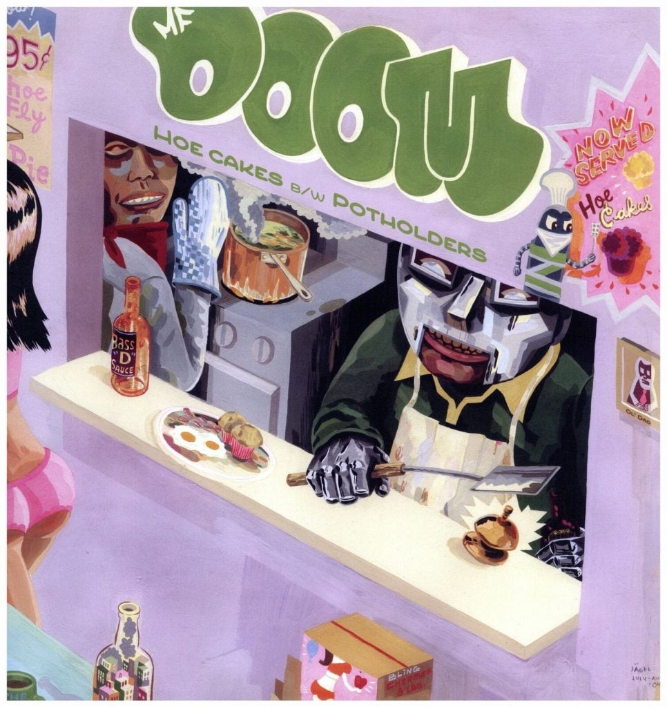
Jason Jägel’s album art for MF DOOM’s “Hoe Cakes” single. Photo: Stones Throw Records.
What is your opinion of Sam Rodriguez’s artwork for the album’s 20th anniversary re-release?
JJ: It’s beautiful. He did a great job. I like looking at what he did with that. I appreciate the fact that he was inspired by me in terms of all kinds of things, color and some of the costuming and certainly the setting and things like that, but I very very very much appreciate that he did not directly bootleg any of my work in any extravagant way. There’s a lot of people that have done that and I do really appreciate bootlegging. But I also really appreciate when people strive for their own distinct creativity.
How did you get in contact with Rhymesayers about doing artwork for the 20th anniversary of MM..FOOD? When was this?
SR: They reached out to me in Spring 2024 to gauge my interest in making the cover variant and of course I said, “Hell yes!”
How do you think your artwork and Jägel’s both work in relation with one another?
SR: I cannot speak for him, but he definitely created a distinct visual language for MM..FOOD. I think we’re both in a creative dialogue with MF DOOM’s music.
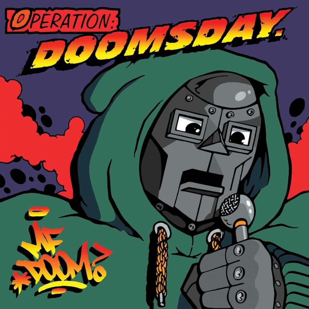
The original artwork for MF DOOM’s Operation: Doomsday. Photo: Fondle ‘Em Records
Up until 2024, hip-hop record covers mostly featured photos or photo collages. Along with DOOM’s original illustration for his first album, Operation: Doomsday, I feel that MM..FOOD influenced hip-hop artists to include more paintings as album art.
JJ: I’m aware of the fact that not only did DOOM change the world of music, he also created artists that wouldn’t have existed without him. He changed the sound, just as Madlib has changed the sound of music permanently and demonstrably.
My work for DOOM has changed the art world, or the world of hip-hop art. I’ve received a lot of messages from people saying that they were inspired by this piece. I’ve received dozens of versions of my cover that are done in photography and clay. Legos, marker. Done well, done “badly.” I say “badly” in quotation marks because I don’t believe in “badly” per se. I think that poorly executed bootlegs are masterpieces in their own right. I‘ve heard from people that I’ve inspired them to make the art that they make. It’s a way of creating your own work, but it’s also connected to the work of art that you admire. So when an artist does artwork that features musicians, it plays this kind of dual role of being the artists’ own work and being this form of connection, or perhaps tribute. I’m an anti-capitalist, so I believe in shared human creativity and I’m not so interested in the commodification of authorship.
During the process for the re-release, was Rhymesayers super hands-on, or did they let you do your own thing?
SR: They were very good to work with. Alex Everson is the art director, and he has a good eye for design/packaging and is a genuine human being who made the workflow very chill.
From what I remember they left it pretty open-ended. They just briefed me on the significance of the album and asked me to propose my take on a variant cover. I wasn’t sure what they were expecting, because my work was much different than the previous [album art].
For the initial sketches I proposed, the team was more or less hands off. Once they saw what I made, they seemed excited about the idea and helped to push it further by suggesting add-ons. I originally proposed the diner scene on the front cover only. I thought it would be an interesting way to approach MF DOOM’s food metaphors throughout the album. I drew compositional and aesthetic inspiration from Norman Rockwell and the show Mad Men. I thought it would be sort of humorous to approach it in that Rockwell-esque way with MF DOOM’s world. It made me think of The Twilight Zone, which always had a way of twisting our perceptions.
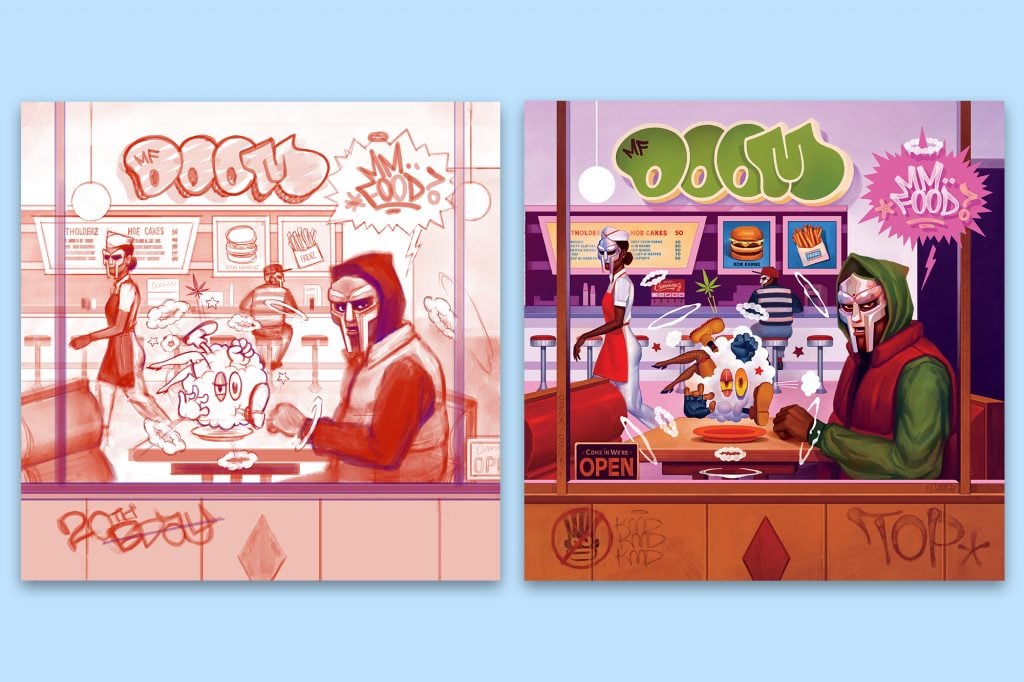
One of Sam Rodriguez’s initial sketches, left, and final artwork, right, for MF DOOM’s MM..FOOD (20th Anniversary Edition). Photo: Rhymesayers.
Can you talk a little about your workflow process with this project?
SR: [The label] was excited about the diner scene, so they suggested I expand this idea from the front to the back of the album cover. They asked if I could add some of his alter egos, which I did and after a few sketches of that they requested a portrait of him as Zev Love X, from when he was in his KMD days.
I thought that was a nice touch and a bit emotional. I felt like it would be him gesturing to us that he was going on a trip somewhere but things will be okay. That’s why you see him pictured with a suitcase. It was my idea to add a family. I didn’t want to lose that Rockwell-esque vibe, and it gave the cover more depth, like MF DOOM’s world has people in it. Souls, not caricatures or stereotypes, but definitely weirdos [laughs].
As for workflow, surprisingly Rhymesayers, DOOM’s estate and his wife Jas approved the concepts kind of quickly. The art director pointed that out, saying it was a first. There were a few iterations of the concept. The main edits were how to properly show his alter-egos. From there, it went smoothly and they did not require color roughs. Every day during the final was a mix of drinking coffee, illustrating, taking an exercise break, and illustrating again.
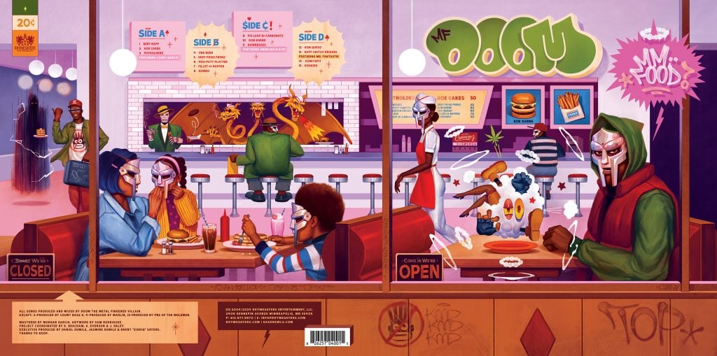
Sam Rodriguez’s complete back and front artwork for the MM..FOOD (20th Anniversary Edition). Photo: Rhymesayers.
How do you think your artwork for MM..FOOD speaks to DOOM’s legacy?
JJ: What’s cool about it is that I’m really not an album cover artist. I think it’s just one of those beautiful things about being an artist. To me it represents a kind of exquisite coincidence that DOOM’s project and my work ended up in conversation. Me having been such a rabid DOOM fan for three years prior, it was like I was studying up for that moment. Then on top of that, being a comic book kid in the ‘70s and ‘80s, being immersed in Marvel comics, being immersed in Jack Kirby.
I was born the same year as DOOM. I grew up on the East Coast like DOOM did. I saw Wild Style in the theater in 1983 when I was 12 years old. So when I heard Operation: Doomsday, I’m listening to it and hearing the way he sampled Wild Style and it speaks to me on a personal level. Or like, I grew up with Marvel Comics cartoons [particularly the Doctor Doom character], so hearing the sampled voices of those cartoons speaks to me in a very personal way. I was sort of uniquely prepared to personally embody the DOOM universe.
SR: I feel that it touched on the various stages in his career, referencing his past albums and identities. It celebrated his legacy in a fun way. I think this is to be determined, we’ll see if it actually reflected the album properly. Once a piece leaves my studio it’s up to the audience to interpret it. I tried my hardest.
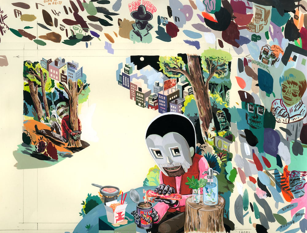
MF DOOM in artwork by Jägel. Photo: Courtesy Jason Jägel
To you, what is the relationship between musical artist, album art and fan?
SR: I think the energy is collaborative. It feels like creativity is at its peak when these come together. As an artist, we’re in one long conversation between what’s come before us and what’s in front of us—that’s our process. So something like this is very special because that process isn’t always on display and this whole project opens the curtains, exposing creativity for what it is: a collaborative effort amongst everyone.
What do you want people to take away from seeing your album art?
SR: That I put some respect on MF DOOM.
Is there anything else you’d like to say to the DOOM fans celebrating 20 years of MM..FOOD?
JJ: Keep it funky. I think that DOOM is this standardbearer for idiosyncrasy, for idiosyncratic artists and for eccentricity, and I think that’s just a beautiful artistic model and should inspire people to be unique, be unusual and most of all, be themselves.


