Art World
Pantone Is Going With an Old Classic for Its 2020 Color of the Year
Move over millennial pink, and make way for the color of the Democratic Party.

Move over millennial pink, and make way for the color of the Democratic Party.

Caroline Goldstein

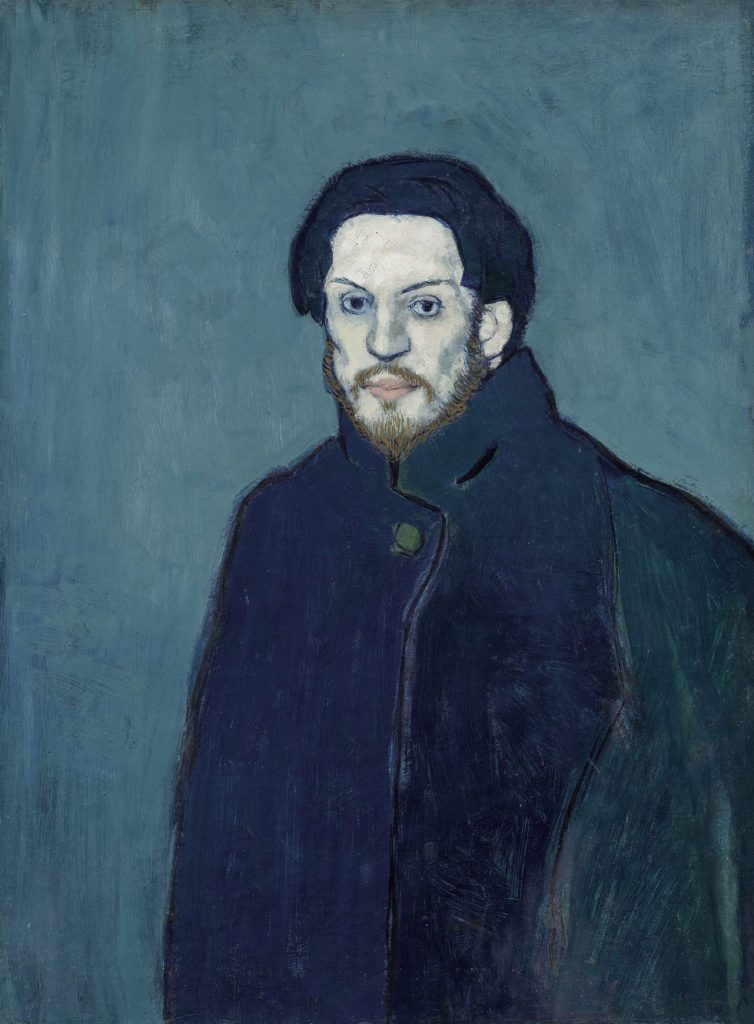
It’s the color of gentility, Pepsi cans, and a cloudless sky. It also happens to be the color of the Democratic party, Miles Davis’s most famous album, and a three-year period in Picasso’s career. But according to Pantone, the authoritative color experts, we’re not meant to read too much into those references.
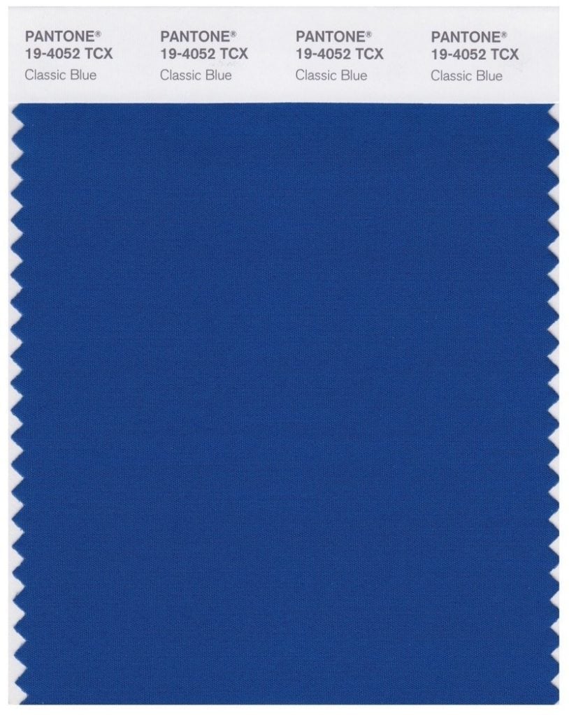
For the 21st Color of the Year, Pantone has picked classic blue, which, according to Leatrice Eiseman, the director of Pantone’s Color Institute, is a “solid and dependable hue we can always rely on. Classic blue encourages us to look beyond the obvious, to expand our thinking, [and to] increase our perspective and open the flow of communication.”
Perhaps one (ironic) reason we’ve been inhibited from such boundless, free-flowing communication is because of the rise of technology. Classic blue, as opposed to the promises of Facebook, denotes, as the company says, “honesty and the promise of protection.”
It may seem like a lot of pressure to put on one color. But it makes sense that Pantone would air on the side of caution after the backlash that followed last year’s announcement of “Living Coral” as the color of 2019. Living coral died very, very quickly.

Pantone’s Classic Blue #19-4052. Courtesy of Pantone.
The company has a history of choosing blues as colors of the year. In 2000, it was cerulean; in 2003, aqua sky. Two years later, it was blue turquoise, then blue Iris in 2008 and “serenity” (along with rose quartz) in 2016.
Another company chiming in is Shutterstock, which sells stock images and music and provides editing tools. In its recently released Color Trends 2020 report, which looks at what colors are cropping up more and more, it says the hottest colors are lush lava, aqua menthe, and—what else?—phantom blue.