Art World
Art Bites: Why People in Old Paintings Look So… Queasy
The age of these paintings have left some figures looking a little green.
.")
by
Verity Babbs
 Share This Article
Have you ever looked at an antique painting and wondered why everyone looks so green around the gills? Poor diet? Not hydrating enough? Did they just completely run out of Drunk Elephant? The answer has more to do with the artistic techniques of the time than bad skin care.
Underpainting—also known as “verdaccio”—helped Medieval and Renaissance artists achieve more natural-looking skin tones with a limited color palette. By painting one color over another, artists could achieve realistic halftones and depth. Green was the ideal color for underpainting beneath yellow or red paints, creating a balance between cool and warm tones. It’s no wonder that the technique is still used by artists today to create appealing contrast in their work and change the effects of their palette.
Terre verte—or “green earth”—is a green clay pigment found in Italy which has been used for underpainting since the days of ancient Rome. A gray-green base layer of terre verte was very popular during the Italian Renaissance, used for many frescos and altarpieces. A clear example of its use can be seen in London’s National Gallery, in the unfinished painting The Virgin and Child with Saint John and Angels (c. 1497) by Michelangelo.
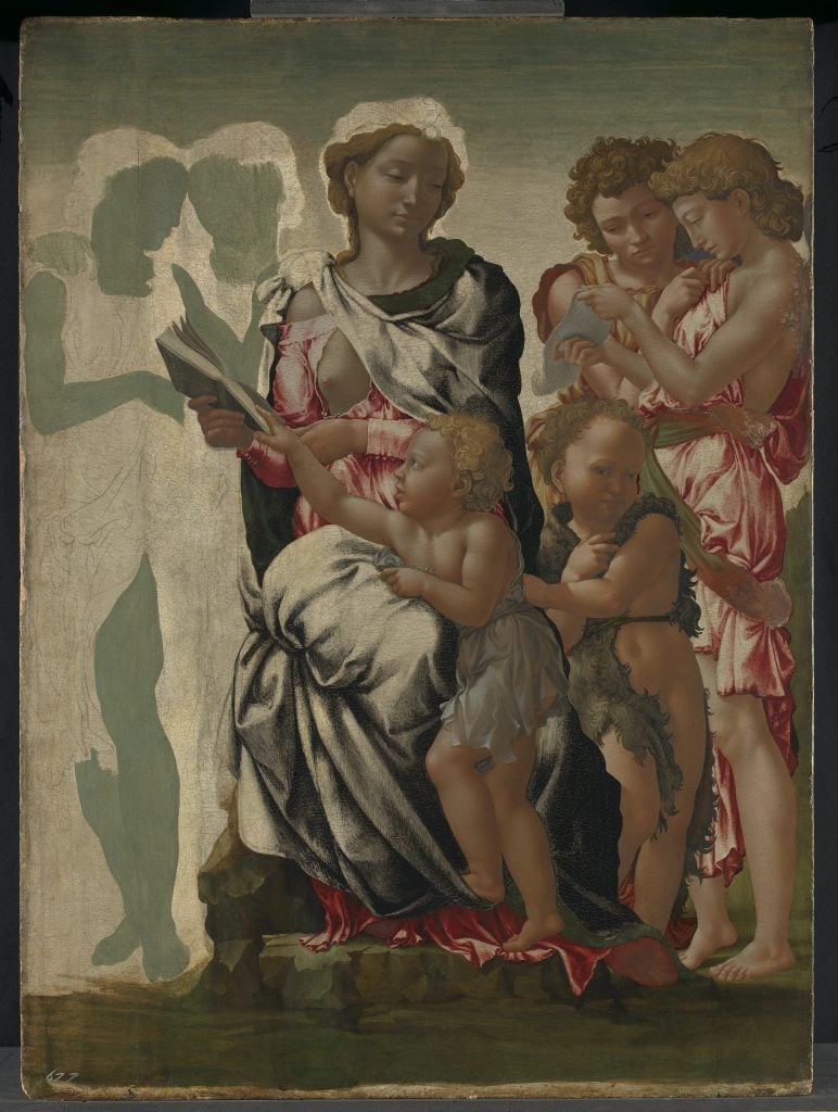
Michelangelo, The Virgin and Child with Saint John and Angels ‘The Manchester Madonna’ (ca. 1494) © The National Gallery, London
Verdigris, another bluish-green pigment made from the oxidation of copper plates, has also been used since ancient times, and eventually surpassed terra verte as the go-to material for underpainting.
The warmer hues added to people’s faces and bodies in portraits and figurative scenes were often applied as a thin, opaque glaze, made from crushed insects or plants, which have withstood the test of time considerably worse than the underpainting layer made from more durable minerals. So what happens as the top, more lively layers of paint have faded with age? Well, that green layer begins to show through, slowly making the once vibrant flesh tones appear more corpse-like.
Famous examples of figures left looking queasy include Duccio di Buoninsegna’s altarpiece Maestà (ca. 1311). Commissioned by the city of Siena, the large altarpiece is made up of several individual panels showing an enthroned Madonna and Child on the front and the stories of the lives of the Virgin Mary and Jesus on the reverse. Many of the attending saints that gather around the mother and baby are starting to turn a little green, but it is Mary herself who is looking the most nauseous.