On View
We Asked ‘Hope’ Artist Shepard Fairey to Break Down 6 Public-Health Posters to Explain What Works—and What Doesn’t
We spoke to the artist about campaigns from around the world.
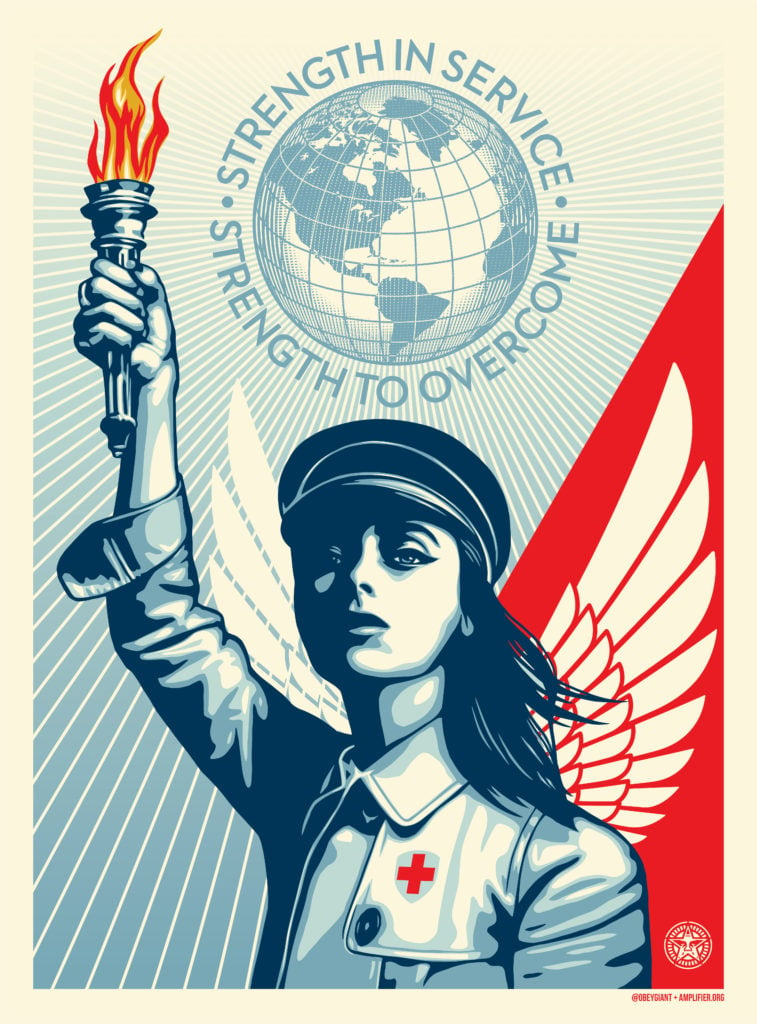
We spoke to the artist about campaigns from around the world.

Naomi Rea

Shepard Fairey, the street artist who made his name in the 1990s with his “Obey Giant” murals and stickers, became known worldwide 12 years ago when he designed the “Hope” poster for Barack Obama’s 2008 presidential campaign. (Eight years later, he designed a memorable series of feminist images, titled “We the People,” protesting Donald Trump’s election.)
Since then, Fairey has created works honoring healthcare workers and has collaborated with the design lab Amplifier, which has been commissioning artists to create public-health and safety messages as part of a COVID-19 campaign.
As part of the project, Fairey is selecting images for Amplifier’s image library, which also contains other posters aiming to raise awareness of grassroots movements.
The project “bypasses most of the gates that exist in the art and design world,” Fairey tells Artnet News, because it invites artists and designers from all background to contribute. The resulting images are also free for anyone to download.
But while posters have historically been important as messaging tools in times of crisis, not all campaigns are equally effective. “I’ve never felt that art by committee yielded great results,” Fairey tells Artnet News. He says that artists are better than bureaucrats at grasping what makes images effective.
“Breaking down what makes a good poster is not easy because there are a lot of variables,” Fairey says. But he appreciates images that “have enough personality to be memorable, but are simple enough to be very instantly legible.”
We asked Fairey to break down six COVID-19-related public-service campaigns to explain what works, and what doesn’t.
Rise Above Hate
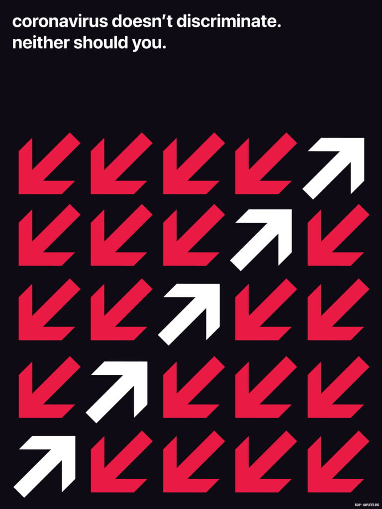
RSHP, Rise Above Hate (2020). Courtesy Amplifier.
Fairey: I think the symbols work, and the arrow of things moving in different directions is easy to understand. Overall, it has a graphic appeal, but I don’t think it has enough emotional appeal. Maybe the safety of not giving a particular identity to discrimination—who is the oppressor and who is being discriminated against—keeps it more neutral and open-ended. Still, I’m not sure it builds a bond with the viewer. But I like it graphically.
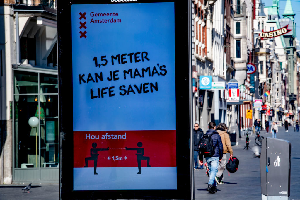
A sign from the city of Amsterdam that reads: 1.5 meters can save your mama’s life. Photo by Robin Utrecht/SOPA Images/LightRocket via Getty Images.
Fairey: I don’t think this is very effective because the type looks like it’s trying to feel cool and edgy, but it’s not that well executed. The international symbol-style people are sort of generic, and I don’t think anyone’s going to feel an emotional connection to it. I do like that it’s saying that moms’ lives are important. I wouldn’t be here without my mom.
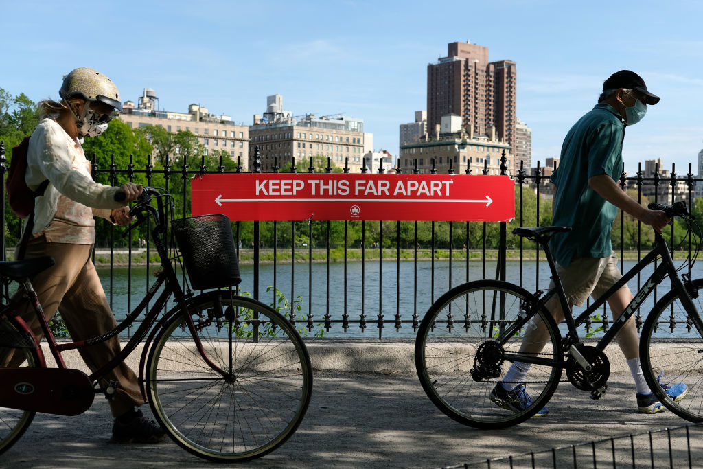
NYC Parks signage reading “Keep This Far Apart.” Photo by Dia Dipasupil/Getty Images.
Fairey: As far as giving an understanding of social distancing with a relatable object, it achieves that and little else.
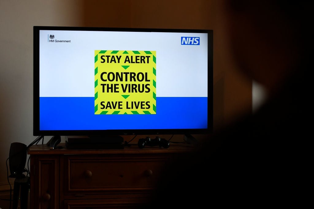
UK government’s new slogan “Stay Alert, Control the Virus, Save Lives.” Photo by George Wood/Getty Images.
Fairey: I like the intensity of the colors here and how quickly this one can be digested. I think the psychology of “control the virus” rather than “control yourself” sounds like you’re uniting against the enemy rather than conforming to some sort of paternalistic command. I think that’s effective. But once again, it’s a prompt, not something that you’re going to remember and revisit in your imagination.

Shyama Kuver, Solidarity (2020). Courtesy Amplifier.
Fairey: I think this is pretty effective because the art is nicely done. It’s a nice illustration. The candles have a lot of different cultural references that make it relatable to a lot of people in different ways. Whether it’s a religious service or a rock concert, the idea of unity with a candle, lighter, or cell phone is something that people can understand. This is effective both emotionally and in terms of the message.
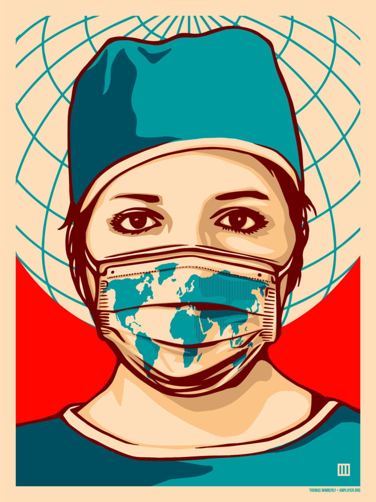
Thomas Wimberly, Global Forefront (2020). Courtesy Amplifier.
Fairey: This piece is effective in the color combination and the symbolism. The viewer meets the subject’s gaze, and [there is a sense of] implicit accountability to everyone in the world during this pandemic. I think this piece has all the winning ingredients. People frequently use imagery as a supplement to language, but some of the most effective works use language to supplement a message that is already understandable. Thomas Wimberly’s Forefront, with the globe behind the woman’s head and the protective mask with the continents on her face and with her direct gaze at the viewer, communicates the need for a global response to COVID-19 without needing text.