Art World
‘These Are Clothes for People Who Make Work’: Why One Sculptor Designed a Fashion Line Just for Artists
Anna Blessmann's monochromatic collection is inspired by both Donna Karan and industrial uniforms.
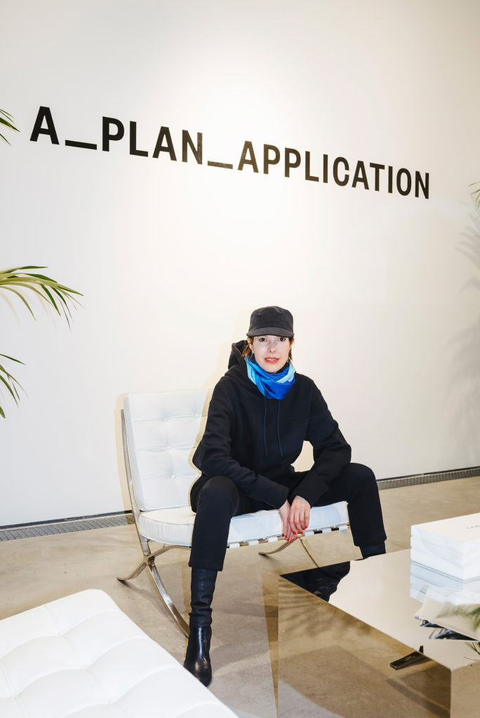
Anna Blessmann's monochromatic collection is inspired by both Donna Karan and industrial uniforms.

Dan Thawley

From Frida Kahlo to Andy Warhol, artists across decades have been celebrated for their unique senses of style. Consider Picasso’s signature striped shirts or Basquiat’s pairing of Armani suits with bare feet. But while flamboyance and idiosyncratic tastes have helped build the profiles of an eccentric few, most artists today would probably agree that good work should speak for itself.
Still, even painters and sculptors have to get dressed every morning before heading out to their studios, galleries, or openings. And for that, the London-based sculptor Anna Blessmann has decided to launch A_PLAN_APPLICATION, the first fashion line designed especially for artists (and other creatives).
Blessmann happened to discuss her idea over dinner with Virgil Abloh—the sometimes curator, founder of streetwear label Off White, and recently appointed designer of Louis Vuitton’s menswear—who referred her to the Milan-based fashion development firm New Guards Group. In September 2017, Blessmann signed on to develop a collection—a kind of unbranded artist uniform—with their production and distribution support, and in collaboration with her partner, the British graphic designer Peter Saville.
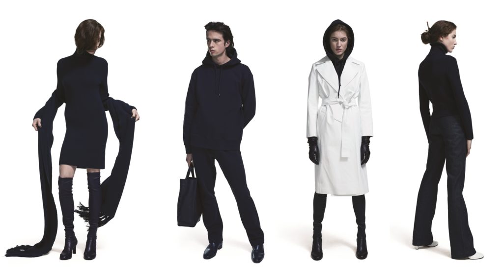
A_Plan_Application A/W 2018. Images courtesy of Anna Blessmann, A_Plan_Application.
In the press release, Blessmann refers to inspirations as diverse as Donna Karan’s 1980s staples, “Seven Easy Pieces,” and a window cleaner’s uniform. Her first designs include a fitted hoodie with shoulder pads, a boiler suit, and a wrapped coat dress. Seventy percent of the designs for the Autumn/Winter 2018 season are for women, 20 percent are unisex, and 10 percent are for men—but, as Blessmann says, “anyone can wear a dress if they want to.”
The overall concept is a careful jigsaw puzzle of pieces in sturdy jersey, wool, cotton drill, and denim that can be layered on top of one another. It elevates the frumpy “normcore” cliché of the contemporary artist’s wardrobe with the puritan rigor of a sculptor.
We spoke to Blessmann about her desire to make apparel functional and how fashion design is very different from sculpture.
What does the name “A_PLAN_APPLICATION” mean?
A_PLAN_APPLICATION explains the collection as a system, and how it can have multiple readings. For me it is important to think that once the pieces go out into the world, they are interpreted and worn by different people in different ways. I thought about “A,” as in number one, the beginning, and then a “Plan” as in, one of many plans, and then “Application”—the fact that the garments and the concept will then be applied differently by different people out of my control.
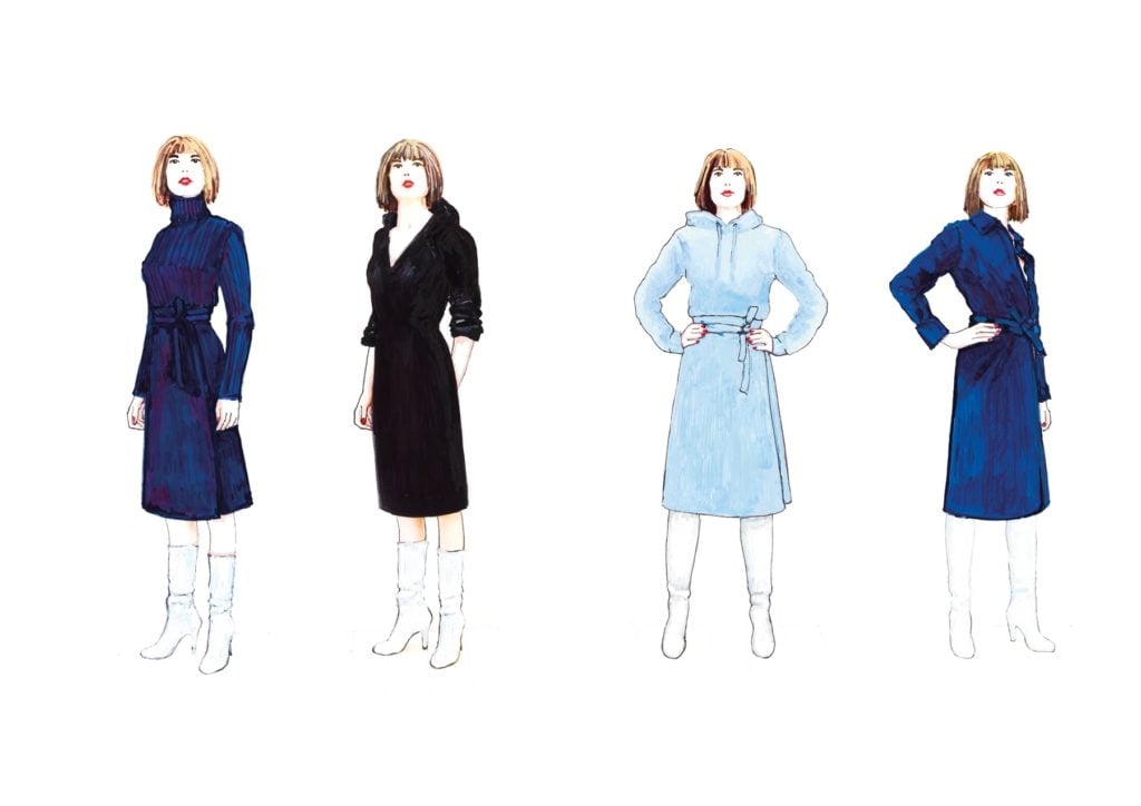
Sketches for A_Plan_Application A/W 2018. Courtesy of Anna Blessmann.
What made you turn from sculpture to clothing?
As an artist, if you look at what is out there in fashion, it is all very specific. It is somebody else’s idea, somebody else’s fantasy, their graphics, their logo. I wanted to find something to wear that was in some ways more neutral, that doesn’t project on you or beyond itself. Then I wanted to approach a specific functionality—the idea that the pieces fit together—so a t-shirt stops here, the jeans start there, the dress doesn’t stick out from below the coat. I wanted each piece to combine with the other parts.
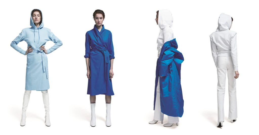
A_Plan_Application A/W 2018. Images courtesy of Anna Blessmann, A_Plan_Application.
Does this collection relate back to your sculpture practice at all?
I think that my experience as a sculptor and my awareness of the body in movement, how people move around my exhibitions, or even inside sculptures I have made, has informed the collection. But reality informs the collection as well—obviously color awareness, too. Also how to apply my image-making practice—or even anti-image-making—how to leave negative space, how to look at something and reduce it and reflect on it.
I also find it important to approach fashion as an outsider, and to actually make the distinction that although fashion and art have become much more linked, they are still so different. We look at similar things, we sometimes think about similar things, however the methods of production and distribution are still so different that there is very little correlation.
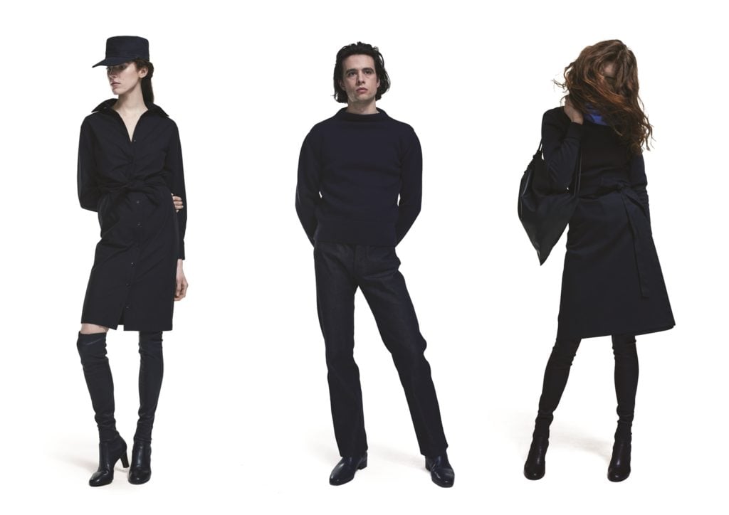
A_Plan_Application A/W 2018. Images courtesy of Anna Blessmann, A_Plan_Application.
Who do you want to make these clothes for?
It is for people who are visually aware, not just artists, but also architects and people in different creative professions. Fashion has really evolved into a 2D image world where so many things are considered from the outside, but I just don’t see how a lot of it can translate into people’s lives. These aren’t clothes for street-style photography and parties and red carpets. They are clothes for people who make work.
Are A_PLAN_APPLICATION pieces meant to get dirty?
Yes! Of course, we use really high-quality fabrics, and I try to use ecological materials where I can. It is not easy. I am confronted with realities that as an artist I had never thought about, like minimum quantities and price points. But I also think that clothing is very different from art—it is applied art. If it doesn’t fulfill the practical function, I would rather make a sculpture. I mean, what is the point of a pair of trousers that you can’t wash, that you can’t move easily in, that only looks good on a model in a photo. I was thinking about my day-to-day activities when I was making the collection. I want a pair of comfortable trousers that I can kneel in when I’m hammering something, and other physical activities within my practice, but then I can just change my shoes and wear them to a meeting or an opening.
In what ways did you work with Peter Saville on this first collection?
Peter made this computer glitch silk scarf. I was thinking about one of the most contemporary, present accidents and that was it—when something goes wrong on one of our screens. All the colors of the collection are in the scarf. The idea is that I don’t want to have any patterns or graphics, because that dates things immediately and makes it identifiable as from a particular time. I want to avoid that. But I like the idea of putting one aspect of the “now” in, and that it is just this one piece that doesn’t repeat, which in some way highlights the timelessness of the rest.
See more of A_PLAN_APPLICATION’s A/W collection below:
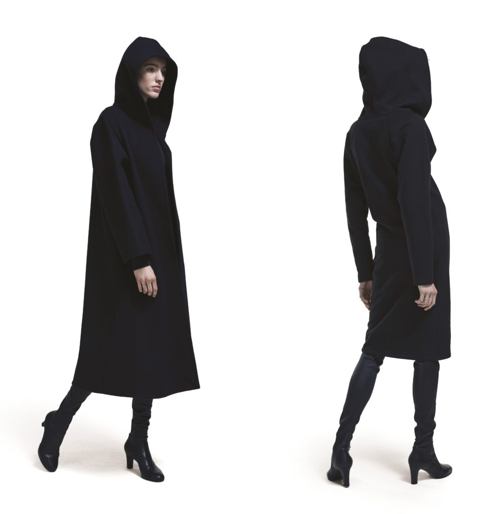
A_Plan_Application A/W 2018. Images courtesy of Anna Blessmann, A_Plan_Application.
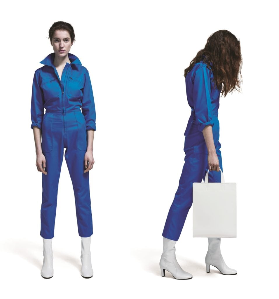
A_Plan_Application A/W 2018. Images courtesy of Anna Blessmann, A_Plan_Application.
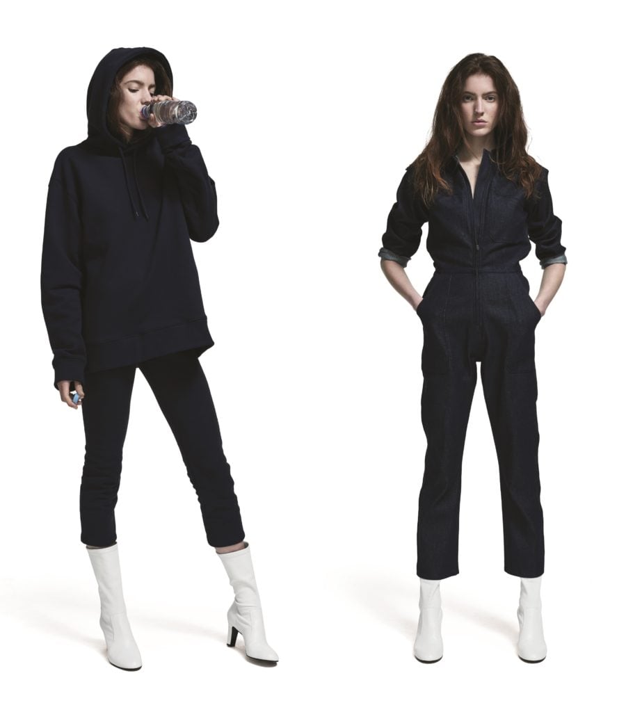
A_Plan_Application A/W 2018. Images courtesy of Anna Blessmann, A_Plan_Application.