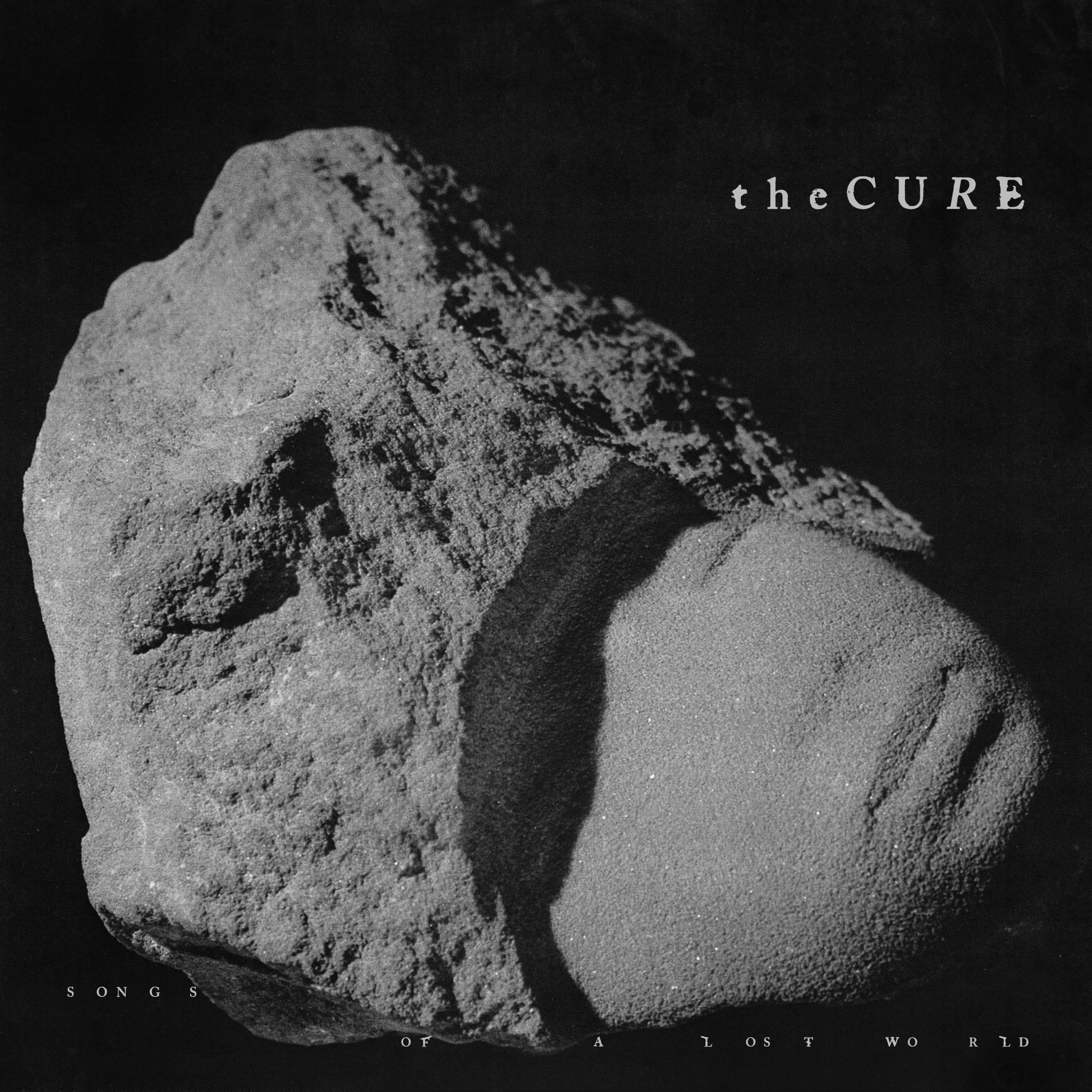
While making Songs of a Lost World, the Cure’s first album in 16 years, frontman Robert Smith decided to crack open an artist’s monograph he was previously gifted. Flipping through it, he was immediately drawn to an artwork. “I saw this head… emerging from rock,” he told NME. “There’s something about it.” His next thought? “That’s the album cover. It struck me.”
What captivated him was a sculpture titled Bagatelle, created by Slovenian artist Janez Pirnat. Over a career that spanned more than five decades, Pirnat reportedly sculpted some 2,000 works, a good bulk of which indeed feature faces materializing out of stone. The artist—who studied architecture and sculpture in the 1950s and exhibited extensively across Eastern Europe—did have a particular penchant for the material. “I’m a Stone Age man, a stonemason, in love with everything old, as old as possible,” he once reflected.
But in 2021, when Smith tried to contact Pirnat to use his sculpture for the forthcoming record, he learned the sculptor had died—on the same day, no less, that the musician discovered his work. “It was a very strange coincidence,” Smith added, “which cemented the idea that this has got to be the album cover.”
Robert Smith on stage at the Royal Arena in Oerestad in Copenhagen, 2022. Photo: Ida Marie Odgaard / Ritzau Scanpix / AFP via Getty Images.
Properly for a Cure outing, Lost World is a mood, and the mood is gothic. Its elegiac soundscapes, inspired by Smith’s own experiences of loss and grief, swell from the mournful to the monumental. In ways, Bagatelle hit those same notes, its artifactual form conjuring a poignancy as much as a far-off realm. The object’s enigmatic aura is further enhanced by its treatment by the U.K. band’s long-time cover artist Andy Vella, who collaborated with Smith on the cover art.
“My interpretation was to turn it into a solid thing. I pictured it floating in space, almost as a distant relic from a forgotten time; a buoyant force resisting any kind of gravity,” Vella told me about the sculpture over email. “We had the image of this head and wanted to take it somewhere else.”
More precisely, Vella took it to space. Working with his colleague Ben Parker at Arts University Bournemouth, the graphic designer placed the object amid a deep, dark space for the cover of Lost World. Using 3D mapping, the artwork was also digitally animated to appear as if it were a strange asteroid spinning across the cosmos—best seen on the band’s website and in its new lyric videos. On the sleeves for singles “Alone” and “A Fragile Thing,” the sculpture is overlaid with various weathered stone textures, in an unwitting tribute to Pirnat’s love for the ancient.
The Cure, “Alone” (2024). Photo courtesy of Andy Vella.
As a final touch, Vella created a custom typeface—a serif design with light smudging—to spell out the album title and the band’s name, effectively producing a new logo for the Cure. The font, he said, bears out “a slight classicism,” but is not without a dash of playfulness and “dark sophistication.”
The typeface got to shine in a number of promotional materials for the album, including a postcard where part of the record’s title was visible only under UV lighting, and a poster crawling with white on black font. One of these posters was tacked up outside the Railway pub in Crawley, site of the Cure’s first-ever performance. “Within a week of the poster going up, someone had smashed the glass cabinet that contained the poster to nick it!” Vella recalled. “It was bonkers.”
Andy Vella, poster for the Cure’s Songs of a Lost World (2024). Photo courtesy of Andy Vella.
Of course, Vella, whose first team-up with Smith dates back to the cover of 1981’s “Charlotte Sometimes,” has more than a passing familiarity with the band. The designer first met founding member and guitarist Porl Thompson as a student in Worthing, U.K., before going on to produce some of the group’s most enduring imagery, including the iconic photograph of Smith for the 1986 release of “Boys Don’t Cry.” He left his mark on the Cure’s work just as the band’s music did on him.
Even before he laid ears on Lost World, Vella said, he could visualize imagery around the record (which, by the way, he reckons is “the Cure at their classic best”). One would expect a look of doom and gloom from the goth purveyors, but he emphasized the glimpse of light to be found on the album’s sleeve: the featured sculpture, which could be read as a stony death mask, is as much “a shimmering star for everyone to stand and watch and reflect on from afar,” he noted.
“The moving thing about this album cover is that it embodies a darkness that the band have always had,” Vella added. “Yet, it’s moved into a different look with the cover almost illustrating and embodying the sound and emotions of the album, which has resonated hugely with people who’ve heard it.”
The Cure, “A Fragile Thing” (2024). Photo courtesy of Andy Vella.
Smith concurs, noting the “connection” with how the record sounds and looks. The sculpture, he told NME, was “done by hand, it’s taken a lot of care, a lot of work, and a lot of thought.” Its craftsmanship all but sits squarely with the title, Lost World.
The actual Bagatelle, though, is far from lost. After Smith reached the artist’s widow for permission to feature it on the Cure’s new record cover, she gifted the work to the frontman. It now sits in his home.
“It’s a fantastic sculpture,” he added. “It’s a beautiful object and just resonates with me.”