Pop Culture
‘We Didn’t Look Homogenized’: The Cure’s Go-To Cover Artist on the Creative Spark Behind the Band’s Most Enduring Album Sleeves
Andy Vella walked us through five of his most iconic designs for the band.

Andy Vella walked us through five of his most iconic designs for the band.
Min Chen
 ShareShare This Article
For a band with such an unmistakable style—eyeliner, red lipstick, black garb, tousled hair—the Cure, in frontman Robert Smith’s telling, has long resisted iconography. “I don’t want to be known for the way I look,” he has said. “When we started out, I refused to have a picture anywhere… I don’t want to be anyone.”
Things, it’s safe to say, have not worked out that way. Four decades into its career, the Cure is as recognizable and beloved for its romantic pop (the band just concluded a wildly successful summer tour around North America) as its distinct aesthetic. Not all of it has been down to Smith’s choice of eye makeup, of course, but the sumptuous visuals that have accompanied the group’s releases.
For that, we can thank Andy Vella, the British designer who, along with the band’s members, masterminded the cover art for a good number of the Cure’s LPs and singles. His handiwork can be glimpsed across the group’s oeuvre—from the stark abstraction of Faith (1981), to the kaleidoscopic deeps of Disintegration (1989), to the saturated tints of the 1997 compilation, Galore.
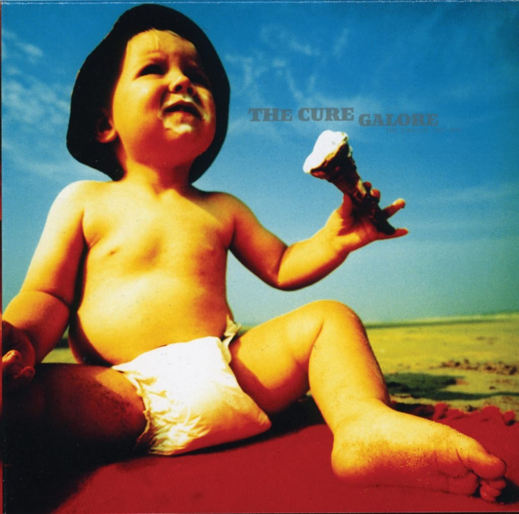
The Cure, Galore (1997). Courtesy of Andy Vella.
Vella was still a student at the West Sussex College of Art and Design in Worthing, U.K., when a chance meeting on a train with Porl Thompson, one of the band’s earliest members, landed him a regular gig designing the band’s album art. (After Thompson left the band, Vella continued working with Smith.)
“All my friends suddenly hated me because I was 18 and didn’t know what I was doing,” he told Artnet News. “But I was doing covers for the interesting band at the time.”
Vella has since gone on to design for other acts including Primal Scream, St. Vincent, and Mogwai. But it’s his work with the Cure that remains most deeply entwined with the group (and collected by the MoMA)—so much so that Vella was most recently tapped to design the deluxe edition of Simon Price’s upcoming book, Curepedia: An A-Z of The Cure, due out on November 23 in the U.K. and December 12 in the U.S.

The deluxe edition of Curepedia: An A-Z of The Cure by Simon Price, designed by Andy Vella. Courtesy of White Rabbit.
The tome is billed as a comprehensive biography of the band and for Vella, it was a job that offered “a very interesting recollection,” quite likely, of his time working with a band close to his heart. “It would really be difficult to work on an album cover for music that I really disliked,” he said.
In the same spirit of recollection, we got Vella to talk us through the creative thinking and processes behind his enduring art for the Cure. Here are his stories behind five of the band’s most iconic album sleeves.

The Cure, Faith (1981). Courtesy of Andy Vella.
Faith was the first album cover I ever did for the Cure in collaboration with Porl [Thompson] and it was done at Bolton Abbey. We didn’t have any plan, but what we were after was a monochrome, loose representation of faith. We drove up to the North of England, and it was just gray and wet and damp and cold. We were just taking lots of pictures and by chance, we came up with that image, which is actually a solarized negative contact print. If you look closely, you can see the grains in and out of focus.
Loads of people interpreted the cover as a representation of Turin Shroud and people were reading into it as a visual comment. If people read into artwork that you create, I think you’re doing quite a good job personally because they start owning it and it becomes part of their life.
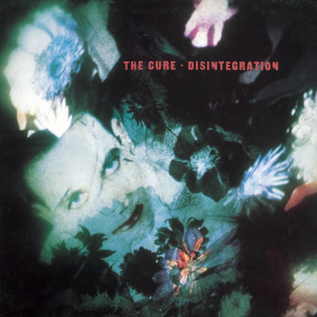
The Cure, Disintegration (1989). Courtesy of Andy Vella.
The word “disintegration” could have been interpreted in a negative sense. So visually, we created disintegration very much based on the disintegration of colors and the disintegration of textures. This was created with Polaroid transparencies, so it was lots of projections and overlaying and re-photographing.
Roger [O’Donnell, keyboardist] said the only reason this album cover got chosen was because it had Robert [Smith] on it but I think that’s a bit unfair. I wasn’t gonna put him on the cover, but it just felt right to have him almost seeping into the background. Certainly, Robert wouldn’t have said, “I want to be on the cover,” because we weren’t going down that commercial route. We were in our zone of creating something beautiful—and his face just fit.
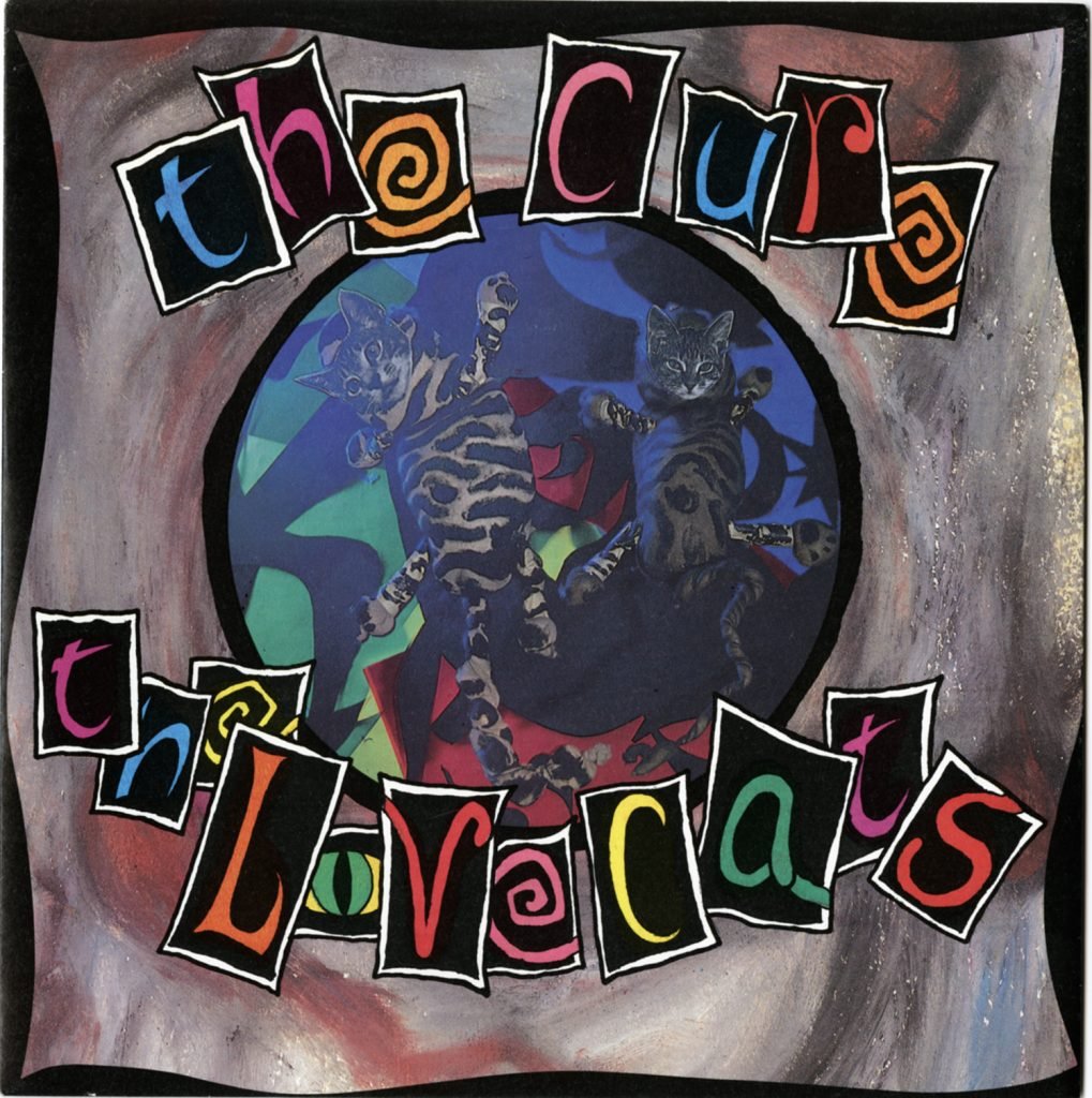
The Cure, “The Lovecats” (1983). Courtesy of Andy Vella.
This was just completely playful on the basis of that jazz cat thing. It was a very commercial and very different song for them, so the cover was just an absolute bit of fun. It was originally created by us making cat masks and their bodies out of old tights, and then photographing in ultraviolet light. We were in Porl’s kitchen all night photographing this with sunglasses on because of the ultraviolet light, and we must have come out of that session looking like two drowned cats.
It was quite a funny process, and I don’t think the record company took us very seriously at all. I think they thought we were idiots who were just playing at it. But I’m glad we were like that, to be honest, because we didn’t look homogenized. It was important to us to do something artistic that represented the music.
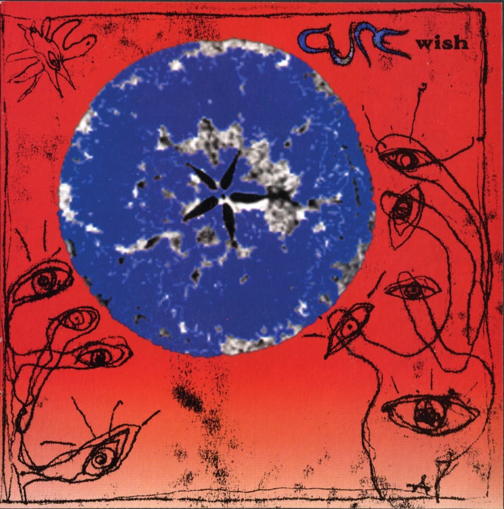
The Cure, Wish (1992). Courtesy of Andy Vella.
Wish is an amazing album. The cover was very much illustrative and guided by Porl. Our interpretation was, obviously, what’s wrong with the world, but with a ray of hope with the hands that are gripping the planet, which comes from the angle of trying to keep hold of something very special. It was our first cover where we combined analog and digital. I got an Apple Mac at that point, in 1992, with this little hand scanner, so that moon in the middle is actually a slice of apple. It’s a digital scan of something very organic.

The Cure, “Boys Don’t Cry (New Voice – New Mix)” (1986). Courtesy of Andy Vella.
I get people sending me images of tattoos they’ve gotten of that image and I’ve met famous people who say they grew up with it on their wall—it’s just crazy. You’re sometimes as good as you are for where you are. And of course, the brilliant talent of mine to get that picture! I just went to the video shoot [for “Boys Don’t Cry”] and took two rolls of film, one in color and one in black-and-white, and that one’s out of the black-and-white roll.
When I lecture, I tell my students to make every job count because you never know where it might take you. If someone had told me in 1985 or ’86 that the picture I was about to take will probably be one of my best, I would have probably crapped myself and not taken the picture. It’s a very proud moment that I guess captures a specific time. It’s identifiable.
Curepedia: An A-Z of The Cure is available in limited-edition deluxe and standard hardback versions from White Rabbit from November 9.
More Trending Stories:
Influencers Are Realizing That A.I. Might Not Be a Magic Money-Making Machine For Artists After All