The Modernist Double
You search for the differences, no matter if the pair is identical—and interestingly enough, you find them.
— Roni Horn
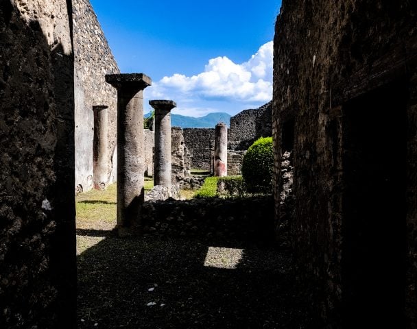
Winter 1898–1899. Toulouse, France. Henri Matisse paints a still life, then another of the same motif. The apples and oranges in Nature morte aux oranges (II) (c. 1899), now in the Kemper Museum, are flat discs of pale orange and yellow. A teacup and saucer and the table’s edge are limned in white. Areas of exposed canvas faintly brushed in black on the compote and wall cause the image to flatten and shimmer. The forms in Still Life with Compote, Apples, and Oranges (1899), in the Baltimore Museum of Art, are more defined. Pink highlights and dark shadows lend volume and solidity to the compote and saucer. The fruit are rounded entities contoured in brushstrokes of ochre and dark red. An oblique yellow line accented in muddy purple defines the edge of the tablecloth.
![An installation view of "The Double: Identity and Difference in Art Since 1900" at the National Gallery of Art. From left, Henri Matisse's <em><span class="s6">Nature </span><span class="s6">morte</span></em><span class="s6"><em> aux oranges (II) (Still Life with Oranges [II])</em></span><span class="s4"> (c. 1899) and his </span><em>Still Life with Compote, Apples, and Oranges</em> (1899). Photo: National Gallery of Art/Robert Shelley.](https://news.artnet.com/app/news-upload/2022/08/DSC_6681-1024x447.jpg)
An installation view of “The Double: Identity and Difference in Art Since 1900” at the National Gallery of Art. From left, Henri Matisse’s Nature morte aux oranges (II) (Still Life with Oranges [II]) (c. 1899) and his Still Life with Compote, Apples, and Oranges (1899). Photo: National Gallery of Art/Robert Shelley.
What is the double for Matisse? “I always use a preliminary canvas the same size for a sketch as for a finished picture,” the painter explained. The sketch completed, he began work on another canvas the same size “to give the same feeling, while carrying it on further.” Feeling is the key word here. Composition is “the art of arranging in a decorative manner the diverse elements at the painter’s command to express his feelings,” the artist remarked. Painting is an emotional response to a situation, sometimes followed by another attempt to capture the feeling. Only by not copying the first version can the painter give form to the emotion again, and more decisively.
The painter of compotes and oranges is already a “doubler,” but his two-step method is not yet in place. The Kemper Museum canvas anticipates the art of pure color harmony of the artist’s Fauvist works several years in advance; the more conservative Baltimore picture hews closely to such forebears as Paul Cézanne (the still life on a table, the modeling of fruit with repeated brushstrokes) and Pierre Bonnard (the dry brushwork, the pastel accents, the scum bled layers of paint). One cannot say for certain which rendition came first. The two-step process that Matisse describes could only fall into place around 1905 or 1906, after he comes to an understanding of color as a kind of visual substance that exists in quantitative proportion to the area of canvas to be used.
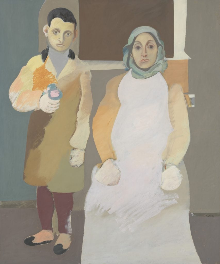
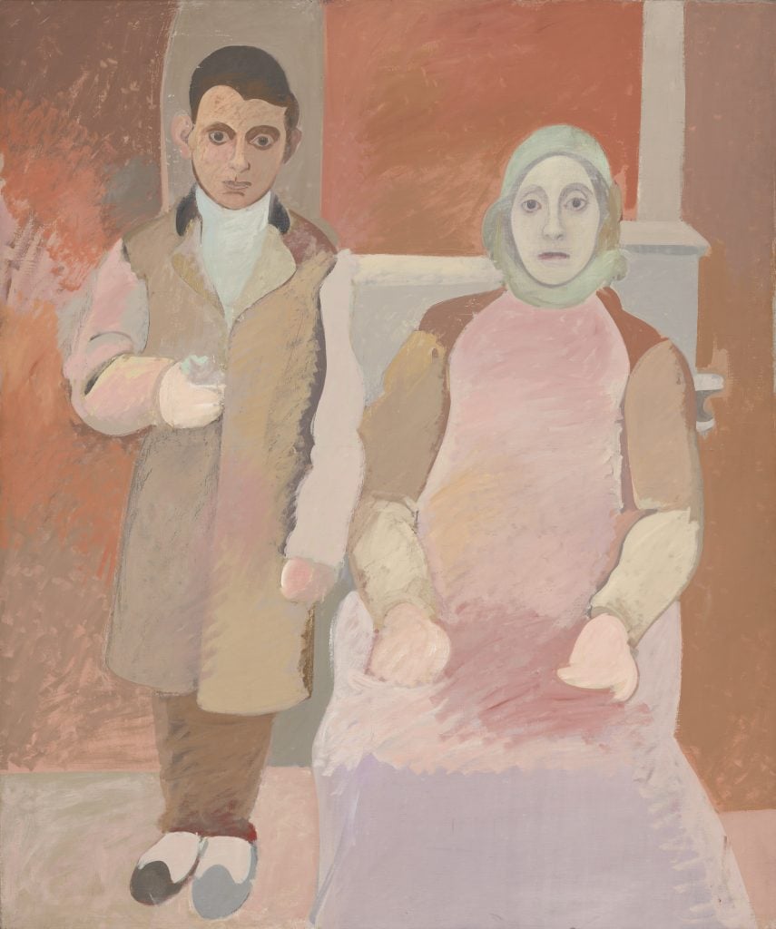
Unlike Matisse, who turned to doubled formats repeatedly during his career, Arshile Gorky is identified with a particularly famous example: the two versions of The Artist and His Mother in the collections of the Whitney Museum and the National Gallery of Art.
Arshile Gorky, The Artist and his Mother (c. 1926–36). This work belongs in the collection of the Whitney Museum of American Art. © 2021 The Arshile Gorky Foundation / Artists Rights Society (ARS), New York, Digital image © Whitney Museum of American Art / Licensed by Scala / Art Resource, NY.
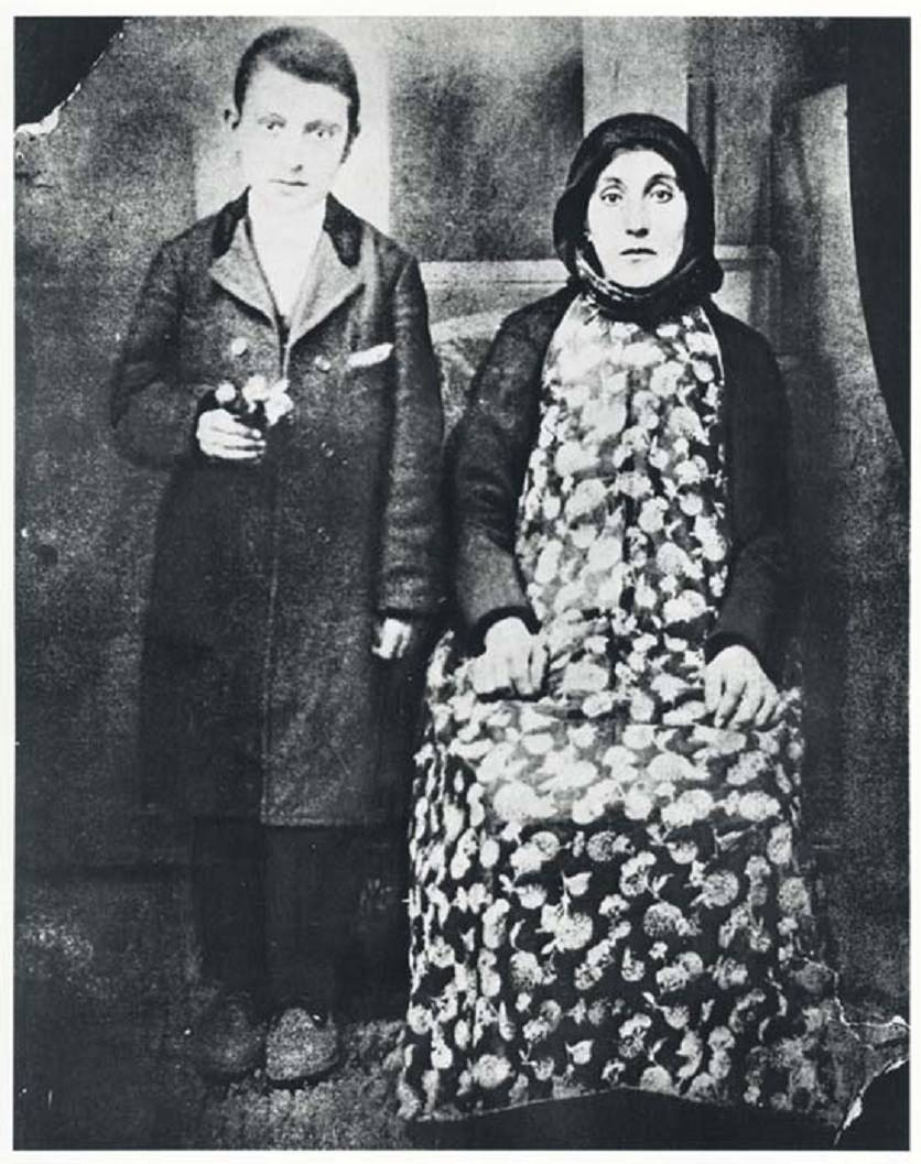
Inspired by a photograph of the ten-year-old Gorky and his mother, Shushan, taken in Van province in eastern Turkey in 1912, the paintings were both begun after the exiled artist discovered the photo in his father’s house sometime after his arrival in the United States in 1920. The year before, Shushan had died in Gorky’s arms, a victim of the Turkish government’s genocidal policies toward its Christian Armenian citizens. The photo depicts the artist and his mother in front of what appears to be a painted backdrop of a faux mantelpiece and window. Gorky wears a coat, trousers, and white shirt, and holds a bouquet. Shushan in pinafore and coat sits beside him, her arm touching his; a scarf covers her head.
A working drawing on squared paper reveals Gorky’s thinking as he transposed the photographic image to the two canvases, both likely begun in 1926. Unlike the drawing, the paintings position Shushan in front of the “window.” Omitting the lower hem of her dress, they advance her closer to the picture plane, emphasizing her hieratic presence. In both versions, Shushan’s hands are brushed out like mitts. The hard, white plane of her dress dissolves in her spatially ambiguous lap. Dominated by passages of gray, brown, black, tan, and mint green, the Whitney painting is cooler in tonality than the National Gallery canvas, executed in shades of orange, rose, lavender, and tan. In the Whitney picture, the boy’s feet, clad in slippers, are splayed. The arms of mother and son are slightly apart. In the National Gallery work, Gorky’s feet point toward the viewer; his arm touches his mother’s.
Arshile Gorky, The Artist and His Mother (c. 1926–c. 1942). The one belongs to the National Gallery of Art. © 1997 The Estate of Arshile Gorky / Artists Rights Society (ARS), New York.
We may never know why Gorky painted this extraordinarily affecting image twice, which canvas he began first, or whether the National Gallery portrait is unfinished. We know that the Whitney painting was a talisman for the artist, who displayed the work in his studio and altered the composition many times, and that he was still at work on the National Gallery canvas as late as 1942. A privileging of finish over unfinish, hence the Whitney’s version over the National Gallery’s, in the literature on the artist fails to grapple with the doubled nature of Gorky’s procedure—the fact that he made two portraits of his younger self and his mother, and that these works draw meaning from and in relation to each other. His restless reworking of these canvases implies that, for Gorky, no one representation could give a definitive form to the works’ multilayered temporality: the instant recorded by the Van photographer evocative of a childhood spent under Shushan’s protection (a “before”); the deeply traumatic period that followed, when the artist and his sister experienced homelessness and an unspeakable loss; and an ever-shifting present when he put brush to canvas as he brought both paintings ever closer to a state of completion, a finish line never quite reached.
The Illusion of Oneness
“The binocular focus of our eyes converges on a single object and gives the illusion of oneness, so that we tend to forget the actual stereoscopic structure of our two eyes or what I want to call enantiomorphic vision, that is seeing double,” the artist Robert Smithson observed (his reference to enantiomorphy, the phenomenon of forms in nature that are symmetrical and reversed, is explored later in this essay). Gazing at Malevich’s matched squares or the same-sized oblongs in Josef Albers’s Familiar Front (1948–52), we become conscious of our binocularity—the fact that our vision combines slightly different points of view into a single impression (Smithson’s “illusion of oneness”).
Josef Albers, Familiar Front (1948–52). © The Josef and Anni Albers Foundation / Artists Rights Society (ARS), New York, 2021, Photo: Tim Nighswander/Imaging4Art.
One of a number of works known as Variants or Adobes, Familiar Front draws its distinctive format from the vernacular architecture of Oaxaca, Mexico, familiar to the artist from his and Anni Albers’s many sojourns there. The portals of these structures, framed by brightly colored lintels and jambs, and adobe walls painted in contrasting hues, are abstractly recalled in these compositions. Applying oil paint directly from the tube to the support with a palette knife, Albers worked from preparatory sketches drawn on checkerboard grids of square and oblong units. Always of the same middle intensity and typically applied in equal amounts, the three, four, or five hues of each Variant combine to produce an intense optical reverberation. Albers’s exquisitely calculated color juxtapositions enhance our experience of seeing two identical forms arranged side by side. Inset in two pink rectangles disposed on opposite ends of a rectangular gold field with uneven margins, the burgundy “doors” of Familiar Front invite us to concentrate on both of these focal points—which read almost as eyes staring back at us—simultaneously.
Marlow Moss also explored the optical effects of doubled forms. Born Marjorie Jewell Moss near London in 1889, the artist broke away from her family and changed her name to the gender-neutral Marlow in 1920 before decamping to Paris in 1927. Entering the circle of Piet Mondrian and other artists with whom she founded the journal Abstraction-Création, Moss adopted the Dutch artist’s Neo-Plastic vocabulary of square and rectangular planes painted in the primary colors, white, and gray, and bounded by black lines; she developed her first double line painting around 1930.
Marlow Moss, White, Black, Red and Gray (1932). Kunstmuseum Den Haag, The Hague, The Netherlands.
The double line was for Moss a means to work through Neo-Plasticism, a system that Mondrian had already tested repeatedly after he consolidated it in 1921. In Moss’s White, Black, Red and Gray (1932), a vertical black band bisects the composition roughly in two, yet this solid entity is in turn interrupted by thin parallel lines stretching from left to right dividing the upper half of the canvas from the lower. Rejecting Mondrian’s signature formula of single intersecting lines by inserting the double line in the center of her arrangement, Moss traduces the aim of Neo-Plasticism to achieve a representation of harmony in order to give form to the universal— Mondrian’s “dream of a perfectly equilibrated future society.” The double line in Moss’s painting establishes an extreme tension in the very center of the work, dividing top from bottom and disrupting the “repose” and balance characteristic of Mondrian’s classic style.
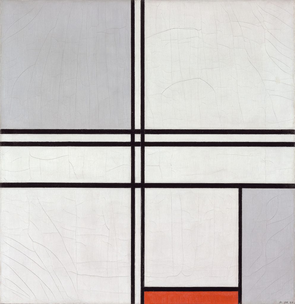
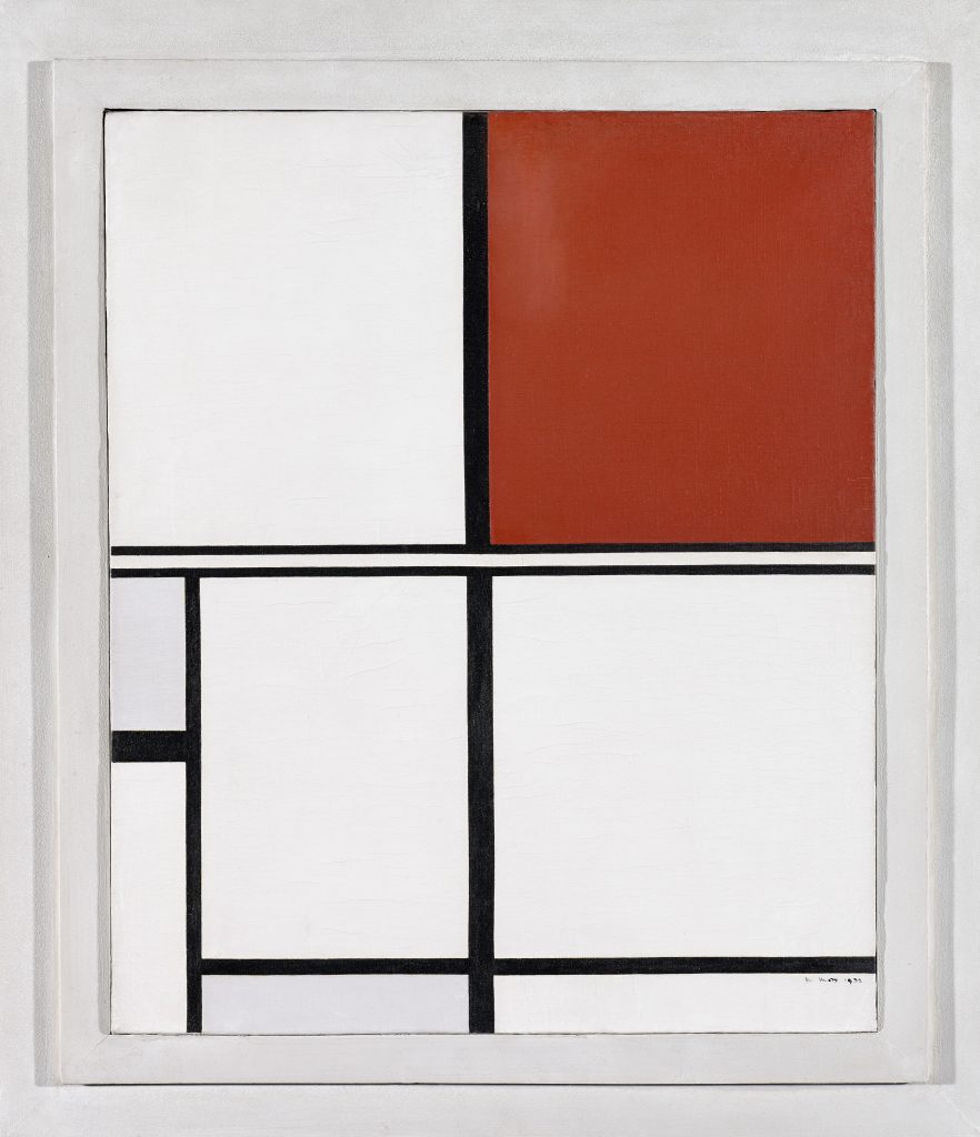
Piet Mondrian, Composition (No. 1) Gray-Red (1935). The Art Institute of Chicago.
The invention of the double line has been much contested. Mondrian, for his part, adopted the format in 1932 and titled some of these works “double line” compositions. Overlapping with single lines (unlike the double line of Moss’s White, Black, Red and Gray, which perceptually lies above the vertical black band) and divided by white bands of equal or greater width, Mondrian’s double line introduced a retinal reverberation to the otherwise balanced arrangements. By 1934–1935, the double line was itself doubled. In Composition (No. 1) Gray-Red (1935), two pairs of parallel lines bisect the composition; the optical intensity caused by the pairs of double lines crescendos at the points of their intersection, while the white, gray, and red planes and single lines at the lower right, a zone of Neo-Plastic calm, are shunted to the margins. As line evolved into the dominant element of Mondrian’s art, line itself was quadrupled and multiplied; the double line, embedded in intricate webs of black bands, was no longer legible as a double. It is as if Moss’s discovery, the reward of a rigorous apprenticeship to Mondrian’s art, came along at the very moment the older painter needed it in order to dismantle his system, which having reached an apogee in 1930–1932, was ripe for “sabotage,” as Yve-Alain Bois has argued. The double line afforded Mondrian a powerful tool to topple the edifice of Neo-Plasticism that he had built with such care, until the double line was itself dissolved in a sequence of multiline compositions of extraordinary visual complexity completed in Paris, London, and New York between 1936 and 1944.
Temporal Doubling
It is often said that Andy Warhol’s serial images evoke cinematic time. The silkscreened photos in Ambulance Disaster mark a “before” and “after”—the moment of impact, when the ill-fated passenger was flung through the backseat window, and the moment the press photographer took the exposure. A number of works here evoke two points in time simultaneously or fragment an instant through doubling. Doubling is “the two-step that banishes the unitary condition of the moment, that creates within the moment an experience of fission,” Rosalind Krauss has written. This is precisely the effect of Wallace Berman’s photomontage of the “double murder” of Lee Harvey Oswald the day after his assassination of President John Kennedy, where the tall detective in the light-colored suit and hat escorting Oswald has been doubled, splitting the instant before Oswald’s killer, Jack Ruby, pulled the trigger; or Barbara Probst’s simultaneous double exposure of a couple shrouded in smoke from slightly different points of view; or Peter Liversidge’s Polaroids of the rippled surface of a swimming pool blurring any perceptible distinction between one instant and another. In Nam Jun Paik’s Nixon (1965–02), a selection of President Richard Nixon’s speeches plays simultaneously on two monitors. Magnetic coils attached to the screens frame Nixon’s head. As the magnetic current is increased, the president’s face contorts; the distortion jumps back and forth between the monitors. These two Nixons—the powerful leader of the free world and a ghostly, diminished presence—change places as we listen to his justifications of the Vietnam War, his remarks about the Watergate scandal, and his resignation speech. Our normative experience of watching broadcast TV, the ultimate “real time” medium, is continuously interrupted.
Other practices juxtapose historical periods in a simultaneous arrangement. Works of reenactment, such as Gmelin’s video projection Color Test (Red Flag #2) (2002), a remake of a 1968 film of radicalized young people running through the streets of West Berlin carrying a Communist red flag during the height of the Cold War that was restaged in Stockholm after the fall of the Iron Curtain, and Mary Kelly’s WLM Remix, a 2005 restaging of a 1970 women’s liberation march, as noted, inspire a comparison of two eras of Leftist and feminist activity. Forced to “see” two periods simultaneously enables us to think historically—to consider what the red flag meant then and now, or the status of feminism thirty-five years after the original protest.
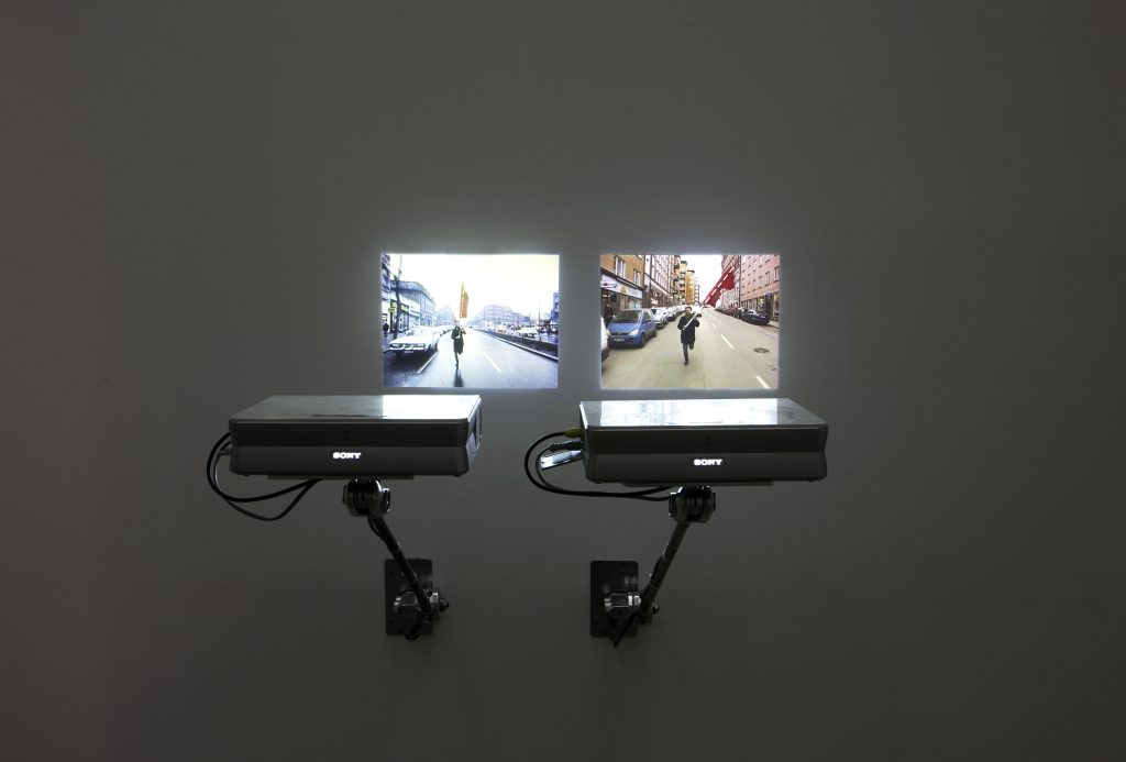
Felix Gmelin, Color Test (Red Flag #2) (2002). Courtesy of the artist.
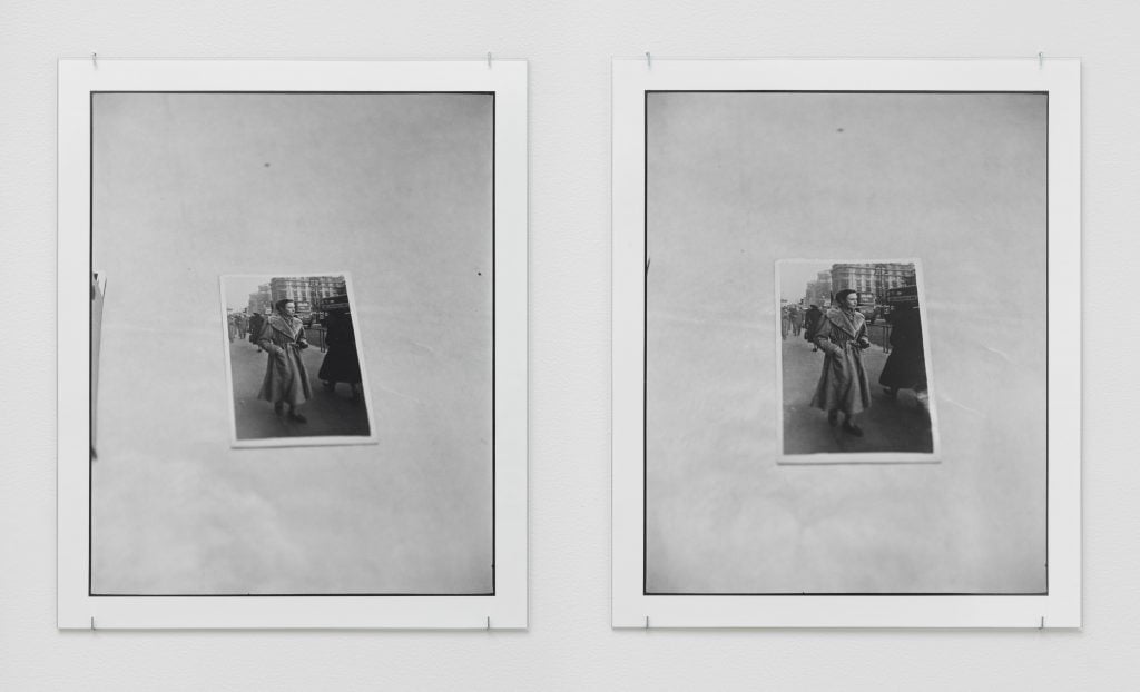
Untitled (2016, at the top of this page), a diptych by Zoe Leonard, explores the mnemonic hold of a recent past on those who are compelled to remember it. Two black-and-white prints have been mounted side by side behind glass. The prints appear to be identical photos of another photo. The subject of this snapshot is the artist’s mother; the place, London during the early 1950s, after Leonard’s family, who had endured the horrors of World War II in their native Warsaw, immigrated to the UK before their arrival in the US. A snapshot asks us to remember the person(s) captured in the photo. The pronounced tilt of the print to a viewer’s left reveals that Leonard took the exposures from slightly different angles, and thus at different instants. Untitled straddles two places and historical moments, yet the “present” recorded by Leonard’s camera is fractured. Just as Gorky realized that his memories of childhood, triggered by his discovery of an old photo, could not be adequately conveyed by any one representation—that his great portrait must be doubled, for doubling alone could express this insufficiency—Leonard chose to photograph the snapshot twice.
Two photos of a photo, Untitled suggests the inaccessibility, the remoteness, of the moment when Leonard’s mother walked along a London sidewalk some 65 years before, the moment that the snapshot causes us to remember. As Gorky’s and Leonard’s works make painfully apparent, even the most precious familial memories are fugitive and unstable.
From The Double: Identity and Difference in Art since 1900 published by Princeton University Press in association with the National Gallery of Art on occasion of the exhibition presented at the National Gallery through October 31.
James Meyer is the curator of modern art at the National Gallery of Art and curator of “The Double: Identity and Difference in Art since 1900.”


