Art World
Helvetica, the Typeface So Beloved It Has Its Own Documentary, Is Getting a Makeover for the Internet Age
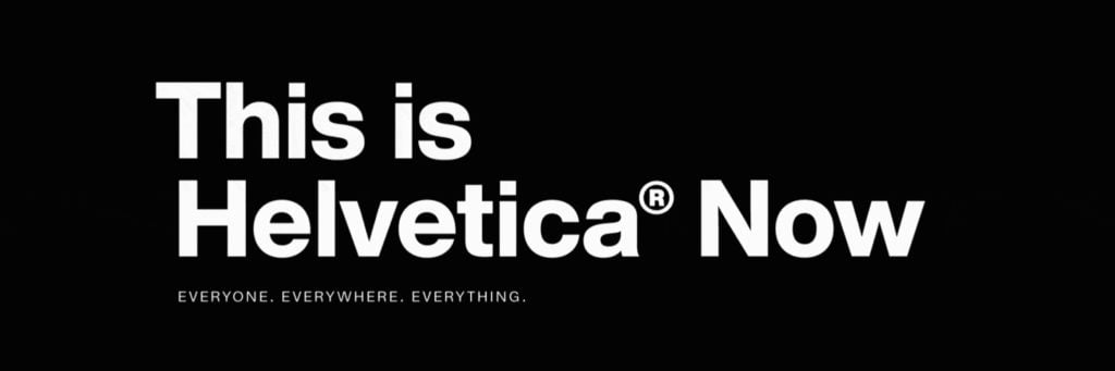
Helvetica has been redesigned with smartphones in mind.
, USA. Directed by Gary Hustwit. Image courtesy of Gary Hustwit.")
Helvetica has been redesigned with smartphones in mind.
Sarah Cascone
 ShareShare This Article
Few typefaces have achieved household name status. Times New Roman? Sure. Comic Sans? Maybe. Helvetica—definitely.
So when it came to updating the famed sans-serif developed by Swiss designer Max Miedinger with Eduard Hoffmann in 1957, Monotype Imaging Holdings took its time. The company, which owns the Helvetica licensing rights, spent five years researching and perfecting the just-unveiled refresh, called Helvetica Now.
“This is not a revival. This is not a restoration. This is a statement,” noted the Monotype web page offering the new typeface. “It has everything we love about Helvetica and everything we need for typography today.”
In 2007, when Helvetica turned 50, it was the subject of an exhibition at New York’s Museum of Modern Art and a feature-length documentary film directed by Gary Hustwit. The typeface is used by such brands as American Apparel, Motorola, Toyota, Panasonic, and American Airlines, and even the MTA, which runs the New York City subway system.
“Helvetica is like water. It’s essential. It’s everywhere. Everyone sees it, reads it, and uses it. Some very actively, and some without even thinking,” said Monotype director Charles Nix in a video unveiling the update. “It’s a benchmark. A typeface against which others are judged.”
Despite its ubiquity, the typeface hadn’t been updated in more than 35 years, since the 1983 introduction of the digitized version, Neue Helvetica, which standardized its structure, weights, and widths. That one was designed for a pre-internet world and wasn’t optimized for the high-resolution screens and printers of the 21st century.
As a result, companies like Google, Apple, Netflix, and IBM have developed their own look-a-like typefaces in house in recent years, allowing for greater versatility. The redesign, which took a team of dozens two years to complete, specifically addressed issues with uneven kerning, or spacing between letters, and with legibility in smaller font sizes.
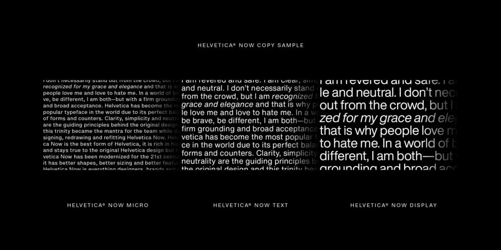
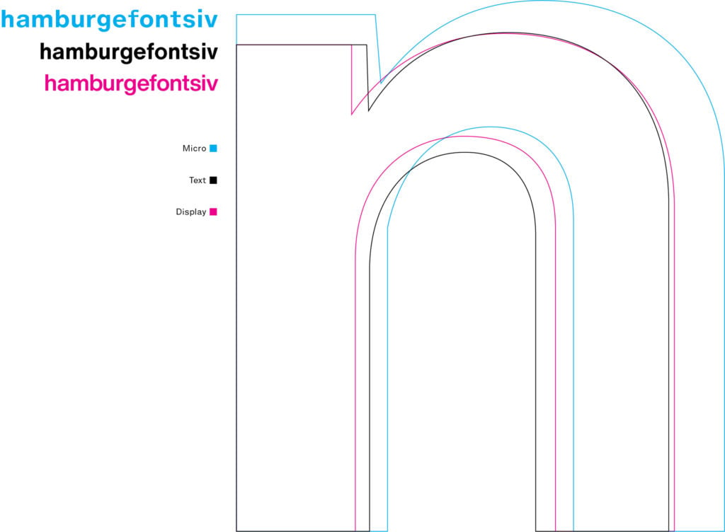
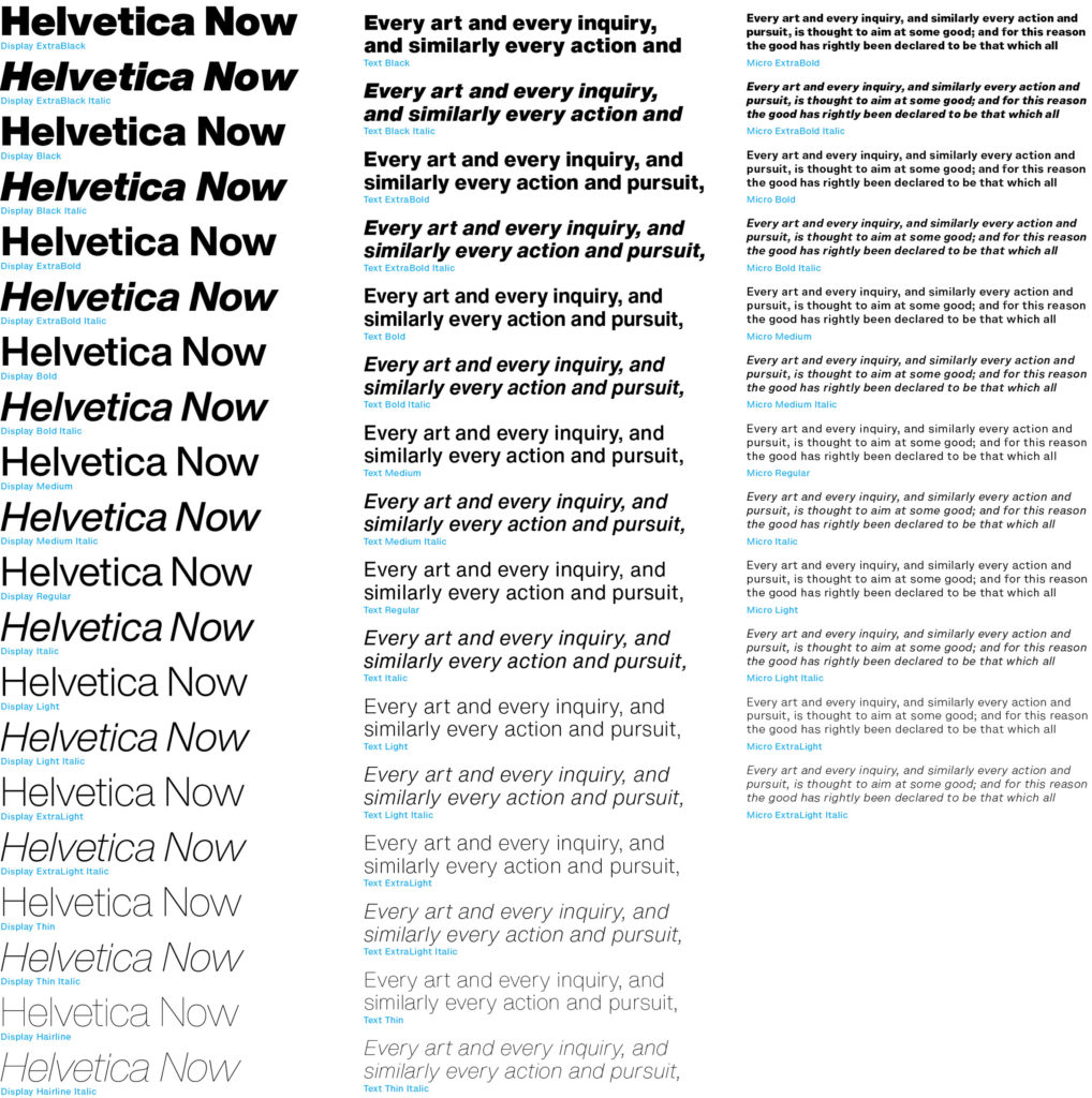
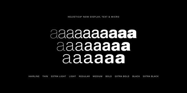
Helvetica Now comes in three optical sizes: micro for optimal viewing on small screens, display for signage, and text for average written documents. Each size is offered in weights ranging from hairline to extra black, each plus italics, for 48 weights in all.
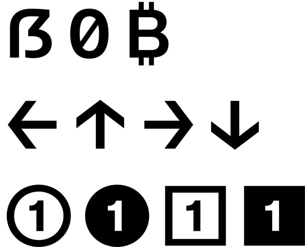
Examples of Helvetica Now. Image courtesy of Monotype.
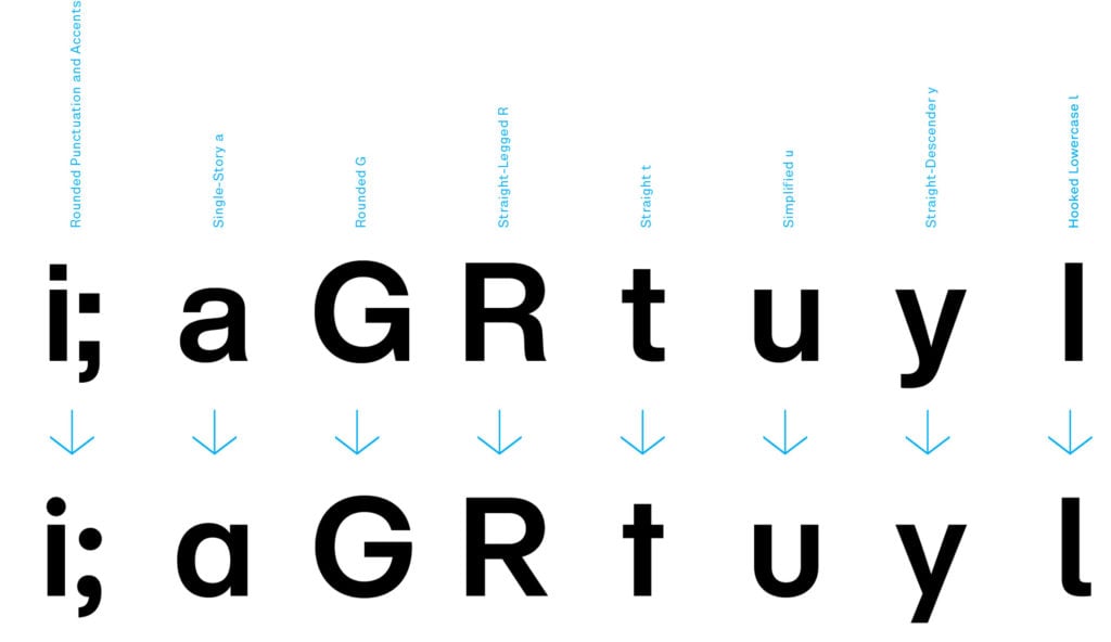
There are a total of an astonishing 40,000 characters, including an updated @ symbol, a “straight-legged” capital R, and a capital I that is now easier to distinguish from a lower case l. In some ways, it’s a return to vintage Helvetica, with a degree of nuance that wasn’t possible with early personal computers and desktop printers.
“It is kind of like visiting the Metropolitan Museum of Art with an easel and canvas and painting a Rembrandt,” Nix told WIRED. “You’re following clearly what the master has done before you, and the big difference in our case is that we’re looking to make the type, the artwork, more suitable to the age in which we live.”
Designers and brands will have to buy a license for the new redesign before they can use it, so it may take a while before you encounter Helvetica Now in the wild. The entire Helvetica typeface family is priced at $299, or $35 for a single weight.
See more examples of Helvetica Now below.
Examples of Helvetica Now. Image courtesy of Monotype.
Examples of Helvetica Now. Image courtesy of Monotype.
Examples of Helvetica Now. Image courtesy of Monotype.
Examples of Helvetica Now. Image courtesy of Monotype.
Examples of Helvetica Now. Image courtesy of Monotype.
Examples of Helvetica Now. Image courtesy of Monotype.