Art World
What the Devil Happened to the Racquets at the US Open?
The tournament's new "theme art" appears to be about real estate, not sports.

The tournament's new "theme art" appears to be about real estate, not sports.
Philip Boroff
 ShareShare This Article
On Monday night at the US Open, at a kiosk filled with programs and posters, a retired management consultant named Andy Lingras stood studying the image emblazoned on the products. It shows Arthur Ashe stadium, with fountains fronting it and the Manhattan skyline as a backdrop. Tennis—actual tennis—Lingras said, did not appear to be a . . . theme at all, not this year anyway. What is this year’s “theme art” about, if it’s not really about tennis? “It highlights the stadium,” Lingras said.
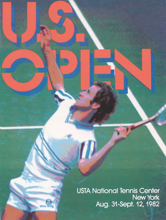
Fans attend the US Open to watch great tennis at the USTA Billie Jean King National Tennis Center. They come to see something like Roger Federer’s between-the-legs shot against 76th-ranked Marinko Matosevic last night.
They may want to go home with a little something that speaks of the sport.
Yet, except for the flaming-ball logo, the “theme art” commissioned for this year’s merchandise omits overt reference to tennis. That in part reflects the United States Tennis Association’s longtime strategy of selling the Open as an internationally themed entertainment spectacle set in New York, rather than a mere tournament.
“It is a tennis event, but it’s a lot more,” said Beth Meyer, the USTA’s creative director, in a phone interview.
Michael Crampton, a UK–born illustrator who beat out seven other artists invited to submit sketches, said he sought to recapture the inventiveness of his 2012 design without repeating himself. That year, he created a skyline growing out of the head of a red tennis racquet, with three East River bridges attached. “They really liked 2012 and they wanted something similar, but I knew it couldn’t be too similar or I wouldn’t get the job,’’ he said from his home in Guilford, Connecticut.
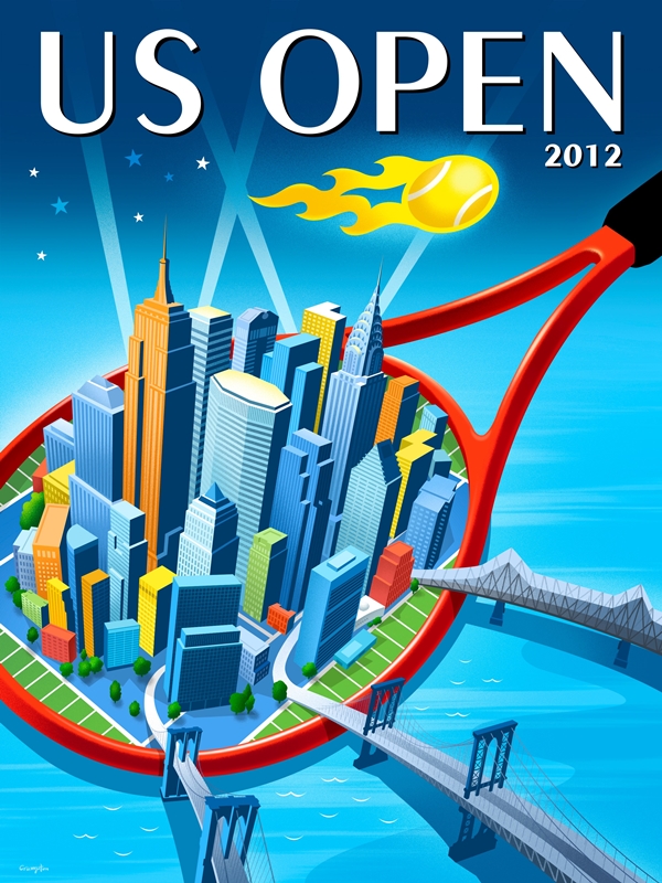
Courtesy US Tennis Association.
As in prior years, the design has a blue backdrop. In 2005, the Open switched to blue courts, from green, to make it easier for players and television audiences to see the ball. And Meyer said the prominence of the stadium in Crampton’s design is a plus given the USTA’s ongoing renovation of the site, which will include a retractable roof over the stadium.
“It was by luck that he developed the sketch with the stadium front and center,’’ she said. (As for the Art Deco skyline, both the Chrysler and Empire State Building designs are trademarked and used with permission, according to a footnote on the image. The USTA didn’t pay a fee for their use, Meyer said.)
Crampton is a 53-year-old former art director for the retailer Neiman Marcus in Dallas with three tennis-playing sons. He said he loves seeing his artwork mass-produced. “It could be on McDonald’s place mats and I’d be very happy,” he said.
Courtesy US Tennis Association.
The image is on T-shirts that sell for $26 and $36, the official program and poster (both $20) and on a 30-by-60-inch beach towel ($36). Plus, there’s a hologram of the image on “souvenir” cups with 32 ounces of soda ($6.75) and 22 ounces of Heineken beer ($10).
Lynn Toney, a payroll coordinator at a New York hospital, said the artwork reminds her of Emerald City in The Wizard of Oz. “I like it but it doesn’t reflect tennis,” she said.
But on the bleachers at court 11, while watching Russian Andrey Kuznetsov beat American Bradley Klahn in four sets, Ron Harper had unequivocal praise for his 3-D soda cup. “It’s cool,” said the Lexington, Kentucky, tennis and basketball coach, adding, “I always like the New York skyline.”
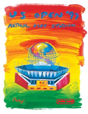
Artwork by Peter Max. Courtesy US Tennis Association.