Art & Exhibitions
David Ebony’s Top 10 New York Gallery Shows for October
There's still time to catch these, before it's too late.
There's still time to catch these, before it's too late.

David Ebony

1. Bruce Nauman at Sperone Westwater, through October 29.
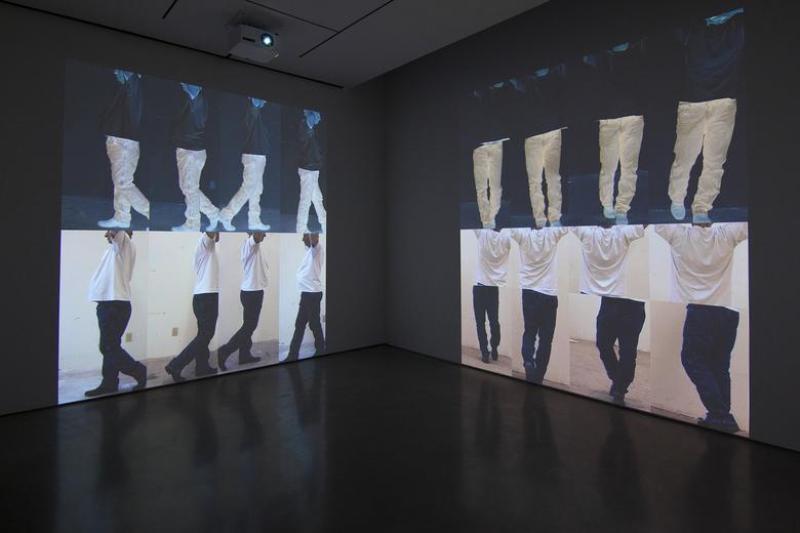
How is it that Bruce Nauman, sequestered as he is most of the time in his New Mexico studio, manages to emerge now and again like a grand wizard to address the art world of the moment with a meaningful gesture that points the way to the future? In his latest presentation, “Contrapposto Studies i through vii,” he does exactly that. The show of seven recent video installations, plus a photo work and a maquette, constitutes an extraordinary art-world event. The overall premise is simple enough—a video self-portrait of the artist moving back and forth in variations of the contrapposto poses of an artist’s model. With ambient studio sounds and repetitive imagery, the installations are generally hypnotic and soothing, and the works are successful as a purely sensorial experience. There is a hopeful emphasis here on the concepts of balance, stability, and perseverance. Eventually, one becomes aware of the tremendous historical depth and conceptual breadth of Nauman’s endeavor.
On one level, the new works are autobiographical. The basic concept evolved from Nauman’s 1968 work Walk with Contrapposto, focused on his exaggerated repetitive movements down a long narrow corridor. Wearing dark trousers and a baggy white t-shirt in Contrapposto Studies i and ii, Nauman refers to the classical figure, although by showing his age (74) and a bit of a paunch he deliberately thwarts any notion of the classical ideal. Appearing in alternately positive and negative images, the figure becomes increasingly fractured and fragmented in later works in the series, on view in the upper level galleries. Rather jarring works, Contrapposto Studies vi and vii are nearly totally abstract projections. With video’s temporal, four-dimensional attributes, Nauman conjures a two-dimensional quasi-Cubist space. One thinks especially of Marcel Duchamp’s Nude Descending a Staircase. It is not a coincidence, then, that Nauman has created for the Philadelphia Museum of Art, home of Duchamp’s 1912 masterpiece, a companion and concurrent exhibition, “Contrapposto Studies I through VII,” on view in Philadelphia through January 8, 2017.
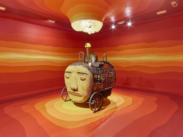
Installation view, OSGEMEOS, “Silence of the Music,” 2016, showing The Kiss, 2015-2016.
Courtesy the artists and Lehmann Maupin.
2. OSGEMEOS at Lehmann Maupin, through October 22.
The Brazilian twins Gustavo and Otavio Pandolfo, better known as the artist team OSGEMEOS, are well-known São Paulo street artists inspired by US hip-hop culture. In recent years, they have established an international reputation for their paintings, sculptures, drawings, and multi-media installations featuring an array of distinctive cartoonish characters, and an evocative form of narrative and whimsical allegory.
Created especially for lucky New Yorkers, “Silence of the Music” is an unabashed, site-specific gallery show. Even if you are vehemently opposed to the notion of art-as-spectacle, the exhibition succeeds on a number of serious levels. OSGEMEOS are not out simply to entertain, although with its colorful pageantry, and live music interludes during its run, the show certainly does that.
Several rooms in the exhibition offer immersive installations, including one featuring The Illuminated (2015) a life-size male figure in the center of the room, nonchalantly rotating on a revolving platform. Surrounding the sculpture, a site-specific mural covering all walls shows an evocative scene conjuring enchanted oceans and exotic beaches. Even more striking is the room centered by a sculpture titled The Kiss (2015-2016). Here, against surrounding murals of undulating horizontal bands of warm orange, red and yellow tones, the main component, with a sunburst “face,” rests on the floor and doubles as a strange musical instrument. Attached to the ceiling just overhead, a glowing lunar “face” with puckered red lips offers a celestial kiss. The hallucinatory dream sequences represented by these two rooms complement the fanciful, street-savvy urban imagery of many of the large panel paintings on view elsewhere in the show.
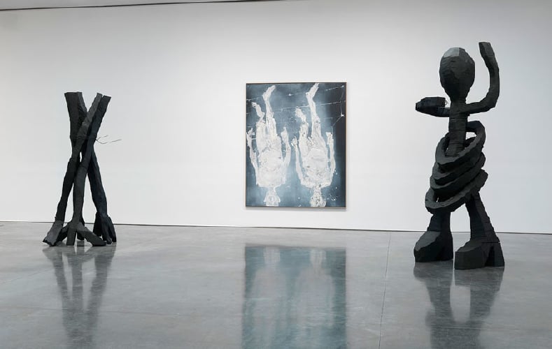
Installation view, Georg Baselitz, “Jumping Over My Shadow,” 2016. Courtesy the artist and Gagosian Gallery.
3. Georg Baselitz at Gagosian Gallery, through October 29.
Some artists get better with age. As evidenced by this show of his recent large-scale paintings and sculptures, “Jumping Over My Shadow,” German artist Georg Baselitz is definitely one of them. Now 78, Baselitz (born Hans-Georg Kern) established his career in the 1970s, and became internationally recognized in the ’80s as one of the leading German Neo-Expressionists. He was famous for rough-hewn figurative sculptures and gritty paintings with provocative upside-down images of figures and landscapes, addressing in some way the postwar-torn German psyche. He entered the cannon of recent art history, and for a time seemed to be taken for granted. As Baselitz himself remarked to curator Okui Enwezor in an interview for the show’s catalogue, “I am certain that the viewers left me a long time ago…I am truly of the opinion that nobody is looking at what I do anymore.”
That may all have changed last year when a room devoted to Baselitz’s recent oil paintings at the Venice Biennale caused a stir. I, for one, gained a new appreciation for Baselitz’s work on the spot. The monumental canvases represented something of a departure. They featured the familiar lone upside-down male figure set against stark black ground. The rendering of the nude figure, however, featured delicate tones, greatly nuanced textures, and fine, feverishly applied networks of black lines that seemed fresh and new to the artist. Somehow he appeared to be getting closer to a mythical place, the essence of painting itself.
“Jumping Over My Shadow” continues this exciting development, with massive, primal sculptures in patinated bronze that resembles wood, and with imposing paintings of an ethereal—and aged—nude male figure. Most of these ghostly self-portraits have titles alluding to a downward motion. Descending with Marcel, for instance, bears an explicit reference to Duchamp’s 1912 Nude Descending a Staircase and suggests that Baselitz’s primary interests here are in movement, spatial relationships, and the passage of time.
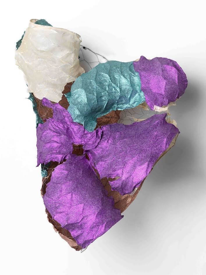
Lynda Benglis, New Sparkle Jumper, 2016. Courtesy the artist and Cheim & Read Gallery.
4. Lynda Benglis, at Cheim & Read, through October 22.
There is a lot going on in this exhibition of recent works by Lynda Benglis. It opens with an enormous monochrome gray aluminum piece, The Fall Caught, which I believe is the closest to a full human figure that Benglis has ever rendered in sculptural form. Filling one gallery near the entrance, the gnarly anthropoid looms more than 14 feet tall. Closing the show is a room filled with small, recent black-glazed abstract ceramic pieces arranged in a circle on the floor of a rear gallery. In between are two rooms containing many smallish, colorful painted-paper sculptures that are more in keeping with Benglis’s familiar glittery and sensuous abstract works.
At first, this part of the exhibition, with dozens of shapes made by stretching and pulling wet paper over molded chicken wire supports, seems crowded and overhung. But if one considers these objects as 3-D drawings rather than sculptures, the installation sings.
In the show’s catalogue essay, writer Nancy Princenthal likens these works to freestanding brushstrokes suspended in midair, and indeed, they convey a feeling of light and space in the great outdoors, often aided by the way Benglis allows details of the construction to show through, as with passages of exposed chicken wire. Created in the artist’s New Mexico studio, most of the twisted, improvised shapes are based on human body parts—often the artist’s own—including legs, arms, and torsos. Phallic and vaginal forms also predominate. Works such as Swift and Storm a’ Coming, directly refer to birds and landscape, respectively. Some pieces, such as New Sparkle Jumper, a conglomeration of shapes painted metallic purple, turquoise, and white, are wholly abstract and just plain gorgeous.
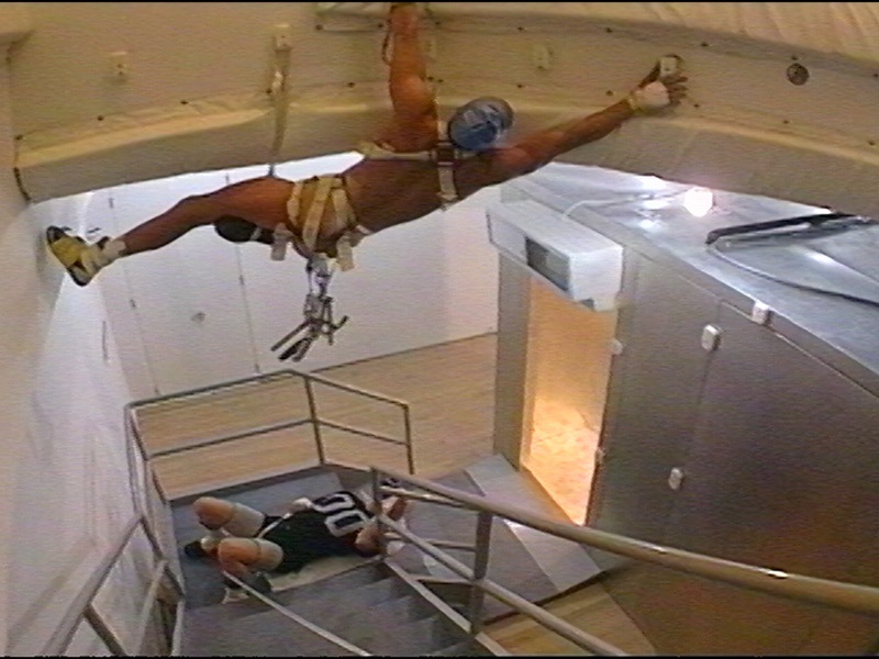
Matthew Barney, video still, Blind Perineum, 1991, in “Facility of Decline.” Courtesy Gladstone Gallery.
5. Matthew Barney at Gladstone, through October 22.
Like ancient Greece’s mythic Athena—born from Zeus’s forehead fully grown and in battle gear—Matthew Barney arrived on the art scene in 1991 as a seemingly fully developed artistic personality, with provocative works, a clarity of vision, a sexy physical presence, and a brilliant, full-fledged mythology all his own. His New York debut at Barbara Gladstone Gallery, then located in SoHo, which I was fortunate enough to see, caused a sensation. It was the most talked-about show in town. Barney’s weird and wild sculptures made of unorthodox materials like petroleum jelly, prosthetic plastic, and tapioca, related to the artist’s actions and performances that he documented in video, film, and photos. His art, centered on orifices and body fluids, seemed related to Surrealism and to works by certain Fluxus practitioners like Joseph Beuys; but it was quite unlike anything seen before.
The current exhibition at Gladstone in Chelsea, “Facility of Decline,” does not exactly replicate the 1991 exhibition, but it reunites many of the works included in that show, and evokes the extraordinary aesthetic sensibility that the San Francisco-born artist, then in his mid-20s, introduced to the world. On view here are works such as the room-size refrigerated gym, Transexualis, with workout equipment made of petroleum jelly; it seems as fresh now as the day it was made. Many other works are laden with ambiguous sexual innuendo, including refined drawings in “self-lubricating” frames. Just as engaging are the videos of early actions and performances continuously showing on small monitors installed throughout the exhibition. In the performance video Blind Perineum, the buff artist in a harness climbs along the gallery ceiling in the nude. One can hardly think of a better way to launch an art career.
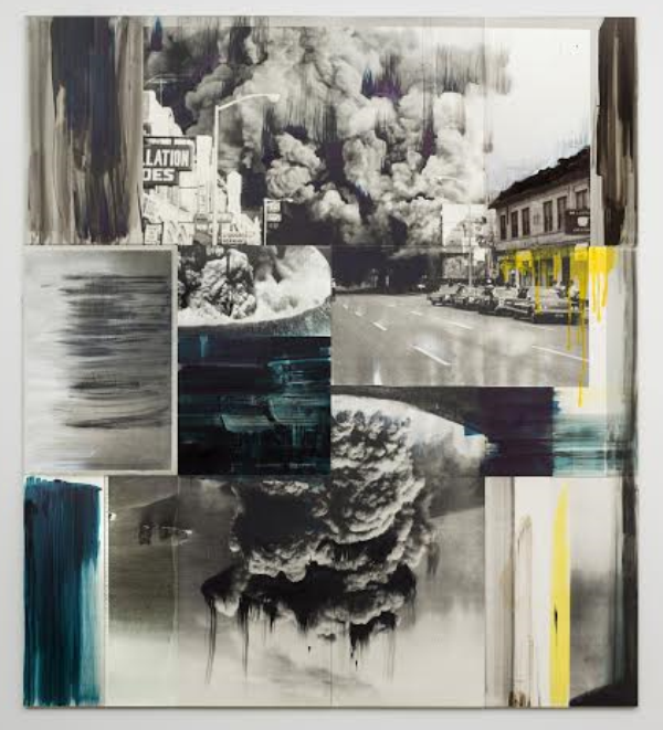
Lorna Simpson, Detroit (Ode to G), 2016. Courtesy the artist and Salon 94.
6. Lorna Simpson at Salon 94, through October 22.
Political comment and social context have always been central to Lorna’s Simpson’s visual vocabulary. They are enmeshed in the work, just as India ink and acrylic paint are part of its material properties. Well known for her photographic explorations of race and gender, especially the role of black women in society, Simpson presents here 11 recent, expansive, photo-based paintings that are comparatively subtle and understated. Quietly sumptuous and elegant, the works feature fragmented photo images ensconced in muted tones of grey, black-and white, and with spare, painterly touches of red, yellow or blue. Despite the subdued look, each piece delivers on some conceptual level, a vital and visceral punch.
Polka Dot & Bullet Holes #1, for instance, is a bifurcated black-and-white composition showing on the left a sideways view of the lower part of a polka dot-patterned robe or gown, worn by someone standing in a grassy field. Dark streaks of pigment pour from some of the polka dots like dripping blood, echoing the image of a bullet-riddled wall at right. The work suggests a provocative statement about victims of gun violence. Among the other standouts here, Detroit (Ode to G), a major work at nine by eight feet, shows archival images of explosions during the Detroit riots in the late 1960s. The graceful formal arrangement of the fragmented imagery, and the brilliant and almost pretty flourishes of blue and yellow paint here and there do not deflect from the horrific view of urban violence in the work nor its overall gravity.
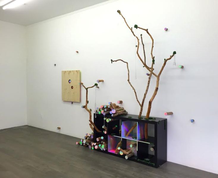
Installation view, David Shaw, “Other Fires,” 2016. Courtesy the artist and Envoy Enterprises.
7. David Shaw at Envoy Enterprises, through October 16.
David Shaw’s signature materials, holographic laminate and found raw wood, have served him well. Since he began showing sculptures uniting these materials in the mid 1990s, other artists have combined wood with the iridescent and radiant plastic sheeting. Shaw, however, consistently merges them in a unique and inimitable way, as evidenced by the works in this engaging show, “Other Fires,” featuring the New York artist’s most recent sculptures, two-dimensional objects, plus an installation.
Most of the works employ sawed tree branches of varying sizes, whose ends have been covered with the reflective laminate. In one work, a bundle of such branches hangs suspended from the ceiling by a long rope. It is an uncanny image, conjuring an isolated, radioactive specimen of nature that has somehow survived a nuclear holocaust. The two-dimensional works convey a similar idea since the holographic laminate is embedded in partially burned panels, shimmering unnaturally in places where the wood knots ought to be.
The largest work in the show, Put Out, suggests a domestic interior. Set against one wall, a found bookcase resembling a piece of Minimalist sculpture is partly covered by the laminate. As one moves in front of the piece, it seems to shift in space, thanks to the optical ambiguities of the elusive surfaces. Several tall tree branches emerge from holes in the boxy construction while long, clear glass teardrops dangling from a number of the upper branches contribute an organic feel to the sculpture. In each work here, Shaw offers a charged metaphor having to do with the ongoing conflict between nature and technology, and the hope that perhaps some sort of reason and balance might prevail.
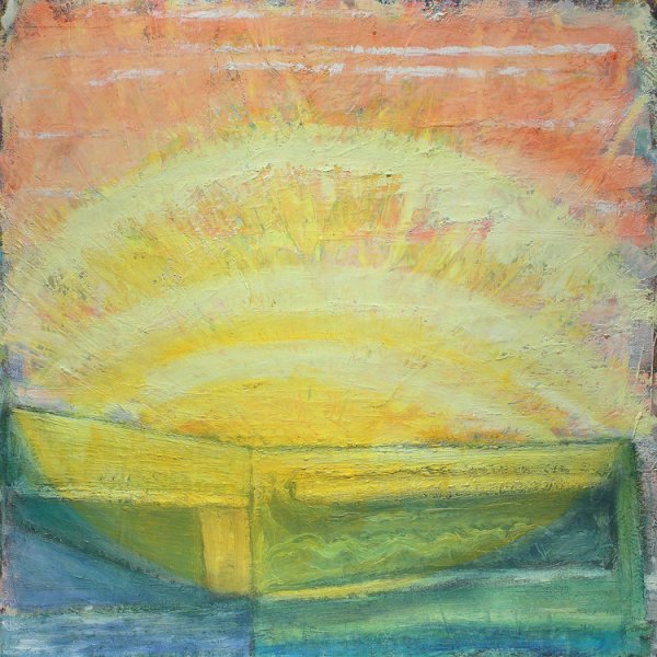
Gregory Amenoff, Early Bright, 2016. Courtesy Alexandre Gallery.
8. Gregory Amenoff at Alexandre Gallery, through October 29.
The art of painting is alive and well in this luminous exhibition of recent works by New York artist Gregory Amenoff. Though fundamentally abstract, the fourteen works on view all refer to landscape in some way, and convey a rather mystical reverence for nature. Early Bright, for instance, showing a brilliant yellow starburst radiating toward a salmon-pink sky, is unabashedly sensuous, and suggests an almost hallucinatory sunrise vision. Other works, such as Clearing (for JB) and Flood feature sinuously undulating and overlapping curving shapes. In the former, the shapes are yellow, trimmed in blue, and stretch from the top center toward the lower portion of the composition, surrounded on either side by highly stylized vegetal forms and organic shapes.
There is a consistent sensuality and muscularity in Amenoff’s application of paint, and in the impasto surface textures he achieves. Aside from technical richness, the works bear a significant art-historical depth especially in their references to American modernist painters like Dove, O’Keeffe, and Hartley, as critic and painter Stephen Westfall emphasizes in his essay for the show’s catalogue. After spending some time with this exhibition, Amenoff makes a convincing case that the medium of painting is still the best way by far to express the euphoric state of being that one may experience in the presence of natural phenomena.
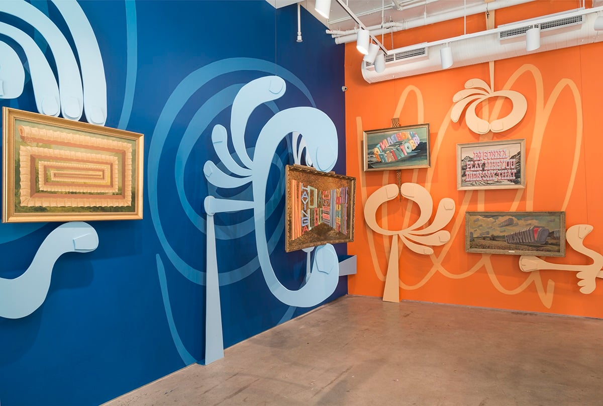
Installation view, Wayne White, “I’m Having a Dialogue with the Universe and Your’re Just Sitting There,” 2016. Courtesy the artist and Joshua Liner Gallery.
9. Wayne White at Joshua Liner Gallery, through October 8.
Tennessee-born, Los Angeles-based artist Wayne White is well known for his Emmy award-winning sets for Pee-wee’s Playhouse in the late 1980s, and for his designs for ground-breaking music videos by artists such as Peter Gabriel, and the Smashing Pumpkins. All along he has nurtured his text-based paintings and kinetic sculptures. This show, “I’m Having a Dialogue with the Universe and You’re Just Sitting There,” is a captivating overview of White’s recent paintings and 3-D works. It also encompasses his uniquely acerbic view of the contemporary art world, conveyed with irreverent, Dada-esque tongue-in-cheek humor.
Typically, White paints colorful blocky letters on the surfaces of found antique thrift-shop paintings, reproductions or printed images. In this show, the works are particularly buoyant and effective as he hung them atop wallpaper he designed.
Titled “Waynetopia,” the wallpaper was inspired by 19th-century French wall coverings featuring fantastical landscapes with tropical foliage, and majestic skies, and abstract, super-graphic designs of the 1960s. To these vibrant backgrounds he added his painted-word pieces. Hung on the extraordinary wall coverings, numerous works harbor hilarious commentary about contemporary art and artists. Among the most memorable pieces on view, a landscape painting with a barn is overlain with stylized lettering featuring the words, “We Were in Awe of His Work But He Was a Giant Asshole.”
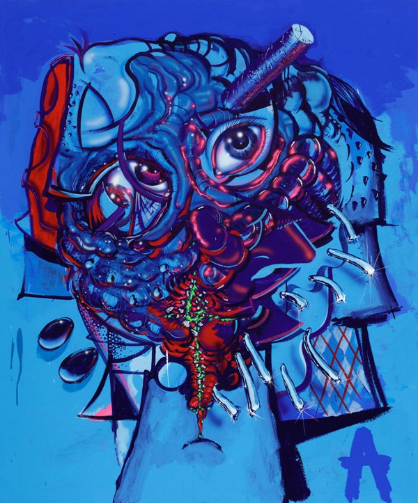
Aaron Curry, My Brain is an Antenna, 2016. Courtesy Michael Werner Gallery.
10. Aaron Curry at Michael Werner, through October 29.
If critic Clement Greenberg were alive today, what would he make of Aaron Curry’s new works in “Headspace,” a riveting show of mostly abstract paintings by the Texas-born, Los Angeles-based artist? The formalist champion of painters like Jackson Pollock and Frank Stella might regard Curry’s shaped-canvas compositions, such as Hot Mess, a revolting travesty, a total send-up of Stella’s post-1970s output. In a way, it is. Hot Mess, however, with its jagged contours, abrasive yellow background and hot-pink markings, may also be seen as a sincere homage to formalist abstraction, in its ad hoc approach, emphatic design, crisp draftsmanship, and coherent expression.
Curry’s Cosmic Bricoleur delivers what the title proposes, a chevron-shaped composition of psychedelic signs, graffiti tags, and spatial illusions that encompasses anything, everything and nothing. Fusing the visual idioms of graffiti, Abstract Expressionism, and Color Field painting is no mean feat, but Curry seems to have accomplished it here in vibrant paintings such as Command Minus and Head Trip. Surrealism seems to be part of Curry’s DNA, too, and with relatively conventional, rectangular-format images, including My Head Feels Weird and My Brain is an Antenna—a portrait-like painting with bulging eyes and fractured facial features against a brilliant blue background—Curry pulls Salvador Dalí and Max Ernst into his orbit. And why not? Curry at his best creates art about art, and mines unexpected if not forgotten areas of relatively recent art history. “Headspace” is definitely Curry at his best.
David Ebony is a contributing editor of Art in America and a longtime contributor to artnet.