Galleries
Art World Report Card: the Whitney Museum, the Brucennial and Cats on Film
Our Editor-at-Large offers a weekly take on art world issues, people, pursuits

Our Editor-at-Large offers a weekly take on art world issues, people, pursuits

Alexandra Peers


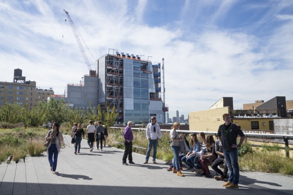
A view from the High Line of the Whitney’s new building by Renzo Piano, September 2013.
Photo: Timothy Schenck.
Whitney: Nu Build, Landscaping, Rvr Vu
What becomes a legend most? Balloon Dogs, apparently. The Whitney Museum of American Art Biennial opens officially March 7. In June the museum will mount its farewell show in the Breuer building, a Jeff Koons retrospective that’s a fitting stylistic chewing-aluminum-foil end to the home of Hopper and Calder. Then, Whitney picks up and moves downtown to a meatpacking-district home designed by Renzo Piano.
When does it open?, I ask a brace of Gansevoort Street construction workers encircled by lumps of grey snow.
“2015.”
Spring, fall?
“Hopefully,” answers one, and they all laugh. The new building is on-time and on-budget, according to the museum.
Even undone, the new Whitney, industrial in look and brawny in attitude, is impressive, the Statue of Liberty is its view on one side, the Empire State Building on the other, and the Hudson at its feet. With the High Line and Standard Hotel adjacent, it will all eventually come together to create an Epcot Center for hipsters in downtown New York. If that sounded like a knock, it wasn’t.
But the last decade has provided a cautionary tale of museum expansions, a host of pricey bad choices, literally set in stone. The Museum of Art & Design dumbed down a prettier structure. The New Museum seems all stairwells. After MoMA’s retrofit, the Pollocks and Monets looked squashed. All together, millions of dollars spent.
There have been a few successes, but most not in New York: Qatar, Milwaukee, arguably Crystal Bridges. In one of the coolest visuals ever—these days, it would be a GIF—I watched Robert De Niro rise up on a revolving open-air elevator platform from the Persian Gulf, to the entrance of the gleaming Museum of Islamic Art, in Doha in 2008, to be greeted by I.M. Pei, its designer. It was Cubist Xanadu, breathtaking.
The problem, of course, is that museum design, like anything else, has its fads.
J. Paul Getty once instructed his board: “I refuse to pay for one of those concrete-bunker type structures that are the fad among museum architects—nor for some tinted-glass-and-stainless-steel monstrosity.” (Getty also insisted that his museum have free parking. And we all know what happened with that wish list.)
Many institutions have used architectural bells and whistles to distract from holes in their collections. But the Whitney doesn’t need to. If you simply hung the museum’s permanent collection—those Rothkos, that Jasper Johns Flag, so very much more—you’d have a better art museum than most in the country. Yet at the new Whitney building, a curator bragged at a hard-hat tour that every level will now have a “sprung floor” so they could theoretically host a dance festival on every floor. (Hey, let’s not and say we did.)
For most museum directors, a new building is the culmination of their careers, so concrete pillars become fetish objects. But I believe Adam Weinberg is pretty savvy about the pitfalls he faces. “I was a curator 30 years before I became a director,” he stresses, and when design problems have come up, “We’ve all said 100 times it doesn’t work for the art,” and changes were made, he says. “The amount of thought that has gone into it . . . It’s in scale with the neighborhood, it’s an elegant building,” he says.
They’ve got some fresh ideas: Terraced outdoor galleries, wide open interior spaces, Danny Meyer restaurants, and the first floor is free. Whether that ends up being an inducement or a mistake (tourists can check off the “I was there” box) is to be determined, but it’s gutsy. Even Glenn Lowry, czar of MoMA, uptown, notes he’s toured the place with Weinberg, downtown and admits, “Who wouldn’t want that view of the Hudson?
Disingendered Art
Like many curatorial kerfuffle, this one started off with good intentions.
The Brucennial, something of an upstart anti-institutional survey of artists, opens March 6 at 837 Washington Street. It’s the fourth iteration of the lines-around-the-block show, and the Bruces, as members of the Bruce High Quality Foundation are known, instituted two changes to it this time around. The first is that it will be the last biennial. The second, meant initially to be private, is that it will feature only women artists.
The all-girls edict began to leak out a couple of weeks ago as male artists who’ve been included in past Brucennials wondered where their invitations were. A backlash began, mostly thanks to excluded artists, but also from some women worried about “ghettoization” (a word that is, interestingly, household-common in the art world, but not even in Spell Check). It was an uncharacteristically hot seat for the critical darling collective and its curator, Vito Schnabel, to be in.
On Friday, January 21, organizers sent out an explanatory “Dear Artist” email to invited artists: “We hope for audiences to approach the exhibition with clear eyes, to see your work first, and not a political statement. . . . this will only work if we don’t mention the all-women aspect of the show to the press before the show opens.”
Well, that didn’t work.
This was a noble attempt, particularly because BHQF was founded a little over a decade ago by a mostly male group of Cooper Union students. But to hope that gender could be the silent elephant-in-the-gallery was naïve—collegiate, even. The Brucennial has succeeded too well: Who gets in is now a high-stakes game.
Felines on Film
The Williamsburg bar Randolph Brooklyn is showing cat videos. And for those who ask “But is it art?,” I say: Ask again after an Absolute & O.J.
Alexandra Peers is artnet News’s Editor-at-Large. Contact her at [email protected].