Opinion
What the Dots Mean in Andy Warhol’s Pop Art
THE DAILY PIC: At the Broad Museum in Los Angeles, one of Warhol's 'Most Wanted Men' is a close-up on our mass-media culture.
THE DAILY PIC: At the Broad Museum in Los Angeles, one of Warhol's 'Most Wanted Men' is a close-up on our mass-media culture.
Blake Gopnik
 ShareShare This Article
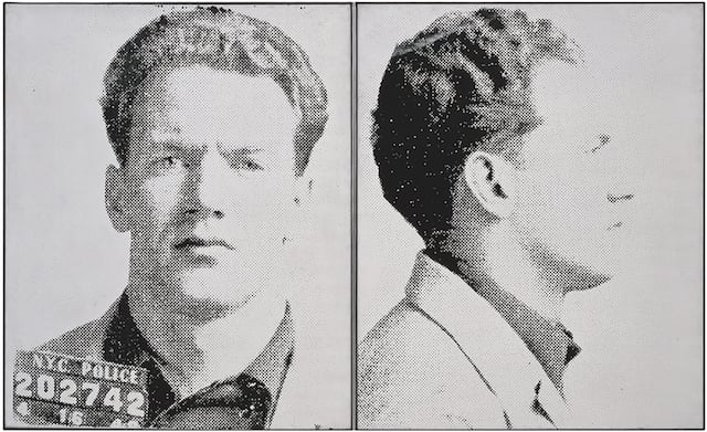
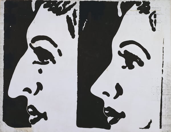
THE DAILY PIC (#1753): This pair of canvases by Andy Warhol has come to be known as Most Wanted Men No. 6, Thomas Francis C., and it’s on view in the current hang of the Broad Museum in Los Angeles. It is always described as a later version of two of the 13 Most Wanted Men silkscreens that Warhol was invited to mount on the facade of a theater at the 1964 New York World’s Fair. The mural was based on police mug shots, and got painted over before almost anyone had seen it, probably out of fear at the very idea that such men—or any man—could be “most wanted” by a male painter.
The Broad’s Most Wanted Man was made from precisely the same screens as the images from the façade project, and in reproduction there’s no telling them apart. When I recently got to see the Broad picture in person, however, I realized that from the beginning the effect of the two versions would have been utterly different. High up on the façade, the images would have looked close to photographic, as though the original mug shots had simply been enlarged: The subject was what mattered to Warhol in that case, and its public effects.
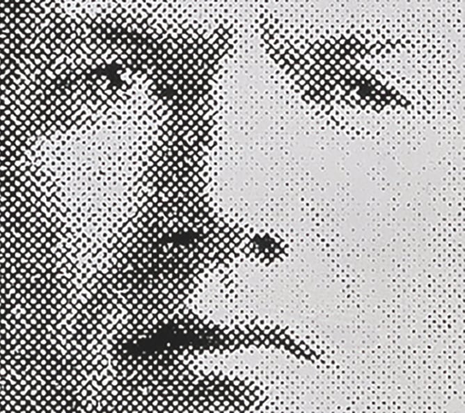
But see the same work in its second iteration, from up close on the wall of a museum, and its mug shot breaks down into a collection of big black dots; its subject stops being legible as you approach. (See the detail below.) That breakdown gives the image a special poignancy, in keeping with the social breakdown it represents and with the concealment involved in being gay at the time. It also gives the work a more conceptual feel, calling attention to the pictorial process behind this image, and behind every image we see.
And, of course, the exaggerated dots in the Broad painting instantly recall the famously dotty works of Roy Lichtenstein, Warhol’s first and most direct rival in the Pop pantheon.
But it’s worth pointing out, first of all, the (trivial?) technical fact that the two artists are actually riffing on different kinds of printer’s spots. Lichtenstein’s are Ben-Day dots, all the same size and used mostly as a cheap way of rendering color in comic books and other lowly ephemera. Warhol’s dots, which vary in size and spacing, come from the halftone screening used in almost all mass-printing of black-and-white photographs.
Warhol’s Pop process always required some amount of halftone, just to transfer an image onto the screens he used to print his canvases. But it was only the other day at the Broad that I realized how carefully he could and did manipulate his dot-screen technique.
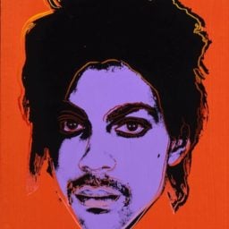
The Broad’s criminal, for instance, seems to have been printed with a tight halftone, since the only dots we see are massive enlargements of the ones used to print the original police flyer he appeared on—the smaller dots of Warhol’s own screen are left invisible. (The high contrast helps.) On the other hand, when Warhol was working from real, darkroom-printed, dot-free photographs of Marilyn and Elvis, both represented in Warhols at the Broad, he used a coarse half-tone technique for his silkscreens, to simulate—to fake—the coarse, mass-reproduction of newspapers and magazines.
Every time Warhol silkscreened an image, that is, he made a choice about how dotty it would appear and just where its dots would come from.
He was making such choices even before he started silkscreening, and almost certainly before he had seen anything by Lichtenstein.
In the hand-painted Before and After canvas from 1961, now at the Museum of Modern Art (see below), one of Warhol’s very earliest Pop images duplicates a nose-job advertisement, complete with a border of halftone dots—that as it happens are nowhere to be seen in the ad it’s based on. (The ad survives in the Warhol archives in Pittsburgh.) Warhol went to the trouble of adding-in artisanal dots, dabbed on by hand through a stencil, even in a case where they weren’t required. He needed a symbol and signal of printedness.
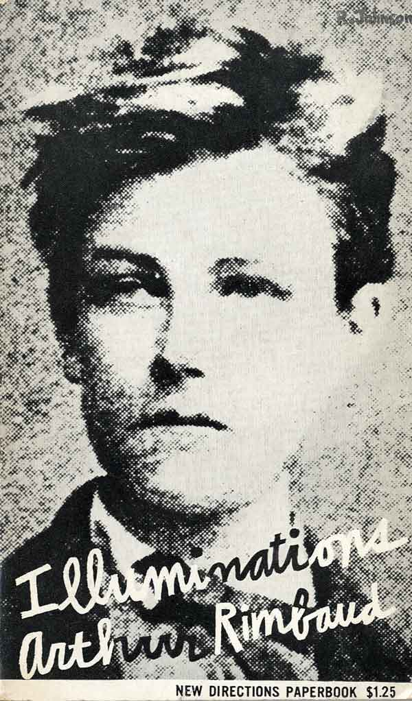
But he wasn’t the first person to go that route. Commercial artists had already explored that same territory. In the 1940s, Lester Gaba, dean of window dressers, had made a giant image of an eye that was vastly dotty. And in 1957, New Directions publishing house, a client of Warhol’s from a few years earlier, had got Warhol’s friend Ray Johnson to do a book cover that is almost a twin of a Most Wanted Man. (See below—and note the queer author involved, and that Ray Johnson was also gay.)
As I’ve found out in researching my Warhol biography, the most sophisticated commercial artists had “discovered” the ironies and displacements of Pop before fine artists did. Warhol’s most important move was to transfer that entire discovery from its “low” source in commerce into the world of galleries and museums. Unlike Duchamp with his urinal “fountain,” Warhol only had to manage a tiny shift, from the highest level of graphic art up a single notch to the world of fancy, collectible paintings. But that nudge turned out to be seismic.
(Most Wanted Men No. 6 is from The Eli and Edythe L. Broad Collection; Warhol images ©The Andy Warhol Foundation)
For a full survey of past Daily Pics visit blakegopnik.com/archive.